One of six children, I was raised by a busy mom, who instilled in me a love of fabric. Though I learned to sew and knit at a young age, it was the arrival of my first grandchild that pushed me into action. A long-time knitter, I am now ready to explore all things fiber.
Here you see the pair of socks I knitted for my S-I-L. This was to be a Christmas gift, but it appears that I missed the deadline by about four weeks. I have no regrets – I did what I had to do.
On my feet – a pathetic stand-in model for the giftee.
You can almost make out the 3 by 1 rib I used on the leg and instep sections. This is currently my favorite stitch for socks. I find it more soothing to work than a 2 by 2 rib. Another feature of this sock is that I doubled up the yarn at heel and toe. I am hoping the extra thickness will increase the lifespan of the socks.
Pale blue yarn is a blend of alpaca, wool and acrylic. Dark blue is Cascade Heritage, a superwash merino, reinforced with nylon, and one of my favorite sock yarns.
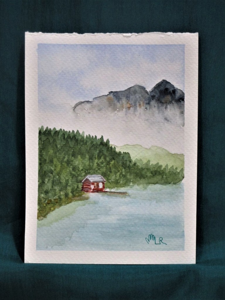
I’m still playing around with quinacridone gold as a background wash. This time, I dropped in five splotches of violet, hoping to get some interesting browns.
I failed to take a photograph of the initial wash. But the results reminded me of the geranium cutting I started a few months ago.
The most striking thing about this photograph is that it is backlit. The leaves furthest from the viewer are the lightest. I really wanted to capture this impression in watercolor, and today is the day to try, using my quin gold washed paper.
I painted leaves on top of four violet blotches, and the pot over the bottom one. To make green, I added a small amount of cobalt blue to the gold. When that didn’t give me a bright enough color, I tried lemon yellow with the cobalt.
As I worked, I felt strongly that the painting was falling well short of my vision for it. But instead of giving up, I kept adding more layers, working the shadowed areas with violet and lifting paint from the highlit ones. Continuing to work, I dropped in white gouache mixed with a little lemon yellow into the background and also into some of the leaf veins. To finish, I layered a bit more gold into corners of the background.
I wouldn’t call this my best work. But something good is beginning to happen. There is a sense of shape – the lower right leaf is the best example. The varying layers of color are bringing a depth of color that is suggestive of the natural world.
I will be painting geraniums again, and soon.
Quinacridone gold, Winsor yellow, cobalt blue and carbazole violet on Fabriano Studio cold press paper.
For the second week of the Stay at Home Round Robin challenge, Chris asked us to make piano keys.
NOPE – THIS IS INCORRECT
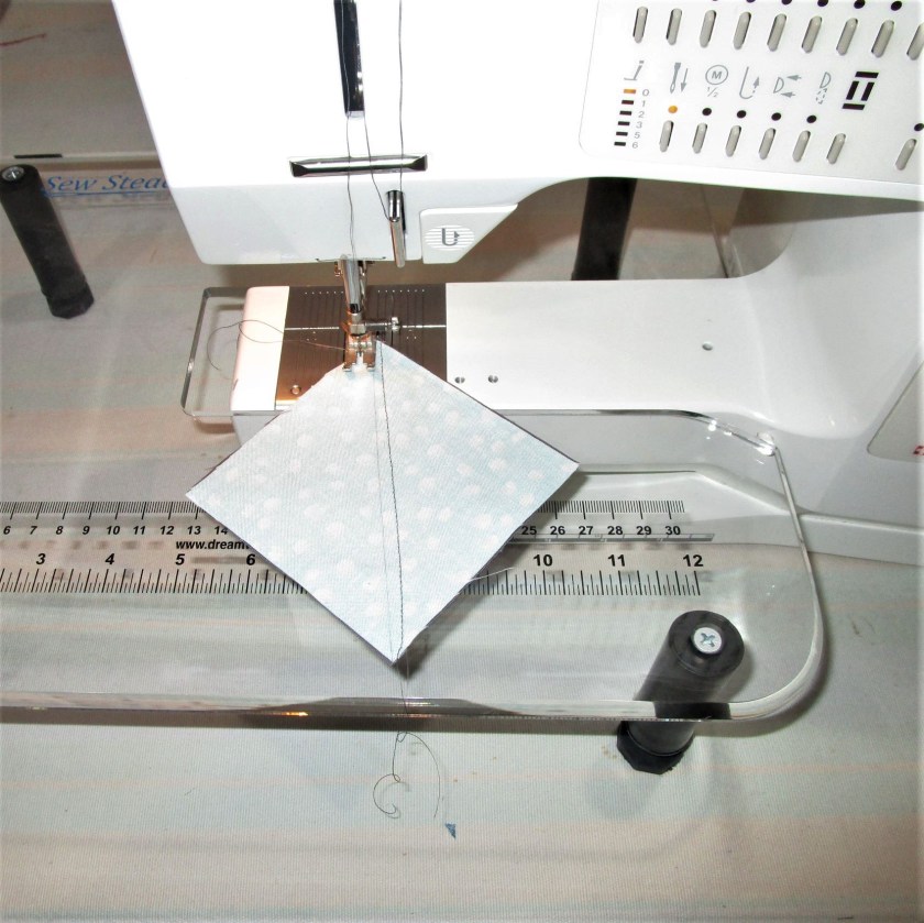
In the world of quilting a piano keys border is one with narrow rectangles in assorted colors sewn together. Oh, I get it, this is like string piecing!
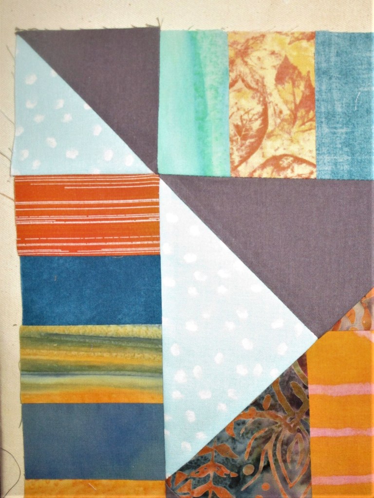
After looking at the other participant’s interpretations, I came back to my own center panel. I decided that my main objective for this round is to continue the outward thrust of the corner triangles. Using the same fabrics, I made half square triangles to use as corner posts.
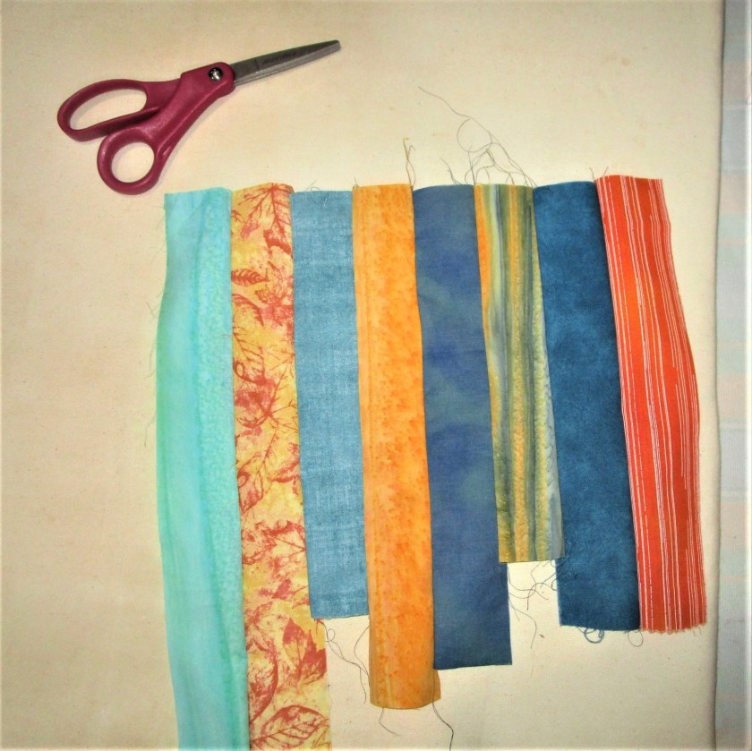
Then I got out my orange and blue-green fabric scraps, cut them into two inch wide strips and sewed the strips together on the long edge. I alternated the two hues and arranged them from light to dark in shade.
These were cut cross-wise into three inch strips, which I then attached to my panel, adding the corner posts as I went along.
Half Way Done
Showing a corner with color continuation into the border.
ALL DONE!!
This post is linked with the group Stay At Home Round Robin. If you would like to see the work of other members….
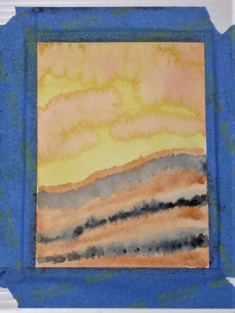
For my exercise, I wanted to experiment with a quinacridone gold wash. Since it is a staining pigment, I decided to pair it with burnt sienna, a granulating pigment. With the idea of a sunset, I added some splashes of alizarin crimson. Streaks of payne’s gray served to ground the image.
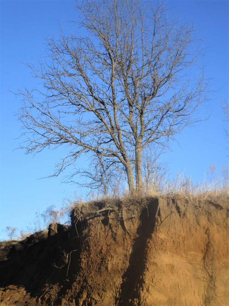
I love the mingling of the pigments so far. This image reminds me of a place at Tallgrass Prairie, where rushing water had torn away part of a ridge, exposing roots and strata of soil. I quickly painted in some details to complete the scene.
Later, I searched my photographs for a picture of the wash.
If I were to paint this scene again, I would include the deep shadows where the landform bends away from the viewer.
Painted wet-in-wet and wet-in-dry with a Sumi brush on 140 lb. cold press paper.