Posted in painting

Friday Finish: Spring Flowers

After my latest experience in watercolor painting that yielded (to me) disappointing results, I decided to sign up for a tutorial. I reasoned that it would give me some pointers on realistic shadows and rebuild my confidence in painting.

Shari Blaukopf has a new course that teaches painting spring flowers. This will be my fourth or fifth tutorial with Shari, so I knew what to expect.

https://learn.shariblaukopf.com/

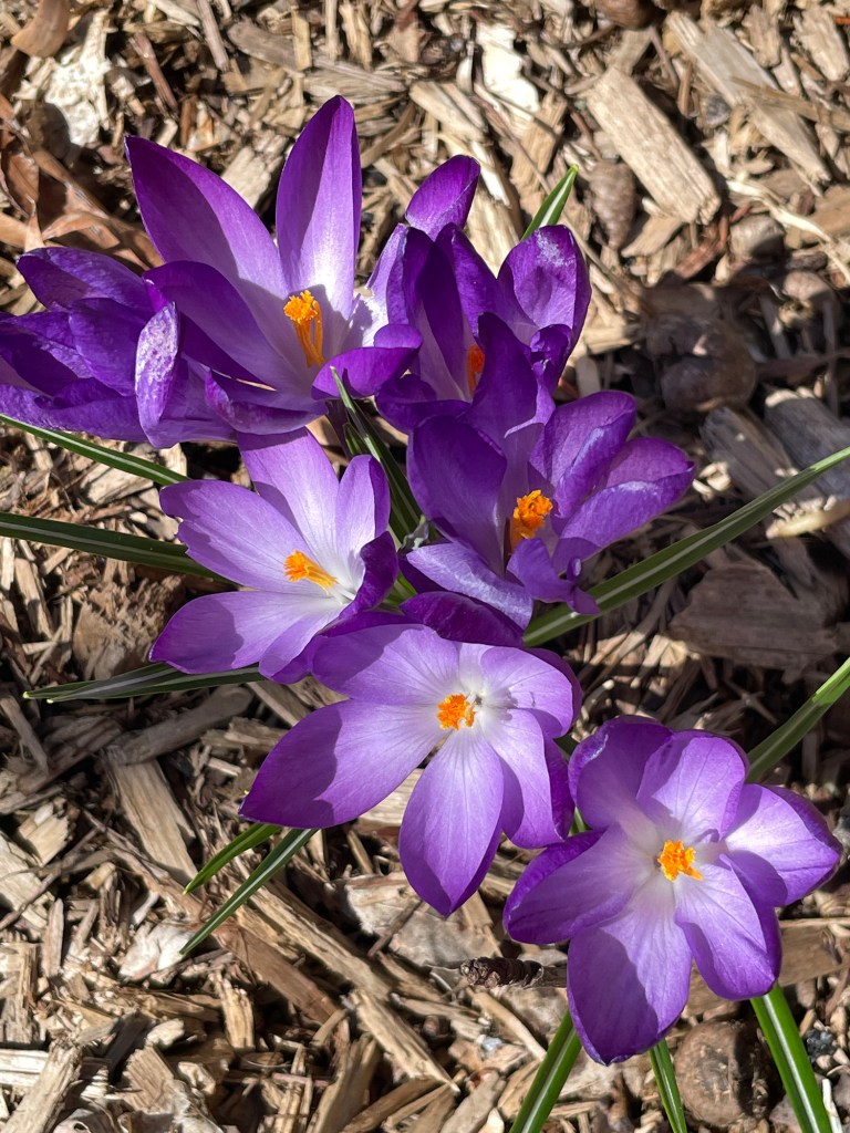
The first lesson is crocuses. Shari chose a perspective that it dramatic and not hard to do. Her reference photo was taken looking straight down at a group of flowers just opening up.

COPYRIGHT SHARI BLAUKOPF

I jumped right into the lesson, sketching it yesterday and painting it today.

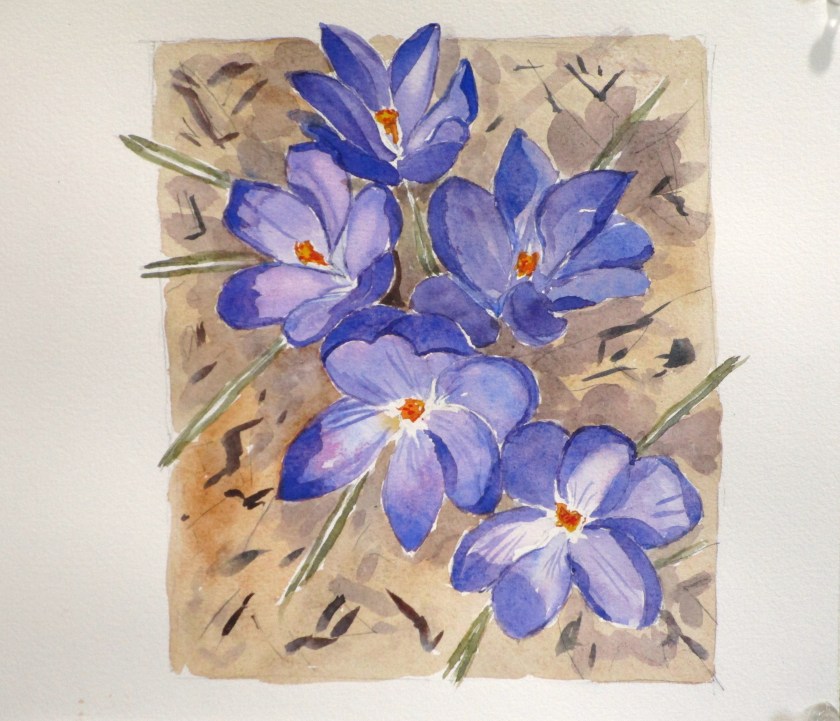
Maybe I could have made my cast shadows darker.

This exercise was fun and relaxing. The palette I used incuded cobalt blue, quinacridone magenta, hansa yellow deep, transparent orange, carbazole violet, burnt sienna, ultramarine blue and yellow ochre. Paper is Arches cold press, 140 weight.

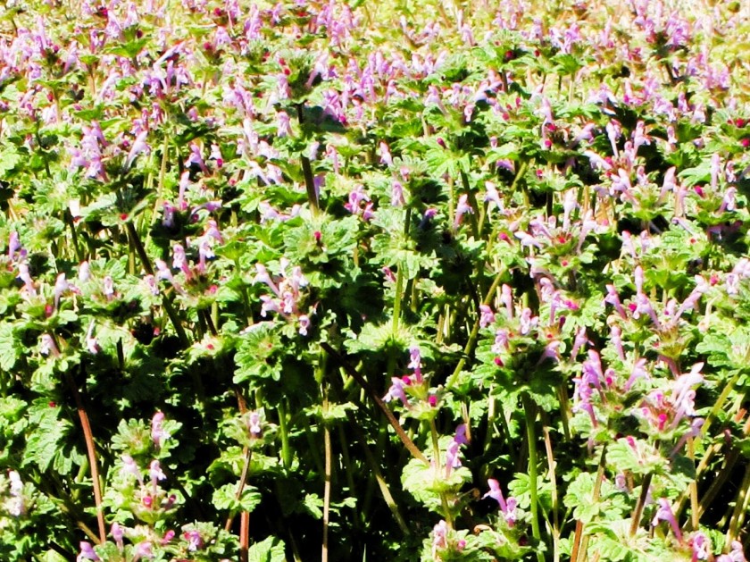
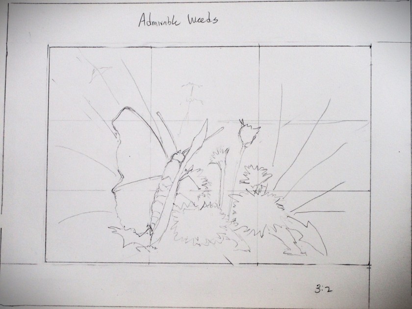
After I finish the next two lessons, I’ll go back and try painting my Admirable Weeds subject again.

Posted in painting

Admirable Weeds

My inspiration for this painting happened during a camping trip to Kansas in late March. At the site, I noticed a dozen or so Red Admiral butterflies floating around an open area near some trees. After following them around for awhile, I realized that they were taking nectar from two weedy non-native plants: henbit and dandelions. My thoughts went something like this: Those two plants are disdained by gardeners and the general public. Yet one of our most beautiful native butterflies found them attractive. There is something to be valued here that I wish to explore.

The henbit was lush and blooming profusely.

I grabbed another photo in my backyard, which I used to create my drawing.

For the butterfly reference, I went to Unsplash.com for this lovely by Don Coombez.

https://unsplash.com/photos/a-butterfly-sitting-on-top-of-a-metal-pole-PLyR1XIwcsU

Reference in hand, I started work, first by testing colors in my sketchbook.

Next came a pencil sketch which was transferred to Arches cold press paper.

Stages of the painting:

Masking fluid applied and Initial wash laid down.

First round of colors dropped in.

Foreground painted and additional layers added.

Masking fluid removed, some shadows and details painted in.

Finished up by adding highlights and cast shadows.

I’m relieved to have finished. These complex organic scenes are still very difficult for me. And while I can’t say I love every bit of my painting, I did achieve my objective.

Posted in painting

Watercolor Wednesday: Playtime

There was quite a crowd at today’s Open Studio. Cheryl Bryan decided that this session would be focused on playing with our paint. She brought examples of daffodils rendered in a stylized fashion using watercolor and pen.

Watercolor painted and photographed by Cheryl Bryan

I have been struggling with painting lately, so it was very therapeutic for me to let go and try stuff. Here is my 3 by 5 1/2 single daffodil based on the reference image.

After making the drawing with pencil, the panel was taped off and splashed with water Three colors were selected, dropped on the wet paper and encouraged to run. I used Winsor yellow, transparent orange and Prussian blue.

The paint was allowed to dry, then additional paint worked in, mostly around the edges and into the background. After drying thoroughly, the tape was removed and lines worked over the painting. I used a dark blue Micron pen. It was fun to let the elements of the image slip outside the border.

Next, I pulled out one of Bill’s photographs. He loves shooting images of the daffodils in our front yard. This variety is called geranium. They have tiny clusters of three or so flowers topping each plant.

copyright Bill Riley

Using the same technique, I worked these cuties in a cool palette of carbazole violet, quinacridone magenta and Prussian blue.

I intensified the color in the short trumpets with some watercolor pencil in gold and dark magenta.

Despite the crowded room, I ended the session feeling relaxed and confident. Now I am ready to return to a slightly bigger painting that I have started, which features a butterfly and some spring weeds. Stay tuned.

To see some of Cheryl’s gorgeous watercolor paintings, you can visit her website:

https://cibstad07.wixsite.com/mysite-1/about

Posted in painting

Watercolor Wednesday: Blissful

I asked my yoga instructor for a photograph of her two little dogs, with the intention of giving her a painting for Christmas. Well, Christmas came and went, and I didn’t get around to the work until January.

Here is an adorable photo of Marianne and Sissy (breed is Havanese)

I know these dogs well. They are present at yoga session and form a 2-dog greeting party with the arrival of each student. My challenge will be to render their personalities as vividly as possible.

No good portrait will happen without a good sketch. In this one, I taped two pieces of paper together so that I could make the sketch on 1:1 ratio with the painting. This allows me to transfer key contour lines and any gestural lines to the watercolor paper by tracing. 

Next, I did a quick color study and selected pigments. Marianne will be painted with a mix of Prussian blue and transparent orange. Sissy will be painted with a blend of Payne’s gray and transparent orange.

White areas masked out and underpainting complete:

Second wash complete

Third wash finished and most details painted in. Time to remove the masking fluid and the little bits of masking tape.

Final touches to finish it.

I’m pretty satisfied with this one. There were challenges, to be sure. But I achieved the bit of sparkle and personality I was seeking. You can probably guess that Marianne is the extrovert and Sissy not so much. I think of them as yang and yin. 

Blissful Dogs finishes out at 12 by 15. It is the largest watercolor painting I have finished to date and will easily fill a 16 x 20 frame after matting.

Done on cold-press Fabrico Artistico paper with a palette of Winsor yellow, yellow ochre, transparent orange, burnt sienna, quinacridone red, Prussian blue and Payne’s gray. Only tiny amounts of white gouache were needed.

Posted in knitting, painting

1st Cast-on for 2024

Need I mention that this will be another stashbuster? While that’s true, this hat is a also a sort-of swatch for a much more ambitious knit project.

I’m knitting it up from scraps of yarn using a pattern offered by Wool & Pine. The technique is called 1 x 1 colorwork. It is just what it sounds like: Using 2 different strands of yarn per row, knit 1 stitch in color 1, then 1 stitch in color 2. Continue alternating colors to the end of the round. Then it’s up to the knitter on how often to change out colors throughout the project.

Here I am switching out colors once per row. After practicing on the hat, I hope I will be ready to knit the pull-over.

https://www.ravelry.com/patterns/library/sea-glass-sweater-2

copyright Wood & Pine

Seaglass is the ultimate stash-busting pattern. It came to my attention from fellow blogger The Crafty Yarnster who is working on her own seaglass sweater.

https://wordpress.com/read/feeds/152202665/posts/5052736941

In other news, five recipients of Christmas handknits expressed satisfaction with their new accessories. The balaclava/mitten combination can be seen here:

After trying it on, the child’s mother ecstatically called out for her own balaclava. It’s that warm! The adult version will be cast-on no. 2 for 2024.

Moving on to watercolors, I have promised my yoga teacher that I would do a watercolor portrait of her two little Havanese dogs. This is the photo she sent.

Irresistibly cute, don’t you think? This will be my first painting of a dog. I think it will be truly fun to do.

So, with these three projects, I believe that my plate for January 2024 is full. Hopefully I can squeeze in some work on December 2023 UFOs.