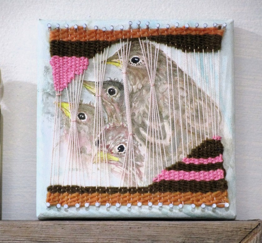
My local art association is having a fundraiser. I agreed to make some artwork on six-by-six canvases that will be sold for $66 each at the event.
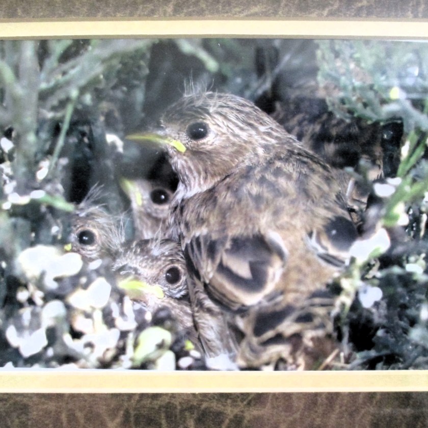
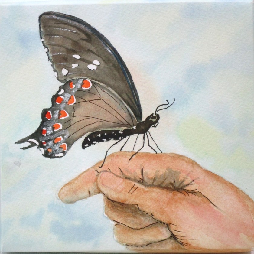
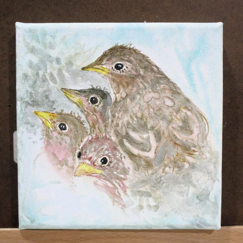
Because of the small size of the canvas, I decided that I would paint only small creatures. This choice allows me to make them life size. Last month I completed a butterfly and a nest full of sparrows. This weekend I am painting a hummingbird. I was inspired to paint one in a hand when a woman at our farmer’s market presented me with a hummingbird she had found on the ground. The bird was alive, but stunned. She wondered what to do with it. I suggested she find a place in the shade of a tree where the bird could recover safely.
The image of that tiny, but alive bird in her hand lingered in my memory. Today I finished a six by six painting that depicts the event.
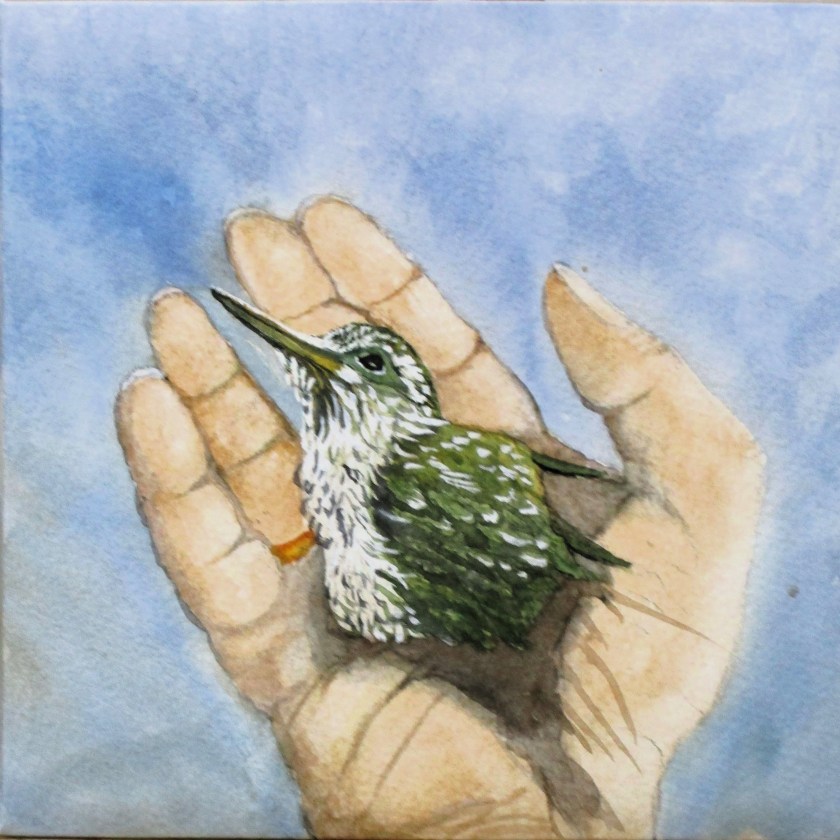
The hand model was me.
I used a photo on Unsplash taken by Osvaldo Pompa for the hummingbird reference.
For my final submission to the fundraiser, I cut down a painting that I completed in 2020 and attached it to the six-by-six canvas.

This cute beetle was crawling around on the brick planter in front of my house. I snapped some photos and did the painting. While I loved rendering the bug, the real challenge for me was painting brick, mortar and shadows. I’m pleased that after four years I still like this painting. It’s on cheap watercolor paper with student-grade paints. A few lines with an ultra-fine sharpie did well for the legs and antennae.
I’ll turn these in next week. Hopefully someone will be willing to buy them for $66.