Last Wednesday I wrote about my 100-day project, during which I will collaborate with Bill in making artwork or fiber objects inspired by his photographs. These three are the subjects of my first week.
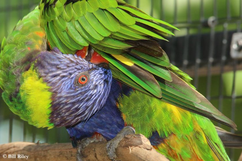
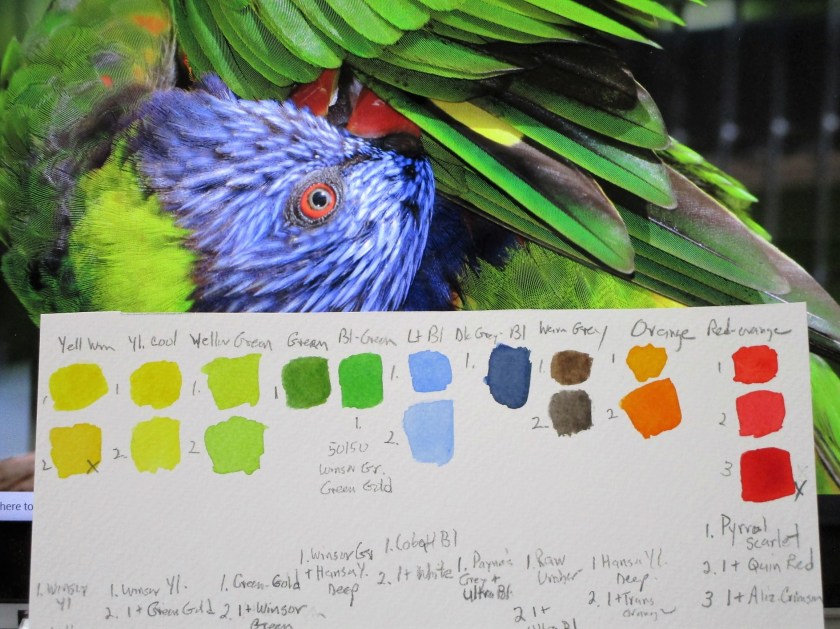
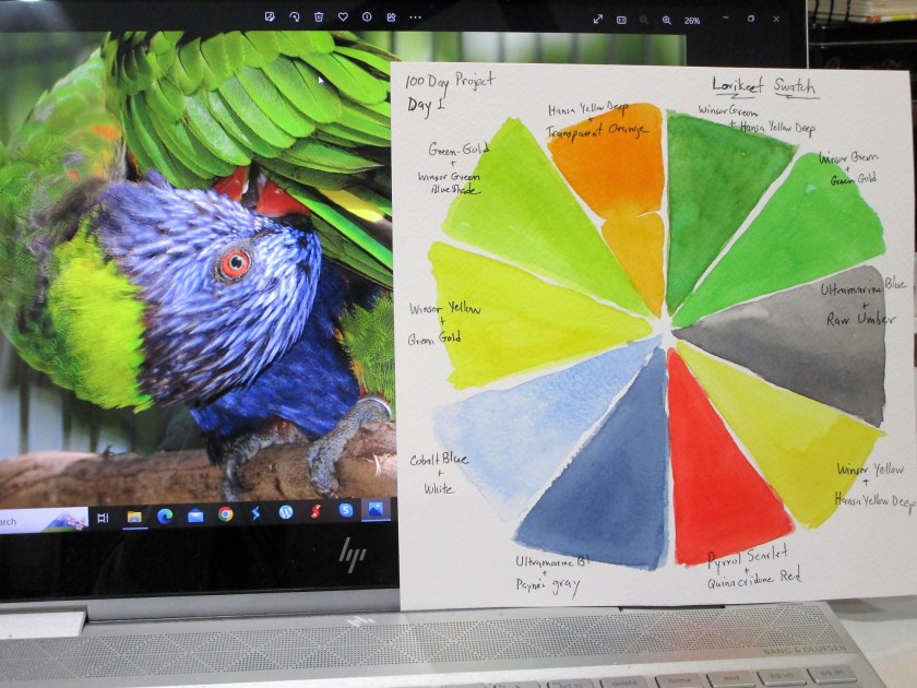
Back in 2017 at the Kansas City Zoo, Bill has a close encounter with this lorikeet. In his image you see plumage in colors that, impossibly, co-exist on one bird. I accepted as my challenge to swatch out this feathery palette in watercolor paint.
Day One: Samples
Day Two: I turned it into a color wheel.
In 2010 we visited The Louvre. While I wandered around, Bill found this sculptural fragment in the Antiquities gallery.
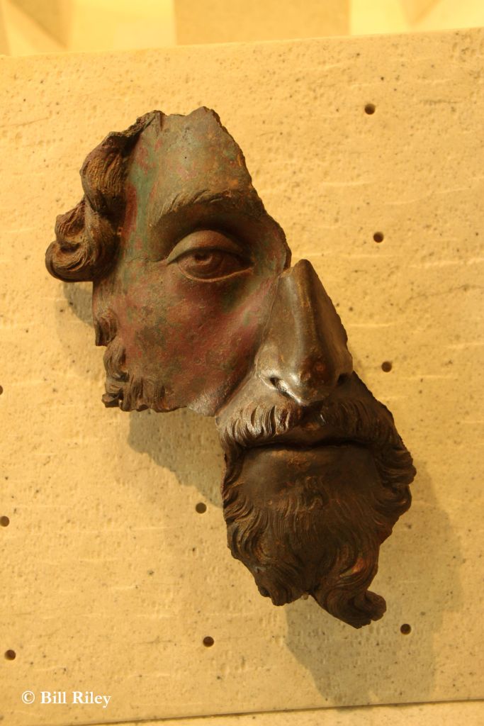
My initial idea was to do a simple drawing using Micron pen. To get a better look at the details, I edited the photo, brightening up the shadows, then printing it in monochrome.
Day Three: Drawing
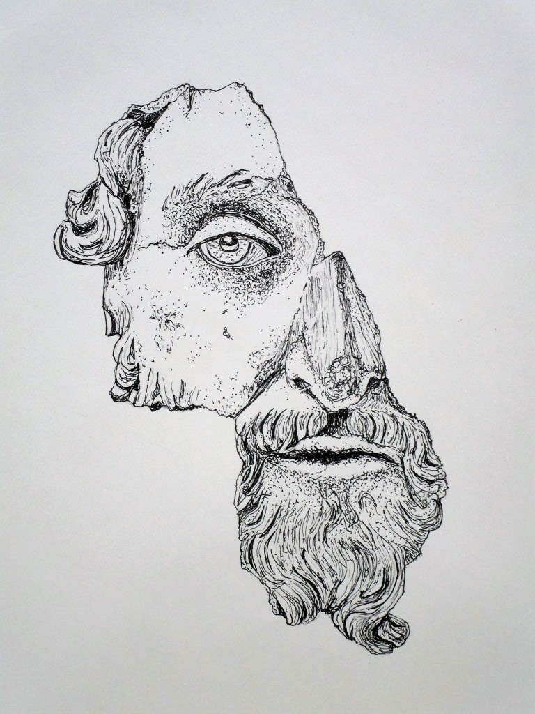
It actually took me two days to finish the drawing because I chose to stipple.
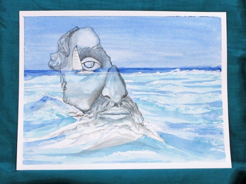
The next photograph was taken while vacationing in the Caribbean, but I am unsure if we were in Barbados or Belize. I really love the wave action and the colors.

My brain must have mashed up the last two photographs because I ended up superimposing the face onto the water.
1st Week Final Note: Searching my yarn closet, I found scraps to match up with the Lorikeet plumage. Today I used them to knit this swatch in fingering yarn.
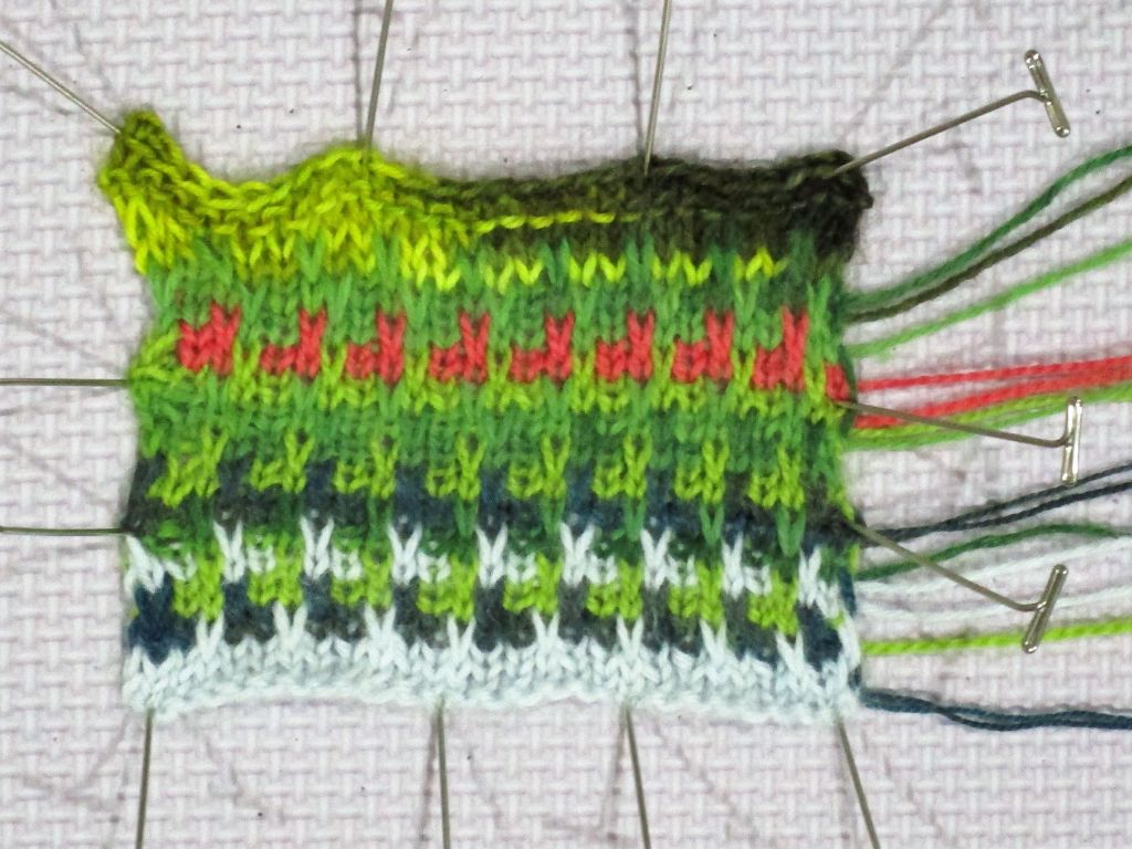
What do you think of the combination? Would you wear it on a hat, scarf or vest?
See you next week.