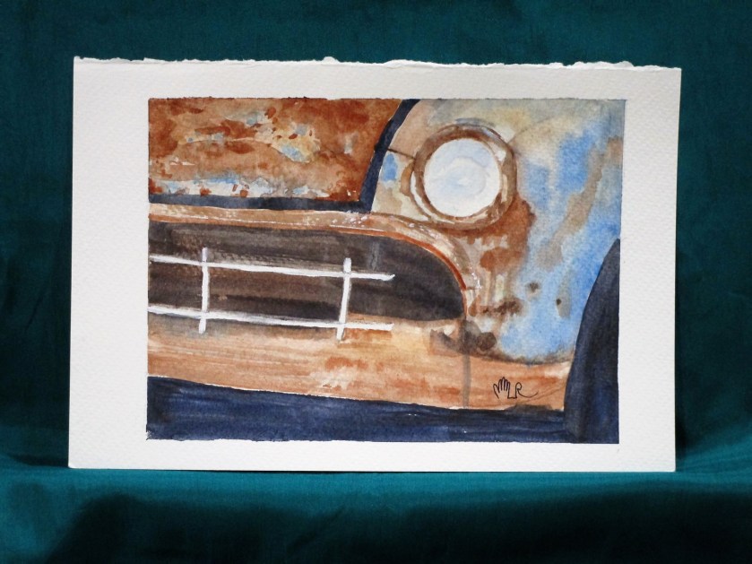
This rusty car was our assignment at the art association open studio last Wednesday. I think I got a pretty good likeness of the photograph. The hardest part was deciding when to stop.
I used a palette of raw sienna, burnt sienna, cerulean blue, cobalt blue and ultramarine blue. Painted on Fabriano Studio cold press paper.
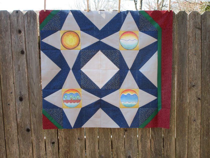
It was a cloudy day when I staged and photographed this image. It documents the assembly of my latest quilt project, tentatively called “Creation.” From a few feet away, the piecing looks fine. All points that are not exactly matched are at least closely matched. You can see on the right one border attached.
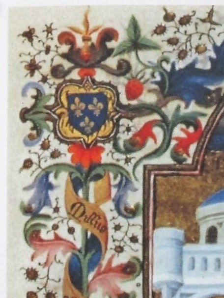
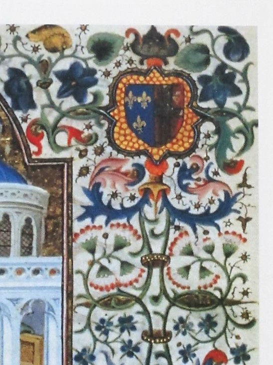
At this point, I really needed a break on lining up and sewing points. So I moved on to the border’s corner blocks. In reading about medieval manuscript paintings, I learned that the owners of the missals often had their family coats of arms painted at the corners. Here are examples.
I desire to do something simpler. (Only partly because I don’t want to spend several years of my life painting an elaborately decorated border like the example!) I have a fascination with symbols, so I decided to place historical and ancient symbols of God and/or creation at the corners instead. After a bit of research, I got busy.
Three out of four are complete. They are painted on the same golden fabric used as used for the scenes of Creation. I used watercolor pencils again. Behind and to the left you can see my border fabrics.
If you follow this blog, you may well guess what my next experiment must be:
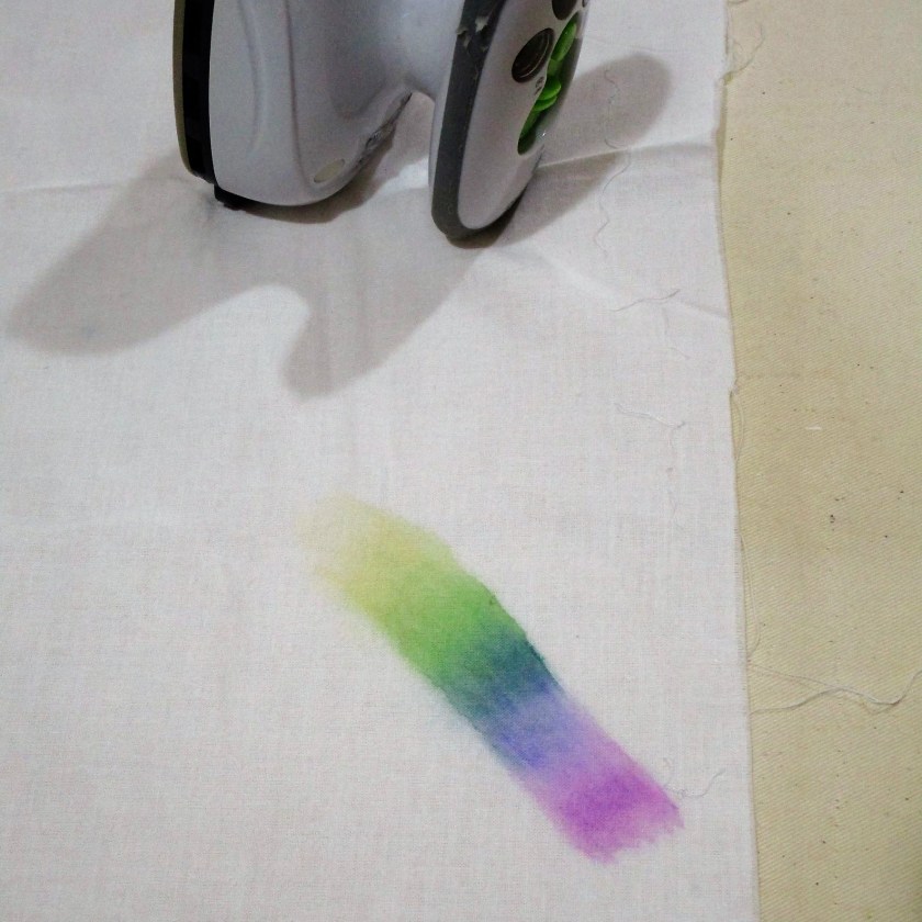
Yes! I had to try my new pencils out on fabric! You see here a piece of cotton muslin. I have marked a part of a rainbow, running the colors into each other. After liquifying the colors and letting the fabric dry, I used my hot iron to set the pigment. Then I sprayed on more water, just to see if the color bled further. The paint passed this test, so I moved on to a bigger experiment.
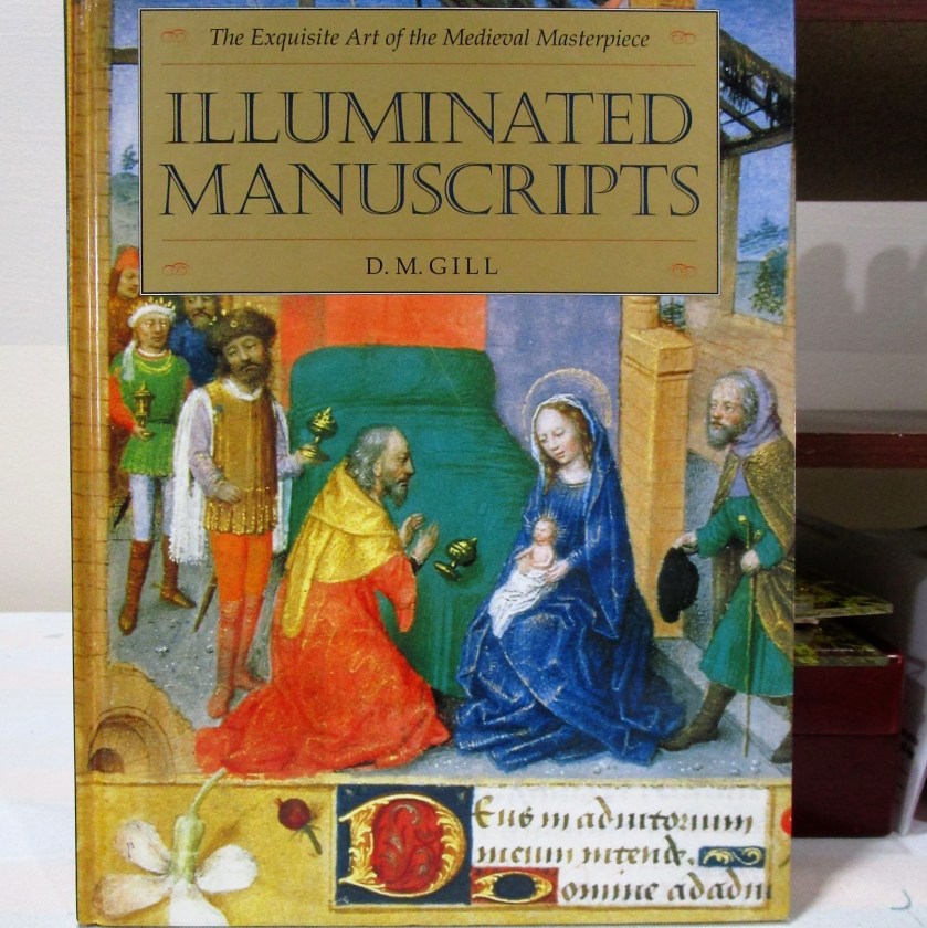
There is something about the medium that reminds me of stained glass. Thinking deeper about the possibilities of blending colors, I decide it is more like medieval illuminated manuscript. Then I remembered that I have a book.
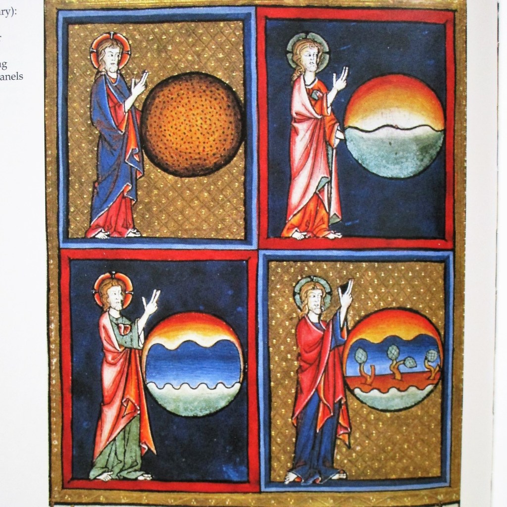
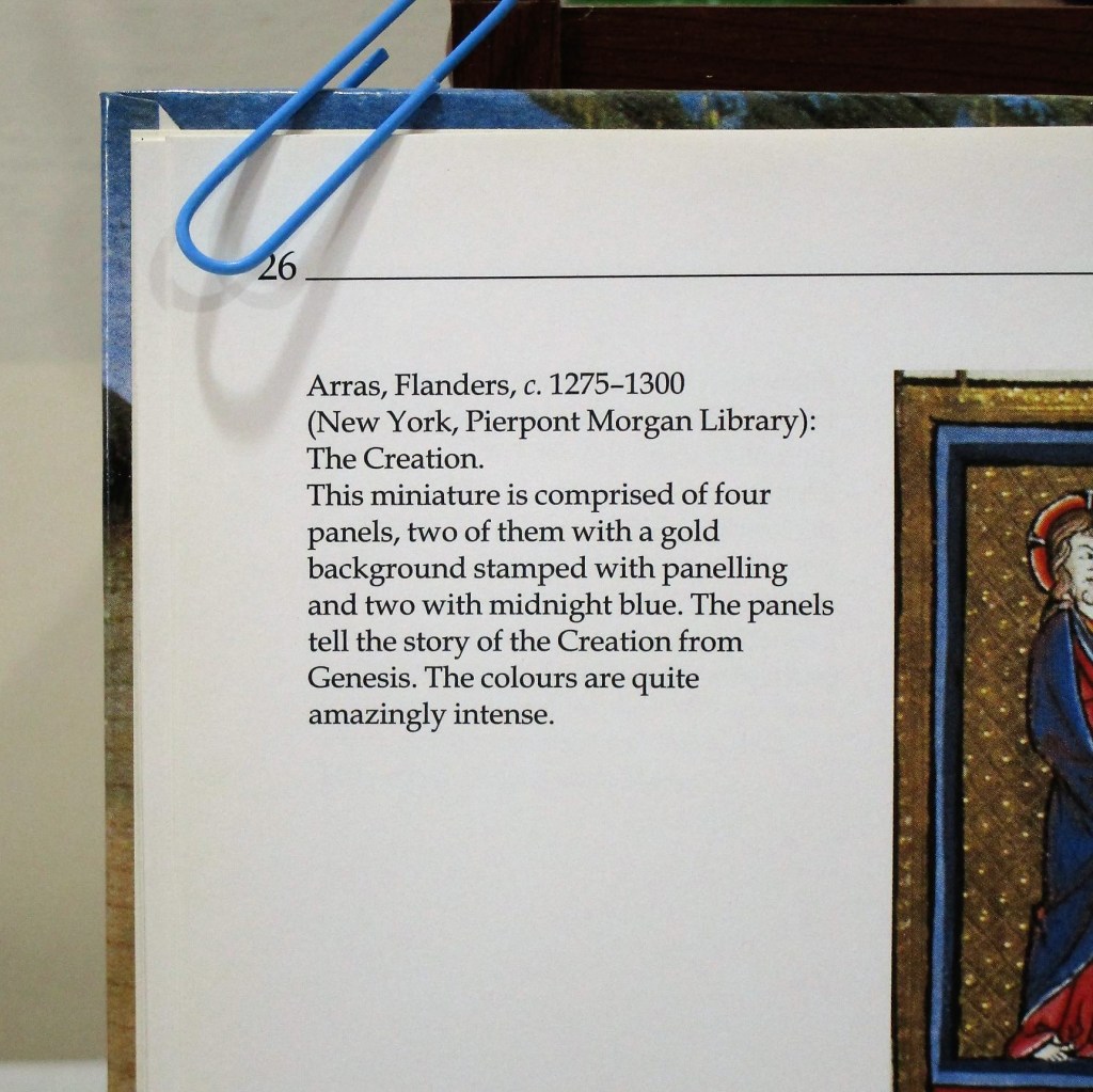
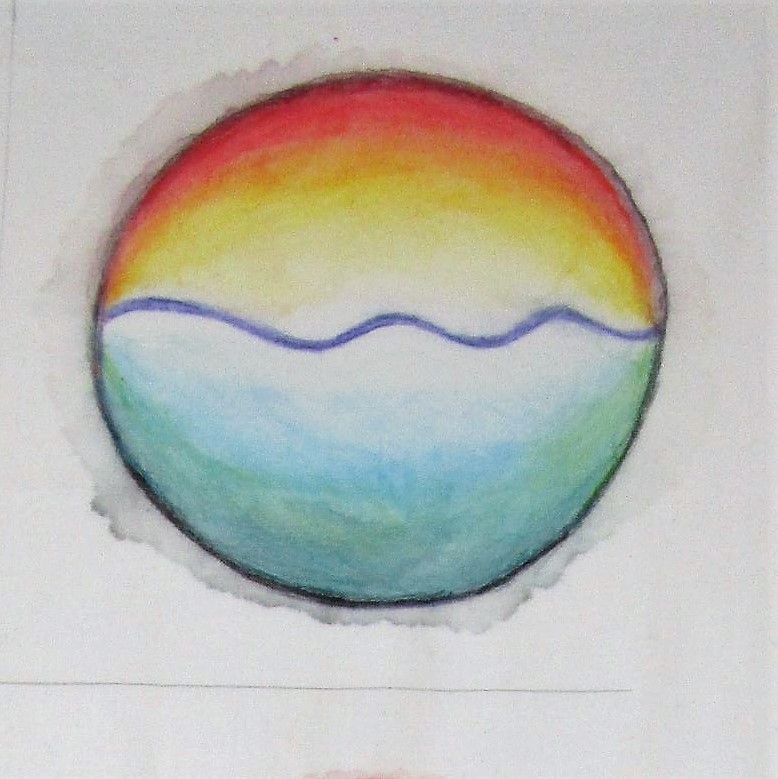
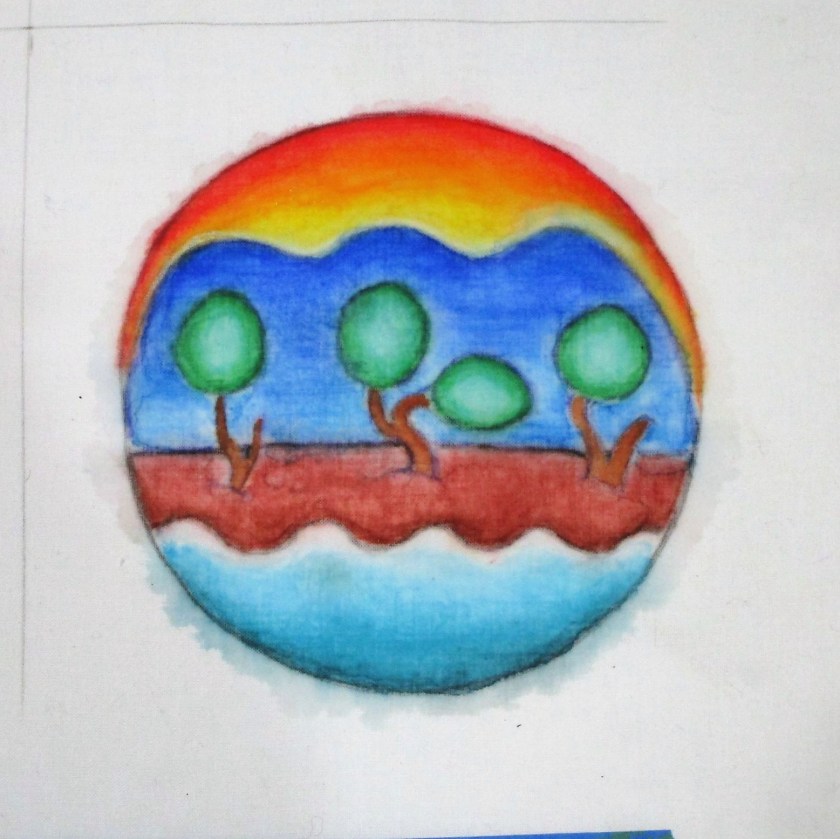
What if I reproduce one of these paintings on my muslin cloth? I flipped through the pages to find a likely subject and landed on this image depicting the creation of the world.
First, I drew a series of four circles on the muslin. Next, I used my swatch card to find matches to the hues of the illustrations. I began working the two days on the right side of the panel.
DAY TWO
DAY FOUR
This was very fun and pretty satisfying. Despite the slight bleeding outside the margins (totally fixable) I find the results most acceptable. I did notice that there are tide marks left behind by some of the blue and green pencils. But this extra texture seems very much in keeping with the pigments and style of the era.
After I paint days 1 and 3, I’ll put the fabric in a gentle cold-water bath to look for more fading or bleeding. If the piece passes this test, I’ll move on to a bit of quilting.
I hope you are enjoying your year-end holiday. Please do let me know what you think of this experiment or share what you are planning to make in 2023. Happy New Year.
It’s Wednesday, it’s time for a watercolor painting but…….
I had to test out my Christmas gift from Bill.
He’s the kind of guy that loves Christmas gift giving. So this is a BIG box of watercolor pencils. The first thing I had to do was make a swatch.
I spent a lot of time on Christmas afternoon making this swatch. First of all, the pencils weren’t in a usable order, so I had to re-arrange them. There were three steps. 1. Write out the color numbers and names in the same order that they lay in the trays. 2. Scribble each pencil. 3. Liquify each swatch with water to reveal the color.
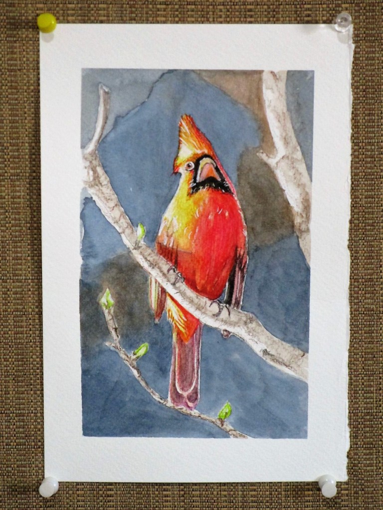
For my first painting with these pencils, I chose a photograph by Bill of a cardinal.
I love this image, because of the light. He must have taken this one late in the day.
After making a sketch, I laid down an initial watercolor wash. Then I selected about a dozen watercolor pencils which seemed to match all the hues of the bird. I blended these on the sketch then stroked over with water to liquify the pigment. After it dried, I added black details and white highlights with paint.
At that point, it was obvious to me that the background was too pale. I deepened the shades using Payne’s gray and a little burnt sienna.
Side-Lit Cardinal
I’m pretty happy with the result. I think that I will try some floral subjects next.
I call this painting Cheryl’s Poinsettia. Yes, I did paint it, but it was while attending a tutorial session offered by Cheryl Bryan in early December. The image is hers and she walked us through all the steps.
While working on this still life, I felt totally relaxed and engaged – to the point that I was sorry when I had finished it. It’s a feeling I hope to capture again.