One of six children, I was raised by a busy mom, who instilled in me a love of fabric. Though I learned to sew and knit at a young age, it was the arrival of my first grandchild that pushed me into action. A long-time knitter, I am now ready to explore all things fiber.
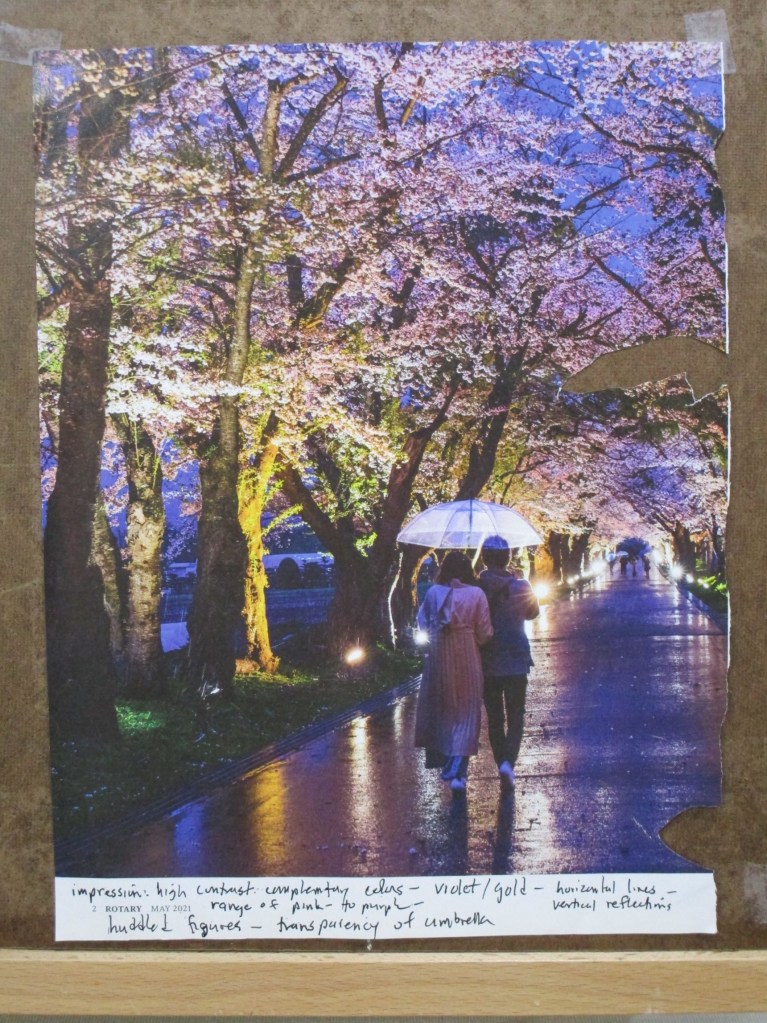
This month I have been participating in an art forum called Sketchbook Revival. For this page of my sketchbook I am following Faith Evans-Sill and her workshop that has us experiment with color and pattern prompted by an image.
I chose to be inspired by a photograph I found in my Rotary Magazine.
For the technique, we are asked to sweep stripes of color across the page, then intersperse shapes and patterns between and among the stripes. I decided to be somewhat more literal in my experiments. I wanted to reproduce the colors and elements that I saw in the photo, especially the trees.
In addition to regular watercolor paint, I worked in some metallic paints to capture some of the shine that’s visible in image. Once everything dried, I made marks with a black micron pen and a few colored pencils.
There were two benefits to the exercise. 1. Splashing the paint around was relaxing and stimulating to my brain. 2. I discovered colors and mixes that were new to me.
If you are interested in Faith Evans-Sill and her class offerings, here is her webpage.
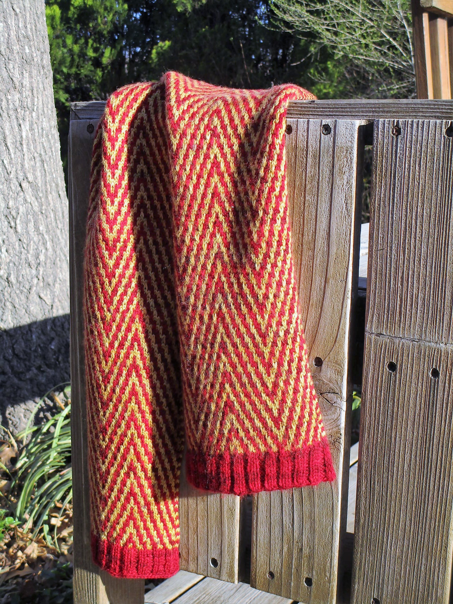
A day late and a dollar short, here is my finish for yesterday. I made this for a friend’s birthday which, sadly, came and went before I had finished knitting.
The chevron stitch pattern is one I had been wanting to try for a while. This version is created using a slipped-stitch, not a stranded technique – which contributed to the lateness of my completion. Because slip-stitch, also known as mosaic technique, tends to pull the rows up tight against each other, it took 48 rows to create 4 inches of scarf.
The yarn came from Hobby-Lobby, from its new line of hand-dyed fingering weight yarns. Fiber is 100% superwash merino wool.
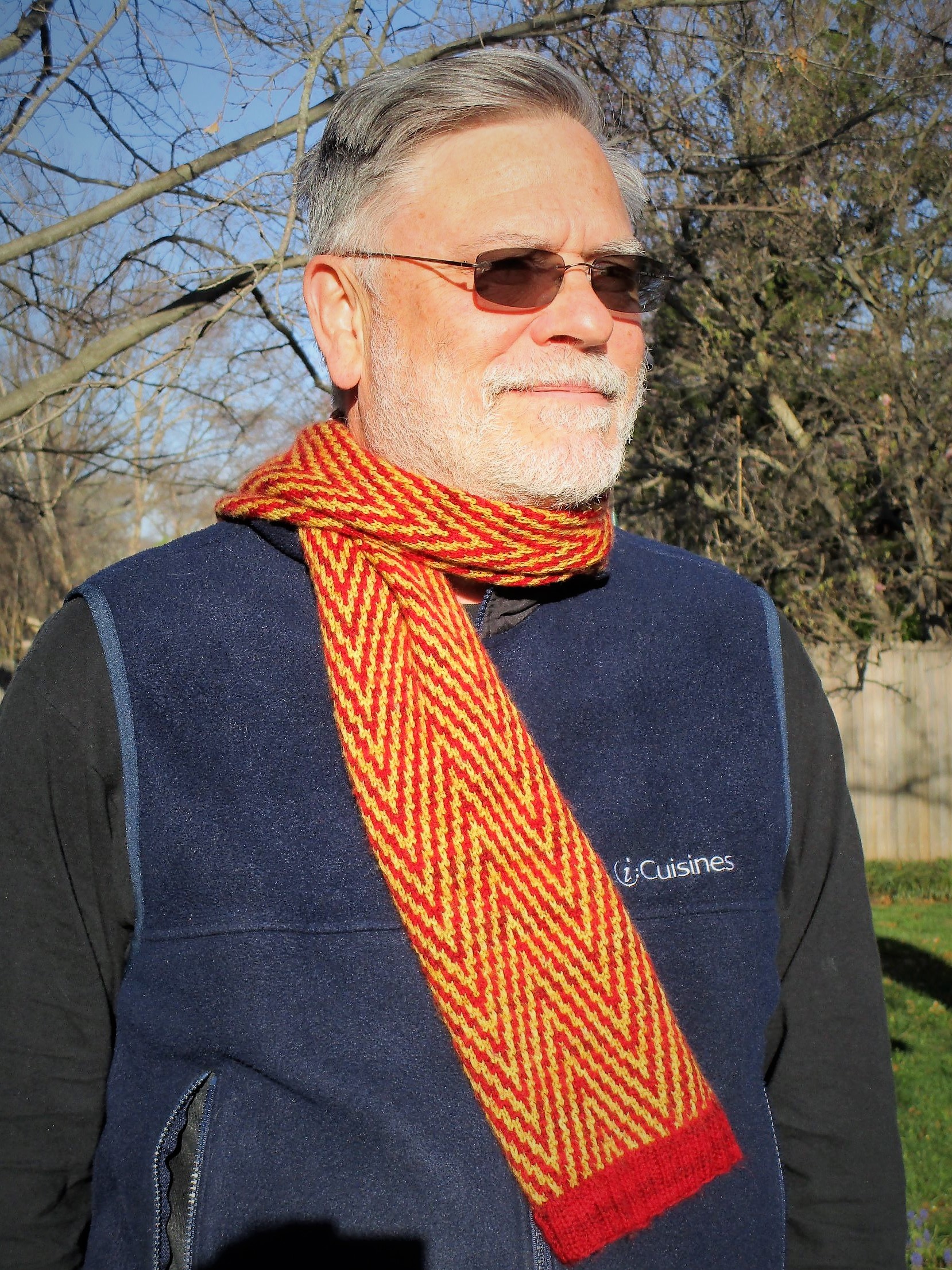
Bill has kindly consented to serving as my model today.
If you would like to give this stitch a try, I have attached a pdf of the twelve-row pattern that I used.
It was fairly easy to memorize, with only three right-side rows that varied. In this technique all back-side rows are the same: purl the knits and slip the slips. The pattern also features an I-cord edging.
I’m pleased with the result, but mostly relieved that I finished.
Hi friends! I have been absent for a few weeks while traveling around the country. A large chunk of our travel was in wintery Wisconsin. Despite the cold, snowy and windy weather, I found some inspiration in what we saw. I love the rolling countryside of the Driftless region. And the sand hill cranes. (More on the cranes coming soon.)
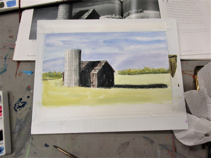
For today I will start with a rural landscape. My re-entry into art started with Wednesday’s Open Studio at the local art association. Every month on the first Wednesday, watercolor artist Cheryl Bryan provides a lesson. This week’s subject was buildings. I chose to paint a barn, in honor of all the lovely barns I saw in WI.
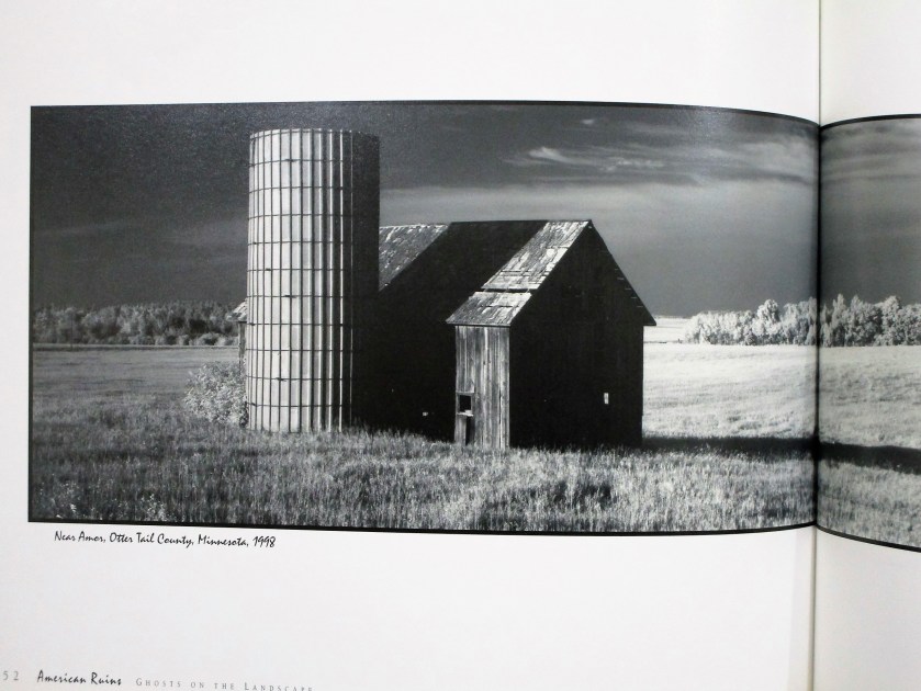
For my reference photo, I turned to American Ruins: Ghosts on the Landscape by Maxwell MacKenzie. A few years back I was blown away by MacKenzie’s formidable photographs of falling down farm buildings on the great plains. My first attempt at rendering one of these images was a few years back when I was learning to draw with pen and ink.
Today I picked this image to paint in watercolor.
The sketch took me almost no time. I didn’t need to re-scale it to fit my paper, so I did a tracing of the essential lines. I then transferred the tracing to my paper. Next I added masking fluid to retain some of the white spaces (especially those small holes in the old barn.
For more drama, I added a few more holes.
To keep things simple, I chose a limited palette: burnt sienna, cerulean blue, cobalt blue, carbazole voilet and Winsor yellow. Oh, and a little black.
Cheryl’s lesson focused on painting values. She asked us to decide where to use high, medium and low values, assigning one value to background, foreground and subject.
Using a black and white photo made this part easy. I wanted to retain the photographer’s focal point, which was the deep shadows thrown by the silo and barn. My background would be a medium tone and my foreground light. After painting the sky and adding a preliminary wash to the foreground, I painted my subject.
At this point I was stumped on how to proceed. So I showed my work to Cheryl, who gently scolded me for using black paint. Watercolor students are discouraged from using black paint. We are told that it deadens the painting.
I went home and proceeded to wash out as much of the black paint as I could.
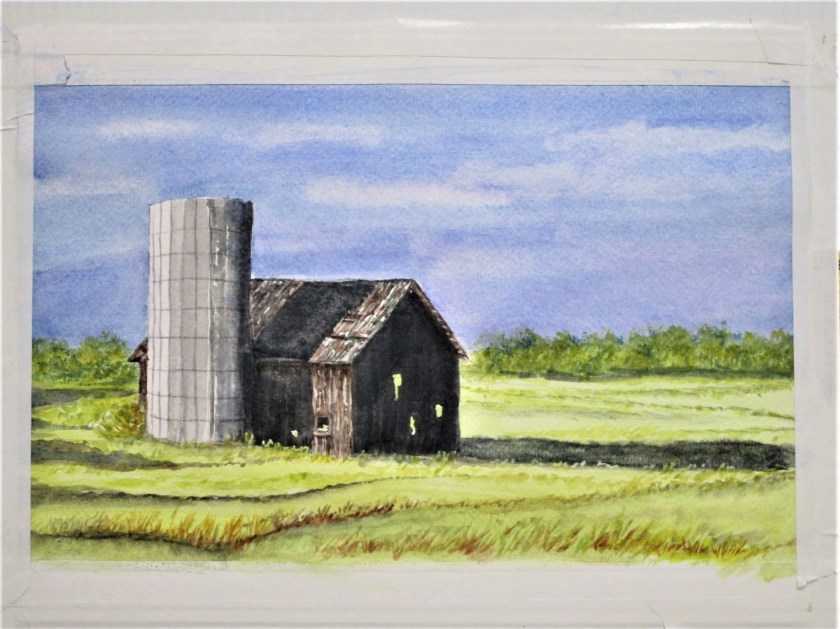
Today I returned to the painting. First, I decided that the sky was too light. Masking the top of the silo and barn, I added a glaze of cobalt blue to the sky. Then I painted glazes over the three areas of black paint using blue, brown and yellow.
At this point I removed all the masking fluid and turned to the foreground. Now, I live on a prairie. I spend many, many hours traveling on roads that cross the prairie. You would imagine that it would be easy for me to fill my painting with prairie grasses. But that expansive area of yellow paint just sat there and mocked me.
To get over my artist’s block, I reviewed this tutorial on composition by Joseph Zbukvic
Forgetting everything I know about prairie grasses, I proceeded to fill my foreground and middle ground with Zzzzzzs…… okay, gently curving zzzs.
The only areas still bothering me were the trees and the little shrub behind the silo. I added more paint and some trunks on the tree line and repainted the shrub as a bare-twigged remnant in burnt sienna. This seemed to work.
I’m finally ready to call it done.
To learn more about Maxwell MacKenzie, you may visit his website.
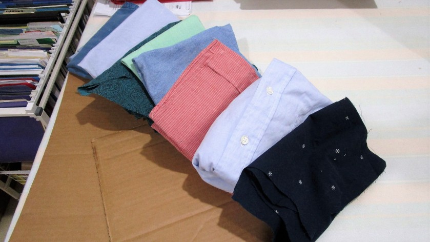
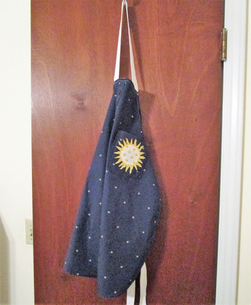
While tidying my workspace last week, I noticed all the shirt pieces I had left over from making the Howard Wabi-Sabi quilt. Since I had used only the backs, the leftovers included sleeves, fronts and collars. It occurred to me that there is a potential fiber object buried inside each one of them.
Naturally, I turned to U-Tube, to see what others have made from discarded men’s shirts. Not surprisingly, there were many, many projects. I wanted to make an apron, but I also spotted a cute little girl’s dress.
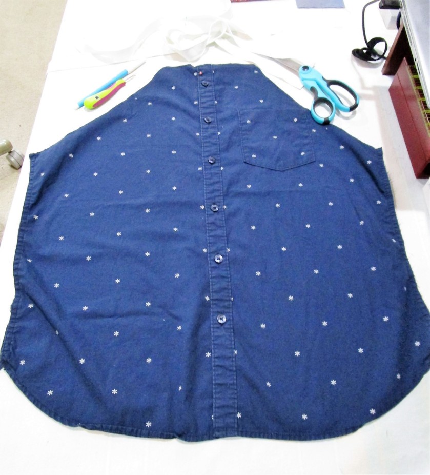
That idea I will save for another day. For today I am focusing on this dark navy all cotton shirt front.
I also happened to have a whole spool of 1-inch white twill tape which will work very well for the neck strap and the ties.
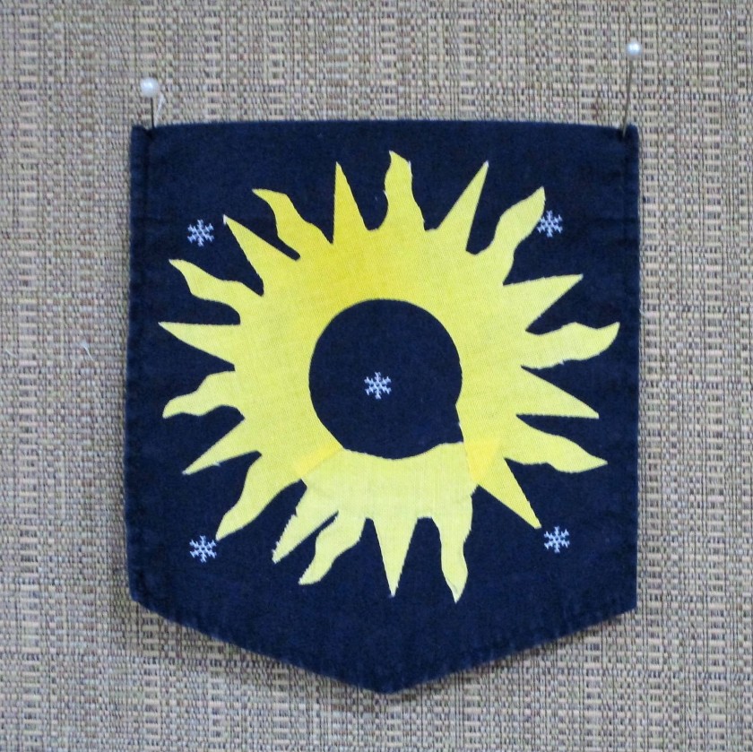
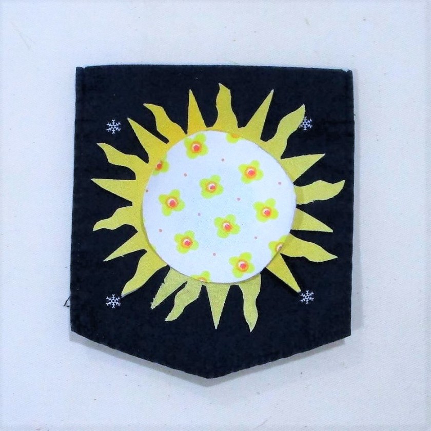
First I removed the breast pocket. This will be jazzed up a bit to add some fun color to my apron. Since the shirt fabric featured a little star motif, (okay, it’s really a snowflake, but go with me on this one) I decided to make a sun using yellow fabric and fusible interfacing. In fact, I happened to have saved some suitable yellow fabric that already had fusing attached to its back. I cut this into the shape of a corona and fused it to the pocket.
Next I traced a circle onto white printed fabric, pressed fusing to its back, cut out the circle and pressed it over the yellow corona.
Sun Shine!
Getting back to the shirt, I trimmed the upper edge into the shape of an apron front and sewed the button opening shut. Next, I sewed a piece of the twill tape to the neck edge and folded it over the raw edge, This made for a sturdy facing. With the rest of the twill tape, I found its center, measured down each leg to reserve a big enough neck loop and marked where to start sewing the side edges. These were sewed down in the same manner as the neck facing.
After zig-zag stitching the apron string ends, I re-attached the pocket, and was done!
POOR QUALITY LIGHT ON THIS PHOTO – SORRY
The apron fits me just fine, but it will work also on shorter persons.
This fun project cost me a few dollars and only an hour of time. With several more cut-up shirts hanging around, I can easily spend a little more time and a few more dollars to make unique, personalized gifts for the artists and cooks in my life.
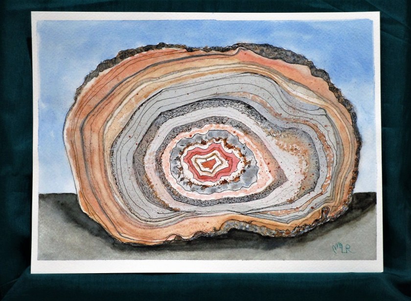
On Sunday I returned to work on the Agate still life watercolor begun in January. (I’ve developed a habit of setting aside partially finished paintings and I’m making a promise to myself to stop doing this.) Here is my last posting:
I found it very soothing to build up the various rings with glazes using matching and contrasting colors. To add more texture, I applied salt to the wet paint in places. After it had dried, I scribbled with a black Prismacolor pencil on the outer layer and darkened some of the rings. To finish, I flecked on spots of copper metallic paint using a toothbrush.
Paints included raw sienna, burnt sienna, quinacridone red, Payne’s gray, cerulean blue and Prussian blue.
The reference photo is found on Pixel and was sourced from the Natural History Museum of London.