First of all, everyone said “Keep the fence.” Many of you liked the wine-purple color, but some agreed with me that an adjustment of some kind was needed.
I did try options 1 and 2.
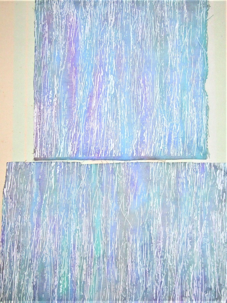
Option 1: Start over with another fabric. Here are the samples I painted on the white fabric. I decided that it was a fun exercise, but just didn’t look too fence-like.

Option 2: I applied a wash of a cool blue color to tone down the strident red violet.

It just plain didn’t work as intended. To my eye, this is worse than before.
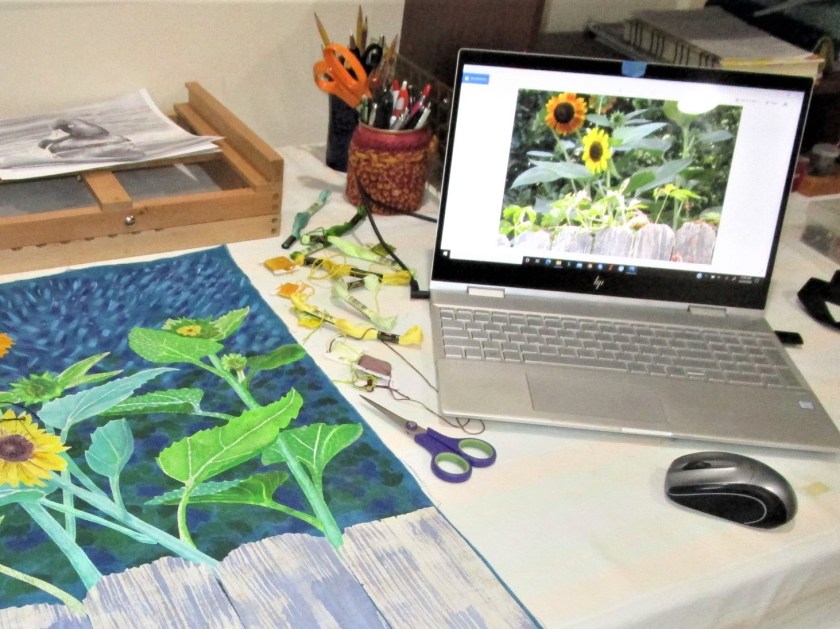
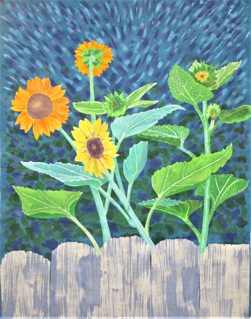
In the end, I chose to start again with the original fabric, for the same reason that I picked this fabric in the first place. The print had an earthy, woody texture to it. This time I mixed my violet paint with enough azure blue to create a sort of periwinkle or lavender tone. I also modified my foam brush by cutting notches into it.

Thanks to all who participated in the game. Your encouragement and positive remarks let me feel the community around me. I wish I could give you each a hug.
Now I can move on to sewing. I’ll start with a little hand embroidery on the flowers.

Happy making to all and to all a good day.

Superbe !
LikeLiked by 1 person
Well done. Glad you found a solution. It’s going to look great.
LikeLiked by 2 people
Thank you.
LikeLiked by 2 people
I love following your process – it’s so very interesting. Hope you enjoy a lovely and creative weekend. Janet 🙂
LikeLiked by 2 people
I plan to. Thank you.
LikeLiked by 2 people
I love it!
LikeLiked by 2 people