This week the summer heat has finally set it. I haven’t been posting for the past several days. Perhaps it’s because my energy is sapped, not only by the heat, but also by the unrelenting misery of contemporary human interactions. Wow, I don’t even know what that last bit means.
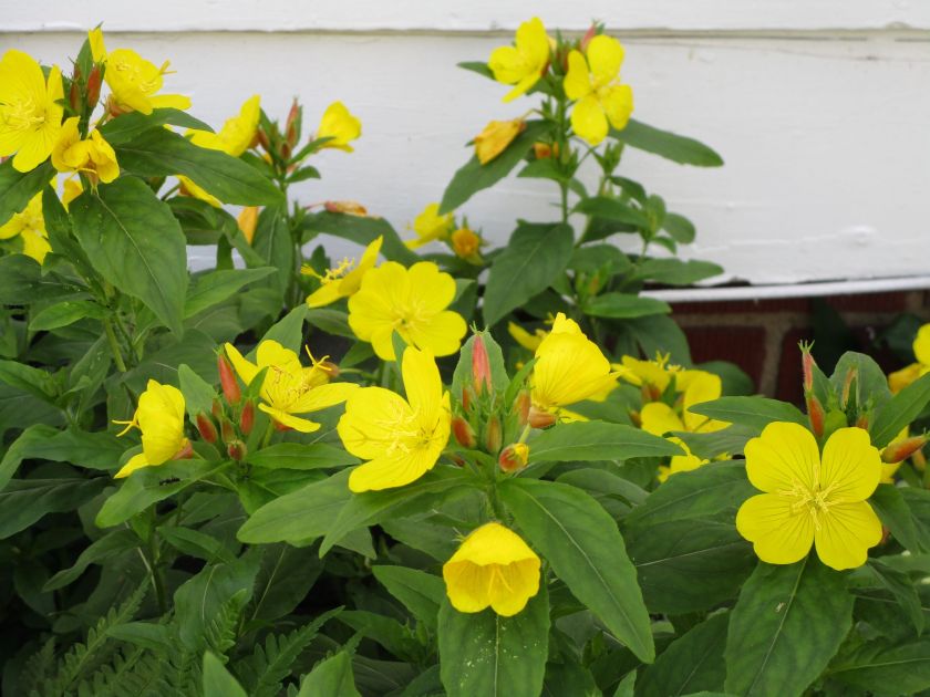
As a counterbalance I give you a photograph of some non-human beauty.
I’ve been working daily with fiber. But nothing that I think is share-worthy. I have two knitting projects underway – a shawl and a baby dress – both are disappointing me. The local art association had another plein air meeting, during which I sketched. But I stopped before completing it, due to the heat.
The one bright spot in my week has been my water color painting. In an effort to hone my skills I made a goal to paint daily. Here are the two still lifes I painted this week.
This one was painted while following an on-line tutorial and a sample photograph.

My photography is not super-focused but I’m pretty happy with the painting.
The next painting was done while looking at a photograph, but I took off the training wheels. I worked out the color mixing and brush technique without a tutor.
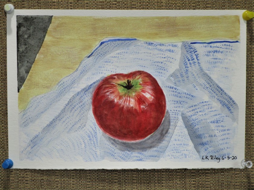
What I like: The textures of each surface, the highlights and shadows of the apple, the rich mottled color and shaping of the apple. What I don’t like: The shading of the folded cloth. But it does have a sort of abstract appeal.
Okay, enough about me. What’s up with you?


Mighty fine paintings! 😊
LikeLiked by 1 person
Thank you.
LikeLiked by 1 person
I like the pear. It looks good enough to eat. The simple background does not take away for the focus point as the cloth under the apple does.
LikeLiked by 1 person
Thanks. I like to hear what you think.
LikeLike
“Contemporary misery of human interactions” hmm Are you fighting with someone?
LikeLiked by 1 person
What a pretty flower. I thought it reminds me of Evening primrose. Your painting of the pear is really good. My mother took a course in botanical painting and I am comparing to those. I’ll have to post a picture of them to my blog. The Apple, my concern is less the paper in the background. The Apple is bright and colourful and stands out from it sufficiently. But the top for me needs to be softer in shading to accentuate the curving of the Apple to the stem. The lines for me make it too sharp. But, I am no painter, and your art is much better than I could ever achieve. 🙂
LikeLiked by 1 person
I read your comments in the spirit that they are intended. I am very much a beginner, and acutely aware of the deficiencies in my work. Thanks for taking time to comment. I value your thoughts.
LikeLiked by 1 person
Thank you. It is often through gaining views from others that we grow. I know I would take on board comments that would help me improve in crafts that I partake. I am a beginner in many and a master of none. (Yet!) 🙂
LikeLiked by 1 person
There is nothing worse than starting a project that you end up not liking than having 2 projects go down that road on you. Its very off putting but omg have you nailed the water colour pairs ❤ Go you!
LikeLiked by 1 person
Thanks.
LikeLike