Posted in painting

Sunday Squash

Not many people would call a pumpkin a squash, but I just love alliteration. I can’t help myself.

I’m a few weeks late in finishing my pumpkin painting. Painting was supposed to take place on the first Monday in October, when Cheryl Bryan conducted her once a month tutorial. I had prepped my paper and packed my traveling paint kit, but didn’t attend class. I was at a funeral for a friend that morning.

As the month wore on, I kept busy in the garden (and with stash-busting knitting.) So, it’s today that my pumpkin painting is ready to be viewed.

My reference photo is by Megan Lee, who generously shared it on Unsplash.

Thank you, Megan.

What attracted me to this image was the background primarily. I liked that the pumpkin is still in the pumpkin patch, surrounded by its vine, whose leaves are changing to yellow. The white tendrils (or roots?) which are visible throughout the image keep the eye moving through the scene.

My goal was to capture a spooky feeling, along with the intense highlights, as if a beam were focused on the pumpkin – the star of the show.
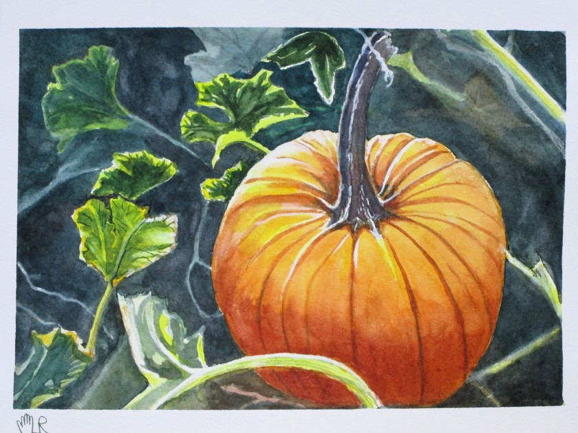
Did I achieve the goal? I believe so. What do you see?

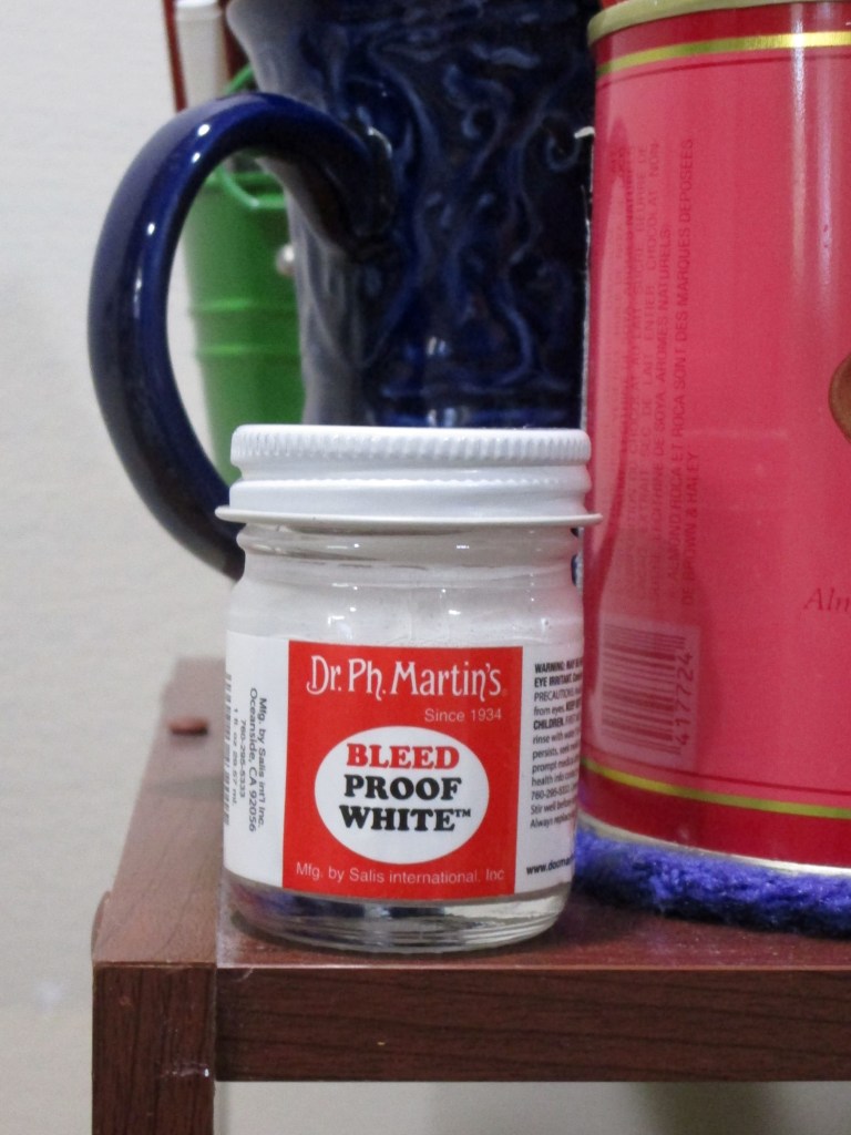
Painted on Arches cold press using Winsor yellow, Winsor green, transparent orange, alizarin crimson, burnt sienna and ultramarine blue. White highlights emphasized with Dr PH Martin’s bleed-proof white.

Posted in painting

Watercolor Wednesday Tutorial

Last Wednesday in Open Studio, Cheryl introduced the group to the work of Soon Y. Warren, a painter who excels at creating light and texture in her watercolor works. Cheryl has taken a workshop with Soon and raves about her.

https://soonwarren.com/

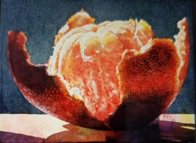
To get us started, Cheryl sent her own version of Soon’s Orange as a reference.

To achieve the effect of bright light on the orange, the artist applies masking fluid on the areas of white. After the painting dries, the mask is scrubbed off and final details are painted in.

I need practice using masking fluid, so I went along with the instructions. It was not a difficult lesson, except for removing the mask. I had to scrape vigorously with fingers, fingernails (go wash my hands and come back) and more fingernails. Ultimately, all the masking fluid came away, but in the process, I rubbed some dirt and/or paint into some places on the white paper where the mask had been. (sigh.)

Fortunately, the areas with the worst stains were pretty well covered with an application of Dr Ph Martin’s Bleed Proof White.

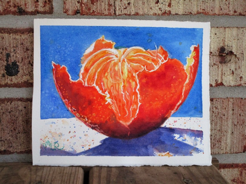
Here is my finished study. It will make a nice greeting card.

I chose a different palette for my version: W&N French ultramarine blue, Thalo blue, Winsor lemon, transparent orange, and permanent alizarin crimson. A little salt and paint spatter added texture.

If you enjoy light-filled, transparent watercolor paintings, check out Soon Warren’s site.

Posted in painting

Taking a Break from Quilting

The last two weeks have seen me working intensly on two quilts. One is finished (yay!) So today I am taking a break from quilting, if not from thinking about quilts.

It’s time to get more watercolor postcards painted. I have some new watercolor paper made especially for postcards that I am excited to try out.

A sample of this 100% cotton paper by Winsor and Newton was included with an order from Dick Blick. Since I liked the sample, I decided to buy this packet of 15 sheets. It seemed affordable and is the perfect size for postcards.

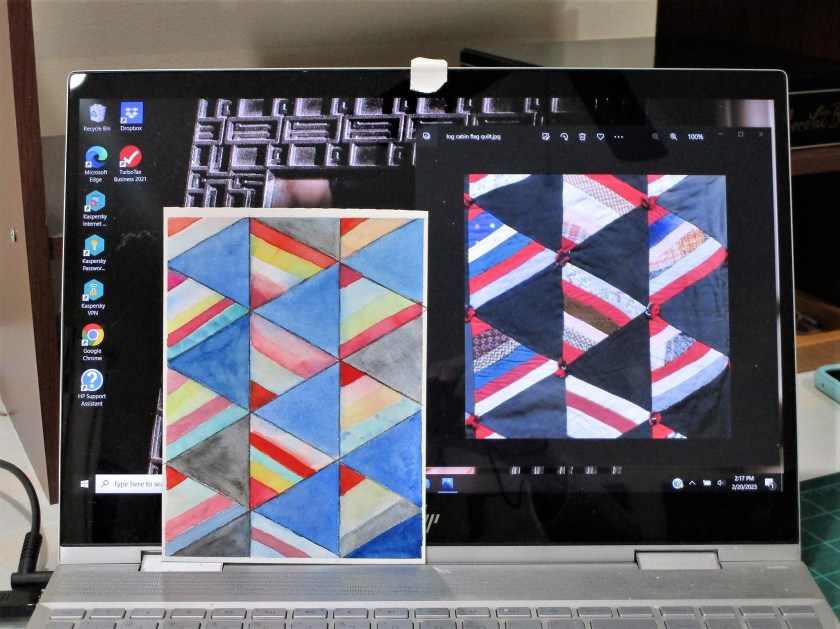
In perusing my library of reference photos, I came across an image of a quilt that really appealed to me. I described it as a log cabin flag quilt. I saved it with the idea of making a similar quilt.

But now I think it’s the perfect subject for a geometric watercolor painting.

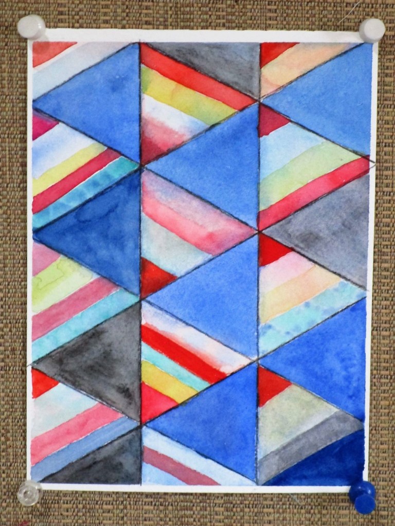
I started by dividing my paper vertically into three columns. Determining that the angle of the flags is sixty degrees, I drew several intersecting lines. The painting process was slow and relaxed. When I was satisfied with the color, I grabbed a black watercolor pencil to reinforce the lines and darken a few of the blocks. Done.

What do you think? It’s not a slavish copy, more of an interpretation. Where the quilt has patterned fabric, I chose to allow colors to mingle.

SIDE BY SIDE.

I used all my reds, which included Pyrol scarlet, alizarin crimson, quinacridone red and magenta. Blues are cobalt and prussian. Rounding out the paints were quinacridone gold and Winsor green blue shade.