When I finished the 12 week Artist’s Way course, I made a commitment to myself to follow up with 90-day self-nurturing plan. It includes a concrete plan of action to write daily, take myself on an artist’s date once a week, and explore more fully my favorite creative practices. One of these is watercolor painting.
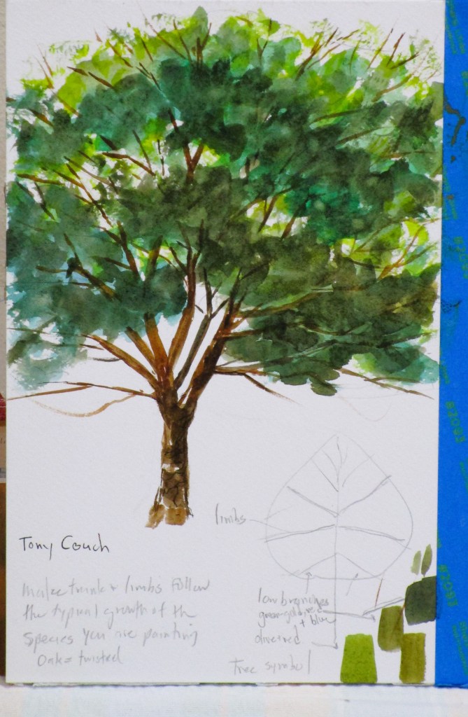
My “date” this week was to attend a workshop at the local art association, which took place on Wednesday. It included a one hour tutorial by Tony Couch. Today I am sharing the practice pieces that I painted as a result of the workshop.
Tony talked a lot about what the landscape artist paints. He insists that we don’t paint a tree. We paint a symbol of a tree. We don’t paint water, we paint a symbol. Symbols have specific characteristics that make the objects instantly recognizable to the viewer. For example, for a deciduous tree the characteristics are shape (round crown), colors (varies with the season) and textures (expressed by the leaves and the bark)
Painting the symbol of a tree.
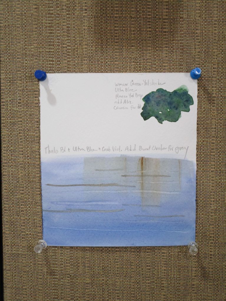
Painting a symbol of still water.
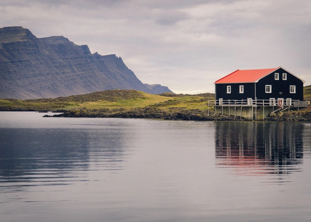
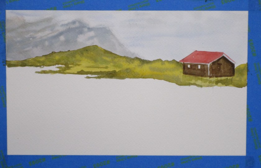
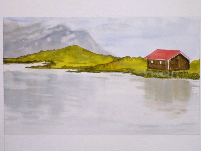
To practice the still water technique, I painted a scene from Iceland. It’s based on a photograph published on Unsplash – a free use site for photographers and other artists. Here is the reference photo:
I started with the sky and worked my way down to the water.
Initial washes are complete. I will come back to deepen some areas and add finishing details. This was painted on a Stonehenge paper block using a palette of Hansa yellow deep, Winsor green yellow shade, ultramarine blue, pyrrol scarlet, quinacridone red, carbazole violet, burnt umber and Payne’s gray.
Earlier this year I shared some work made following a tutorial taught by Montreal artist Shari Blaukopf. She is an urban sketcher and watercolorist who offers a wide range of online lessons through Teachable. Today I finished painting A French Village Scene, which is the final lesson in her course by the same name.
The challenges were multiple: perspective drawing, sketching in ink, and completing the scene with watercolor.
Here is Shari’s reference photo. She took it while teaching in France this year.
Photograph by Shari Blaukopf
I labored over the perspective drawing for 2 or more hours. Perspective drawing doesn’t come easily to me, and I wanted my work to be believable, if not 100% accurate. When satisfied, I inked the important lines and erased the pencil marks.
I was forced to take some liberties with the scene, because my paper was not proportional to the original. Mine is wider.
I did most of the painting before our Thanksgiving trip to Wisconsin. Returning home, I was keen to finish this and get it off my workspace. Other projects, both started and planned are stacking up awaiting my attention.
Here is my (almost) final painting.
It’s a truism, at least for painters, that they must take some time away from a work before deciding that it is finished. So that’s what I will do. Even looking at it now, I see a few areas that need more work.
My selection today is all watercolor, of varying qualities.
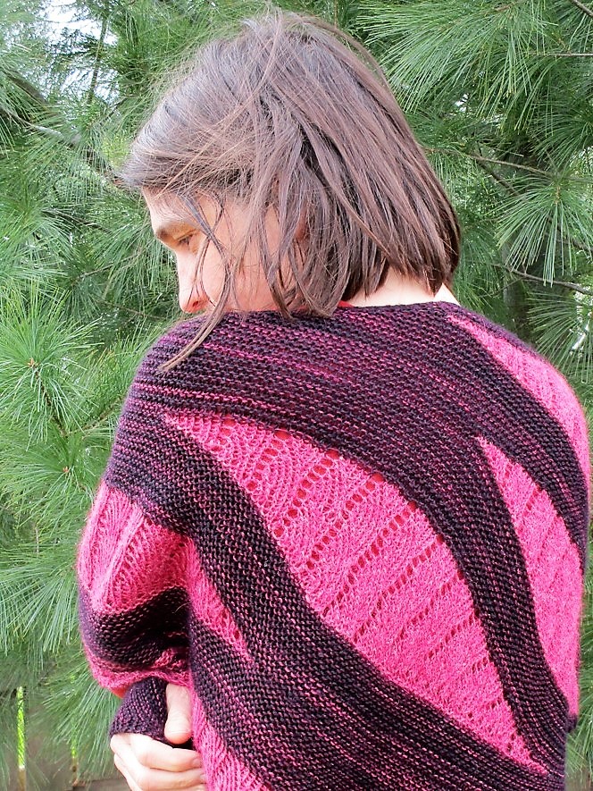
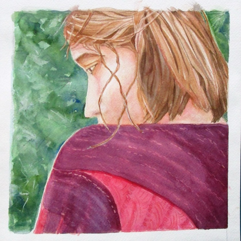
Day 18: Amanda’s Shawl
This week I slipped in a photograph taken by me. Last August I had started painting a close-up version in watercolor. The painting has been in time-out for several months. This week I finished it.
The theme is texture, and I’m fairly happy with most of what I did. I’d like to try again using a larger piece of paper and the full view.
Day 19:
Again, I was drawn to the texture, and the points of the barbed wire which look almost white to me.
I didn’t achieve a good range of value. I plan to try again, maybe in a monotone, so I can focus the value contrasts.
Day 20: Sharp-shinned hawk.
Yesterday was First Wednesday Open Studio at the arts center. Cheryl Bryan’s lesson focused on lost and found edges. I chose this photograph because the hawk’s coloration allows it to blend in with its environment. And there are cool shadows.
The lesson started with creating a three-color background in a random fashion. After it dried, we determined the subject’s position in the background and penciled it in lightly. In addition to making a lost and found edge at the bird’s wing and tail, I also practiced negative painting around the right edge and the talons. I enjoyed it and the work went quickly.
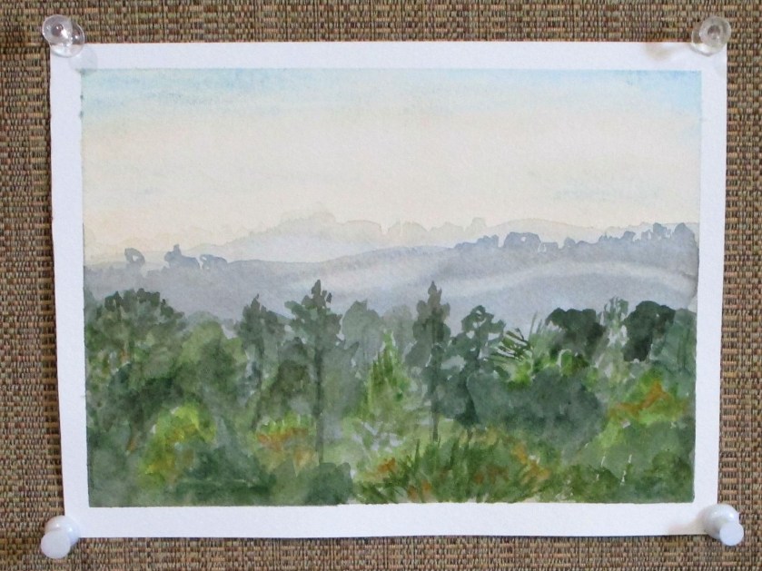
Day 21: Sonoma view
Bill took this photo from the upper deck of his brother’s house in Petaluma, CA. It could almost be a view of Oklahoma last week, when, pushed by high winds, fire raged barely five miles from our home.
I brightened up the foreground to see what exactly made up all those plants. Using three different mixes of green and some yellow ochre, I just played around with shapes until it looked done.
The first painting is 8 by 8. The other three are postcard sized. All were painted on Arches cold press paper.
Last Saturday, I was wanting to just mess around with mark-making in my sketchbook. As I opened my pen case, I spied a dip pen that I had purchased, but never really used. Grabbing a bottle of Sumi ink, I got busy. It was fun! After I had marked up the paper quite a bit, I added some watercolor crayon for color, and spritzed water on sections.
That exercise left me warmed up and wanting to do more. I turned to this photograph of Mogadore reservoir that I had taken while visiting Ohio in November of 2020.
After blocking the scene in pencil, I used watercolors to paint the background. The dip pen and ink came into use for the foreground branches.
This little 4 x 6 painting will be a nice postcard to send home.
Hi friends! I have been absent for a few weeks while traveling around the country. A large chunk of our travel was in wintery Wisconsin. Despite the cold, snowy and windy weather, I found some inspiration in what we saw. I love the rolling countryside of the Driftless region. And the sand hill cranes. (More on the cranes coming soon.)
For today I will start with a rural landscape. My re-entry into art started with Wednesday’s Open Studio at the local art association. Every month on the first Wednesday, watercolor artist Cheryl Bryan provides a lesson. This week’s subject was buildings. I chose to paint a barn, in honor of all the lovely barns I saw in WI.
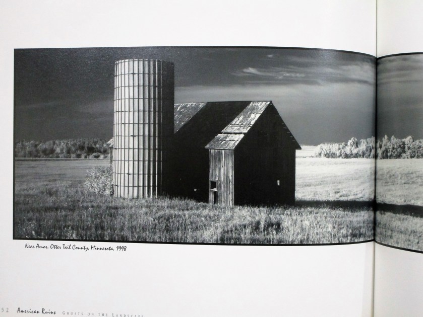
For my reference photo, I turned to American Ruins: Ghosts on the Landscape by Maxwell MacKenzie. A few years back I was blown away by MacKenzie’s formidable photographs of falling down farm buildings on the great plains. My first attempt at rendering one of these images was a few years back when I was learning to draw with pen and ink.
Today I picked this image to paint in watercolor.
The sketch took me almost no time. I didn’t need to re-scale it to fit my paper, so I did a tracing of the essential lines. I then transferred the tracing to my paper. Next I added masking fluid to retain some of the white spaces (especially those small holes in the old barn.
For more drama, I added a few more holes.
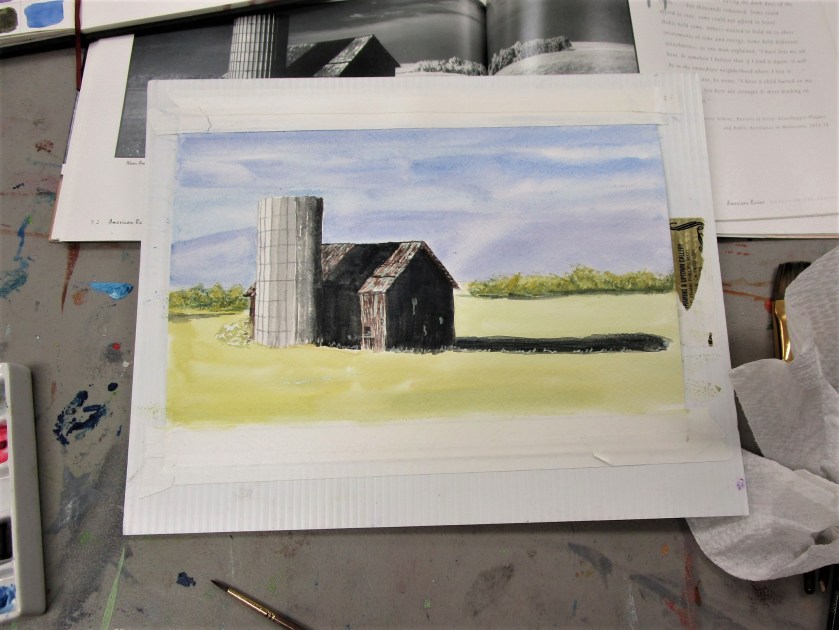
To keep things simple, I chose a limited palette: burnt sienna, cerulean blue, cobalt blue, carbazole voilet and Winsor yellow. Oh, and a little black.
Cheryl’s lesson focused on painting values. She asked us to decide where to use high, medium and low values, assigning one value to background, foreground and subject.
Using a black and white photo made this part easy. I wanted to retain the photographer’s focal point, which was the deep shadows thrown by the silo and barn. My background would be a medium tone and my foreground light. After painting the sky and adding a preliminary wash to the foreground, I painted my subject.
At this point I was stumped on how to proceed. So I showed my work to Cheryl, who gently scolded me for using black paint. Watercolor students are discouraged from using black paint. We are told that it deadens the painting.
I went home and proceeded to wash out as much of the black paint as I could.
Today I returned to the painting. First, I decided that the sky was too light. Masking the top of the silo and barn, I added a glaze of cobalt blue to the sky. Then I painted glazes over the three areas of black paint using blue, brown and yellow.
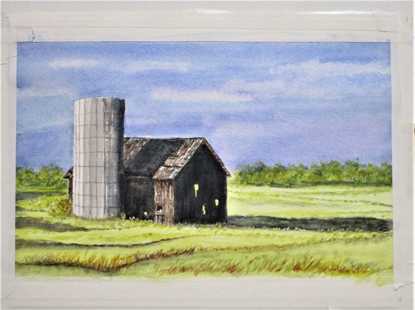
At this point I removed all the masking fluid and turned to the foreground. Now, I live on a prairie. I spend many, many hours traveling on roads that cross the prairie. You would imagine that it would be easy for me to fill my painting with prairie grasses. But that expansive area of yellow paint just sat there and mocked me.
To get over my artist’s block, I reviewed this tutorial on composition by Joseph Zbukvic
Forgetting everything I know about prairie grasses, I proceeded to fill my foreground and middle ground with Zzzzzzs…… okay, gently curving zzzs.
The only areas still bothering me were the trees and the little shrub behind the silo. I added more paint and some trunks on the tree line and repainted the shrub as a bare-twigged remnant in burnt sienna. This seemed to work.
I’m finally ready to call it done.
To learn more about Maxwell MacKenzie, you may visit his website.