On this sketching Sunday, I have two quick (sort of quick) sketches for the viewers to consider. First is my value study for the chickadee painting I am planning.
This image is a combination of the two chickadee photographs that Bill gave me for the 100Day Project.
He also gave me this delightful and slightly mysterious photograph of Lu’s face, as she peered through a wood structure at the CITY Museum in St Louis.
I did this study,
I intend to refine the drawing further, then ink like I did her brother’s portrait a few weeks back. This will be no. 44 in #The100dayproject.
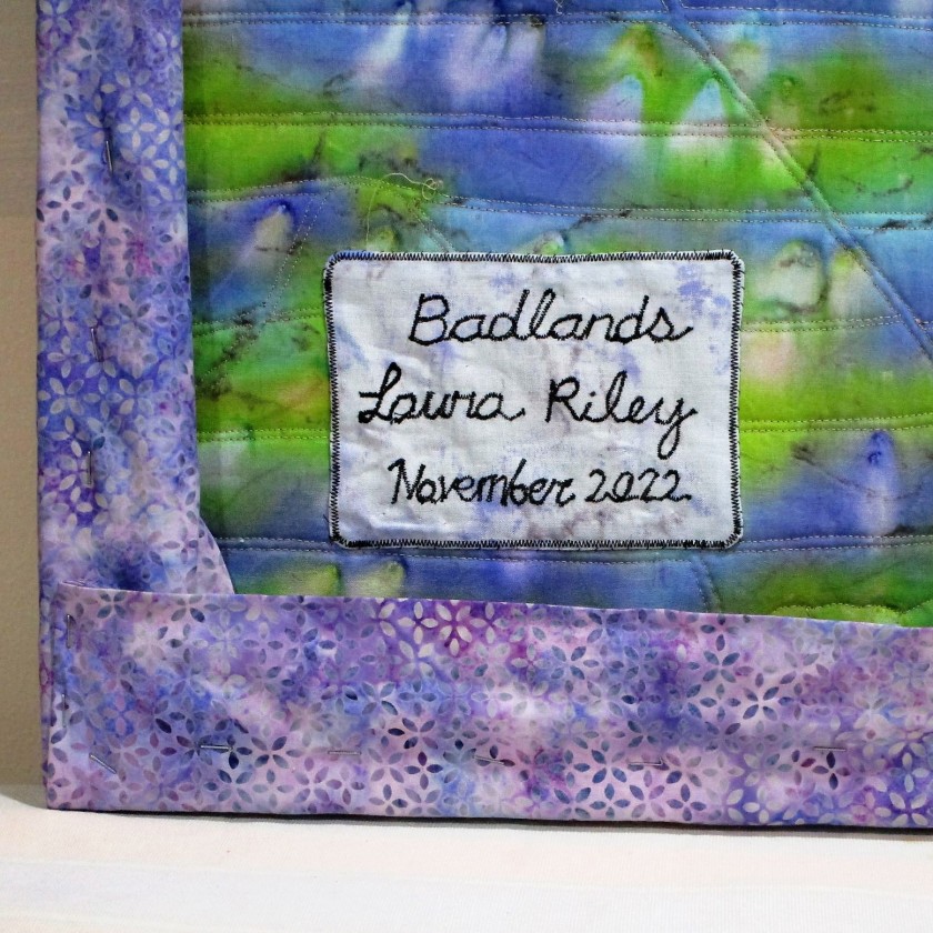
The inspiration for this art quilt came to me during our trip to Roosevelt National Park in July of 2021. I was captivated by the sandwich layering of rock, running in parallel lines that eroded down over thousands of years. It suggested to me a string pieced quilt. For the next several months I thought about my concept and puzzled over how I could bring it to life in fabric.
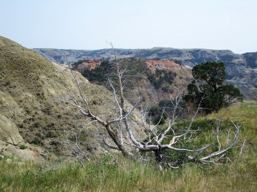
Our photographs were disappointing. It was high noon, and pervasive smoke dulled the light. No shadows were in evidence and the colors were muted. I decided to rely on an internet image for my working reference photo,
Photo from vangorentalmn.com
To get from concept to finished art is a long process. I started by making a value sketch. Next, I drew a pattern to scale, identifying major segments and eliminating excessive detail.
Here’s the part all fiber artists (including myself) find extremely creative: choosing fabrics. Since I like to use watercolor, I painted my swatches. After assigning a hue and value to each segment on my pattern, I picked out the fabrics to best achieve my color scheme of orange, blue-purple and blue-green.
Here’s an aside about the fabric I chose. Ultimately, I couldn’t find fabrics that had the colors and textures that I needed. To get there, I painted on printed fabric for most parts of the quilt. I also selected a few batik prints that were close enough, with only minor adjustments to color.
With the design decisions made and fabric selected, I began to assemble the quilt. All of the techniques that I used in making this quilt I learned from two fiber artists: Annette Kennedy and Gloria Loughman.
I thank these artists for giving me the skills I needed at the time I needed them.
And here is Badlands in its final form:
The design is invigorated by lines running in parallel diagonally and horizontally. Where the diagonals meet, triangles are formed. These shapes lead the eye to the center where two focal points have a quiet conversation across the river valley.
As a final note, I want to acknowledge the influence on my style of pop artist David Hockney. A print of his painting, Garrowby Hill, hangs over our fireplace.
My imagination has traveled that blue road countless times over the past twenty years.
For over a year, I have been ruminating over an idea I have for an art quilt. It is inspired by our trip last year to Teddy Roosevelt National Park in North Dakota.
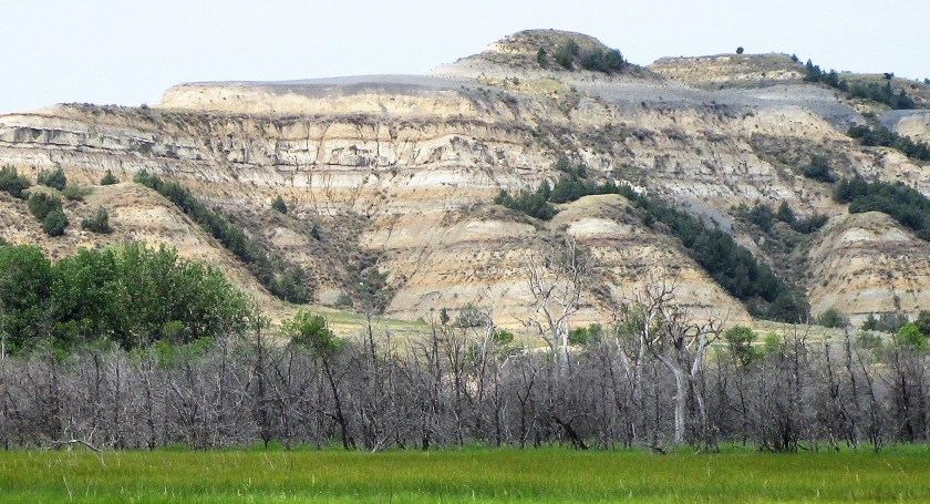
For those not familiar with the park, it is known for what’s called the Badlands. These are sedimentary rock formations that have been eroded away, displaying the different layers almost like a layer cake.
Here is an example of what I’m talking about.
The timing and circumstances of the trip were counter-productive to getting any good photographs. It was high noon in mid-July. I had no idea how hot it could be in North Dakota during the summer. To compound things, the whole western edge of the United States was on fire last year. We were about a thousand miles away from the smoke and yet haze covered the entire sky and dampened the light. Nearly all the color was washed out of the scenery. No shadows. No highlights.
Here is my best photograph in the park that day.
To get a suitable reference photo of the overlook, I resorted to the Internet. This photo was taken by Mike Hanson. It is 2017 and it must be a sunset view.
Bill added the segmenting lines so that I could scale it up to size I wanted. Using the grid method, I transferred the major shapes to paper and sketched a value study.
Very well pleased with the result, I moved on to the fun stuff: selecting a color scheme and swatching it out in watercolor. I chose a split complementary scheme focused on orange, with blue-violet and blue-green as the complements.
Now my creative juices are flowing. I’m excited to pick out some fabrics and start painting them!
We’ve been enjoying lots of birds in our backyard. Because it has been such a dry and cold spring, the birds seem to be spending lots of time perched on the birdbath.
Male cardinal, photo taken last year
All the interest in the little blue birdbath reminded me that I had started a series of watercolor paintings of various creatures that stop here to drink or bath. In particular, I want to make a large-scale painting of an imaginary scene.
In my imagination, a bird and a squirrel are having an argument over which of them gets to drink first. I had done some small sketches and paintings of squirrels. Today I am sketching a blue jay perched here, right about where the cardinal is sitting.
To get started, I turned to David Sibley’s book, What it’s like to be a bird.
One of the things I love about this guide is the watercolor paintings, done to scale, of each bird featured. I knew Sibley was a great naturalist and now I know him as a fine illustrator. Turning to his image of blue jays, I traced the life-size head of the blue jay.
Eventually, I ended up scaling it down to about 90% of life size. I then transferred the tracing to my sketchbook. Then I looked at several photographs of the blue jay, some from the internet and some from Bill’s archives. Since I couldn’t find exactly the posture I want to represent, I just took bits and pieces of different images. This could have turned into a disastrous Frankenstein of a drawing, but it didn’t.
Love this guy’s attitude!
This took about an hour and a half, the but the time was well worth it. I learned a lot by studying each part of the bird as I worked on it.
In the future, I will do a few watercolor studies of the jay and also draw a squirrel to this same scale, before combining all the pieces together in one painting.
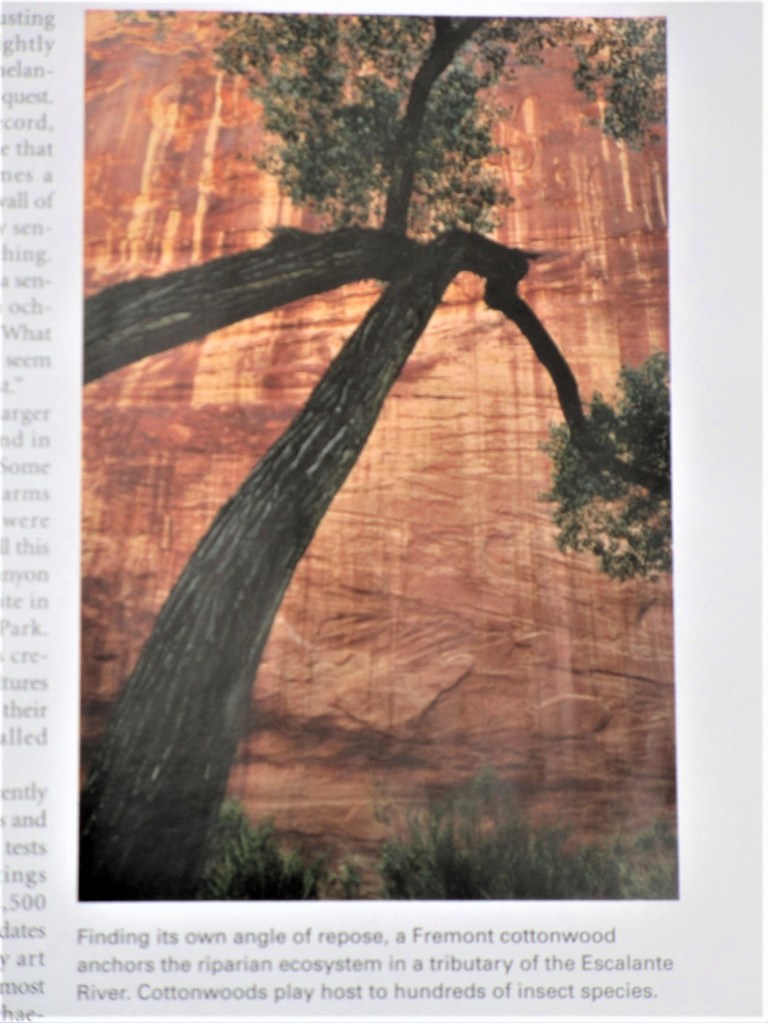
While organizing the reading material in my studio, I came across a National Geographic magazine from 2007 that I had saved for some reason. There were no bookmarks or post-it notes attached. So I asked myself: why did this issue end up here? The only thing to do is thumb through it and sees what jumps out. I stopped at page 147.
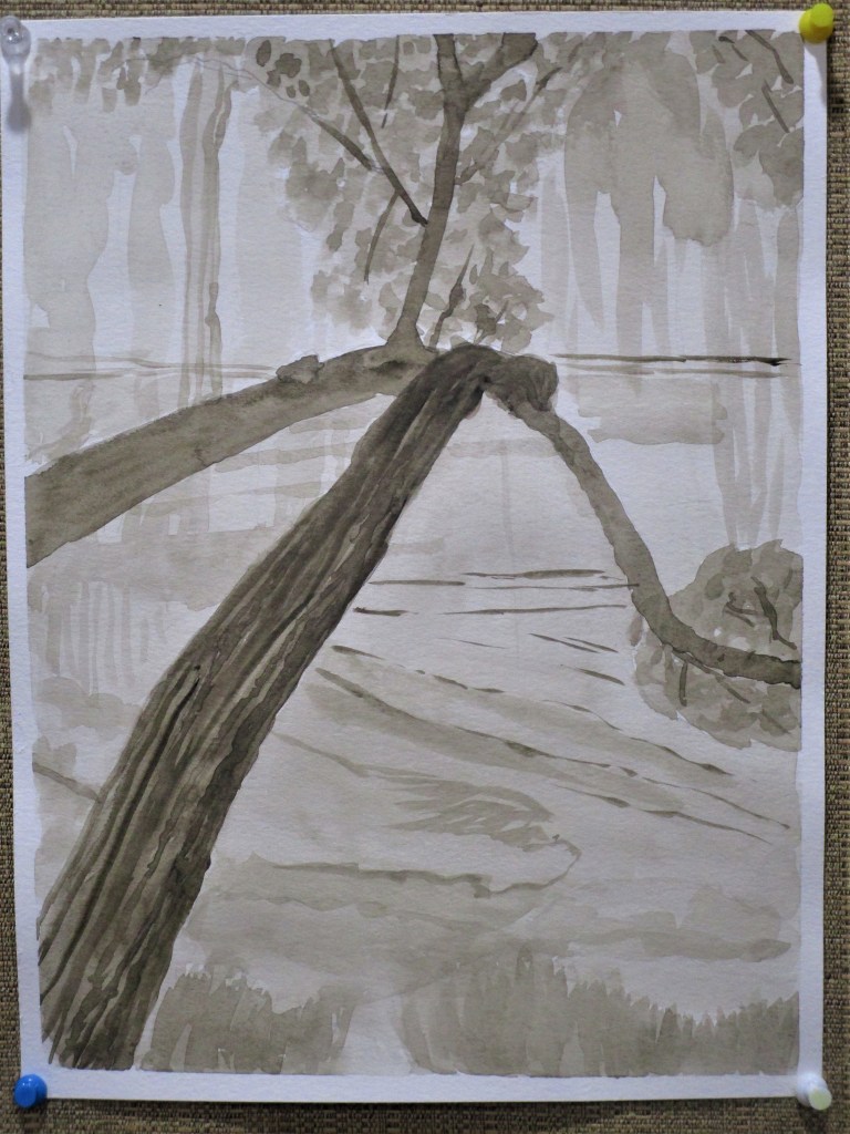
The photographer captured a tortured cottonwood on the Colorado Plateau, which is an area that sprawls across four states and contains a vast expanse of sedimentary rock. The plateau is carved by the Colorado and other rivers. This particular cottonwood is on the banks of the Escalante River in Utah. The dramatic sandstone cliff behind the tree forms a warm backdrop to the massive black branches. It’s as if the tree is embracing the cliff. I knew right away that I wanted to paint it.
Instead of just jumping in and fooling around with paint and brushes, I studied the subject a little. Following the classic approach to painting, I first made a value study. This involves working out the light-to-dark areas of the image in a monotone. I had no gray paint, so I chose to paint the value study in sepia hues.
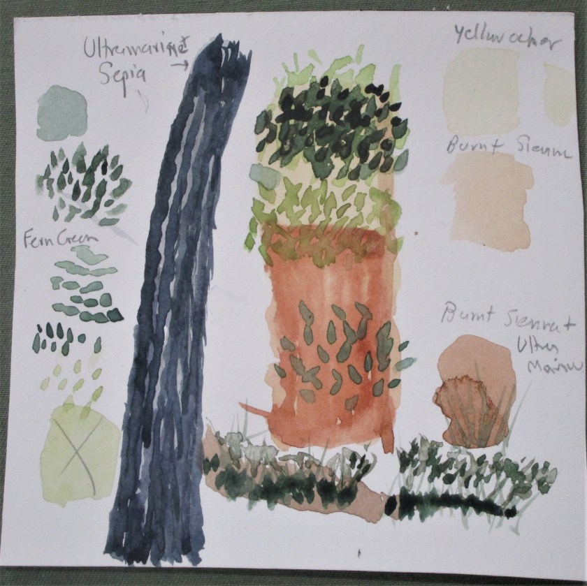
That seemed to go well. I was satisfied with this study. Next I worked out my palette. I had a little fun, making my paint swatches into parts and pieces of the image.
The palette will be yellow ocher, burnt sienna, sepia brown, ultramarine blue and fern green. My gestural study, using the selected palette, was next. I don’t have a photograph of this step. What I learned from that step was that the stone cliff is composed entirely of warm hues. So I chose to paint the tree in cool hues. As I worked through my studies, it became clear that this subject is all about the focal point. Having realized this, I knew it would be my task to eliminate any parts of the background that distracted.
After sketching in the outline of the tree branches, I applied an overall wash, and then laid down some burnt sienna on the cliff face.
The cottonwood looks ghostly. Focal point is where the branches intersect.
A landscape watercolor can take several steps to paint. I ended up painting four different layers, each of which needed drying time before I could proceed. Here is the painting after the second and third layers were complete.
I let it dry overnight. The next day I worked in the final details, adding another layer of darker leaves, some shading and shadows on the tree trunk, and some fine lines in burnt sienna on the cliff face. I tried to emphasize the detail lines that directed the eye to the focal point. After these parts dried, I glazed the whole background with a thin layer of yellow ocher and finally worked some textural lines onto the trunk.
Finished Painting. Cottonwood on the Escalante River
The finished painting is definitely better than I had expected it to be. The only fly in my ointment is that I didn’t use artists’ quality paper. So there is some buckling to deal with. Does anyone have recommendations on how to flatten the paper out?