Posted in quilting

Obsessed with Strips

Since completing the Japanese Knot bag (which turned out quite well, IMHO,) I keep thinking about the potential of making art by sewing strips of fabric together. Casting around for some inspiration, I thought about making another abstracted landscape art quilt. Last year’s landscape quilt was inspired by a visit to the Badlands at Roosevelt National Park. My technique of choice for that piece was layered applique. It interests me to try another landscape but this time piece it with blocks made of fabric strips.

In searching suitable references, I returned to this evocative photograph by James Kemp which I had found on Unsplash a few years ago.

james-kemp-bXFEiuZtk64-unsplash

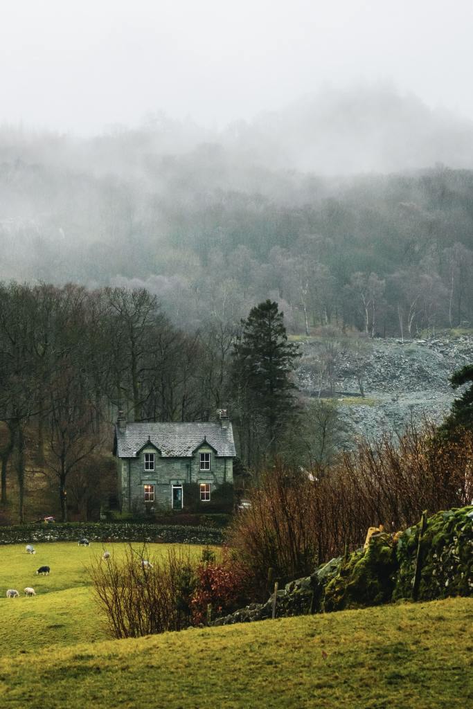
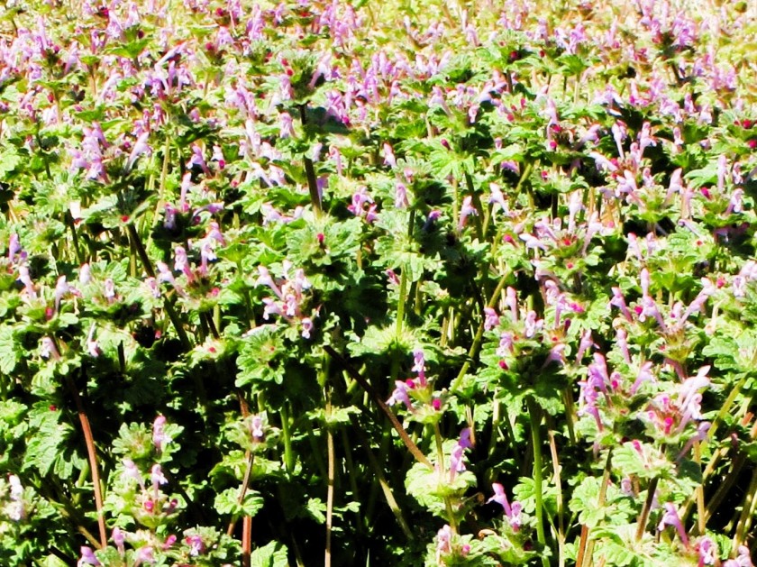
I love the contrast of pale foggy high places, with a midground of dark trees and a foreground of warm grasses and red twigs. If I can simplify the big shapes and translate the photo’s colors to fabric scraps, it could work.

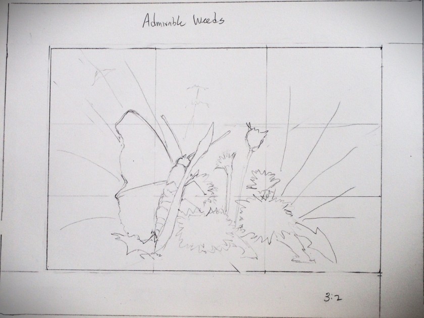
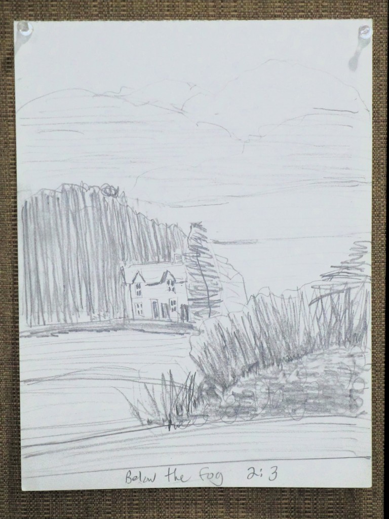
Next I did a quick, scribbly value sketch.

I transferred the major lines to a giant Post-It note, which happened to be full-size for this project. I next drew in a grid of 4 x 4 squares. Using 4 inch blocks, I will need to make 35 blocks.

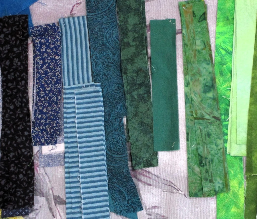
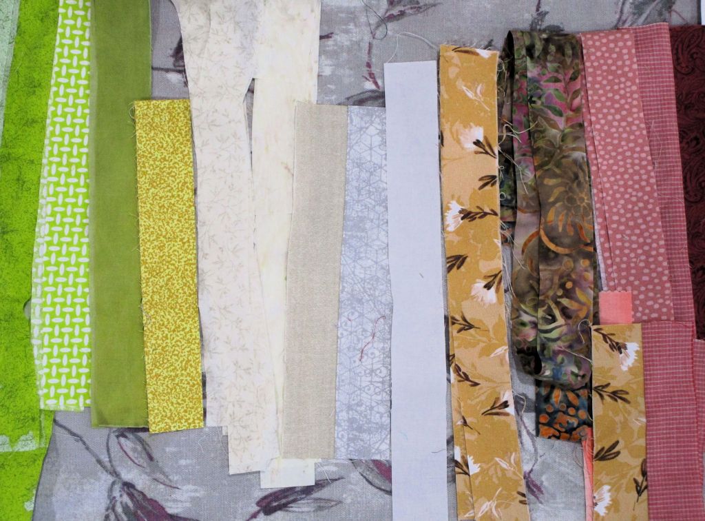
I started cutting my strips and sorting them by color.

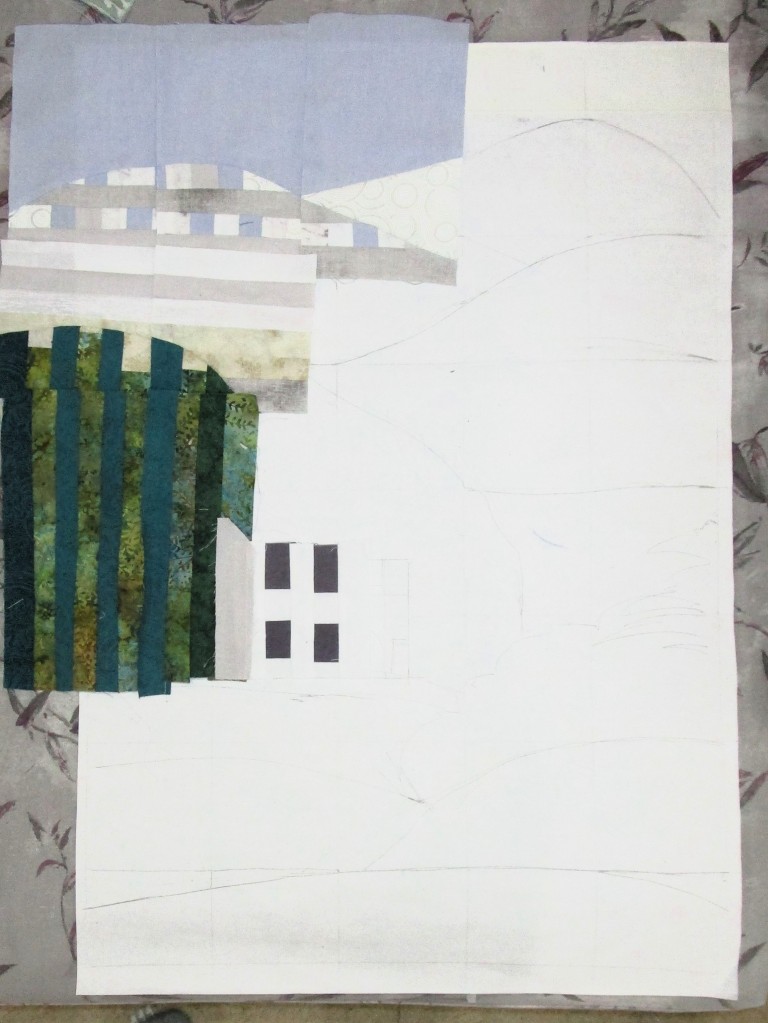
Using the image as my guide, I built sets of six strips, arranged them along the grid and cut them down into squares.

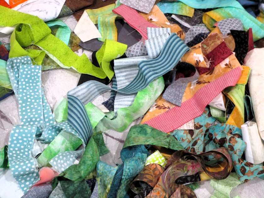
The whole project started to spin out of control. Weirdly enough, instead of getting frustrated, I was drawn into working with more effort and thought.

Two days later, things looked something like this.

No, look away Nothing to see here!

Ah, more like this.

Sad little blocks. Believe me, it does look better IRL than in this photo.

I predict that if it keeps raining, and I can’t go outside and play, I’ll continue to cut, strip and sew on this project.

Posted in painting

Admirable Weeds

My inspiration for this painting happened during a camping trip to Kansas in late March. At the site, I noticed a dozen or so Red Admiral butterflies floating around an open area near some trees. After following them around for awhile, I realized that they were taking nectar from two weedy non-native plants: henbit and dandelions. My thoughts went something like this: Those two plants are disdained by gardeners and the general public. Yet one of our most beautiful native butterflies found them attractive. There is something to be valued here that I wish to explore.

The henbit was lush and blooming profusely.

I grabbed another photo in my backyard, which I used to create my drawing.

For the butterfly reference, I went to Unsplash.com for this lovely by Don Coombez.

https://unsplash.com/photos/a-butterfly-sitting-on-top-of-a-metal-pole-PLyR1XIwcsU

Reference in hand, I started work, first by testing colors in my sketchbook.

Next came a pencil sketch which was transferred to Arches cold press paper.

Stages of the painting:

Masking fluid applied and Initial wash laid down.

First round of colors dropped in.

Foreground painted and additional layers added.

Masking fluid removed, some shadows and details painted in.

Finished up by adding highlights and cast shadows.

I’m relieved to have finished. These complex organic scenes are still very difficult for me. And while I can’t say I love every bit of my painting, I did achieve my objective.

Posted in painting

Sunday Squash

Not many people would call a pumpkin a squash, but I just love alliteration. I can’t help myself.

I’m a few weeks late in finishing my pumpkin painting. Painting was supposed to take place on the first Monday in October, when Cheryl Bryan conducted her once a month tutorial. I had prepped my paper and packed my traveling paint kit, but didn’t attend class. I was at a funeral for a friend that morning.

As the month wore on, I kept busy in the garden (and with stash-busting knitting.) So, it’s today that my pumpkin painting is ready to be viewed.

My reference photo is by Megan Lee, who generously shared it on Unsplash.

Thank you, Megan.

What attracted me to this image was the background primarily. I liked that the pumpkin is still in the pumpkin patch, surrounded by its vine, whose leaves are changing to yellow. The white tendrils (or roots?) which are visible throughout the image keep the eye moving through the scene.

My goal was to capture a spooky feeling, along with the intense highlights, as if a beam were focused on the pumpkin – the star of the show.

Did I achieve the goal? I believe so. What do you see?

Painted on Arches cold press using Winsor yellow, Winsor green, transparent orange, alizarin crimson, burnt sienna and ultramarine blue. White highlights emphasized with Dr PH Martin’s bleed-proof white.

Posted in painting

More Fun with Printmaking

Today I got out my lino-cutting tool to make another stamp based on a sketch. Last week I drew this monarch butterfly, referencing a free-use photograph from UnSplash.

Using tracing paper I transferred the drawing to a softcarve 4 x 6 block. It took me about an hour to carve out the image.

I did a few test prints and touched up the lines a bit. Here is the ink that I chose.

I find the types of stamping ink very confusing. Also, I paid $5 for this pad and there is hardly any ink in it. Eventually I got at least one decent print on a sheet of Canson Smooth Bristol paper.

While there are a few too many “echo lines” for my taste, I decided to carry on. Next came color. I was keen to see how easily paint would go over the permanent ink. I wasn’t terribly concerned that the black would be covered up, since watercolor paint is transparent.

I finished off by adding a little Micron pen – doing some stippling in black and drawing lines in yellow and orange to represent some of the details that I observed in the reference photograph.

I think this came out great. I will probably make several of these prints to use as greeting cards.

If any of you crafters out there in the blog-sphere have a recommendation for printing inks, please share.

Posted in painting

My First Rose

Flowers are a popular subject for beginning watercolor students. So far, I have not been attracted to this subject. If given a choice, I would prefer to paint an animal instead of a flower. But today I decided to go for a rose.

And not just any rose. I picked a multi-hued rose, very close up. Obviously, I was ready for a challenge.

This photograph was chosen from a free-usage website, most likely Unsplash. Unfortunately, I saved it to my folder so long ago that I can’t remember where it came from. I was attracted by the assortment of warm colors. I especially like the magenta hues, because I recently purchased a tube of quinacridone magenta.

Day One.
All the initial washes are in place
Deeper values and a little bit of detail

I used my Prismacolor pencils to emphasize the veining in the petals.

I’m reasonably happy with my first effort. But in retrospect, it would have been wiser to pick a rose of one hue – a red, red rose – for my initiation into painting flowers.