Posted in painting

Finished by Friday – a Farewell

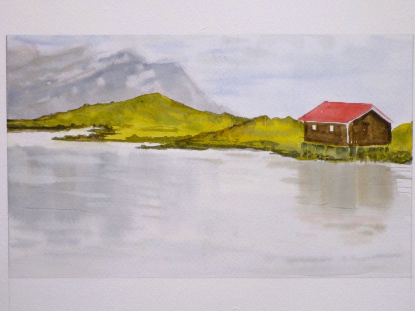
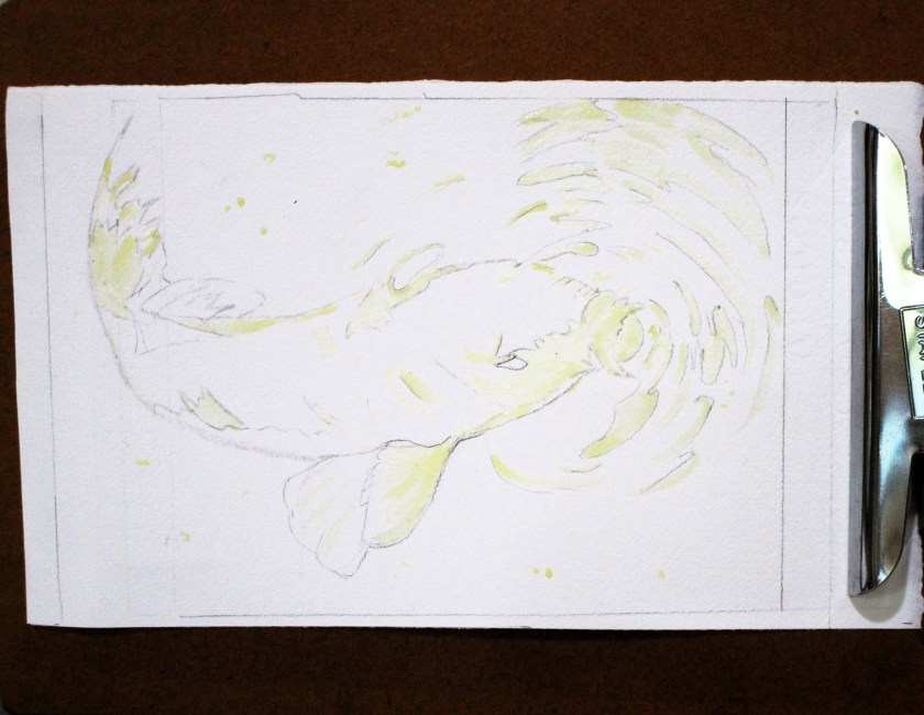
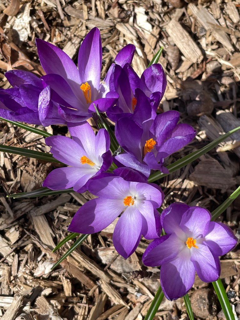
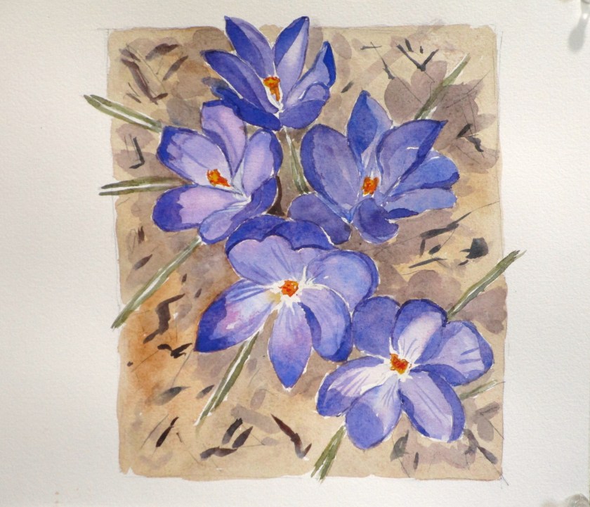
Taking a break from packing boxes this week, I decided to attend Open Studio at my local art association for a class conducted by mentor Cheryl Bryan. This will be my last class with Cheryl before I move away. She sent us this sketch…..

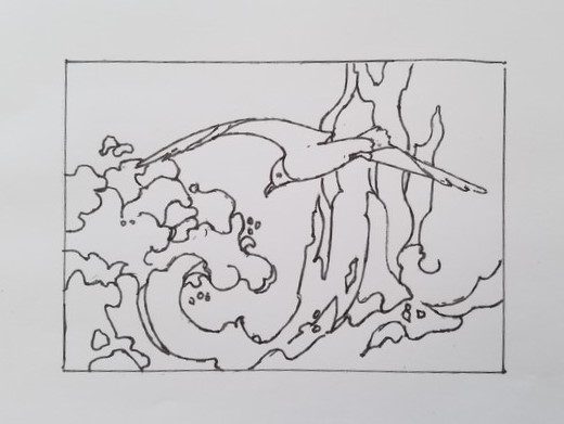
……and told us we would practice painting with only two colors. We were to choose two that, when mixed together, created a neutral black.

I chose to make my own sketch instead of tracing Cheryl’s. I followed her general design but simplified the line work in the lower left area. My chosen pigments were Winsor and Newton’s Ultramarine blue and transparent orange. This is one of my favorites for a good black, as I discovered when painting Winter Chicks in 2023.

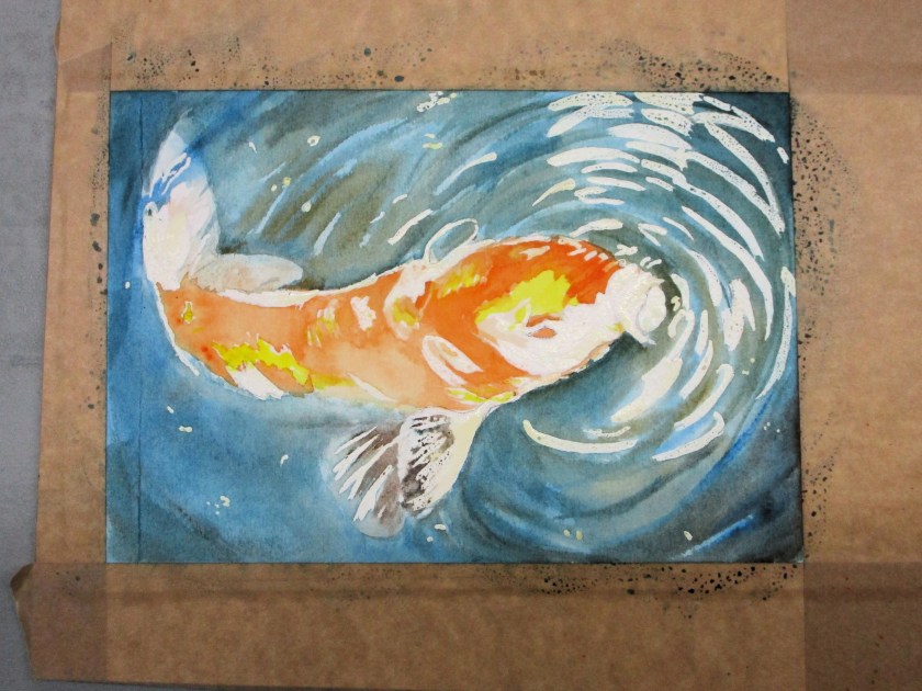
The following morning, I cleaned up my edges, adjusted a few values and added tiny and minimal details using Micron pens and a soluble graphite pencil.

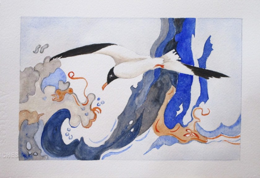
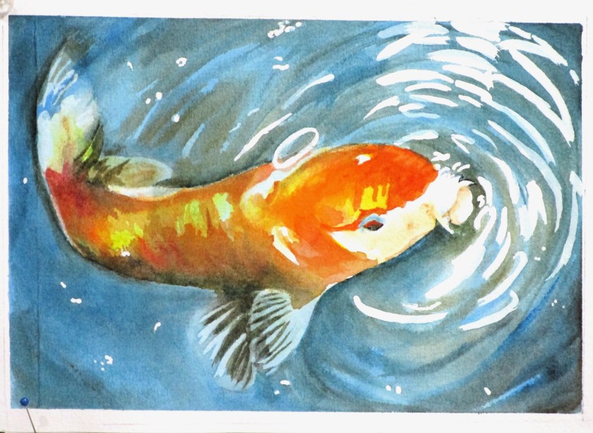
This was a fun, easy class that produced a highly-stylized result. I loved every minute. I call this one Dancing with a Seagull. It is 9 by 6 inches on cold press Arches paper

I will sorely miss these Open Studio sessions, the people at the association and especially instructor Cheryl Bryan. It will be hard to find another group like it in my new home. I’ll check in with Cheryl periodically, in the spirit of Apprenticeship.

Posted in painting

This week’s watercolor work

Hi, Friends,

When I finished the 12 week Artist’s Way course, I made a commitment to myself to follow up with 90-day self-nurturing plan. It includes a concrete plan of action to write daily, take myself on an artist’s date once a week, and explore more fully my favorite creative practices. One of these is watercolor painting.

My “date” this week was to attend a workshop at the local art association, which took place on Wednesday. It included a one hour tutorial by Tony Couch. Today I am sharing the practice pieces that I painted as a result of the workshop.

Tony talked a lot about what the landscape artist paints. He insists that we don’t paint a tree. We paint a symbol of a tree. We don’t paint water, we paint a symbol. Symbols have specific characteristics that make the objects instantly recognizable to the viewer. For example, for a deciduous tree the characteristics are shape (round crown), colors (varies with the season) and textures (expressed by the leaves and the bark)

Painting the symbol of a tree.

Painting a symbol of still water.

To practice the still water technique, I painted a scene from Iceland. It’s based on a photograph published on Unsplash – a free use site for photographers and other artists. Here is the reference photo:

I started with the sky and worked my way down to the water.

Initial washes are complete. I will come back to deepen some areas and add finishing details. This was painted on a Stonehenge paper block using a palette of Hansa yellow deep, Winsor green yellow shade, ultramarine blue, pyrrol scarlet, quinacridone red, carbazole violet, burnt umber and Payne’s gray.

Posted in painting

Watercolor Wednesday

Last Wednesday, I participated in a watercolor tutorial offered by fellow art association member Cheryl Bryan. We were to paint a koi swimming near the surface of a pond. While she had a nice reference image, I preferred to use this one from Unsplash by Jason Leung.

https://unsplash.com/photos/macro-photography-of-koi-fish-7rR_WSk4HM0

Subjects in water are very appealing to me, especially creatures such as fish.

Here is my sketch of Jason’s photograph after I had added masking fluid to reserve the whites of the paper.

I am using Arches 140# cold press paper. The masking fluid is Incredible White Mask liquid frisket. I recently learned to apply this messy stuff by using a small paint brush that is first dipped into a solution of water and liquid soap. To apply little dots, I used the tip of a wooden knitting needle (!) Both worked great.

Here is my painting at the end of the 2 hours tutoring session.

I had the background mostly complete and the first wash on the fish. The next day I painted more color on the fish, added shadows and a glaze of highly diluted Phthalo blue. After the paper dried completely, I removed the mask and added highlights.

I’m pretty happy with the result. The fins, tail and ripples came out well. You can tell that the head and mouth are poking through the water’s surface.

I’m less happy with the shadows and my color mixes. Perhaps I should have chosen different pigments.

Anyway, I have dipped my toes back into painting after a long hiatus. The dry spell is over, for now. (puns intended.)

Posted in painting

Friday Finish: Spring Flowers

After my latest experience in watercolor painting that yielded (to me) disappointing results, I decided to sign up for a tutorial. I reasoned that it would give me some pointers on realistic shadows and rebuild my confidence in painting.

Shari Blaukopf has a new course that teaches painting spring flowers. This will be my fourth or fifth tutorial with Shari, so I knew what to expect.

https://learn.shariblaukopf.com/

The first lesson is crocuses. Shari chose a perspective that it dramatic and not hard to do. Her reference photo was taken looking straight down at a group of flowers just opening up.

COPYRIGHT SHARI BLAUKOPF

I jumped right into the lesson, sketching it yesterday and painting it today.

Maybe I could have made my cast shadows darker.

This exercise was fun and relaxing. The palette I used incuded cobalt blue, quinacridone magenta, hansa yellow deep, transparent orange, carbazole violet, burnt sienna, ultramarine blue and yellow ochre. Paper is Arches cold press, 140 weight.

After I finish the next two lessons, I’ll go back and try painting my Admirable Weeds subject again.

Posted in drawing, painting

Friday Finish: Tutorial with Shari Blaukopf

Earlier this year I shared some work made following a tutorial taught by Montreal artist Shari Blaukopf. She is an urban sketcher and watercolorist who offers a wide range of online lessons through Teachable. Today I finished painting A French Village Scene, which is the final lesson in her course by the same name.

https://learn.shariblaukopf.com/courses/

The challenges were multiple: perspective drawing, sketching in ink, and completing the scene with watercolor.

Here is Shari’s reference photo. She took it while teaching in France this year.

Photograph by Shari Blaukopf

I labored over the perspective drawing for 2 or more hours. Perspective drawing doesn’t come easily to me, and I wanted my work to be believable, if not 100% accurate. When satisfied, I inked the important lines and erased the pencil marks.

I was forced to take some liberties with the scene, because my paper was not proportional to the original. Mine is wider.

I did most of the painting before our Thanksgiving trip to Wisconsin. Returning home, I was keen to finish this and get it off my workspace. Other projects, both started and planned are stacking up awaiting my attention.

Here is my (almost) final painting.

It’s a truism, at least for painters, that they must take some time away from a work before deciding that it is finished. So that’s what I will do. Even looking at it now, I see a few areas that need more work.