An oak tree reaching for the crescent moon.
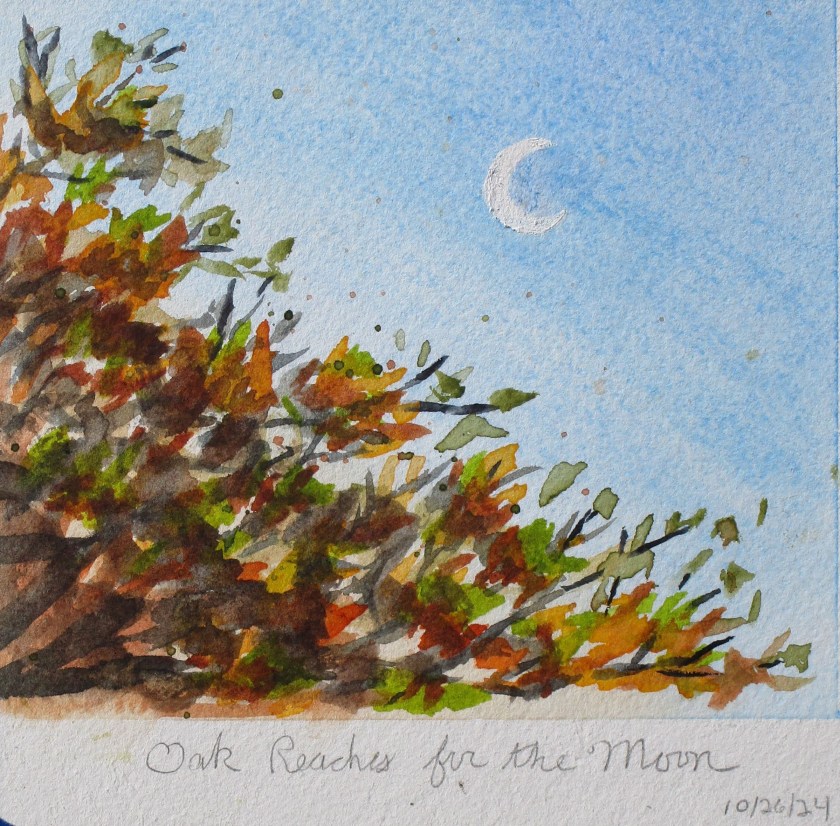
An oak tree reaching for the crescent moon.

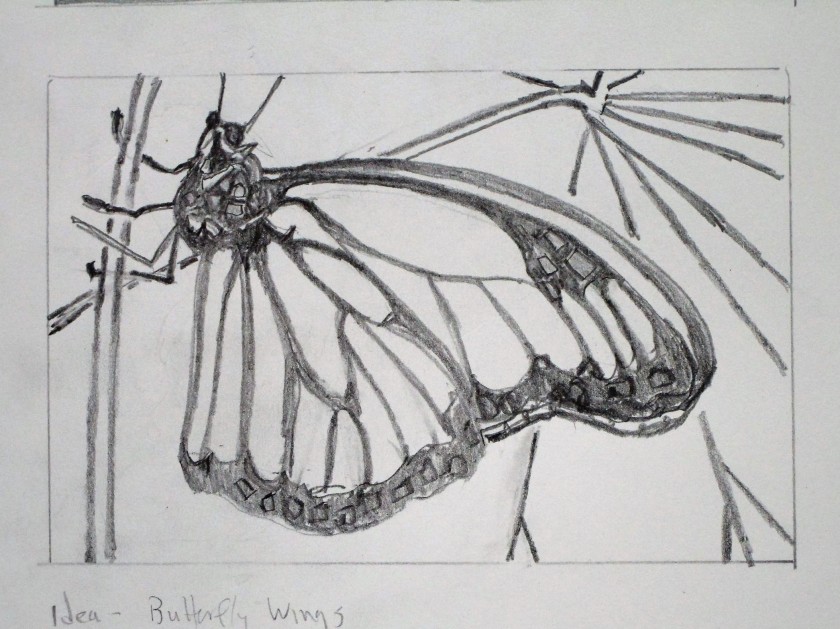
If you follow this blog, you may well guess what my next experiment must be:
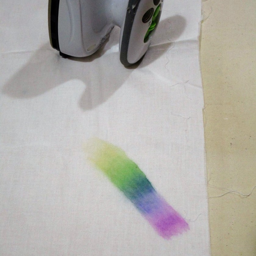
Yes! I had to try my new pencils out on fabric! You see here a piece of cotton muslin. I have marked a part of a rainbow, running the colors into each other. After liquifying the colors and letting the fabric dry, I used my hot iron to set the pigment. Then I sprayed on more water, just to see if the color bled further. The paint passed this test, so I moved on to a bigger experiment.
There is something about the medium that reminds me of stained glass. Thinking deeper about the possibilities of blending colors, I decide it is more like medieval illuminated manuscript. Then I remembered that I have a book.
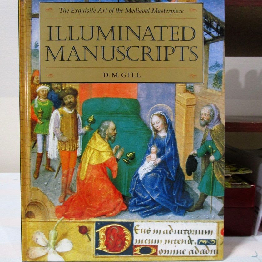
What if I reproduce one of these paintings on my muslin cloth? I flipped through the pages to find a likely subject and landed on this image depicting the creation of the world.
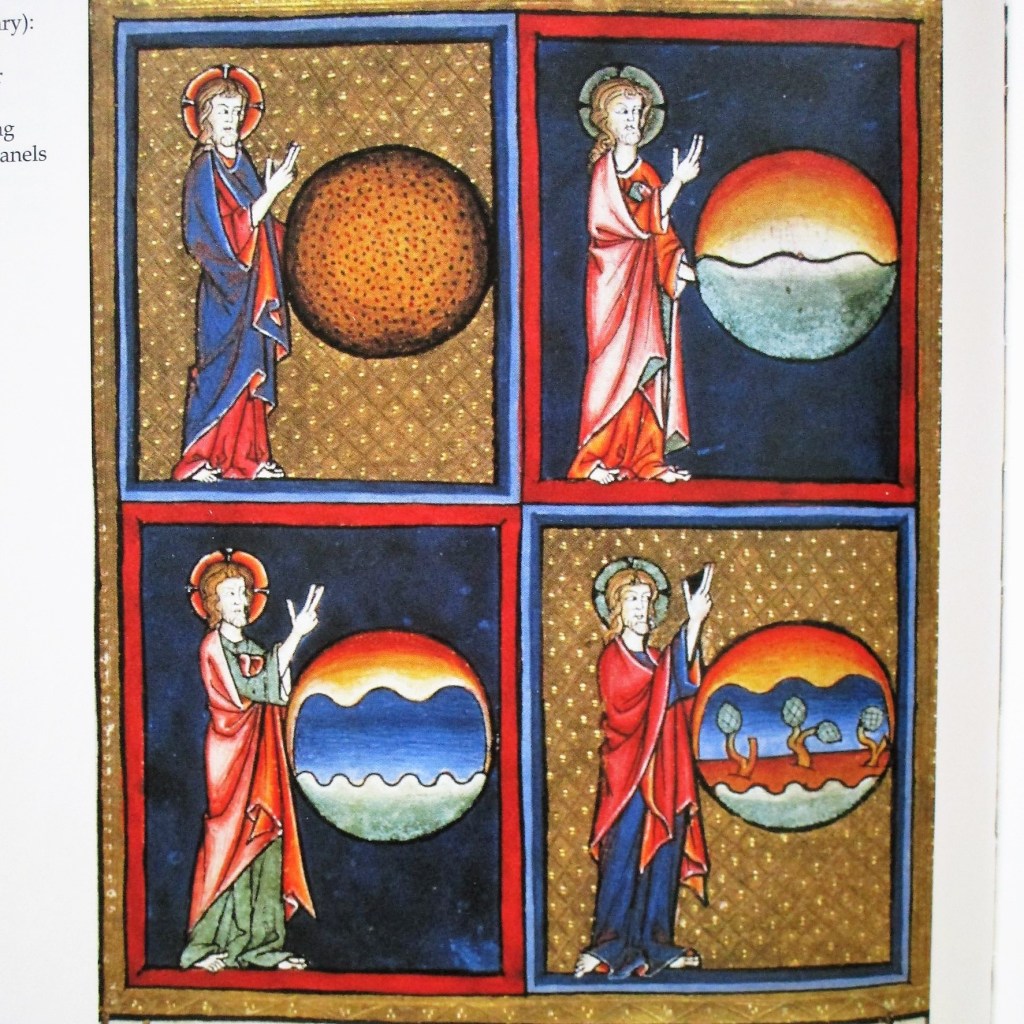
First, I drew a series of four circles on the muslin. Next, I used my swatch card to find matches to the hues of the illustrations. I began working the two days on the right side of the panel.
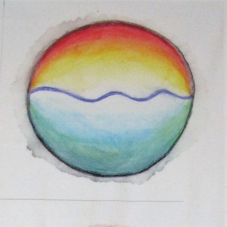
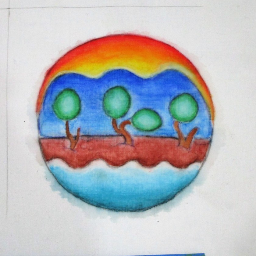
This was very fun and pretty satisfying. Despite the slight bleeding outside the margins (totally fixable) I find the results most acceptable. I did notice that there are tide marks left behind by some of the blue and green pencils. But this extra texture seems very much in keeping with the pigments and style of the era.
After I paint days 1 and 3, I’ll put the fabric in a gentle cold-water bath to look for more fading or bleeding. If the piece passes this test, I’ll move on to a bit of quilting.
I hope you are enjoying your year-end holiday. Please do let me know what you think of this experiment or share what you are planning to make in 2023. Happy New Year.

I had an inspiration recently to try painting some converging curved lines that I saw in a photograph. While perusing my supplies, I came across some 8 by 10 boards with paper stretched on top, promoted as suitable for watercolor paints. So I thought I would test them with my current inspiration.

I plan to use staining pigments, starting with quinacridone rose and Thalo blue in the first two blocks. Why pink and blue? I think my brain was lingering on the yarns from my latest knitting project. Cast-on Monday – Summer Style
It took a little work to get the paper wet enough to lay on the wash. But eventually the paper was evenly wet and I laid down the paint using my biggest round brush.

So far so good. At this point, I was happy that the paper/board seemed to be performing well. After allowing the paint to dry overnight, I added two additional colors – gold and violet. This time, I let the colors bleed into the pink and blue, as a way to merge the two together. The work began to remind me of gender roles and society. Why? Again, the pink and blue, and the way the curves leveled out while flowing in a parallel fashion across the paper.
Here is the board immediately after laying down the two additional washes.

And 30 minutes later……

And here after completely dry.

Analysis: I’m not terribly sure what I am trying to say about gender and society. Something about shifting lines, blurring edges and the pressure to conform.
But the experiment on the watercolor board was successful enough to persuade me to try it again.