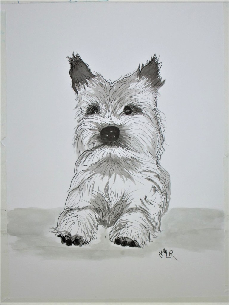
For this week, I worked with a very nice selection of Bill’s photographs.

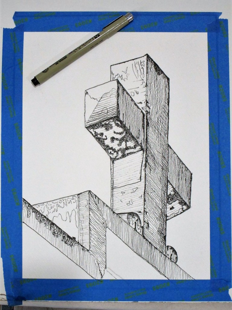
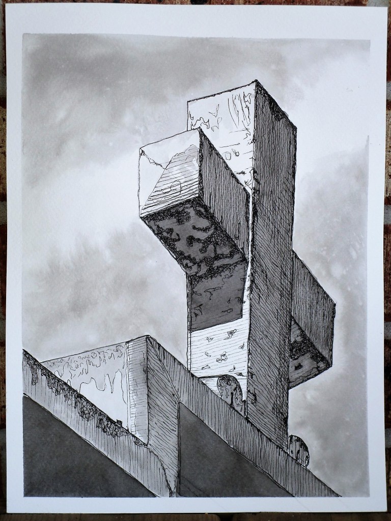
I was drawn to this one by its lines, texture and geometry. To bring those characteristics to the fore, I used pen and ink to render the cross.
DAY 6:
Day 7: Adding Sumi ink wash.
Photograph Two
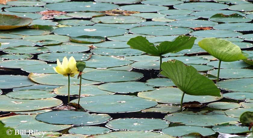
In looking at this photograph of waterlilies, I got the impression that the leaves and blooms rising above the water line looked like actors on a stage, with the flat lily pads as the audience. To emphasize this impression, I used mostly pencil, and a cool wash to the background; warm, bright paint to the subjects.
Days 8 and 9:

Photograph Three.

Bill’s close up of a wood duck was begging for another paint swatch study. So that what I did on Day 10.
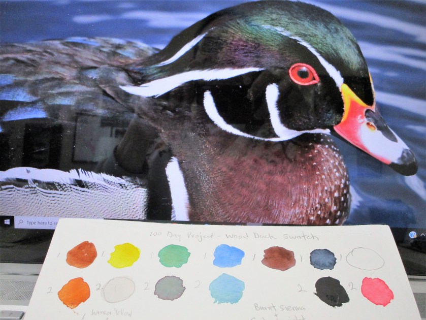
First, I brightened up the image using photo editing software. Using my watercolors, I discovered that it took eleven different pigments to match all the different colors of this bird. And after I finished the swatches, I was in love with wood ducks. So, I proceeded to paint him.
Days 11 and 12:

That finished out my week. Looking back at what I had done, I noticed that most of the work was realism. I’d like to challenge myself to try for more abstract images in the next week.