Posted in painting

Sunday Squash

Not many people would call a pumpkin a squash, but I just love alliteration. I can’t help myself.

I’m a few weeks late in finishing my pumpkin painting. Painting was supposed to take place on the first Monday in October, when Cheryl Bryan conducted her once a month tutorial. I had prepped my paper and packed my traveling paint kit, but didn’t attend class. I was at a funeral for a friend that morning.

As the month wore on, I kept busy in the garden (and with stash-busting knitting.) So, it’s today that my pumpkin painting is ready to be viewed.

My reference photo is by Megan Lee, who generously shared it on Unsplash.

Thank you, Megan.

What attracted me to this image was the background primarily. I liked that the pumpkin is still in the pumpkin patch, surrounded by its vine, whose leaves are changing to yellow. The white tendrils (or roots?) which are visible throughout the image keep the eye moving through the scene.

My goal was to capture a spooky feeling, along with the intense highlights, as if a beam were focused on the pumpkin – the star of the show.

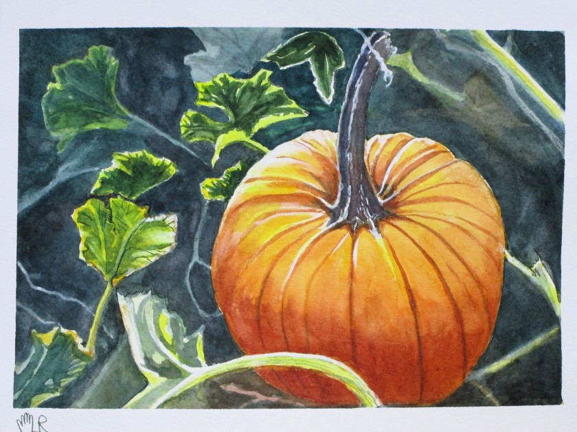
Did I achieve the goal? I believe so. What do you see?

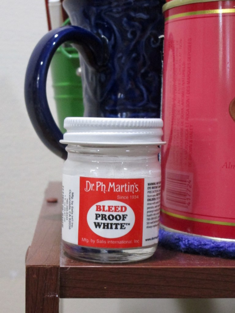
Painted on Arches cold press using Winsor yellow, Winsor green, transparent orange, alizarin crimson, burnt sienna and ultramarine blue. White highlights emphasized with Dr PH Martin’s bleed-proof white.

Posted in drawing, painting

Watercolor Wednesday: Blaukopf Online Learning

I gave myself a gift by purchasing another Blaukopf tutorial through Teachable. This one appealed to me because it featured ink and watercolor.

https://learn.shariblaukopf.com/p/sketching-a-french-village-scene

For the first lesson, Shari walked us through the mixes we would be using throughout the course. My swatches came out nicely, despite the fact that I had no Hooker green paint and substituted Winsor green.

Our first painting was of a balcony scene in a Normandy village featuring lots of stone and pots of plants perched on a wall.

Photograph taken by Shari Blaukopf

Shari suggested that we avoid pencil lines and draw straightaway with the ink pen. I am using Pigma Micron with archival ink.

Not too bad. The basic shapes and textures look as expected.

First wash.

I was so focused on finishing that I didn’t take any other images of intermediate steps.

Here is my final ink and watercolor painting of the balcony scene.

While I didn’t have fun throughout the entire experience, I got re-introduced to my watercolor paint and had enough fun for a Wednesday.

Posted in painting

Watercolor Wednesday Tutorial

Last Wednesday in Open Studio, Cheryl introduced the group to the work of Soon Y. Warren, a painter who excels at creating light and texture in her watercolor works. Cheryl has taken a workshop with Soon and raves about her.

https://soonwarren.com/

To get us started, Cheryl sent her own version of Soon’s Orange as a reference.

To achieve the effect of bright light on the orange, the artist applies masking fluid on the areas of white. After the painting dries, the mask is scrubbed off and final details are painted in.

I need practice using masking fluid, so I went along with the instructions. It was not a difficult lesson, except for removing the mask. I had to scrape vigorously with fingers, fingernails (go wash my hands and come back) and more fingernails. Ultimately, all the masking fluid came away, but in the process, I rubbed some dirt and/or paint into some places on the white paper where the mask had been. (sigh.)

Fortunately, the areas with the worst stains were pretty well covered with an application of Dr Ph Martin’s Bleed Proof White.

Here is my finished study. It will make a nice greeting card.

I chose a different palette for my version: W&N French ultramarine blue, Thalo blue, Winsor lemon, transparent orange, and permanent alizarin crimson. A little salt and paint spatter added texture.

If you enjoy light-filled, transparent watercolor paintings, check out Soon Warren’s site.

Posted in drawing, painting

100 Day Project: Days 13 to 17

I had hoped to make more art objects in the week after my return from vacation. But then I decided it’s better to keep posting what’s done than wait for more progress.

If you are following this subject, you know that I am working with husband Bill. He selects the photos, I make art objects inspired by them. This week I selected five photos that feature interesting textures.

Day 13: Mosaic floor in Roman church

What struck me about this image was its illustration of single point perspective. As you look down and away, the medallions morph from circles to ovals. I started by drawing two straight lines, narrowing towards the vanishing point. For my texture, I went with Zentangles.

Fun and meditative drawing with Micron pen on bristol smooth paper

Day 14: What would you do with this object?

In case you can’t tell, it’s beachball floating in a pool. I found myself drawn to the reflection in the northern hemisphere of the ball.

Using pencil, I did my best to draw the shapes. Next, I combined it with this photograph of an orchid.

Day 15:

I added the orchid to the lower right corner of my pencil drawing, overlapping the edge of the circle. Then I dropped in color washes to the sphere. After that dried, I painted the orchid with darker shades.

Day 16: Ghost leaf

This is one of Bill’s favorites. The light is from behind, filtering through the oak leaf. The back leaf, peeking out between the lobes of the large front leaf, is casting its shadow.

I adore the color and texture of this image. It was impossible for me to do justice to the lacey network of golden veins. Instead, after painting on a golden wash, I lightly tapped the surface with a sponge dipped in masking fluid.

I also intensified the color of the background using orange’s complement, blue. The two hues side-by-side seem to throb.

Day 17: Shells

This photo was chosen for making a quick study in my sketchbook. I drew the shells free hand using a watercolor pencil in a neutral brown. Using that and other watercolor pencils, I added detail, color and texture. Finally, I dissolved and blended the pigments with a wet brush.

I recently read Painting Light & Shadow in Watercolor, by William B. Lawrence. Inspired by his work, my next set of photos will be chosen for the presence of interesting shadows. I’m excited to see what happens.

Posted in painting

Christmas Post – Poinsettia

I call this painting Cheryl’s Poinsettia. Yes, I did paint it, but it was while attending a tutorial session offered by Cheryl Bryan in early December. The image is hers and she walked us through all the steps.

While working on this still life, I felt totally relaxed and engaged – to the point that I was sorry when I had finished it. It’s a feeling I hope to capture again.

Cheryl Bryan’s work can be found here:

https://cibstad07.wixsite.com/mysite-1

Merry Christmas to all.