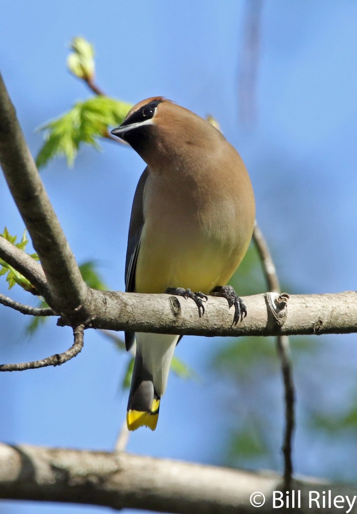
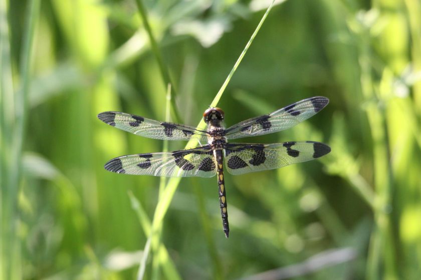
This is the second time I painted this bird, based on a photograph by Bill.
I’m pretty happy with my work. If I were to paint it a third time, I would choose a hot-press paper. It was difficult to get smooth washes and crisp lines on this paper. I would also use a non-granulating blue paint for the background.
I like the bird’s attitude. He is eye-balling the photographer, as if to size him up.
This past week I spent a good amount of time on this project. Since the background fabric is complete, I focused on the subject and the foreground. On Wednesday, I got out my fabric paints and created some terracotta and dark neutral colored swatches.
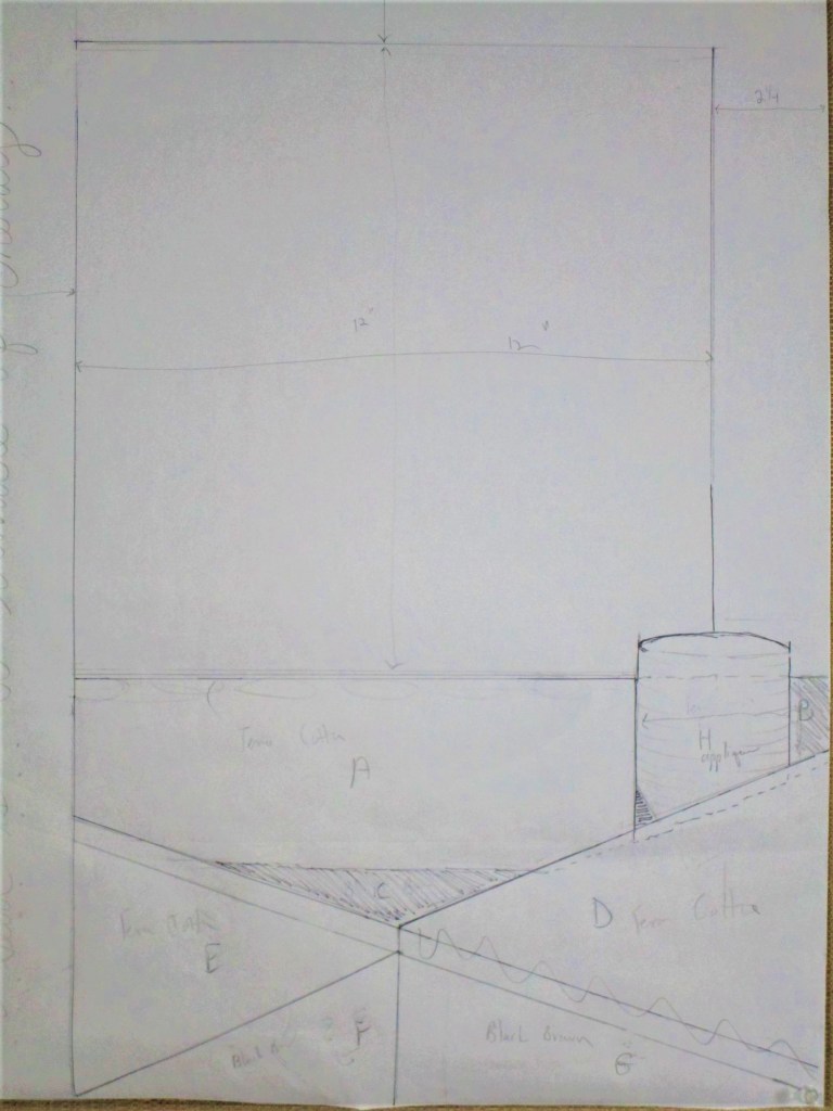
While the fabric was drying, I finalized the design layout. Because the foreground was the interior of a building, I decided to use the piecing instead of applique technique. The stitch lines would be straight and follow the lines of the greenhouse interior. Here is the full-scale drawing that I used to make the pattern pieces.
Next I traced each of the lettered sections, cut the traced images apart, pinned them to the fabric and cut each piece.
Following my decision to use a reverse-applique technique to replicate the little seed pots, I had made a template with elliptical shapes. I now traced these shapes onto the corresponding fabric pieces.
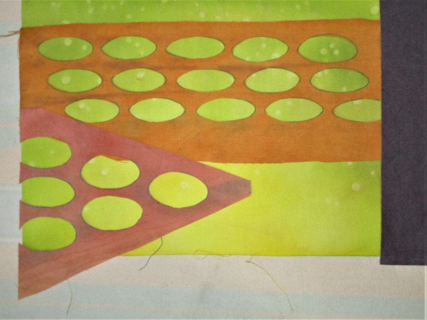
One of three sections that have seed pots.
Ellipses are cut out
Laying the cut-outs over the background fabric to check placement
Everything looked like it would fit. Starting with piece A, I sewed the pieces to each other in alphabetical order and stitched the resulting block to the background fabric.
Completed piecing.
My vision is that the bright green color glowing up from each seed pot symbolizes the energy released by the seed as it germinates. You know what I mean – like the way superheroes are drawn.
Here is an image of the project as it stands now.
I awoke several times during the night to ideas about the next step swirling around. I had so many of them! When I awoke early this morning, I could recall only a few. Too bad. I guess I could force myself to get out of bed when this happens, track down my notebook and write those ideas down. But I digress.
The next steps involve adding some final touches of paint, stitching down the raw edges of the ellipses and making the quilt sandwich.
I will also practice drawing and stitching the seedlings before working them on the real thing.
I like Spring. I like just about everything about Spring. It’s the time of year when we can sleep with windows open, the days are getting longer and warmer. The earth’s growing things burst forth with an abundance of new growth. Most of that growth starts out in a yellow-green color that I call Spring Green.
This luscious shade can be painted with a mixture of lemon yellow and cool blue pigments.
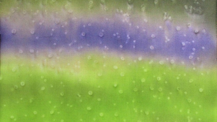
Last spring, I was inspired by a post on Kate Davies’ blog showing a view from her garden shed. The weather was wet. There were big raindrops dripping down the glass. While the view itself was out of focus, it was radiantly colored – mainly in spring green.
It was so inspiring that I tried to capture the color sequence on a piece of cotton with fabric paint.
I think I was successful. After I painted it, the piece languished on my design wall for a year. I was busy with other projects that had overtaken my attention. But with the coming of spring I feel inspired to return to the subject. The painted cloth will become the background of the art quilt. For the foreground, I will focus on seedlings.
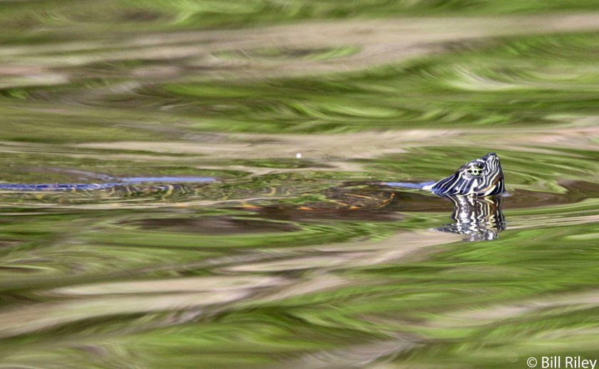
Lately I have been so inspired by the fresh green-ness of springtime. I am eager to make fiber objects that memorialize what I see. While viewing some of Bill’s photographs from our recent camping trip at Lake Montgomery, I was amazed by his images of red-eared slider turtles. They were paddling around in a quiet inlet. The colors of the surrounding trees were reflected in the water and bent by its ripples. That water surface reminds me so much of silk moire. I would love to re-create the image in fabric.
To get started, I reach for my old stand-by medium: Jacquard Dye-Na-Flo.
I’ve mixed up a leafy color by blending yellow, green and a bit of orange. Black will be dabbed on in small quantities.
I think that I can manipulate the paint into ripples by sewing the fabric into pleats – much like a Shibori technique. Studying the photograph, I organize the pleats by direction and number to match what I see.
The fabric is wet thoroughly. I don’t want any of the fabric inside the folds to remain white. Then I sponge the green paint onto the top and bottom sides of the fabric. A little extra paint, including dabs of black, is applied to the edge of the folds. Here is my piece after the painting is finished.
The fabric will need to remain tied up until it is thoroughly dry. This technique works because the parts of the fabric that dry fastest hold the most color. The slowest drying sections will be the lightest in color.
And here is the finished, pressed cloth:
It may be difficult to tell from the photograph, but yes, this fabric is completely flat. I was pleased. There is an uncanny resemblance to the lake water in the photograph.
My next step will be to imitate the ripples by brushing on thicker textile paint. It will be interesting to see if I can do it.


