Posted in painting

Color Study

I’m interested in doing a few watercolor portraits. Today I am studying this photograph that I took of my daughter wearing a shawl I knit.

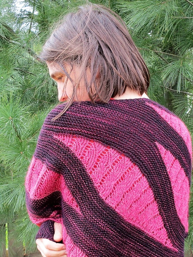
I chose this because of the variety of textures and contrasting values. Her pose is also very interesting to me.

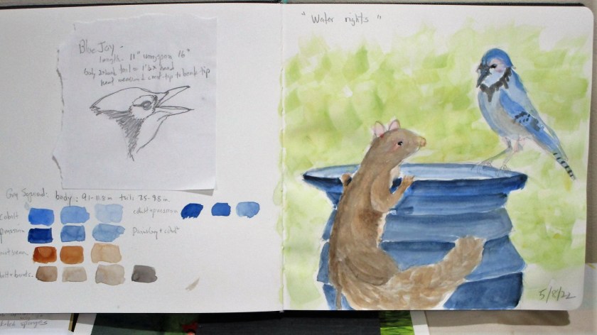
So far, I have cropped the image and penciled the shapes onto watercolor paper. But before jumping into painting, I thought I would test out a few color selections in my sketchbook.

Some good options

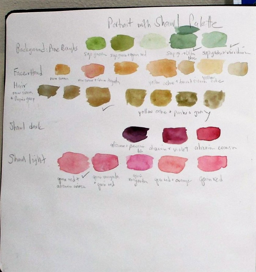
A good start. The background is not dark enough, but I like the shawl colors. I can add more layers of paint to the background. That hair is too orange! It will be useful to attempt another study of the head before I move on.

8-05-22

Today I corrected values, added detail to the background and refined the face.

Posted in painting

Quick Study: Winter Scene

I laid down this wash yesterday so it had plenty of time to dry. This is a weak blend of French ultramarine blue and sap green. It took mere minutes to paint.

This morning I had a firm idea of what I wanted to do. First I washed some water over the lower portion and blotted up the excess. This brightened the foreground. Using a one inch flat I brushed the sky with a stronger ultramarine wash and picked out the clouds with a tissue. The rest of the paint went on with the same brush using vertical strokes for the trees and horizontal slashes for the snow shadows.

At the end, I used the Sumi brush to work a little burnt sienna into the trees. It was this last step that caused the wonderful blooms. I love the texture that resulted.

Total time to make this impression: 15 minutes.

Pigments: Ultramarine blue, sap green, payne’s grey and burnt sienna.