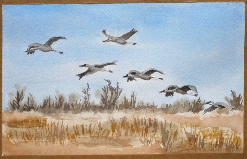
This week I practiced drawing and painting sandhill cranes in flight
This study will be part of a larger landscape that I am planning. I used cerulean and phthalo blues, raw sienna, burnt sienna, yellow ochre and a bit of Payne’s gray on Arches cold press paper. My reference photo appeared on the MPR website and was taken by Ben Hovland.
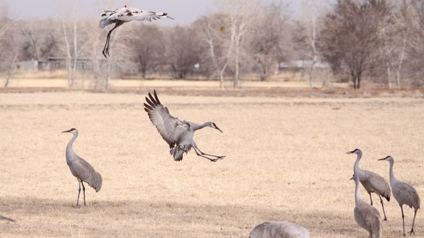
When I returned from Wisconsin last month, I made a vague suggestion about painting a watercolor of sand hill cranes. They are very impressive birds. In Madison the cranes are so acclimated to humans that they are not bothered with our presence. We even saw a couple with a dog on the leash approach resting cranes, and the birds never budged.
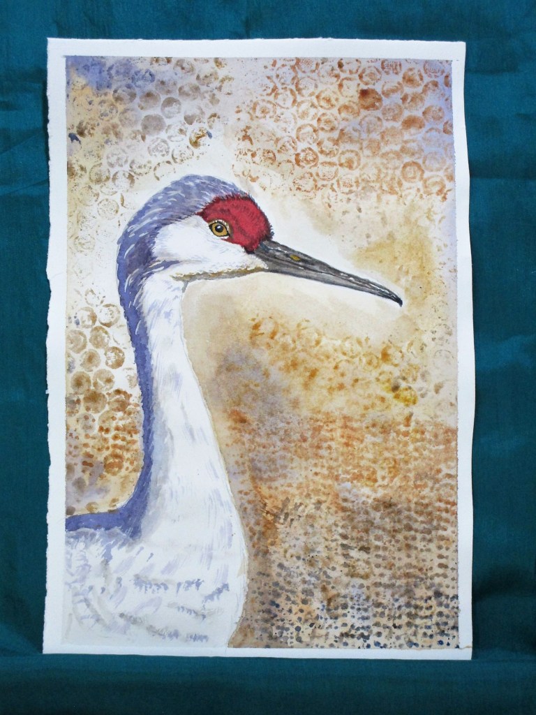
Because I think this will be a difficult painting, I decided to start with a simple close-up of a sandhill. This photograph was snapped by Bill. I zoomed in when did my edits.
This is a nice profile shot.It seems the bird is showing up its “good” side!
After making a quick pencil sketch, I used the printing technique learned on Wednesday. This time I stamped the background with bubble wrap and some rug grips using three earthy colors: yellow ochre, burnt sienna and ultramarine blue.
Once that was sorted, I painted the subject. It was a simple matter to follow the lines and colors of the photograph. I was careful to leave a little white. Masking fluid allowed me to represent the wispiness of the feathers.
After a few relaxing hours I was finished.
Time for a Crane
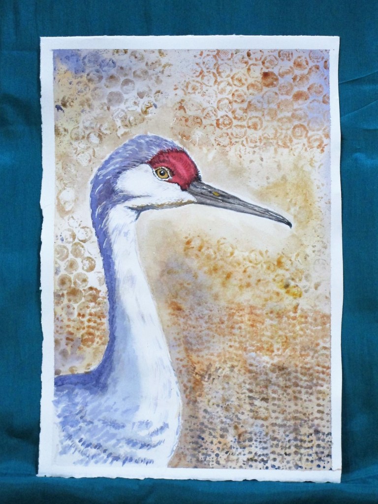
I wish all my watercolor attempts would go this smoothly.
In addition to the ochre, sienna and blue, I used alizarin crimson, carbazole violet and a little quinacridone gold and white gouache to bring out the eye. Painted on Arches hot press paper.
5/08 2022: Happy Mother’s Day all. I’ve been mulling about this painting for the past two days, not satisfied. It seems to me a little flat and unfinished.
So today I addressed the bits that bothered me. In the photograph, the light is strong, making crisp dark shadows and bright highlights. The light in the painting was too subtle. To fix this, I brightened areas around the face and beak with lifting and then applying white gouache. Once the highlights were as light as I could get them, I moved to increase the depth and complexity of the shadows. In particular, the gradation of the shadow along the bird’s body was inadequate. I added another layer, feathering the shadowed area over a larger section of the torso.
Finally, I looked over the background, deciding that the bright white section on top of the head just drew the viewer’s eye up and out of the picture plane. I painted it out with a wash of light tan paint that blended into the existing background color.
These adjustments may seem like not-so-much. Perhaps a big to-do about nothing.
I feel that the changes made the difference between a bland copy of a photograph and an interesting portrait with shadow, light, texture and all the compositional elements working together. To me, my crane is now more vibrant, existing in three dimensions instead of two.