Posted in painting

Shawl Value Study

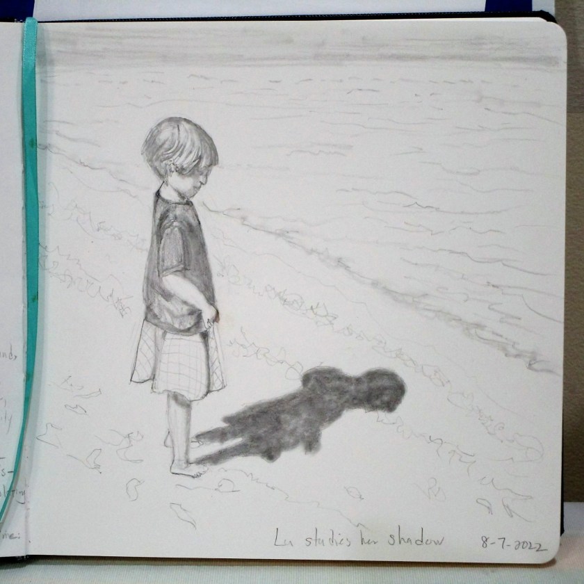
One more step in learning how to paint this pose

Photograph translated to black and white image

Completed value study, using Paynes gray on Fabriano Studio cold press paper.

I find that the values I painted are very close to the values in the photograph. But I came to the conclusion that there is insufficient contrast among the mid-tones.

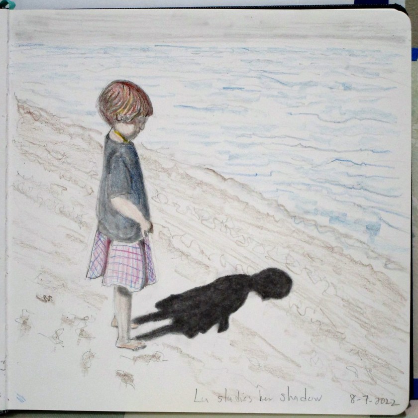
So I will be “pushing” these tones when I paint the image in color. I think I will leave the contrast between the two shawl colors the same, but paint the background tones darker overall.

And maybe it’s time to get out the Arches paper.

Posted in drawing

Sunday Sketch – Add Watercolor

About two weeks ago, we received a text message with a surprising photograph.

To the casual viewer, this may look like an ordinary, but happy day for my two loves. But this was no ordinary day for the little one. She had just received her first haircut! Gone were the messy locks, constantly hanging down over her face. Gone was the daily task of putting in the band to make the wonky ponytail. These delighted expressions and giant smiles just grabbed my heart.

I had to sketch this scene.

Sketch with lines drawn in black Ultrafine marker.

Final portrait with watercolor wash added.

I’m delighted that I was successful in capturing the emotion that I saw in the photograph. The portrait was sent along with Lu’s birthday present in yesterday’s mail. I can’t wait to hear about her reactions when she opens the box.

Posted in painting

Sleeping Babes Revisited

Yesterday I made a watercolor version of the sleeping baby posted earlier this week.

Here is the original photograph:

And my take on this portrait using watercolor.

Somehow in the process of painting, the little mite’s coloration was translated from dark hair to straw-colored red hair, and the facial tones got very rosy, especially the lips. I guess I am channeling Lu.

Anyway, this sketch pleases me. With practice I am learning how to manipulate multiple layers of wash, getting the colors to blend better.

Pigments used were raw sienna, yellow ochre, quinacridone red, burnt sienna, ultramarine blue, carbazole violet, and tiny bit of permanent alizarin crimson. This was worked in my brand new 5 x 8 inch Hahnemuhle watercolor sketchbook. The paper was very forgiving.