Posted in painting

Watercolor Wednesday: Blissful

I asked my yoga instructor for a photograph of her two little dogs, with the intention of giving her a painting for Christmas. Well, Christmas came and went, and I didn’t get around to the work until January.

Here is an adorable photo of Marianne and Sissy (breed is Havanese)

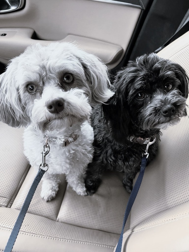
I know these dogs well. They are present at yoga session and form a 2-dog greeting party with the arrival of each student. My challenge will be to render their personalities as vividly as possible.

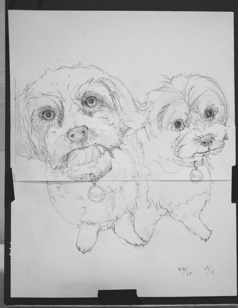
No good portrait will happen without a good sketch. In this one, I taped two pieces of paper together so that I could make the sketch on 1:1 ratio with the painting. This allows me to transfer key contour lines and any gestural lines to the watercolor paper by tracing. 

Next, I did a quick color study and selected pigments. Marianne will be painted with a mix of Prussian blue and transparent orange. Sissy will be painted with a blend of Payne’s gray and transparent orange.

White areas masked out and underpainting complete:

Second wash complete

Third wash finished and most details painted in. Time to remove the masking fluid and the little bits of masking tape.

Final touches to finish it.

I’m pretty satisfied with this one. There were challenges, to be sure. But I achieved the bit of sparkle and personality I was seeking. You can probably guess that Marianne is the extrovert and Sissy not so much. I think of them as yang and yin. 

Blissful Dogs finishes out at 12 by 15. It is the largest watercolor painting I have finished to date and will easily fill a 16 x 20 frame after matting.

Done on cold-press Fabrico Artistico paper with a palette of Winsor yellow, yellow ochre, transparent orange, burnt sienna, quinacridone red, Prussian blue and Payne’s gray. Only tiny amounts of white gouache were needed.

Posted in painting

100-Day Project: Days 18 to 21

My selection today is all watercolor, of varying qualities.

Day 18: Amanda’s Shawl

This week I slipped in a photograph taken by me. Last August I had started painting a close-up version in watercolor. The painting has been in time-out for several months. This week I finished it.

The theme is texture, and I’m fairly happy with most of what I did. I’d like to try again using a larger piece of paper and the full view.

Day 19:

Again, I was drawn to the texture, and the points of the barbed wire which look almost white to me.

I didn’t achieve a good range of value. I plan to try again, maybe in a monotone, so I can focus the value contrasts.

Day 20: Sharp-shinned hawk.

Yesterday was First Wednesday Open Studio at the arts center. Cheryl Bryan’s lesson focused on lost and found edges. I chose this photograph because the hawk’s coloration allows it to blend in with its environment. And there are cool shadows.

The lesson started with creating a three-color background in a random fashion. After it dried, we determined the subject’s position in the background and penciled it in lightly. In addition to making a lost and found edge at the bird’s wing and tail, I also practiced negative painting around the right edge and the talons. I enjoyed it and the work went quickly.

Day 21: Sonoma view

Bill took this photo from the upper deck of his brother’s house in Petaluma, CA. It could almost be a view of Oklahoma last week, when, pushed by high winds, fire raged barely five miles from our home.

I brightened up the foreground to see what exactly made up all those plants. Using three different mixes of green and some yellow ochre, I just played around with shapes until it looked done.

The first painting is 8 by 8. The other three are postcard sized. All were painted on Arches cold press paper.

Posted in drawing, painting

100 Day Project: Days 13 to 17

I had hoped to make more art objects in the week after my return from vacation. But then I decided it’s better to keep posting what’s done than wait for more progress.

If you are following this subject, you know that I am working with husband Bill. He selects the photos, I make art objects inspired by them. This week I selected five photos that feature interesting textures.

Day 13: Mosaic floor in Roman church

What struck me about this image was its illustration of single point perspective. As you look down and away, the medallions morph from circles to ovals. I started by drawing two straight lines, narrowing towards the vanishing point. For my texture, I went with Zentangles.

Fun and meditative drawing with Micron pen on bristol smooth paper

Day 14: What would you do with this object?

In case you can’t tell, it’s beachball floating in a pool. I found myself drawn to the reflection in the northern hemisphere of the ball.

Using pencil, I did my best to draw the shapes. Next, I combined it with this photograph of an orchid.

Day 15:

I added the orchid to the lower right corner of my pencil drawing, overlapping the edge of the circle. Then I dropped in color washes to the sphere. After that dried, I painted the orchid with darker shades.

Day 16: Ghost leaf

This is one of Bill’s favorites. The light is from behind, filtering through the oak leaf. The back leaf, peeking out between the lobes of the large front leaf, is casting its shadow.

I adore the color and texture of this image. It was impossible for me to do justice to the lacey network of golden veins. Instead, after painting on a golden wash, I lightly tapped the surface with a sponge dipped in masking fluid.

I also intensified the color of the background using orange’s complement, blue. The two hues side-by-side seem to throb.

Day 17: Shells

This photo was chosen for making a quick study in my sketchbook. I drew the shells free hand using a watercolor pencil in a neutral brown. Using that and other watercolor pencils, I added detail, color and texture. Finally, I dissolved and blended the pigments with a wet brush.

I recently read Painting Light & Shadow in Watercolor, by William B. Lawrence. Inspired by his work, my next set of photos will be chosen for the presence of interesting shadows. I’m excited to see what happens.

Posted in painting

Color Study

I’m interested in doing a few watercolor portraits. Today I am studying this photograph that I took of my daughter wearing a shawl I knit.

I chose this because of the variety of textures and contrasting values. Her pose is also very interesting to me.

So far, I have cropped the image and penciled the shapes onto watercolor paper. But before jumping into painting, I thought I would test out a few color selections in my sketchbook.

Some good options

A good start. The background is not dark enough, but I like the shawl colors. I can add more layers of paint to the background. That hair is too orange! It will be useful to attempt another study of the head before I move on.

8-05-22

Today I corrected values, added detail to the background and refined the face.