An oak tree reaching for the crescent moon.
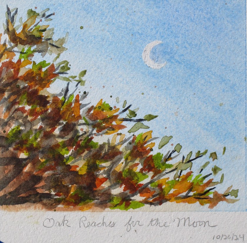
An oak tree reaching for the crescent moon.

Yesterday at art association weekly open studio, we had a lesson incorporating printing into a watercolor painting. We gathered various leaves from our yards. I chose some fern leaves and the soft fuzzy leaves of lamb’s ear.
There are just a few steps. First, lightly pencil in your subject. I chose to draw a vase of flowers based on my memories. The paper is wet over the background and allowed to dry to the “low gloss” stage. Next, choose a leaf and paint a few colors on it. I started with yellow, then added stripes of blue. Then the leaf is pressed onto the paper, held in place briefly and removed. In addition to pressing the two shapes of leaves wherever I wanted leaves, I used a paper doily as a stencil, painting through the holes to make a pattern in the foreground. Next, I painted on some small tulips
Here is my painting after the paint had dried, showing these steps completed.

Today I finished the painting. This involved building up color and adding some details to the leaves, the vase and the flowers.

While it is a very simple style, I will call this experiment a success.
Painted on Arches cold press paper with yellow ocher, Winsor yellow, ultramarine blue, alizarin crimson, carbazole violet, transparent orange, and viridian. A little white gouache played up the highlights.


Today I finished my first attempt to capture a feeling in watercolor.
On December 12th, I wrote this entry in my Belize journal, describing the boat trip back from the reef after snorkeling there:
“On either side of me the sea rolled by, with bright, transparent turquoise water punctuated by amorphous, dark green forms of sea grass and coral clumps below the surface. After the first several miles had passed, I began to detect bits and pieces of the shoreline. They came in the form of striated horizontal lines, looking like a slow fade from one color to the next. First sea green, then turquoise, followed by the strip of land separating the bay from the lagoon. The land was dark, with bumpy forms of vegetation. Beyond and above that was a cool blue strip of atmosphere. Was it mist, fog or ordinary clouds? I couldn’t tell. Eventually I detected the purplish forms of the mountains, overlapping each other and rising from the mist.”
I’m relatively happy with this painting. It captures the way I felt about what I saw that day. Working abstractly was an experiment. I might try to paint the scene again using a more organic style.
This is also my first painting on Arches hot press paper. It took a little getting used to. Pigments used were Winsor green, Thalo blue, Prussian blue, quinacridone gold, quinacridone red, carbazole violet and Payne’s gray.

