Today I have two – six by six canvases – that will be submitted for sale in October to benefit my local art association. I had fun coming up with ideas.
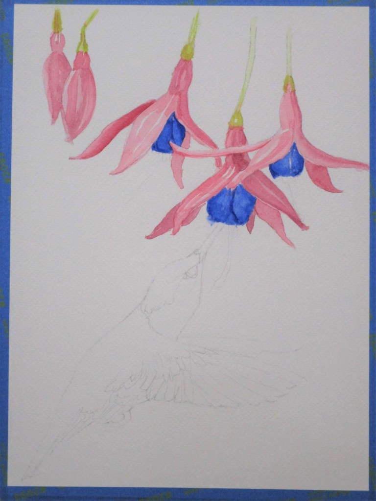
Last week I did two sketches. One was intended to be a traditional watercolor work. The second will start out with watercolor, but will finish out with some threadwork.
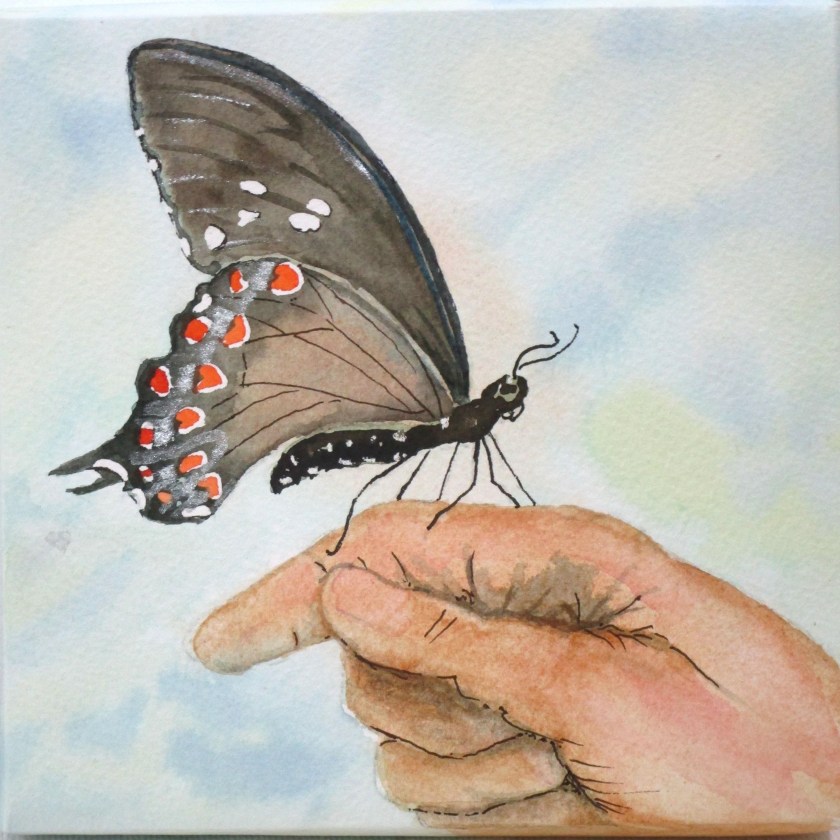
I call this work In Our Hands.
Reference photo:

Sketch:

Finished painting:
To utilize the 6 by 6 stretched canvas, I cut my watercolor paper into a 9 by 9 square. My initial wash was worked over the whole piece. After it dried, I cut it at the corners, wrapped it around the canvas, folding over flaps, which were stapled in place. I used double-face tape to press down the sides onto the canvas edges and cut off the excess. Then I proceeded with the rest of the painting.
Pigments used: Winsor lemon, quinacridone gold, raw sienna, transparent orange, Payne’s gray, Prussian blue and Winsor green, blue shade. Some silver metallic gouache suggests the pale iridescent scales of the butterfly.
For the second piece, I prepared the canvas with a product new to me: QOR Watercolor Ground. This base is supposed to transform the fabric canvas into a watercolor paper-like surface. Reviews were good, so I will give it a try.
My reference is photograph of baby birds taken by Bill.
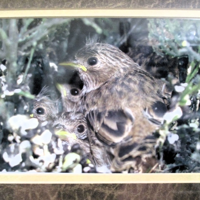
He discovered this nest outside a busy title office inside a fake plant. What was that mother bird thinking! I call this work Tight Quarters.
Original sketch

Partially completed painting with photograph in background.

Finished painting, ready for the next step.
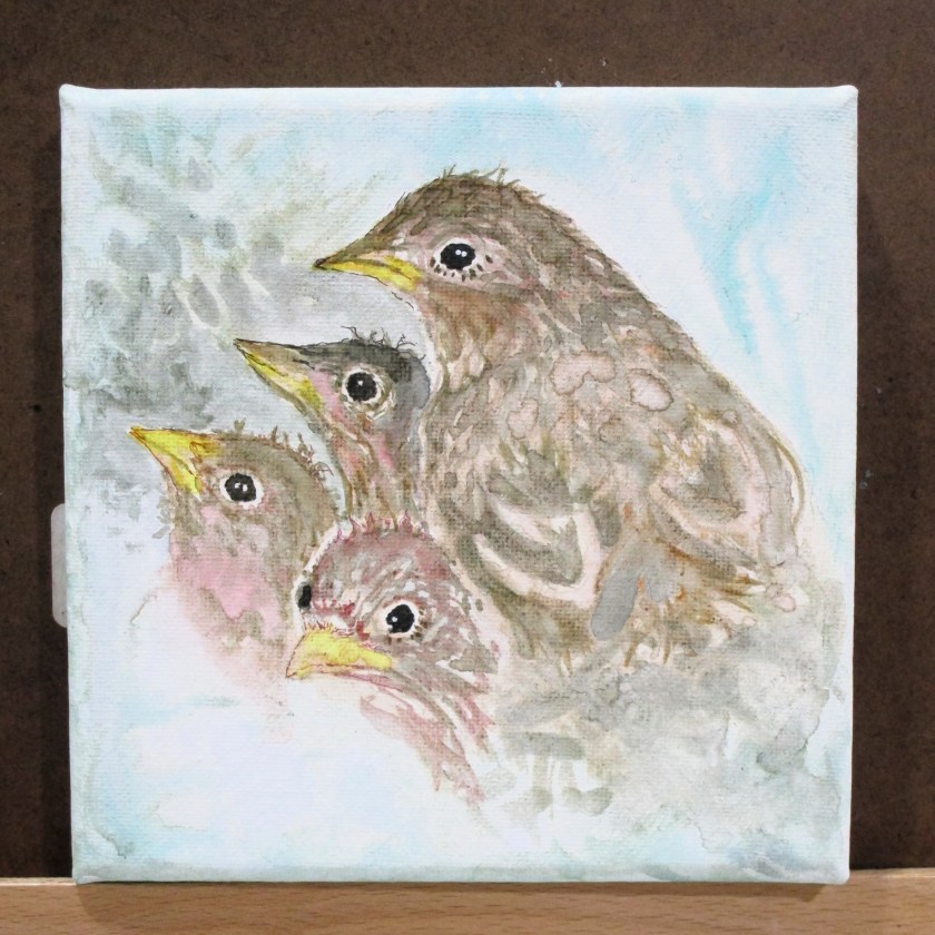
Painting on the watercolor ground, IMHO, was nothing like painting on paper. These sparrows look like they have a serious case of bed-head feathers. I found it almost impossible to layer my paints in a normal way. When I tried to add a glaze, the underlayers would liquify. So, I just pushed the paint this way and that to suggest the texture of the feathers. Despite the struggle, I find that these little birds have a lively character which is appealing to me.
Pigments used were Winsor lemon, quinacridone gold, raw sienna, transparent orange, quinacridone red, ultramarine blue, Prussian blue and Winsor green, blue shade.