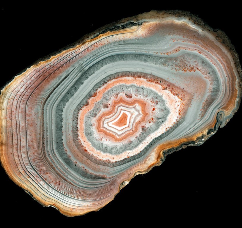
I wanted to try the geometric glazing technique that I used for Belize Memory on another subject. This is an image of an agate in the collection of the Natural History Museum, London.
I thought it would work well as a subject for the technique.
I started with an ink drawing showing the major lines in the striations.
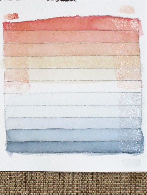
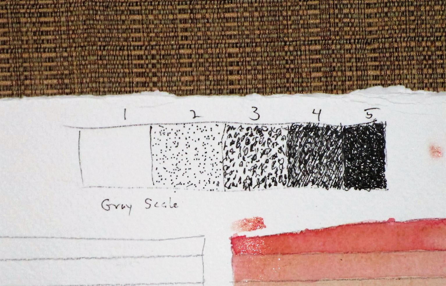
Next I created a color swatch and a gray scale to guide my work.
With a lot going on today, I had to stop working. Here is my agate painting with initial washes and a few details.
At this stage, I’m encouraged. Perhaps I can finish up tomorrow.
Micron pen on watercolor paper with raw sienna, burnt sienna, quinacridone red and Payne’s gray.
I drew this one loose and fast, but took my time inking and painting it. It’s on Bristol paper, not watercolor paper, so I got some waviness. Quinacridone gold, transparent orange, cerulean blue and Payne’s gray. My pen was a Pigma Micron 05.
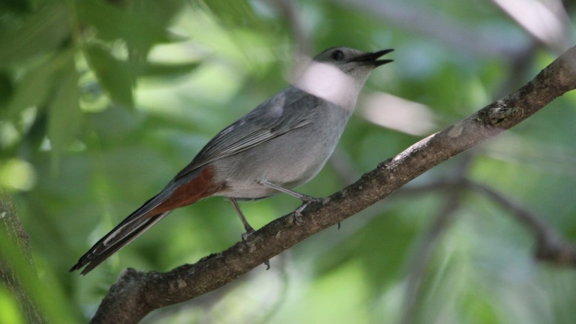
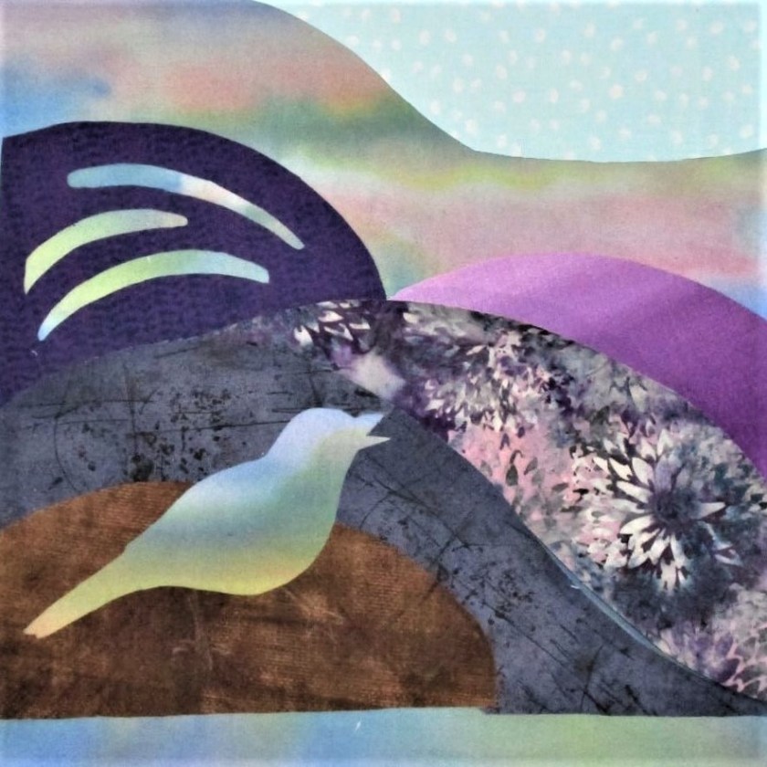
The idea for this fiber object came to me one morning while porch-sitting with a book. It was a gorgeous day, but I was poring intently, with all my focus, on the book in hand. Surprisingly, I no longer remember what I was reading. The probable cause of this memory lapse was the very thing that intruded upon my thoughts. A catbird had begun an insistent and virtuosic song. The sound tore my mind from my book and into the present moment. Looking about, I failed to spot him. So instead of continuing to search with my eyes, I closed them and sat back in my chair.
Pretending that I possessed synesthesia, I imagined what that birdsong might look like, if it were visible. There were deep chortles and murmurs, but also squeaks, shrieks and ascending melodies. It went on and on. And on. Eventually the catbird flew off.
Here’s what I wrote in my journal: “Sky-inspired painted background. Reverse applique to suggest an unseen bird. Throaty -chortling purples, warm tones high pitch trills – bright white squeaks. dashed gestural lines to suggest direction of pitch. Parallel wavy lines for a musical staff.”
All very poetic. But I want to make a piece of visual art, and as such it must have form.
This week I got underway. Since my fabric paints were out, I started with the background. On a piece of white quilting cotton I stroked colors that I thought would make a good sky at daybreak – pale blue, violet, peach and gold. I achieved this rather startling canvas:
Paint is still wet here
What sort of a sky has leaf and dark green in it? None I’d ever seen. I was prepared to set it aside and start again. But on second thought, I chose to continue with this background. The unconventional sky colors can represent the effect of birdsong on the air. Here is my bright background after it dried.
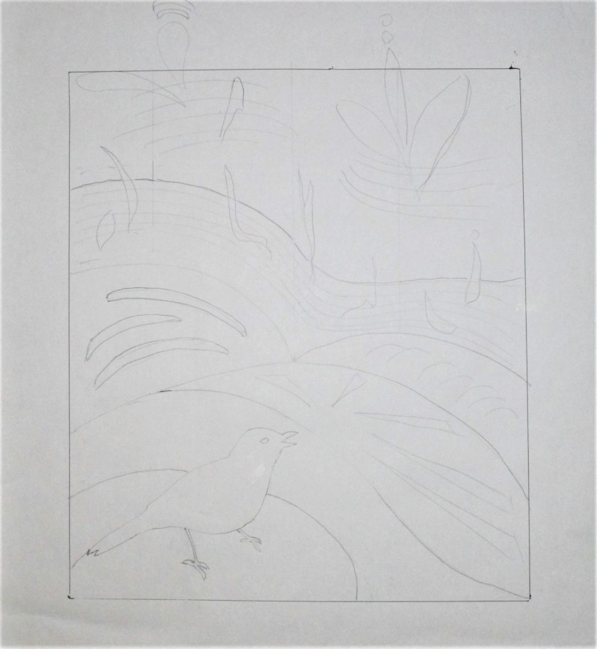
Next comes the sketch. I put the catbird’s silhouette in the lower left.
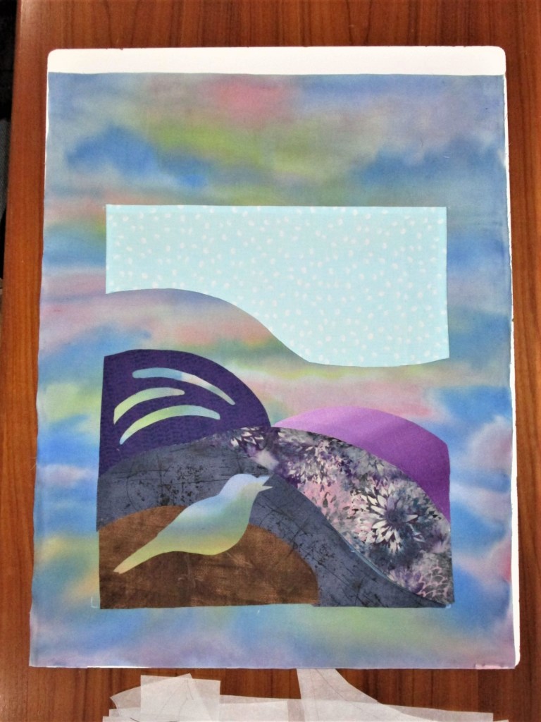
Now the hard part. Searching my fabrics for the colors mentioned in the journal, I found some purples and some brassy bright scraps. Also a few interesting prints. Most of yesterday was occupied with choosing, cutting and attaching fusible to the back of my chosen fabrics. Here is what this applique quilt looked like at the end of the day.
“Catbird Sings” stage oneClose up
While I am keen to get on with this work, I need some supplies. So I will have to pause pending a visit to the craft store.
This blog is about my first watercolor on-line tutorial from Shari Blaukopf. She is a Montreal-based artist who specializes in urban sketching. First let me say, I enjoyed it. The reference photo is of a barn wood clad schoolhouse relocated to an urban garden somewhere in the Pacific Northwest.
My first challenge was to draw and ink the essential lines of the image. I took my time over this step, since it is critical in setting up the rest of the painting.
By the way, I’m working on Arches cold-press watercolor paper for the first time. This premier paper is much beloved by watercolorists.
Next I completed the preliminary washes for the sky, building and flowers.
After letting these dry thoroughly, I went to work on the shrubbery and trees. Shari gave instructions on how to mix eight different greens using various blue and yellow paint. This part was really hard for me, partly because I didn’t have all of the paints that she used in her mixes. I had to substitute.
To me, the various green areas look like they don’t belong together.
I let the paper dry for almost a week before I got around to adding the final details. First the lawn went in, then dark green for underpainting the brighter greens. The barn wood got more shading before all final details were added using a small round brush. After drying, I dabbed some white opaque paint onto the flowers to give a little sparkle to the scene. Here is my finished painting.
This is the first time I successfully painted a mass of foliage. I also learned how to paint a lawn and the order to use in painting flowering plants. I’m betting that I will use these techniques in many future paintings.
Since I didn’t finish any of my fiber objects this week, I have decided to write a progress report. You see above about ten inches of the Weaver’s Square pattern, which will become a colorful vest for my daughter. This is the back of the garment. The front I have planned will be much more subdued. While working with seven strands of yarn each row has been a challenge, the satisfaction of the work and the excitement of seeing the color emerge has more than compensated for any difficulty. I have chosen to switch out the vertical colors at a rate of two or three for every band of horizontal color. As a result, the pattern has a more vertical effect.
Log Cabin Mini Quilt
Another work in progress is picture above. The quilt sandwich is constructed and some stitch in the ditch took place. At that point, I decided to work some embroidery in the flower squares and add hand quilting to the strips.
Blue block nearly finished.
I also felt that a border was essential to provide balance between the light and the dark sections of the piece. Going further, I plan to hand-paint this border in multiple hues. It will be exciting to see how well that goes, and it will take me more time.
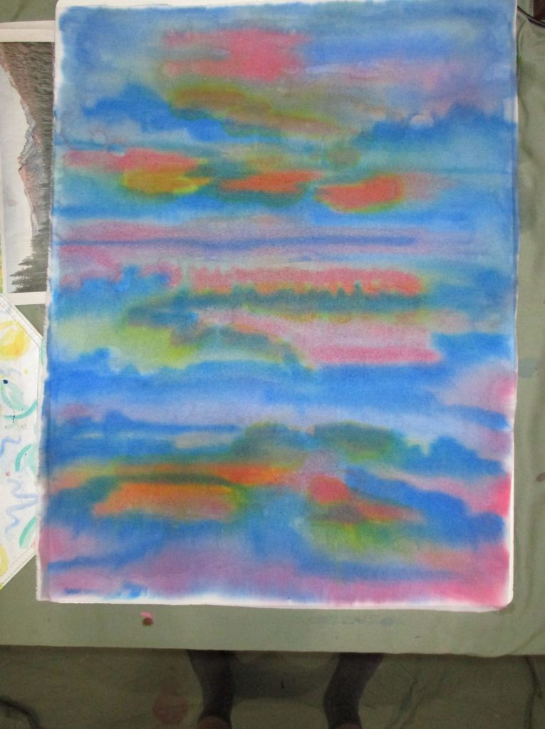
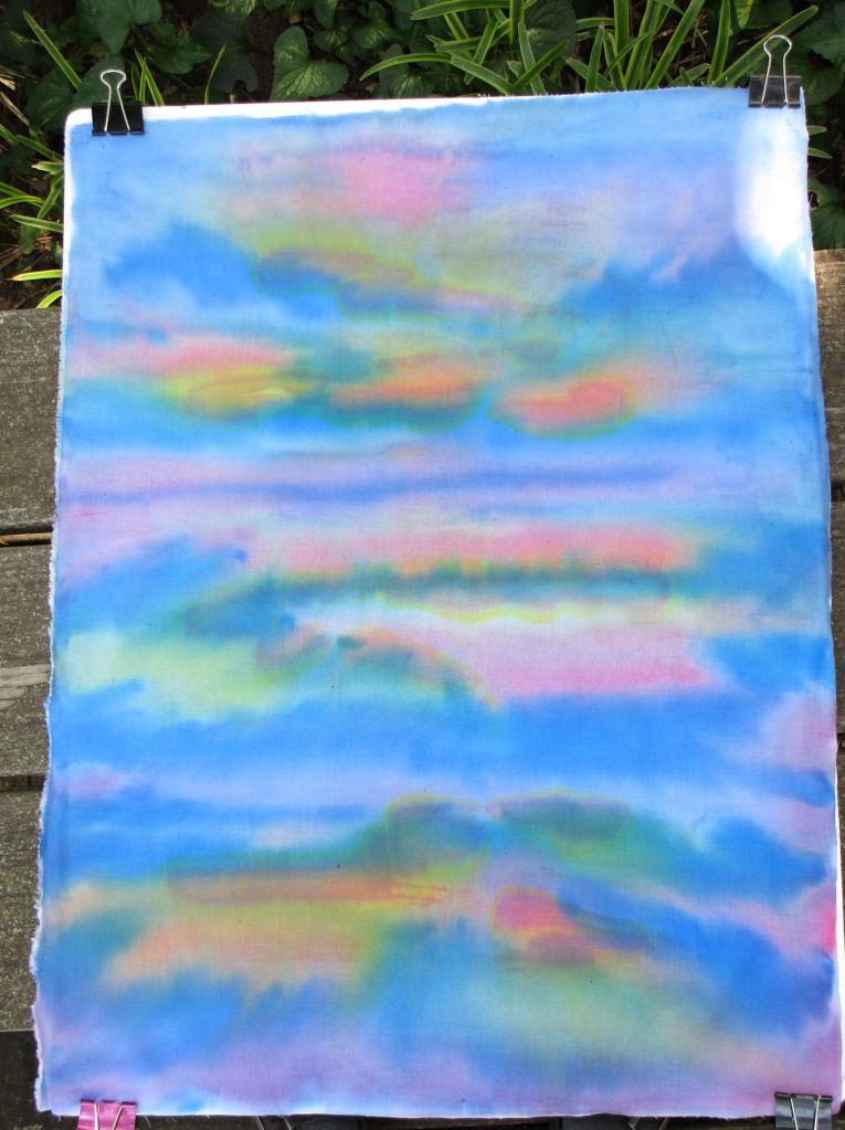
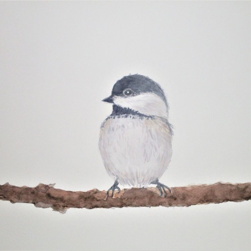
Last week-end I started a tutorial on painting with water color on paper. This class was offered on Bluprint.com. Despite a little trepidation, I am sharing my work today. Keep in mind I am a rank beginner and be kind.
Seascape at daybreak with birds.Color Block using primary colors, salt, colored pencil and micron pens.Realistic style chickadee
Such a fun week. Sometimes I have to pinch myself to remind me that this life is real.