
My attempt to work quickly. This image is based of a photograph by Janet Weightreed. It is taken at Crickhowell, Wales.
https://wordpress.com/read/feeds/13290563/posts/2800871695
My attempt to work quickly. This image is based of a photograph by Janet Weightreed. It is taken at Crickhowell, Wales.
https://wordpress.com/read/feeds/13290563/posts/2800871695

It’s been almost two weeks since I posted last. My days have been full, if not busy, but nothing to write home about. At least I can catch you up on projects in progress.
Improvisational Quilt.

As you see in the photo, the quilt is under the needle. I have been whacking away at the quilting for days and days. This is the biggest piece of cloth that I have attempted to quilt with my lil’ old Bernina.

I’m doing a parallel- straight line pattern, mostly because this type of quilting doesn’t require much manipulation of the quilt. I start at a long section and keep sewing parallel lines until I get tired or run out of bobbin thread. My goal is simply to finish. Pretty lines and straight lines are both out of the question at this point. Optimistically, I’m going for quirky charm. My daughter loves that aesthetic.
Watercolor Painting
My water color painting results have been less than satisfying. When I crashed and burned at applying the background wash to the bird of paradise painting, it got tossed. I then resolved to start back at the beginning. To this end, I checked out a “teach yourself” watercolor instruction book from the library and began working through the techniques one each day. Today’s lesson was line and wash. I chose to paint from a photograph I took of a pond on our local walking trail.

Here is my painting.

I enjoyed working on this one and am happy with it. The only thing I want to add is darker paint on the the group of leaves at the right edge, giving the painting more contrast of values.
The garden has been getting much of my attention. But starting today, heat is intensifying. So I will likely shift my attention back to indoor activities.

While organizing the reading material in my studio, I came across a National Geographic magazine from 2007 that I had saved for some reason. There were no bookmarks or post-it notes attached. So I asked myself: why did this issue end up here? The only thing to do is thumb through it and sees what jumps out. I stopped at page 147.
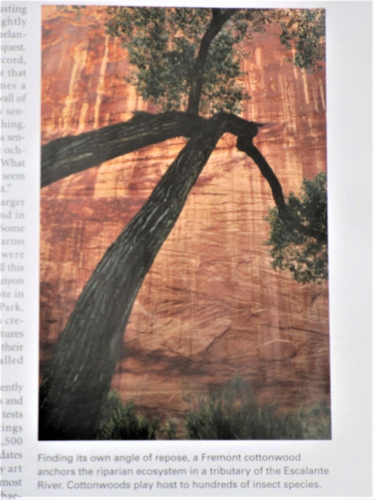
The photographer captured a tortured cottonwood on the Colorado Plateau, which is an area that sprawls across four states and contains a vast expanse of sedimentary rock. The plateau is carved by the Colorado and other rivers. This particular cottonwood is on the banks of the Escalante River in Utah. The dramatic sandstone cliff behind the tree forms a warm backdrop to the massive black branches. It’s as if the tree is embracing the cliff. I knew right away that I wanted to paint it.
Instead of just jumping in and fooling around with paint and brushes, I studied the subject a little. Following the classic approach to painting, I first made a value study. This involves working out the light-to-dark areas of the image in a monotone. I had no gray paint, so I chose to paint the value study in sepia hues.
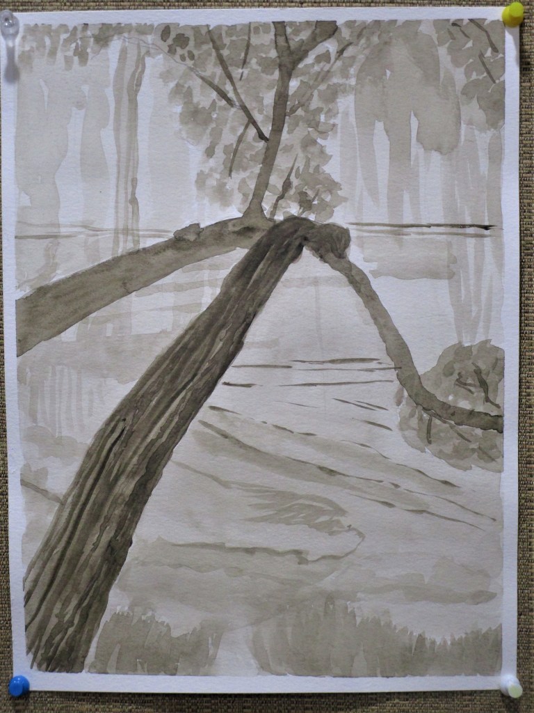
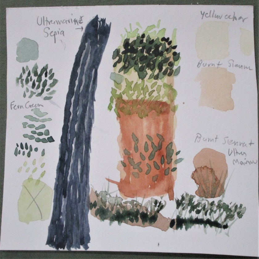
That seemed to go well. I was satisfied with this study. Next I worked out my palette. I had a little fun, making my paint swatches into parts and pieces of the image.
The palette will be yellow ocher, burnt sienna, sepia brown, ultramarine blue and fern green. My gestural study, using the selected palette, was next. I don’t have a photograph of this step. What I learned from that step was that the stone cliff is composed entirely of warm hues. So I chose to paint the tree in cool hues. As I worked through my studies, it became clear that this subject is all about the focal point. Having realized this, I knew it would be my task to eliminate any parts of the background that distracted.
After sketching in the outline of the tree branches, I applied an overall wash, and then laid down some burnt sienna on the cliff face.

A landscape watercolor can take several steps to paint. I ended up painting four different layers, each of which needed drying time before I could proceed. Here is the painting after the second and third layers were complete.

I let it dry overnight. The next day I worked in the final details, adding another layer of darker leaves, some shading and shadows on the tree trunk, and some fine lines in burnt sienna on the cliff face. I tried to emphasize the detail lines that directed the eye to the focal point. After these parts dried, I glazed the whole background with a thin layer of yellow ocher and finally worked some textural lines onto the trunk.

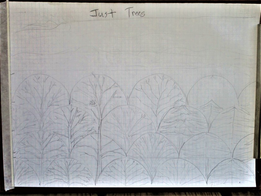
The finished painting is definitely better than I had expected it to be. The only fly in my ointment is that I didn’t use artists’ quality paper. So there is some buckling to deal with. Does anyone have recommendations on how to flatten the paper out?

Yesterday was spent finishing up the Just Trees miniquilt. This project was inspired from the way treetops look in the winter. As spring started to move it, I had to add some color in the form of blooming redbud trees. New skills practiced: paper piecing, hand applique of clam shell shapes, using textile paint mixed with floating medium on fabric. This last technique allows a more precise line by slowing the flow of the paint into the fibers. The floating medium is made by Folk Art. Here is my miniquilt all pieced together and painted, but not yet quilted:
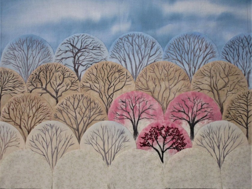
I decided to improve my focal point by embroidering details into the lowest redbud tree.

And here is the piece fully quilted, with a border of commercially printed fabric. I used my walking foot to stitch around the applique. I free motion quilted the sky and around the border.

I’m happy with the results of this fiber object. It reminds me of the view across the floodplain in my little Oklahoma town.


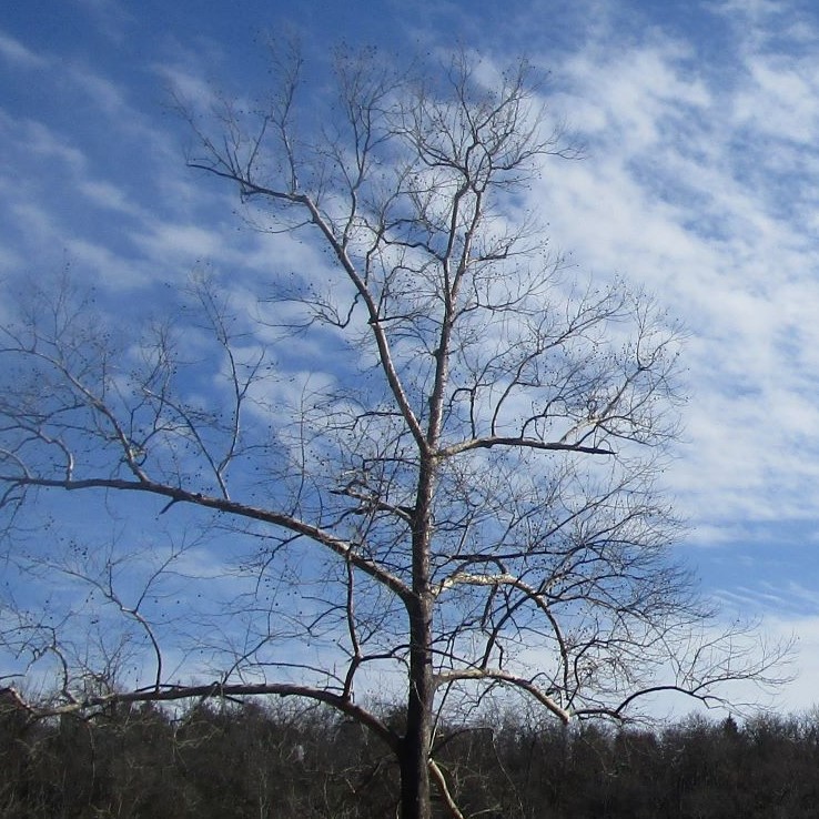
A few months ago, I had a phone conversation with my daughter while she was on a walk. As we chatted about sundry things, she said, “I just love trees. I could draw nothing but trees and never get tired of them.” I wholeheartedly agreed. In fact, I have been thinking about making a fiber object based on trees for months. To that end, I have been taking photos of the trees in their winter nakedness.

Finally I have come up with a plan and a design for the trees. And I owe it all to paper piecing with clamshells.
Non-quilters now have no clue about what I am trying to say. My apologies. But the quilters among us will recognize the context of “clamshell” and “paper piecing”. This applique shape is one of the classics. Rather than try to describe it, I direct you to Pinterest, with the instructions to search on “quilt clam shell pattern.”
Here is an example:

Cute, right? But for me, I can hardly look at this quilt WITHOUT thinking Tree Tops.
I decided to try paper piecing with clamshells after viewing a tutorial on BluPrint.com. The instructor uses the applique stitch to sew the clamshell shapes onto a tote bag.
https://shop.mybluprint.com/quilting/classes/giftable-projects-english-paper-piecing/715557
To get started, I searched for an object with a 4 inch diameter, and then drew around it until I had several clamshells.
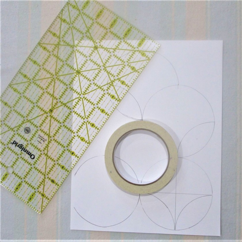
After photo copying this sheet four times on cardstock, I had enough pieces. Each applique will need one of these pieces of paper inserted to form the half-dome shape.

Next I made a thumbnail sketch to work out the size, applique placements and design.
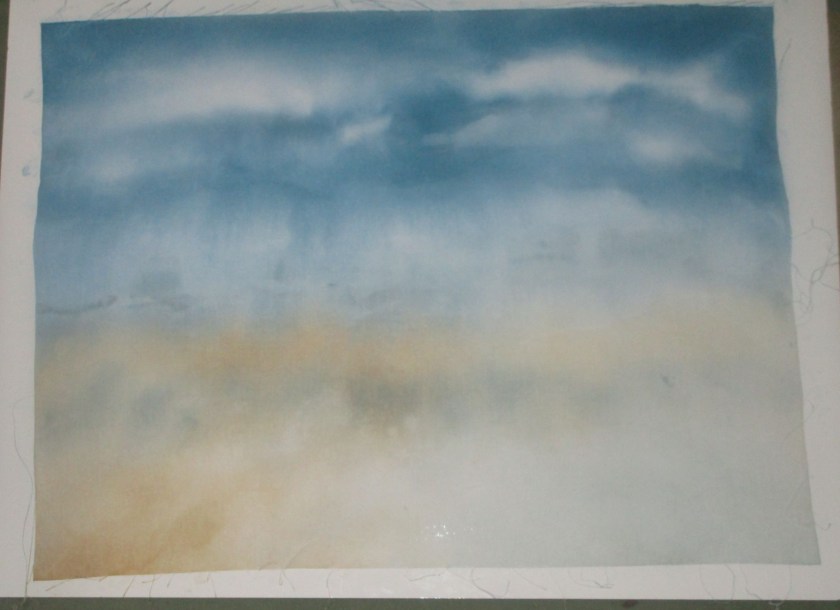
The next step was to paint the sky on white fabric. This will serve as a background and base fabric for my appliques. I used Dye-Na-Flow paint and lots of water.
At this point, I will need to practice painting the trees onto the appliques. But my mojo is flowing well, and I am excited to get this fiber object to its next stage.

