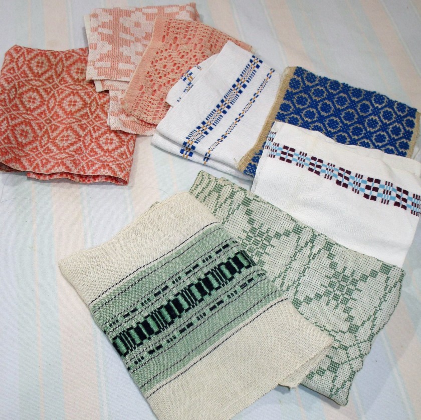
The process of making up a quilt from scratch has many challenges. One I face today is building my Stay At Home Round Robin quilt around another maker’s pieces. None of the swatches are the same size or shape. How can I fit them together?
Here’s how I went about finding an answer.
The first step I took was to get them as flat as possible. Each swatch was hemmed by hand on the warp edges to keep it from fraying. As I began carefully picking out the stitches, I marveled at the how small each was. That got me to thinking about the maker, Margaret Howard. And I began to imagine her at her cottage on the lake, where she lived three months of the year. (Since this cottage is still in the family, and I had been there several times, my imagination has lots to work with.)
I imagine that, despite the passage of years, the grounds surrounding the cottage are very little changed. There are towering trees, both deciduous and coniferous, providing lots of shade. The path through the trees to the cottage are lined with wood ferns, all the way up to the door itself.

Margaret is sitting in the main area of the cottage, sewing this hem. She has a view of the lake through a large picture window. While the trees now are quite tall and obscure this view, back then she likely could see the lake easily.
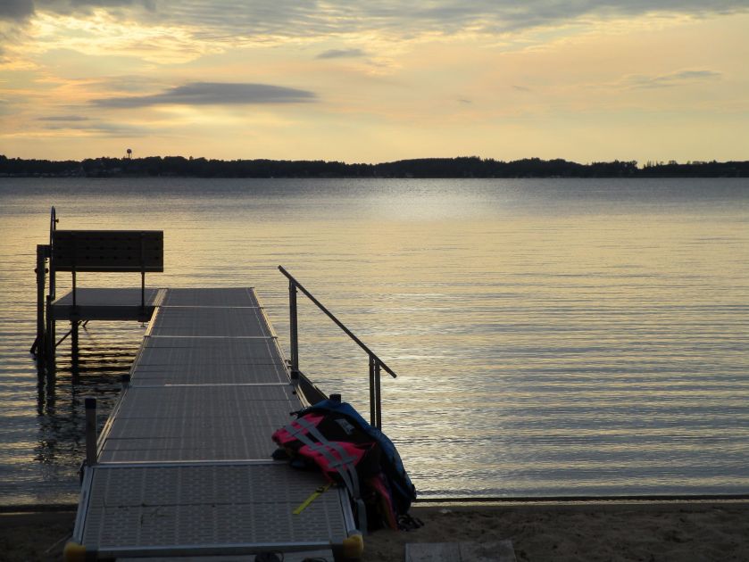
There were other families, her relatives, staying in cabins nearby. Each evening as the sun sank low, they gathered on the shore to toast the passing of the day. I feel certain that Margaret would join them. That bit of the beach is on the east side of the lake. The sun sets directly across the lake from this beach.
Having been there during one of these sunsets, it’s hard to describe exactly how beautiful it is. When the waves on the lake are gentle, one feels that the lake is bringing the colors of the sunset directly to one’s feet, like a precious gift.
Back then, the silence must have been profound.
Of course, on special occasions, or when the air is too cold, a campfire is a must.

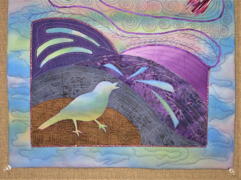
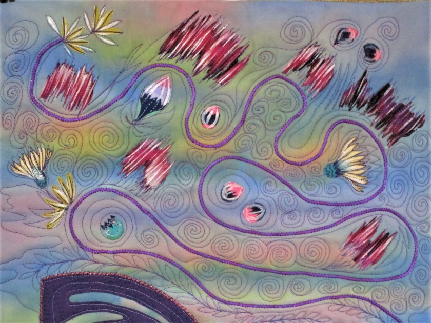
At this point in my musings, I brought these ideas together, and came up with a plan for the quilt. If you have been following this project in my earlier post, you saw that I sewed together three swatches to form the center block.
What if I divided the rest of the quilt into four sections, making a large block to anchor each section. And each section would show one of the elements enjoyed by the maker at her cottage on the lake – woods, fire, water, sky. Thinking more deeply about these elements, I realized that they corresponded to the basic elements described by ancient civilizations of the world: Earth, Fire, Water, Air.
To tie everything together, I did some research on the colors that the ancients associated with these elements:
Earth: Green and brown. Fire: Red and orange.
Water: Blue and pastels. Air: White and yellow.
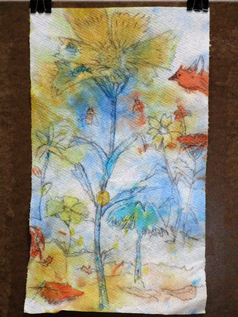
And here is my (somewhat crude) plan for the quilt, sketched in watercolor.

This is my first go at the layout. I’m not sure about the dark sashing. But there will be plenty of time to audition some other fabrics as I work along.