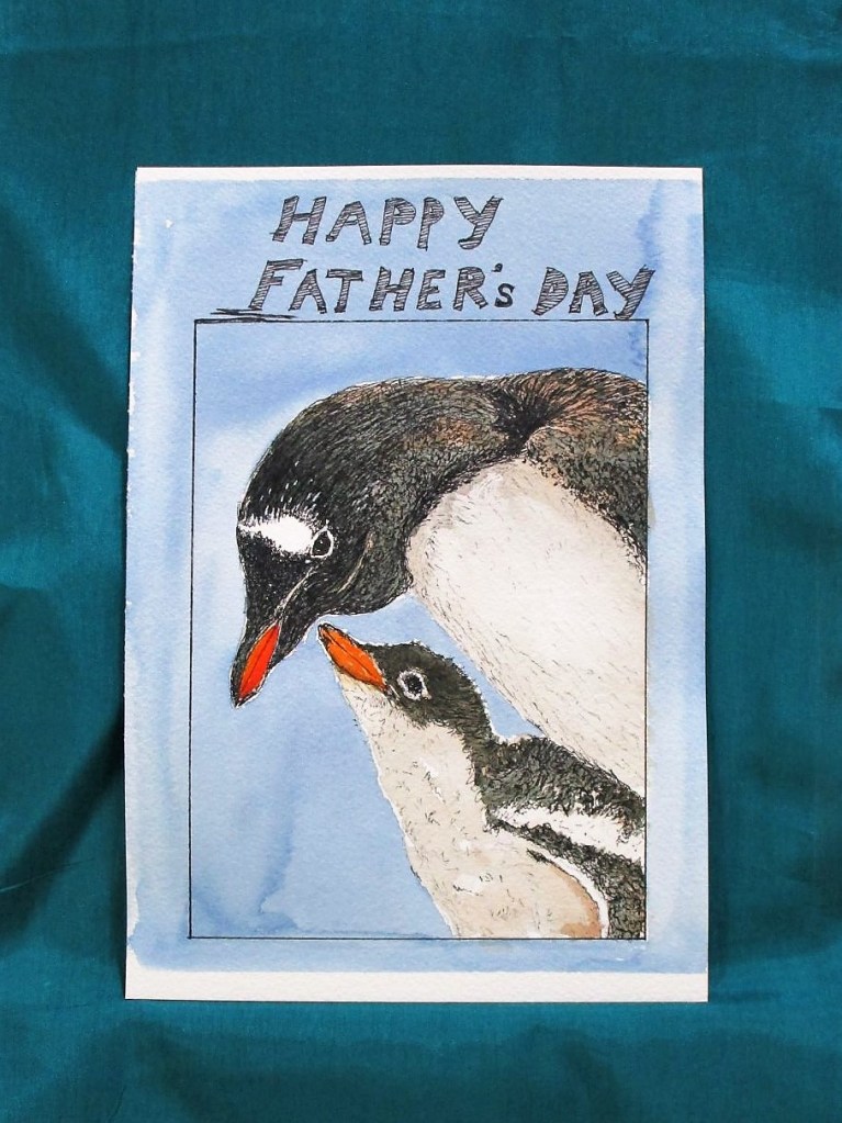
Celebrating those who stand up and stay engaged.
Thank you Bob, Bill and Cobie.
Pigma Micron pen on Arches cold press paper, with Prussian blue, burnt sienna, transparent orange, new gamboge and Dr Ph Martin bleed proof white.
Celebrating those who stand up and stay engaged.
Thank you Bob, Bill and Cobie.
Pigma Micron pen on Arches cold press paper, with Prussian blue, burnt sienna, transparent orange, new gamboge and Dr Ph Martin bleed proof white.

While rooting through the garage this week, I found this frame.
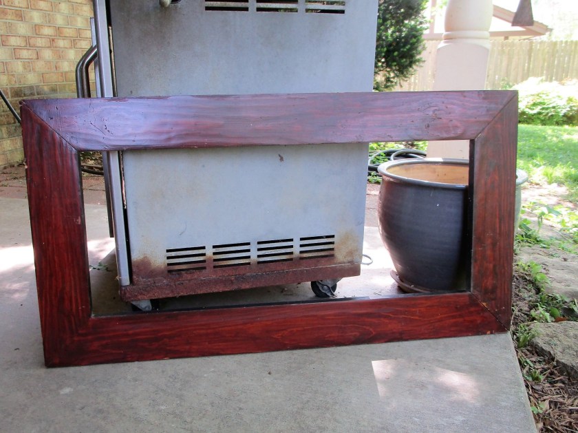
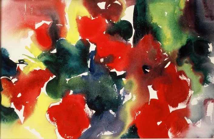
I decided that I could make a decor item for my patio, which also could hold various gardening implements on a row of hooks. But what I really wanted was to fill the opening with an abstract painting of geraniums. Something like this:
I picked up a remnant of solid white cotton twill. It seemed to be sturdy enough to stand up to outside conditions. After I washed and dried the fabric, I cut a piece approximately 3 inches wider and longer than the frame opening. Now the fun starts.
My fabric paint choices included green, emerald, red, and yellow. I mixed some violet into the yellow to make a gold color. After about twenty minutes of messing around I had a nice background painted.
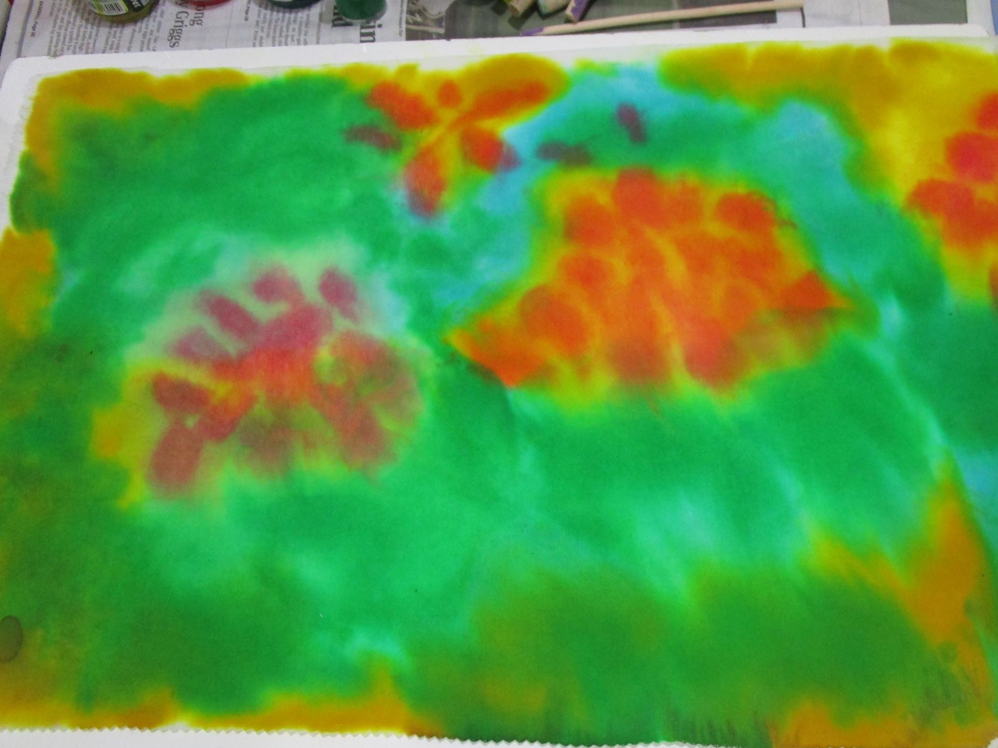
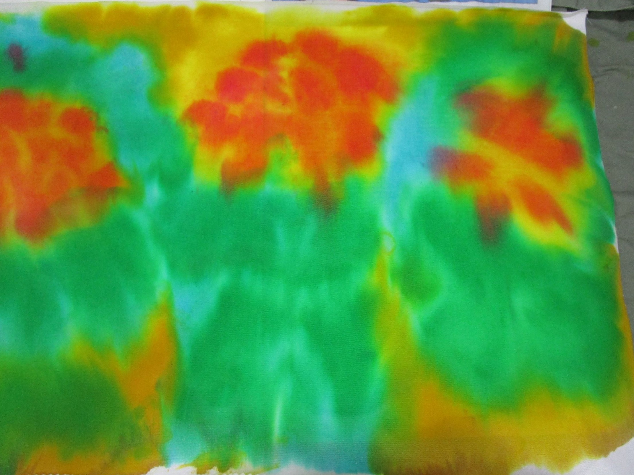
To give a little variety to the patches of color, I scrunched up the fabric.
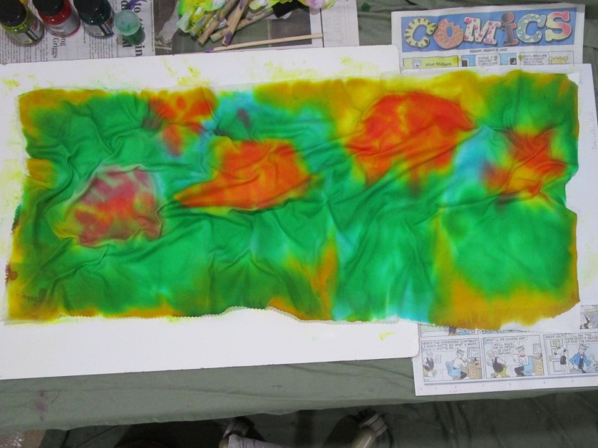
And here is my panel, fully dry and ready for further paint layers.
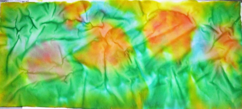
I’m excited by this result, and keen to work on this fiber object some more.

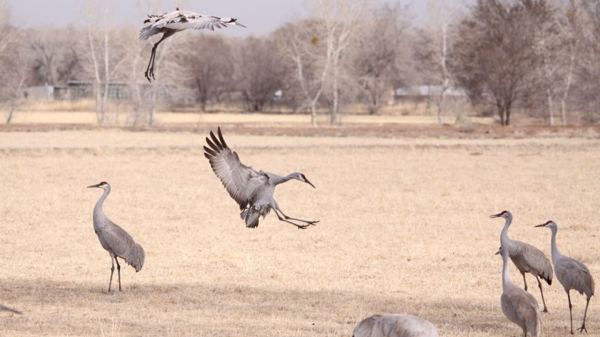
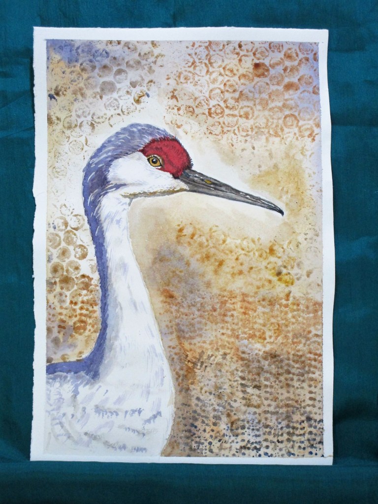
When I returned from Wisconsin last month, I made a vague suggestion about painting a watercolor of sand hill cranes. They are very impressive birds. In Madison the cranes are so acclimated to humans that they are not bothered with our presence. We even saw a couple with a dog on the leash approach resting cranes, and the birds never budged.
Because I think this will be a difficult painting, I decided to start with a simple close-up of a sandhill. This photograph was snapped by Bill. I zoomed in when did my edits.

After making a quick pencil sketch, I used the printing technique learned on Wednesday. This time I stamped the background with bubble wrap and some rug grips using three earthy colors: yellow ochre, burnt sienna and ultramarine blue.
Once that was sorted, I painted the subject. It was a simple matter to follow the lines and colors of the photograph. I was careful to leave a little white. Masking fluid allowed me to represent the wispiness of the feathers.
After a few relaxing hours I was finished.
I wish all my watercolor attempts would go this smoothly.
In addition to the ochre, sienna and blue, I used alizarin crimson, carbazole violet and a little quinacridone gold and white gouache to bring out the eye. Painted on Arches hot press paper.
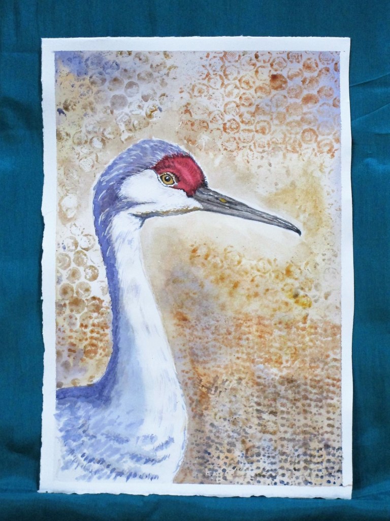
5/08 2022: Happy Mother’s Day all. I’ve been mulling about this painting for the past two days, not satisfied. It seems to me a little flat and unfinished.
So today I addressed the bits that bothered me. In the photograph, the light is strong, making crisp dark shadows and bright highlights. The light in the painting was too subtle. To fix this, I brightened areas around the face and beak with lifting and then applying white gouache. Once the highlights were as light as I could get them, I moved to increase the depth and complexity of the shadows. In particular, the gradation of the shadow along the bird’s body was inadequate. I added another layer, feathering the shadowed area over a larger section of the torso.
Finally, I looked over the background, deciding that the bright white section on top of the head just drew the viewer’s eye up and out of the picture plane. I painted it out with a wash of light tan paint that blended into the existing background color.
These adjustments may seem like not-so-much. Perhaps a big to-do about nothing.
I feel that the changes made the difference between a bland copy of a photograph and an interesting portrait with shadow, light, texture and all the compositional elements working together. To me, my crane is now more vibrant, existing in three dimensions instead of two.

Yesterday at art association weekly open studio, we had a lesson incorporating printing into a watercolor painting. We gathered various leaves from our yards. I chose some fern leaves and the soft fuzzy leaves of lamb’s ear.
There are just a few steps. First, lightly pencil in your subject. I chose to draw a vase of flowers based on my memories. The paper is wet over the background and allowed to dry to the “low gloss” stage. Next, choose a leaf and paint a few colors on it. I started with yellow, then added stripes of blue. Then the leaf is pressed onto the paper, held in place briefly and removed. In addition to pressing the two shapes of leaves wherever I wanted leaves, I used a paper doily as a stencil, painting through the holes to make a pattern in the foreground. Next, I painted on some small tulips
Here is my painting after the paint had dried, showing these steps completed.

Today I finished the painting. This involved building up color and adding some details to the leaves, the vase and the flowers.

While it is a very simple style, I will call this experiment a success.
Painted on Arches cold press paper with yellow ocher, Winsor yellow, ultramarine blue, alizarin crimson, carbazole violet, transparent orange, and viridian. A little white gouache played up the highlights.

We’ve been enjoying lots of birds in our backyard. Because it has been such a dry and cold spring, the birds seem to be spending lots of time perched on the birdbath.

All the interest in the little blue birdbath reminded me that I had started a series of watercolor paintings of various creatures that stop here to drink or bath. In particular, I want to make a large-scale painting of an imaginary scene.
In my imagination, a bird and a squirrel are having an argument over which of them gets to drink first. I had done some small sketches and paintings of squirrels. Today I am sketching a blue jay perched here, right about where the cardinal is sitting.
To get started, I turned to David Sibley’s book, What it’s like to be a bird.
One of the things I love about this guide is the watercolor paintings, done to scale, of each bird featured. I knew Sibley was a great naturalist and now I know him as a fine illustrator. Turning to his image of blue jays, I traced the life-size head of the blue jay.

Eventually, I ended up scaling it down to about 90% of life size. I then transferred the tracing to my sketchbook. Then I looked at several photographs of the blue jay, some from the internet and some from Bill’s archives. Since I couldn’t find exactly the posture I want to represent, I just took bits and pieces of different images. This could have turned into a disastrous Frankenstein of a drawing, but it didn’t.

This took about an hour and a half, the but the time was well worth it. I learned a lot by studying each part of the bird as I worked on it.
In the future, I will do a few watercolor studies of the jay and also draw a squirrel to this same scale, before combining all the pieces together in one painting.

