Posted in quilting

Work in Progress: Badlands

When I last wrote about this art quilt project, I was waiting on a delivery of fabric.

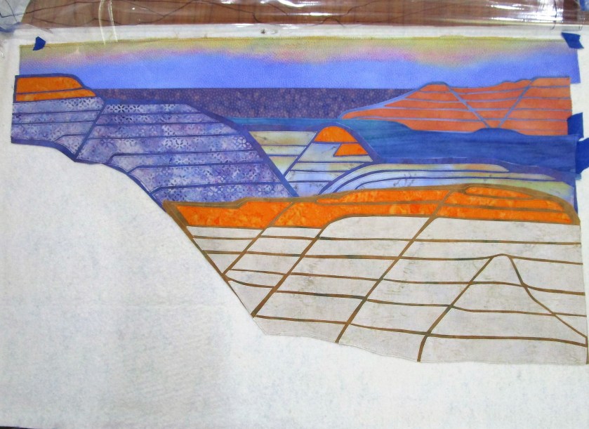
Here is what my quilt looked like at that point.

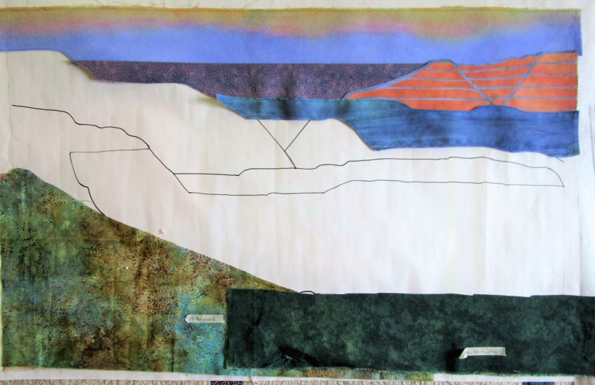
I had selected some fabrics from my stash. The sky and horizon segments had been painted and positioned. My first module of background ridges was cut-out, fused and stitched together. I liked it a lot. But it was clear to me that I needed more orange and purple fabrics to really represent the scene as I designed it.

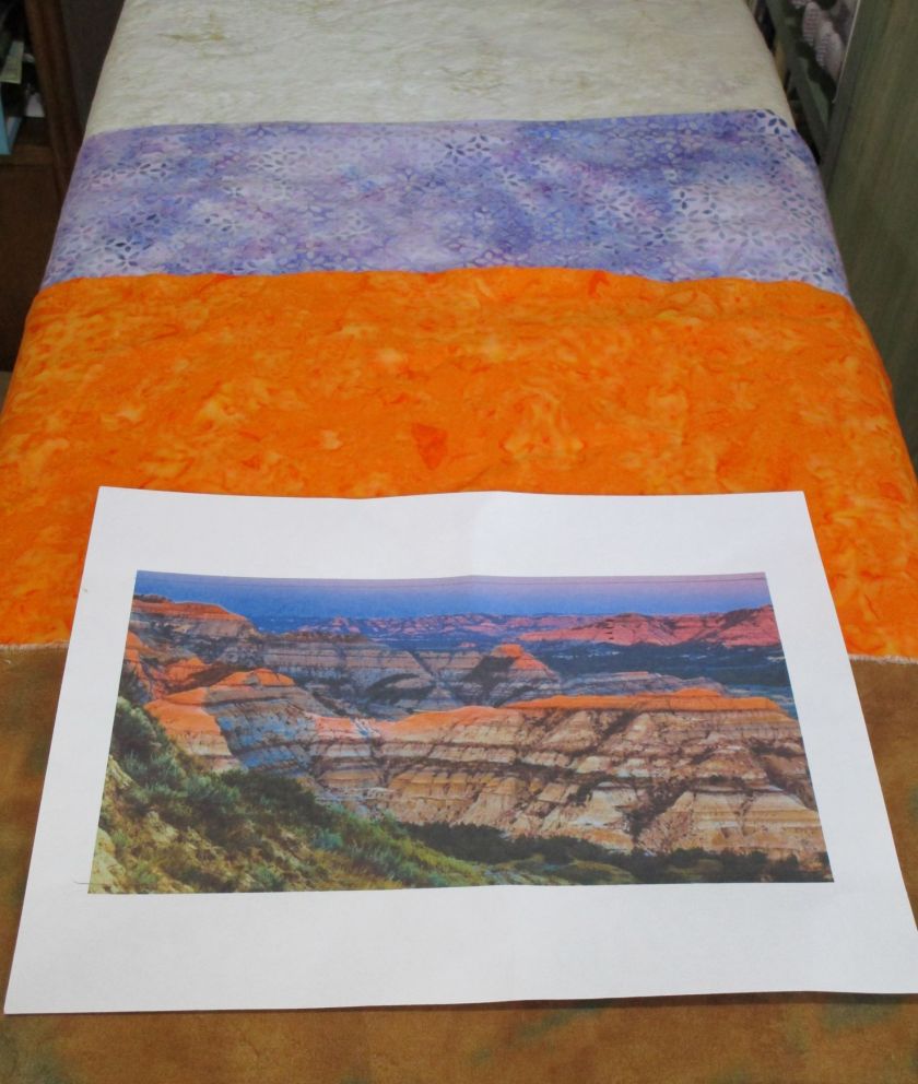
This photo shows my reference image and the three batik fabrics that arrived from Fabric.com last month. I was pretty impressed that the fabric colors looked just like they did on my computer screen.

So, full steam ahead with the work!!

Half-way assembled:

In this photo all the segments are finished and in place but one – the lower right. You see the segment’s base fabric that I plan to use.

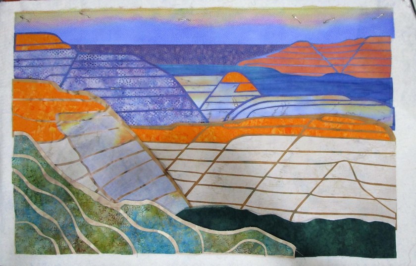
At this stage I am very encouraged, and kind of excited. The lines and colors of the work represent my inspiration very well.

After I finish sewing down and quilting the background and middle ground, I will turn my attention to the focal point and foreground. Then comes a bit more painting of details before the final assembly.

Posted in drawing

Sunday Sketching: Value Study

For over a year, I have been ruminating over an idea I have for an art quilt. It is inspired by our trip last year to Teddy Roosevelt National Park in North Dakota.

For those not familiar with the park, it is known for what’s called the Badlands. These are sedimentary rock formations that have been eroded away, displaying the different layers almost like a layer cake.

Here is an example of what I’m talking about.

The timing and circumstances of the trip were counter-productive to getting any good photographs. It was high noon in mid-July. I had no idea how hot it could be in North Dakota during the summer. To compound things, the whole western edge of the United States was on fire last year. We were about a thousand miles away from the smoke and yet haze covered the entire sky and dampened the light. Nearly all the color was washed out of the scenery. No shadows. No highlights.

Here is my best photograph in the park that day.

To get a suitable reference photo of the overlook, I resorted to the Internet. This photo was taken by Mike Hanson. It is 2017 and it must be a sunset view.

Bill added the segmenting lines so that I could scale it up to size I wanted. Using the grid method, I transferred the major shapes to paper and sketched a value study.

Very well pleased with the result, I moved on to the fun stuff: selecting a color scheme and swatching it out in watercolor. I chose a split complementary scheme focused on orange, with blue-violet and blue-green as the complements.

Now my creative juices are flowing. I’m excited to pick out some fabrics and start painting them!

Posted in painting

Happy Birthday Bill

Yesterday was dedicated entirely to celebrating my husband’s birthday.

Here we are having a photography adventure at Unity Square park.

I wonder if you can guess his age?

His favorite hobby is taking pictures, especially with the honking big lens affectionately referred to as The Hubble.

Another favorite hobby is fly fishing…………………………………………………………………….

Birthday Card – with apologies to Robert Indiana.

Posted in painting

Patio Decor – Stage Two

Back in May, I started a painting on fabric for the purpose of decorating my patio.

https://wordpress.com/post/dailyfiberfun.wordpress.com/5098

It was May, and the weather for patio-sitting was perfect. But I didn’t finish my painting – I had become obsessed with the Shell Lake Story quilt, and could think of nothing else.

Now that the quilt is finished, AND lovely patio-sitting weather has returned, I got out the fabric paints to work on stage two of the painting.

At the end of stage one, I had a 15 by 30 inch canvass with a nice background on it.

The lovely green-colored folds already looked like geranium leaves. The blank-looking orange blobs will become geranium blossoms.

Using Jacquard Textile paint in colors green, ruby red and goldenrod, I started working from the right side of the canvas to the left. Here is the painting after my first two sessions:

Only one more blossom to go. Today I finished it up,

Hm, it’s pretty obvious that I got better at painting as I went along! While the far left blossom is more carefully painted, it lacks the bright highlights of the first two. This was caused by the tone of the underpainting, which was predominately violet instead of yellow, like the other ones. The only way to fix this is to apply opaque paint. The risk in doing that is overworking the painting.

So I guess I will leave well enough alone.

My next steps are to square up the fabric and staple it to the back of the frame.