Posted in colorwork, painting

Spring Green

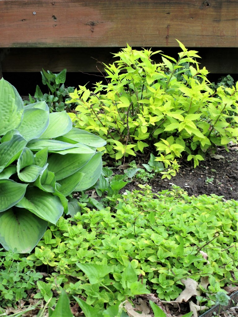
I like Spring. I like just about everything about Spring. It’s the time of year when we can sleep with windows open, the days are getting longer and warmer. The earth’s growing things burst forth with an abundance of new growth. Most of that growth starts out in a yellow-green color that I call Spring Green.

Photo by Pixabay on Pexels.com

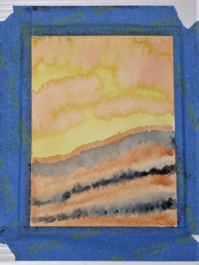
This luscious shade can be painted with a mixture of lemon yellow and cool blue pigments.

Last spring, I was inspired by a post on Kate Davies’ blog showing a view from her garden shed. The weather was wet. There were big raindrops dripping down the glass. While the view itself was out of focus, it was radiantly colored – mainly in spring green.

It was so inspiring that I tried to capture the color sequence on a piece of cotton with fabric paint.

I think I was successful. After I painted it, the piece languished on my design wall for a year. I was busy with other projects that had overtaken my attention. But with the coming of spring I feel inspired to return to the subject. The painted cloth will become the background of the art quilt. For the foreground, I will focus on seedlings.

Photo by Akil Mazumder on Pexels.com

This quilt will challenge my technical abilities as I intend to hand embroider the plantlets using wool yarn and/or cotton floss.

Slow Work is in my future.

Posted in drawing

Celebrate Equinox – Belatedly

Since I missed celebrating the equinox on the right date, I am belatedly posting pictures of spring flowers blooming in my yard. This one is the front yarn, showing multiple pansies, some grape hyacinths, and the foliage of daffodils whose blooms got zapped in the late February freeze.

Another view including late blooming daffs that just opened up this week.

Two views of the back yard.

On to more artsy subjects. I may have mentioned that I am taking a course in traditional art. It runs for ten weeks, five of which are devoted to drawing. Since I am nearly finished with the drawing portion of the course, I thought I would share some pages from my sketchbook.

Full disclosure: I am not really working very hard at this, due to other, more deadline-driven projects that have eaten away at my free time. Here are some pages with notes and examples of drawing adult and child portraits.

The first lesson was about still life drawing.

Next came portraits of children. I chose to draw three girls from a photograph I found on Unsplash.com. I was charmed by their expressions.

Last Monday, we moved on to animals. This drawing is based on a magazine photograph – probably National Geographic.

SNOW LEAPORD

It’s been pretty fun so far. There is a lot light-hearted banter, and no-one is stressing about their performance very much. From feedback I have received, I am encouraged to try more portraits. I’m also ready to have a go at drawing those frisky squirrels which make their home in our trees and regularly steal food from the bird feeders.

Posted in painting

Monochromatic Study

You may recall that I was back to experimenting in water color paint earlier this week. Working with carbazole violet, I laid down a wash and then lifted the paint back in vertical lines. Because these looked like tree outlines to me, I added some pencil lines to accentuate the effect.

Yesterday I returned to this sketch. Deciding that I would continue with one color, I started to layer up violet washes between the white lines. This went pretty well, except for the fact that some of the white trunks and branches got covered up. In my mind the painting was ruined. Instead of giving up on it, I let the paint dry and then, following the lines of the trunks, lifted up the paint to find some branches. I stroked some paint horizontally in the foreground to suggest tracks in the snow. Finally I dabbed water and dots of paint in upper area of the paper, splashed on more water and let it dry again. Now I was willing to sign this one.

GHOSTLY TREES

It’s interesting how much I am learning by doing with these little pieces. I guess it’s the idea that there is no price to pay for failure.

Only a small scrap of paper and a bit of my time.

Posted in painting

Sunset at the Wash

For my exercise, I wanted to experiment with a quinacridone gold wash. Since it is a staining pigment, I decided to pair it with burnt sienna, a granulating pigment. With the idea of a sunset, I added some splashes of alizarin crimson. Streaks of payne’s gray served to ground the image.

I love the mingling of the pigments so far. This image reminds me of a place at Tallgrass Prairie, where rushing water had torn away part of a ridge, exposing roots and strata of soil. I quickly painted in some details to complete the scene.

Later, I searched my photographs for a picture of the wash.

If I were to paint this scene again, I would include the deep shadows where the landform bends away from the viewer.

Painted wet-in-wet and wet-in-dry with a Sumi brush on 140 lb. cold press paper.

Posted in painting

A Rosy Picture

Still working with the quinacridone red wash, I decided to paint a dried-up oak leaf over the washed paper. Here is my pencil sketch, drawn from a leaf I brought home with me a few weeks ago.

My experiment today is with a wet-on-wet technique. First I used plain water stroked over sections of the leaf individually. Then I dropped in burnt sienna. After watching the brown spread out, I added drops of different colors.

Adding details, I painted in the stem, veins and a shadow. Next came a little white gouache stroked over the pale veins. And finally some brown pen outlined the edges.

This one makes me feel happy.