Posted in drawing, painting

Belize Journal – A Memory

I am returning to my Belize journal in an effort to coax from my memory the images I experienced on the return boat ride from our snorkeling outing. Memories are all I have of this experience. Because of the choppiness of the ride and the spray of the sea no cameras were in use during this part of the trip.

First, it’s important to mention that I wasn’t wearing glasses. They were stowed away so I wouldn’t lose them overboard. I believe that state of fuzzy vision contributed mightily to the dream-like quality of the experience. Here’s what I remember.

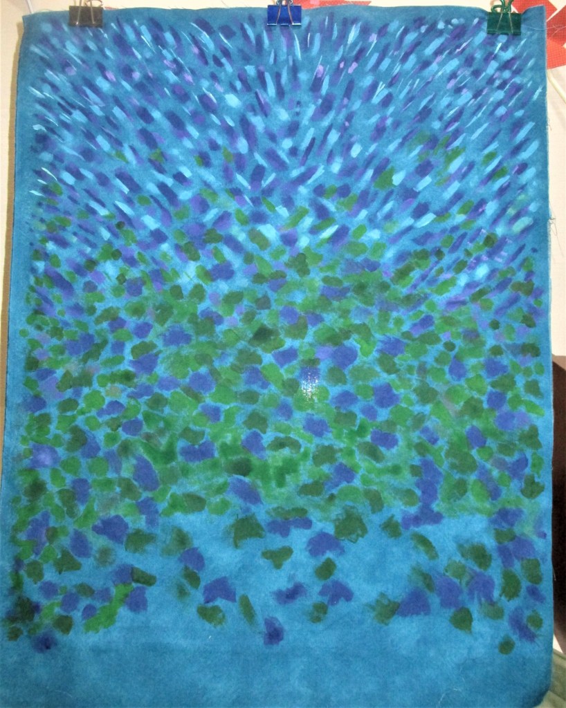
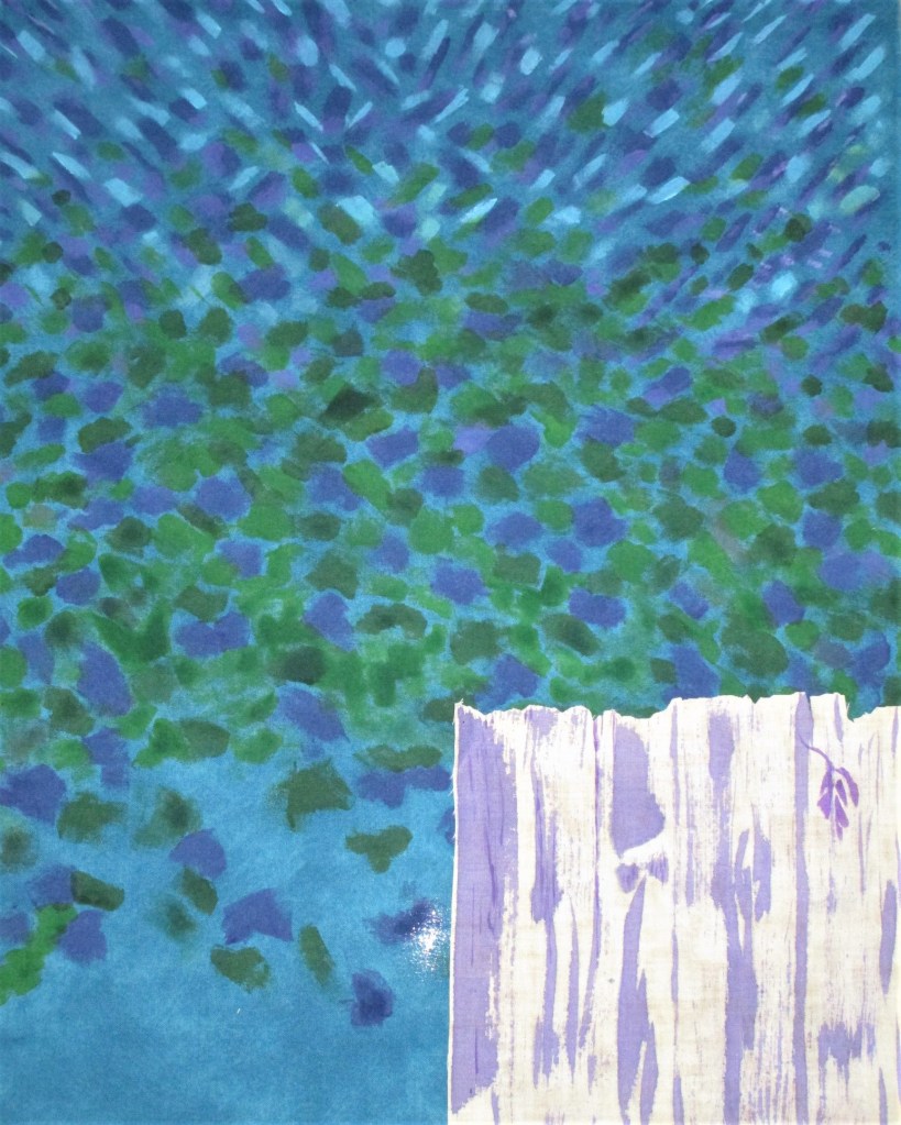
I was sitting on the port side of the boat, with my left hand to the south and my face to the west. On either side of me the sea rolled by, with bright, transparent turquoise water punctuated by amorphous, dark green forms of sea grass and coral clumps below the surface. After the first several miles had passed, I began to detect bits and pieces of the shoreline. They came in the form of striated horizontal lines, looking like a slow fade from one color to the next. First sea green, then turquoise, followed by the strip of land separating the bay from the lagoon. The land was dark, with bumpy forms of vegetation. Beyond and above that was a cool blue strip of atmosphere. Was it mist, fog or ordinary clouds? I couldn’t tell.

Eventually I detected the purplish forms of the mountains – roughly pyramid shaped, overlapping and rising from the mist. Above the mountains stretched the sky. I have no memory of its color. It could have been layered in clouds, thinning out to pale blue at the apex. Or it could have been a sky blue, pale just above the mountains, and then intensifying into deep blue in the upper atmosphere. I wish I could recall this detail.

Preliminary palette for Belize memory

This dream-like state carried on until we passed through the narrow strip and returned to the inlet from where we had started.

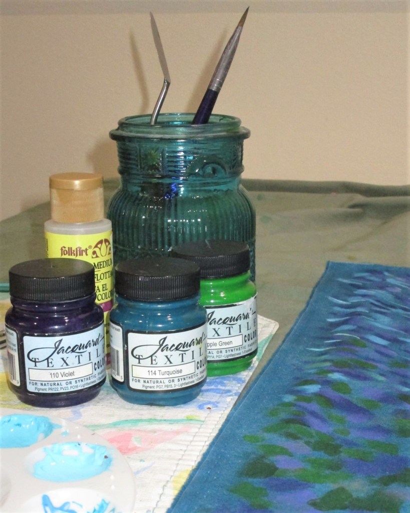
I will attempt to paint my impression. The colors are definitely more vivid to me than the shapes are. So, I plan to render the shapes in geometric, abstract fashion.

Preliminary sketch, Belize Memory

Now that I have a rough layout and some color options, I can start doing watercolor sketching. I’m pretty excited to start on this one and hope to get painting during the next few weeks. I’m also aware that the design has much potential as a fiber work.

Posted in painting

Quick Study: Winter Scene

I laid down this wash yesterday so it had plenty of time to dry. This is a weak blend of French ultramarine blue and sap green. It took mere minutes to paint.

This morning I had a firm idea of what I wanted to do. First I washed some water over the lower portion and blotted up the excess. This brightened the foreground. Using a one inch flat I brushed the sky with a stronger ultramarine wash and picked out the clouds with a tissue. The rest of the paint went on with the same brush using vertical strokes for the trees and horizontal slashes for the snow shadows.

At the end, I used the Sumi brush to work a little burnt sienna into the trees. It was this last step that caused the wonderful blooms. I love the texture that resulted.

Total time to make this impression: 15 minutes.

Pigments: Ultramarine blue, sap green, payne’s grey and burnt sienna.

Posted in painting

Channeling Vincent Van Gogh

If you read my post dated October 1, you will remember that I have a desire to make a fiber object featuring sunflowers. As a reminder, here is the photograph I took this summer that will form the basis of my design.

I got pulled off my work when I decided to make a “confetti” sample on October 1st. It was great fun, but it won’t really give me the effect I want for this background.

So today, I am back on the trail of Van Gogh. I’ve studied some of his still life paintings, enough to get a handle on how he painted those dotted backdrops. I am trying it on the background fabric I have selected. It is a mottled pattern in a Prussian blue color. Certainly, it looks painterly in its own way, but it lacks the dynamic quality I seek.

I get out my Jacquard textile paints and, with new brush in hand, start at the top of the fabric. Directional lines and dashes are what I’m going for.

Sky complete, starting on foliage background.

As I work my way down the fabric, I move from thinner lines to fatter, more blocky shapes. These represent what I see when looking at the background of my photo: mottled light and shadow of leaves, branches, etc.

Middle section painted.

I leave the bottom of the fabric blank, because the foreground is the fence. I have another piece of fabric for this element. It will be painted with a dry brush technique to portray the weathered state of the boards.

Background with my test swatch of fence fabric. I make the marks in violet paint.

I found this process quite meditative. As the fabric gets filled with splotches, one pauses, studies the work, and asks oneself: Where do I put the next mark? What is it calling for? How will I know when it’s finished?

Mr. Van Gogh might have known, but I am only guessing.