Posted in painting

Taking a Break from Quilting

The last two weeks have seen me working intensly on two quilts. One is finished (yay!) So today I am taking a break from quilting, if not from thinking about quilts.

It’s time to get more watercolor postcards painted. I have some new watercolor paper made especially for postcards that I am excited to try out.

A sample of this 100% cotton paper by Winsor and Newton was included with an order from Dick Blick. Since I liked the sample, I decided to buy this packet of 15 sheets. It seemed affordable and is the perfect size for postcards.

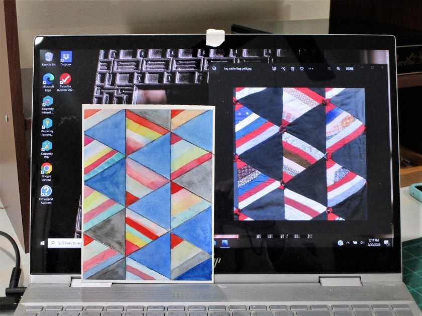
In perusing my library of reference photos, I came across an image of a quilt that really appealed to me. I described it as a log cabin flag quilt. I saved it with the idea of making a similar quilt.

But now I think it’s the perfect subject for a geometric watercolor painting.

I started by dividing my paper vertically into three columns. Determining that the angle of the flags is sixty degrees, I drew several intersecting lines. The painting process was slow and relaxed. When I was satisfied with the color, I grabbed a black watercolor pencil to reinforce the lines and darken a few of the blocks. Done.

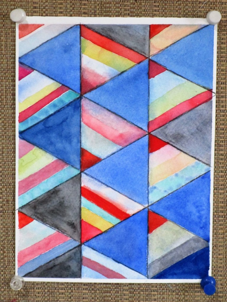
What do you think? It’s not a slavish copy, more of an interpretation. Where the quilt has patterned fabric, I chose to allow colors to mingle.

SIDE BY SIDE.

I used all my reds, which included Pyrol scarlet, alizarin crimson, quinacridone red and magenta. Blues are cobalt and prussian. Rounding out the paints were quinacridone gold and Winsor green blue shade.

Posted in painting

Finished Object Friday – Belize Memory

Comin’ frum Reef, Belize, 2021

Today I finished my first attempt to capture a feeling in watercolor.

On December 12th, I wrote this entry in my Belize journal, describing the boat trip back from the reef after snorkeling there:

“On either side of me the sea rolled by, with bright, transparent turquoise water punctuated by amorphous, dark green forms of sea grass and coral clumps below the surface. After the first several miles had passed, I began to detect bits and pieces of the shoreline. They came in the form of striated horizontal lines, looking like a slow fade from one color to the next. First sea green, then turquoise, followed by the strip of land separating the bay from the lagoon. The land was dark, with bumpy forms of vegetation. Beyond and above that was a cool blue strip of atmosphere. Was it mist, fog or ordinary clouds? I couldn’t tell. Eventually I detected the purplish forms of the mountains, overlapping each other and rising from the mist.”

I’m relatively happy with this painting. It captures the way I felt about what I saw that day. Working abstractly was an experiment. I might try to paint the scene again using a more organic style.

This is also my first painting on Arches hot press paper. It took a little getting used to. Pigments used were Winsor green, Thalo blue, Prussian blue, quinacridone gold, quinacridone red, carbazole violet and Payne’s gray.

Posted in painting

Belize Memory WIP

Since Sunday, I have painted several sample palettes for the imaginary Belize waterscape. I have also completed my first watercolor sketch. Its subject is the mountains and sky, including a little of the shoreline.

This type of work helps me learn how the different paints I have chosen behave in the mixing and glazing process. I also have narrowed my choices of colors.

And I’ve come to the conclusion that hot press paper will give a better result with this technique, so I’m off to the art supply store in search of same.