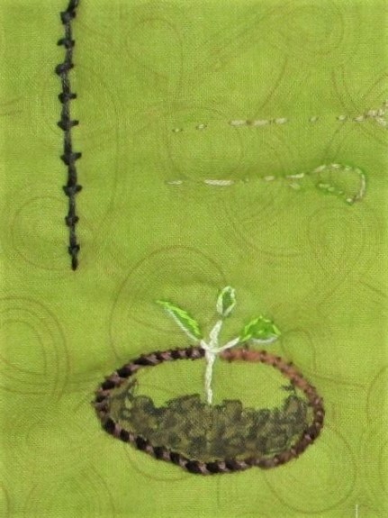
I am in the process of working out what stitches in which colors will be embroidered on to my Spring Green project. The wacky sampler you see above resulted from my random practice.
Just in case you are curious, here are the names of the stitches.
Clockwise from upper right:
Fly stitch worked in columns, Detached chain stitch, French knot on stalks (yellow flower.) I have no idea what the top left stitch is.
The goofy face on the left: running stitch (black) couch stitch (green yarn) woven back stitch (mouth)
The seedling: Stem is stem stitch, leaves are satin stitch tied with back stitch.
Black line is coral stitch. The seedling is growing from a pot outlined in couched yarn and cross stitched. The leaves are chain stitches and stem stitch. I used paint and fabric marker to add the color.
I think that’s enough for now. Time to get dinner.
I like Spring. I like just about everything about Spring. It’s the time of year when we can sleep with windows open, the days are getting longer and warmer. The earth’s growing things burst forth with an abundance of new growth. Most of that growth starts out in a yellow-green color that I call Spring Green.
This luscious shade can be painted with a mixture of lemon yellow and cool blue pigments.
Last spring, I was inspired by a post on Kate Davies’ blog showing a view from her garden shed. The weather was wet. There were big raindrops dripping down the glass. While the view itself was out of focus, it was radiantly colored – mainly in spring green.
It was so inspiring that I tried to capture the color sequence on a piece of cotton with fabric paint.
I think I was successful. After I painted it, the piece languished on my design wall for a year. I was busy with other projects that had overtaken my attention. But with the coming of spring I feel inspired to return to the subject. The painted cloth will become the background of the art quilt. For the foreground, I will focus on seedlings.
This week’s assignment is Log Cabin block. I’m a fan of this block and find it useful in improvisational quilts and as a background for art quilts. When I woke up this morning, I had a good idea for incorporating this block into my design. So I got right to work on the challenge.
Because I have not yet sewn the wonky stars border on, I can still incorporate the log cabin blocks into it. My plan is to use the pale blue fabric and the flowered batik fabric to make four log cabins and attach them in the corners of the wonky star border. For the final challenge (whatever it may be) I will use the flowered batik as my primary fabric. This will tie what has come before to what comes next. Follow along and you will see.
Here are my four log cabins.
I used a one and one half inch center and cut the light and dark strips to finish at 3/4 inch. These are three rows of each color, giving me a finished block of 6 inches – the same as my light blue star border.
Next I got out my fabric paint and added a metallic motif to each center square.
I think they look like eyes in the heavens.
Laying each block with the pale blue to the inside and the batik fabric to the outside, I get this effect:
Lower right cornerLower left corner
With the log cabin blocks done, I return to building the quilt sandwiches for the four sides. They will be about 12 inches wide each. This includes enough allowance for the quilting. At this point, I am expecting my quilt to finish out at around 60 inches square – a good size to use as a lap blanket.
Don’t forget to check in with the others who are building round robin quilts. They are showing a tremendous variety of styles and some ingenious solutions to the challenges.
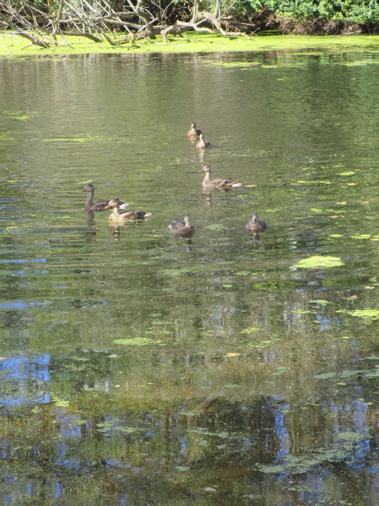
For the past couple of weeks I have been working on a new project. It’s inspired by this photo, which I captured in September at a nature reserve in Madison WI.
Mallards at Cherokee Marsh
I didn’t have any big expectations for this quick snap of a group of mallard ducks. But when I looked at it on my computer, I was captivated by the foreground – a mish-mash of colorful and spotted reflections. How might I create this look in fabric?
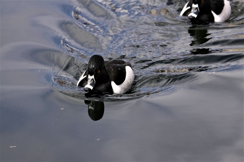
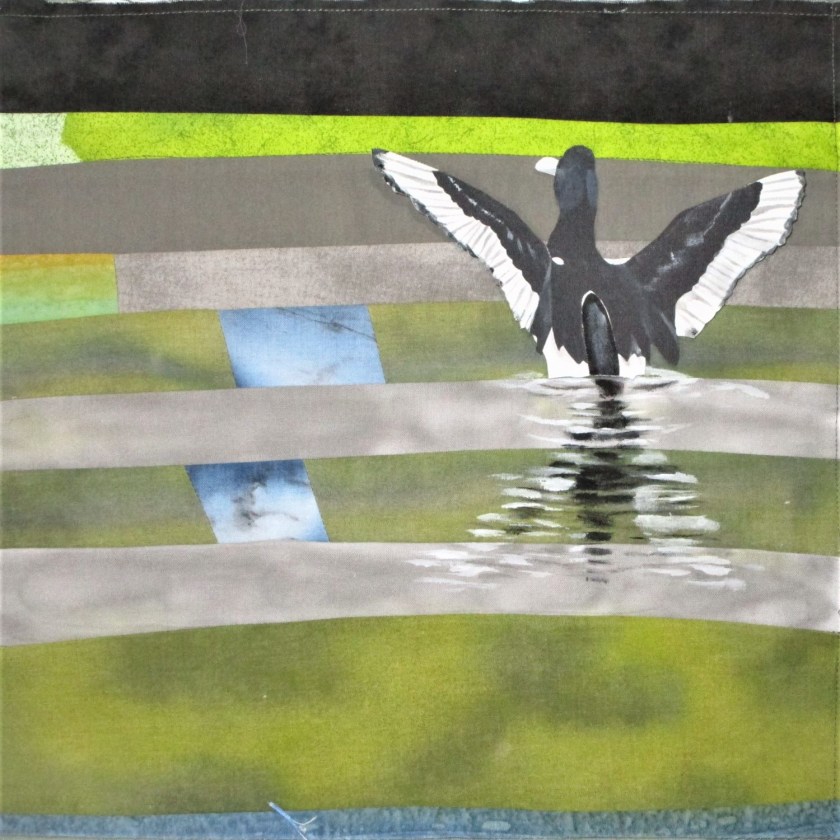
For this project I chose to use ring-necked ducks instead of mallards.
Male Ring-necked Ducks.
I love the black and white coloration and the crispness of its markings. Since this species of duck is also native to Wisconsin, I decided that it was a fair exchange.
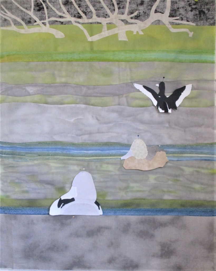
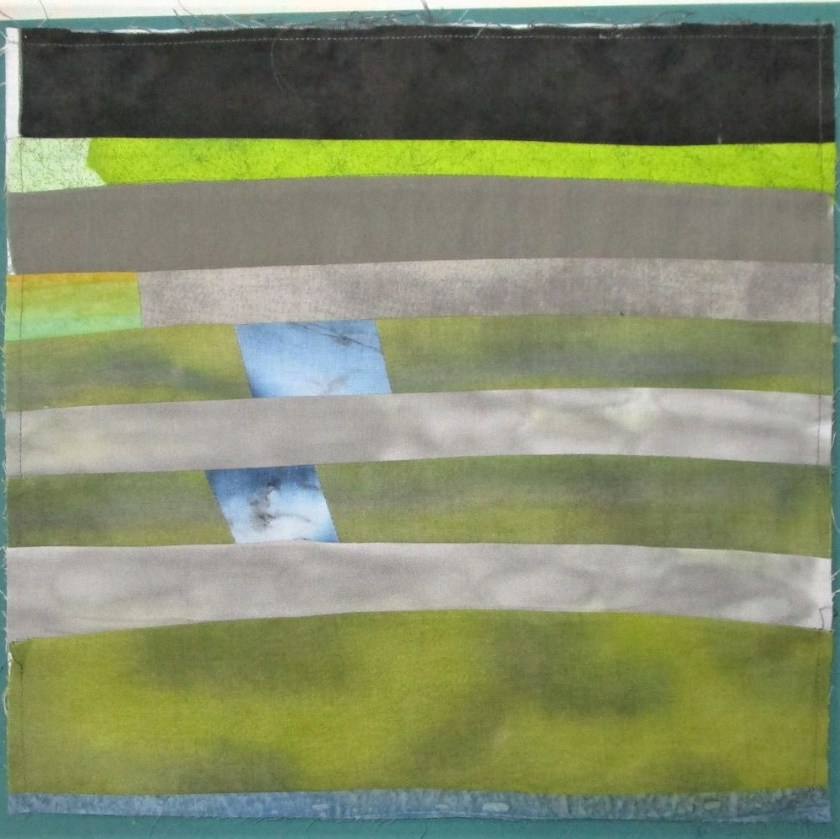
For the background, I selected some commercially printed and hand-painted fabric. these were sewn together in strips. Next I pieced together the first three ducks.
Eventually details will be painted on the ducks with fabric paint.
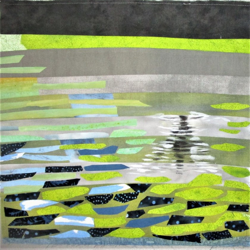
I took a pause for a few days. I want to use the confetti technique to render the mottled foreground. But this is a very new technique to me. So it makes sense to practice first.
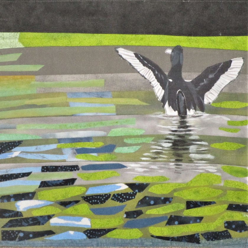
I put together an extra duck so I could practice painting his reflection.
I like the pose of this one.
The next step? Go to U-tube to watch some instructional videos on the confetti technique. I had done this already, but the second viewing helped me work up my confident. With the prepared fabric in hand, I applied fusible webbing to the backs and cut them up into pieces. For the next hour or so, I fiddled around with layout.
Practice block with reflection and confetti foreground.
Did I mention that the title of this work is “Duckweed?” I guess I forgot to say. When I was at the marsh, it was the duckweed that really caught my attention. It was growing about the pond profusely in an intensive shade of green. This is what I am attempting to depict with my confetti pieces.
I next fused the duck in place and stitched a piece of tulle over the whole sample. The purpose of the tulle is to make the quilting easier. Here is where I left off today:
I’m fairly happy with my work. But I want to try rendering the reflection in the confetti technique instead of paint. I also want to work on the shapes of the confetti pieces.
I concluded that the results were less than stellar.
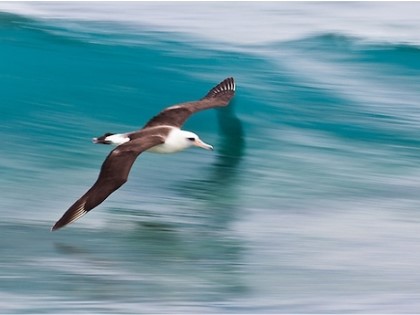
Today I am doing a side by side comparison using watercolor paint and fabric paint. My reference photo is an albatross.
I chose this because of the water background and because it would be quick to paint.
First I gave the sheet a good soaking in warm water, laid it on a waterproof board and squeegeed the excess water out. I was trying to break or reduce the amount of primer/sizing on the canvas. After it dried overnight, I cut it in half and started painting.
Colors used were cobalt blue, turquoise, paynes grey and burnt sienna. There seemed to be no difference in this result versus my first attempt. It was clear to me that the canvas had been primed with paint – probably acrylic.
Next came the textile paint. This paint is acrylic so I had high hopes. As I normally do when painting on fabric, I mixed the paint with a floating medium to thin it.
Colors were sapphire blue, turquoise, burnt sienna, gray and white. The experience of pushing the paint/medium combination around on the canvas was not pleasant. It had the consistency of snot and clumped up quite a bit. I will admit that it dried just fine and did hold some of my paint strokes pretty well.
The conclusion is that neither media gave a good result.
So I will probably abandon the canvas pad for purposes of fiber arts. Maybe some of my art association friends who work in regular acrylic paint would like to try it.


