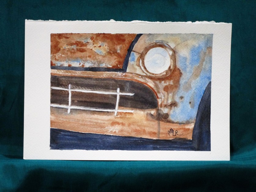
This rusty car was our assignment at the art association open studio last Wednesday. I think I got a pretty good likeness of the photograph. The hardest part was deciding when to stop.
I used a palette of raw sienna, burnt sienna, cerulean blue, cobalt blue and ultramarine blue. Painted on Fabriano Studio cold press paper.
I have just a few comments to make about this watercolor of a coleus plant.
The subject was chosen as I work to use my own photographs for reference images. The picture you see on my computer screen was taken in my laundry room. It has the best sunlight for growing plants. By aiming the camera down from above, I achieved a simple image very suitable for a small painting.
After sketching with Prismacolor water soluble pencils, I added green-gold, Thalo blue, unltramarine blue and quinacridone magenta to a 4×6 piece of Fabriano cold-press paper.
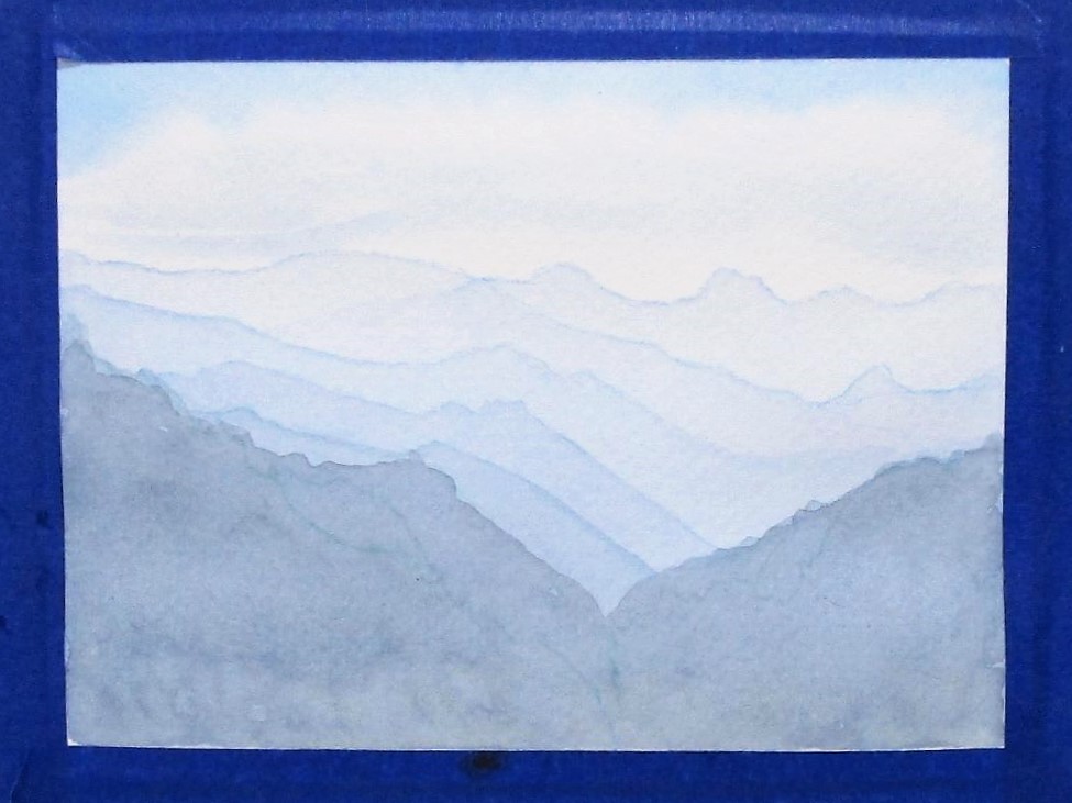
I was experimenting with an ombre effect. This took a lot of patience because I had to wait for each layer to dry fully before continuing on to the next.
This postcard featured a lot of blues including prussian, Thalo, and Payne’s grey, with burnt sienna added in the final layer.
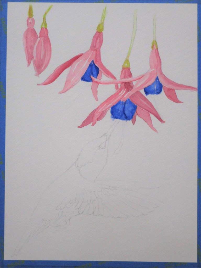
This project has been sitting around since mid May.
Back then, I sketched a picture that was a composite of two photographs: A group of fuchsia blossoms and a hummingbird.
Eventually I used this image during a class I attended on collage technique.
It was more convenient to transfer the image in reverse.
But had always intended to paint it. Today I finally finished. Here is my process:
Transfer of drawing and first wash of flowersBird body and wings painted, second wash on flowersDetails added to birdPAINTING COMPLETED
To finish it, I worked in a pale background wash, added final details to flowers and deepened the darks on the hummingbird.
This was a very good learning experience. If I were to paint it again, I would choose more transparent pigments. The cobalt blue was more granulating than I liked, and the alizarin crimson did not give a clean delicate hue on the flower petals. Instead I would use a mixture of ultramarine blue and Thalo blue and use quinacridone magenta, very thin, for the petals. I would also apply the background wash first. It was very tricky to work it around the finished flowers.
The parts I do like: The composition, the texture of the feathers and bird wings, and the shading on the petals.
I’m still playing around with quinacridone gold as a background wash. This time, I dropped in five splotches of violet, hoping to get some interesting browns.
I failed to take a photograph of the initial wash. But the results reminded me of the geranium cutting I started a few months ago.
The most striking thing about this photograph is that it is backlit. The leaves furthest from the viewer are the lightest. I really wanted to capture this impression in watercolor, and today is the day to try, using my quin gold washed paper.
I painted leaves on top of four violet blotches, and the pot over the bottom one. To make green, I added a small amount of cobalt blue to the gold. When that didn’t give me a bright enough color, I tried lemon yellow with the cobalt.
As I worked, I felt strongly that the painting was falling well short of my vision for it. But instead of giving up, I kept adding more layers, working the shadowed areas with violet and lifting paint from the highlit ones. Continuing to work, I dropped in white gouache mixed with a little lemon yellow into the background and also into some of the leaf veins. To finish, I layered a bit more gold into corners of the background.
I wouldn’t call this my best work. But something good is beginning to happen. There is a sense of shape – the lower right leaf is the best example. The varying layers of color are bringing a depth of color that is suggestive of the natural world.
I will be painting geraniums again, and soon.
Quinacridone gold, Winsor yellow, cobalt blue and carbazole violet on Fabriano Studio cold press paper.