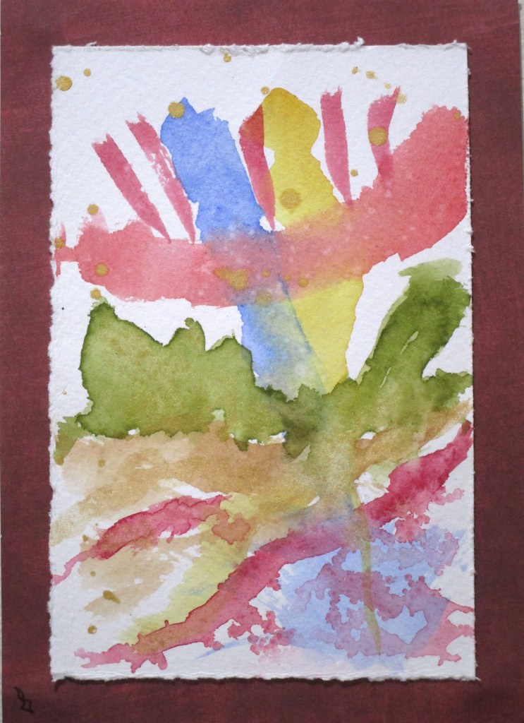
I received some new paint colors this week and it’s time to see what they look like. So I did a little free exploration.
Olive green and burnt umber have been added to my palette.
I splashed them on Stonehenge 100% cotton paper with ultramarine blue, quinacridone red, quinacridone gold, and alizarin crimson. While still wet I worked in some metallic gold.
Here I am trying out a new brush. It is a 1/4 inch dagger, very soft, and shaped like a, well, a dagger.
The paper was first splashed with water, causing the lines to break up and run down the paper. I pulled the brush through the center of the curves to carry the blue all the way down. After the paper dried, I added a few lines with extra-fine Micron pens.
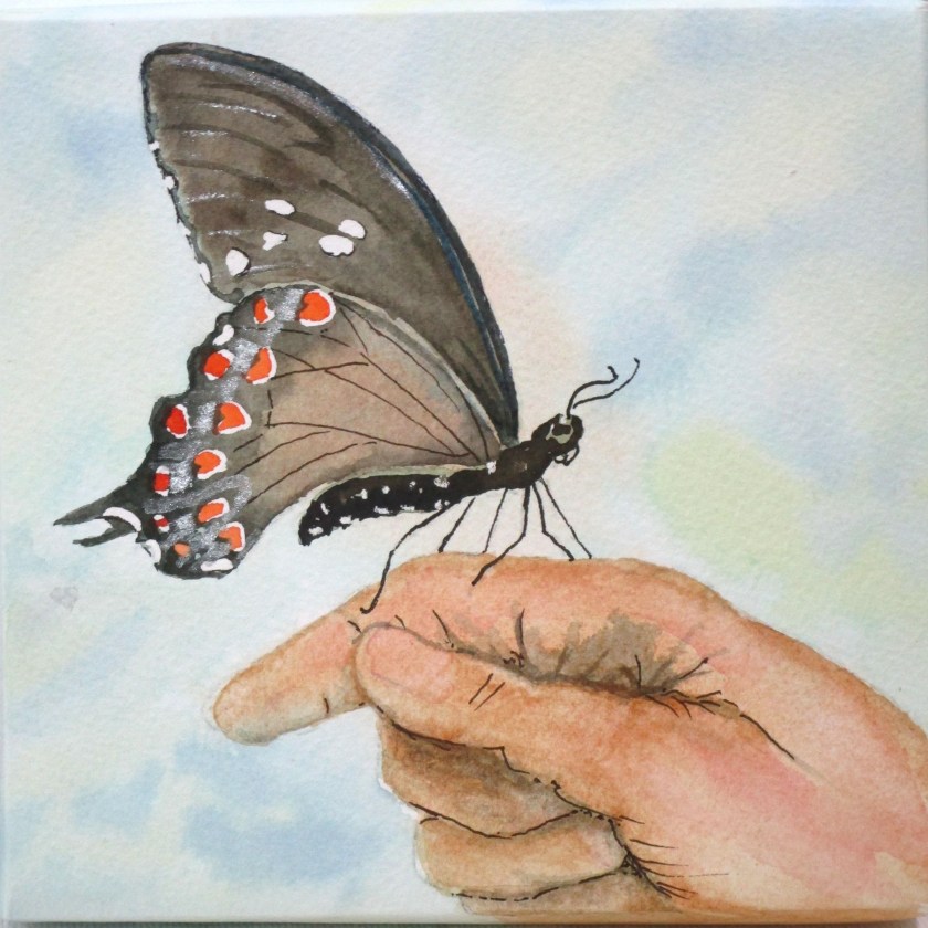
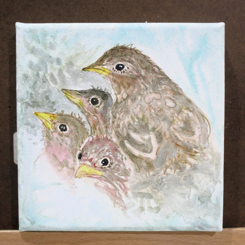
Today I have two – six by six canvases – that will be submitted for sale in October to benefit my local art association. I had fun coming up with ideas.
Last week I did two sketches. One was intended to be a traditional watercolor work. The second will start out with watercolor, but will finish out with some threadwork.
I call this work In Our Hands.
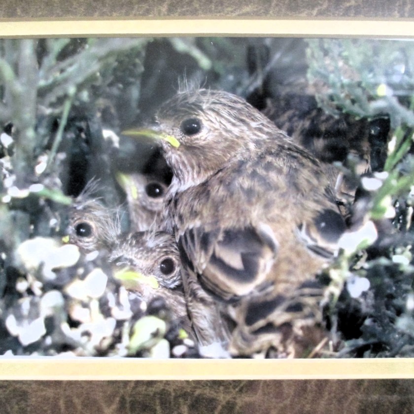
Reference photo:
Sketch:
Finished painting:
To utilize the 6 by 6 stretched canvas, I cut my watercolor paper into a 9 by 9 square. My initial wash was worked over the whole piece. After it dried, I cut it at the corners, wrapped it around the canvas, folding over flaps, which were stapled in place. I used double-face tape to press down the sides onto the canvas edges and cut off the excess. Then I proceeded with the rest of the painting.
Pigments used: Winsor lemon, quinacridone gold, raw sienna, transparent orange, Payne’s gray, Prussian blue and Winsor green, blue shade. Some silver metallic gouache suggests the pale iridescent scales of the butterfly.
For the second piece, I prepared the canvas with a product new to me: QOR Watercolor Ground. This base is supposed to transform the fabric canvas into a watercolor paper-like surface. Reviews were good, so I will give it a try.
My reference is photograph of baby birds taken by Bill.
He discovered this nest outside a busy title office inside a fake plant. What was that mother bird thinking! I call this work Tight Quarters.
Original sketch
Partially completed painting with photograph in background.
Finished painting, ready for the next step.
Painting on the watercolor ground, IMHO, was nothing like painting on paper. These sparrows look like they have a serious case of bed-head feathers. I found it almost impossible to layer my paints in a normal way. When I tried to add a glaze, the underlayers would liquify. So, I just pushed the paint this way and that to suggest the texture of the feathers. Despite the struggle, I find that these little birds have a lively character which is appealing to me.
Pigments used were Winsor lemon, quinacridone gold, raw sienna, transparent orange, quinacridone red, ultramarine blue, Prussian blue and Winsor green, blue shade.
Using my new watercolor pencils, yesterday I painted the final two panels copied from a 13th century illuminated manuscript.
Days One and Three
I’m testing the performance of this medium on cloth. If I find that the pigment doesn’t bleed or fade, I will add this tool to my fabric painting practice. Now that all four images are finished, the cloth gets dipped in soapy water……
….swished gently, rinsed and dried. I’ll admit that I left the cloth to soak for less than a minute. There was a tiny bit of yellow and red pigment dissolved into the bath water. But as I blotted the rinsed cloth, I saw no pigment transferred to the white terry towel. Happy days! The pigment is colorfast.
The absolute final test is permanence. This one can’t be rushed. I just have to use the object and see what happens over time.
Because the muslin is so lightweight, I decided to cut out the circles and applique them to quilting cotton. In keeping with the “let there be light” theme, I chose a gold ombre fabric.
For the quilt, I’ll stick with the colors of the original painting – gold, dark blue, red and teal green. I have a silvery-gray solid to use as the background.
Yesterday at art association weekly open studio, we had a lesson incorporating printing into a watercolor painting. We gathered various leaves from our yards. I chose some fern leaves and the soft fuzzy leaves of lamb’s ear.
There are just a few steps. First, lightly pencil in your subject. I chose to draw a vase of flowers based on my memories. The paper is wet over the background and allowed to dry to the “low gloss” stage. Next, choose a leaf and paint a few colors on it. I started with yellow, then added stripes of blue. Then the leaf is pressed onto the paper, held in place briefly and removed. In addition to pressing the two shapes of leaves wherever I wanted leaves, I used a paper doily as a stencil, painting through the holes to make a pattern in the foreground. Next, I painted on some small tulips
Here is my painting after the paint had dried, showing these steps completed.
Today I finished the painting. This involved building up color and adding some details to the leaves, the vase and the flowers.
While it is a very simple style, I will call this experiment a success.
Painted on Arches cold press paper with yellow ocher, Winsor yellow, ultramarine blue, alizarin crimson, carbazole violet, transparent orange, and viridian. A little white gouache played up the highlights.
For some time now, I have been noticing that partially used-up sock yarn skeins have begun to accumulate in my stash. With sock yarns most commonly sold at 100 grams (about 437 yards) it’s obvious to me that my feet and the feet of those that I knit for are below average. I can use up only about 75% of a skein in my favorite sock patterns. Thus I have left-overs. Many left-overs.
It’s time to deal with the clutter. I’m searching for patterns that are written for small amounts of multiple skeins in fingering weight. Today’s project fits that bill to a T.
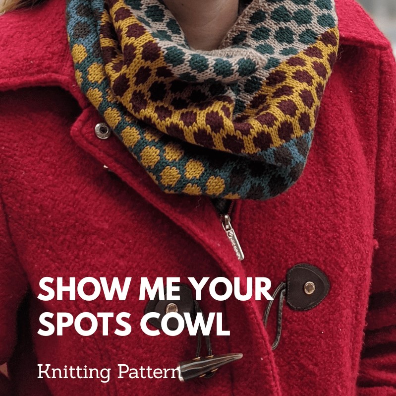
This sweet little cowl requires 3 light and 3 dark in fingering weight yarn – about 100 yards of each color. After pulling all of my leftovers out of the yarn closet, I managed to come up with six that could work.
The bowl contains a combination of Ewetopia Wisco, Cascade Heritage and KnitPicks Hawthorn. The colors don’t quite line up with those chosen by the designer. But I’m ready to give it a go WITHOUT MAKING A SWATCH FIRST. I know- this behavior is aberrant for me. It must be the summer heat getting to my brain.
You see my cast-on. I am three rows into the ten row repeat. I figure that I will know pretty quickly whether I’m going to like this or not. But then again, it probably doesn’t matter if I like it. I will likely give the cowl as a holiday gift to a loved one who lives in a colder climate.
Full steam ahead!
If you like the pattern, it can be found here on designer Lauren Savidge’s blog:
FOLLOW UP: As I worked through this pattern, I realized that it had an error. The picture and the dimensions seem to indicate that the 10 row polka-dot pattern was knit twice in each color combination. The pattern did not say to repeat the pattern before switching colors. Now I used the pattern as it appeared in her blog, so maybe the pattern you can purchase has been corrected.