Posted in painting

Update on my Watercolor Journey

It’s been over a month since I worked in watercolor paint. I’m disappointed in myself for dropping out of a self-imposed daily practice. Even though I am busy with two quilts, the desire to improve my painting skills is ever present. It’s time to pick up my brush again.

To that end, I signed up for a 10 week program of in-person art classes. The instructor is Ross Meyers, who is offering the classes at our local art association. After my first lesson (drawing), I got all ambitious again, remembering that I wanted to paint some snow scenes this winter.

Winter Woods

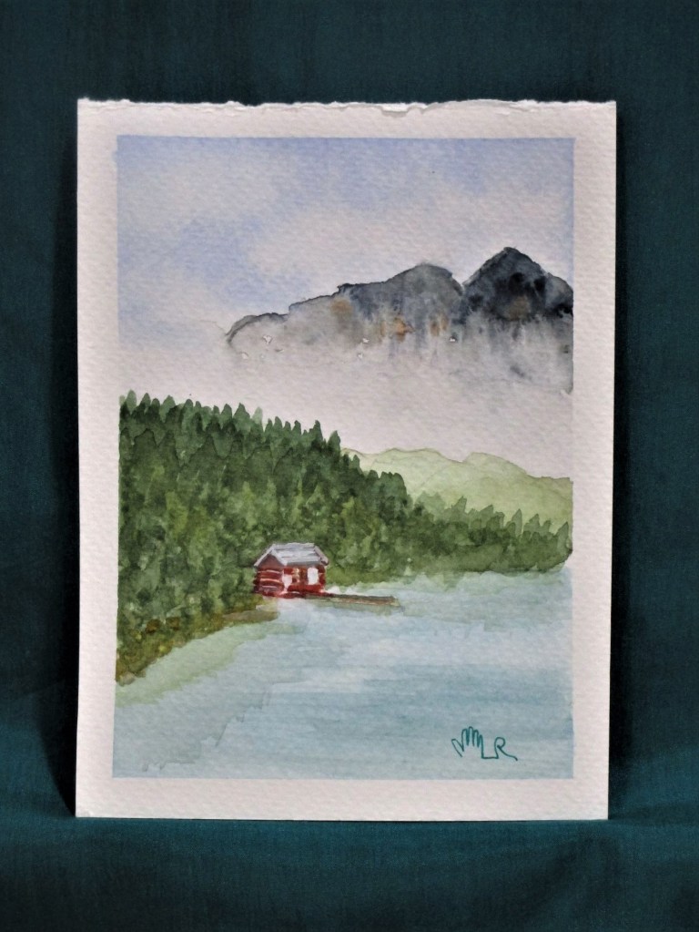
You may recall that I am working on 4 by 6 inch pieces of Fabriano Studio cold press paper. In this little painting I am practicing with carbazole violet. I like the way that shadows on the snow pick up cool hues of blue and violet. The reference photo I am looking at is by Catherine Arcolio, who posts under the name Leaf and Twig. In her posts she combines beautiful photography with a brief poem.

The Two Of Us – leaf and twig (wordpress.com)

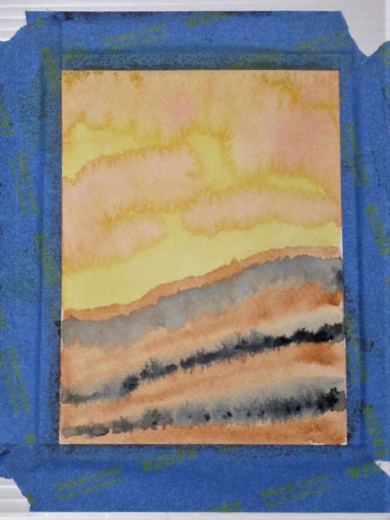
The second painting is another experiment with violet. I laid down a graduated wash and let it soak in briefly. Then with a rigger brush, I lifted the paint vertically.

The resulting image reminds me of snow blown onto tree trunks. I added some pencil marks to accentuate this impression.

For the next layer, I will come back with full strength violet and a rigger brush to make grasses in the foreground. I will use a dry brush technique and maybe some black paint to further refine the tree trunks.

After my next art lesson, I’ll write about what I am learning, and whether I think it is worthwhile.

Posted in painting

Foggy Mountain Retreat

Lately I’ve been viewing a lot of images of mountains in the fog. It was time for me to paint my own.

The trick is to paint the mountains on dry or slightly damp paper, then flood the area just under them. The water pushes the pigment away.

French ultramarine blue, cobalt blue, Payne’s grey, burnt sienna, quinacridone gold and scarlet lake. Cold press Fabriano Studio paper.

Posted in painting

Sunset at the Wash

For my exercise, I wanted to experiment with a quinacridone gold wash. Since it is a staining pigment, I decided to pair it with burnt sienna, a granulating pigment. With the idea of a sunset, I added some splashes of alizarin crimson. Streaks of payne’s gray served to ground the image.

I love the mingling of the pigments so far. This image reminds me of a place at Tallgrass Prairie, where rushing water had torn away part of a ridge, exposing roots and strata of soil. I quickly painted in some details to complete the scene.

Later, I searched my photographs for a picture of the wash.

If I were to paint this scene again, I would include the deep shadows where the landform bends away from the viewer.

Painted wet-in-wet and wet-in-dry with a Sumi brush on 140 lb. cold press paper.

Posted in painting

Quick Study: Winter Scene

I laid down this wash yesterday so it had plenty of time to dry. This is a weak blend of French ultramarine blue and sap green. It took mere minutes to paint.

This morning I had a firm idea of what I wanted to do. First I washed some water over the lower portion and blotted up the excess. This brightened the foreground. Using a one inch flat I brushed the sky with a stronger ultramarine wash and picked out the clouds with a tissue. The rest of the paint went on with the same brush using vertical strokes for the trees and horizontal slashes for the snow shadows.

At the end, I used the Sumi brush to work a little burnt sienna into the trees. It was this last step that caused the wonderful blooms. I love the texture that resulted.

Total time to make this impression: 15 minutes.

Pigments: Ultramarine blue, sap green, payne’s grey and burnt sienna.

Posted in painting

A New Paper

Last week my order from Jerry’s Arterama arrived just in time. I had run out of watercolor paper. Here is my choice:

I was convinced to try this particular paper by a video demonstration from manufacturer. While the cotton content is only 25%, it was described as the next best thing to 100% cotton at less than half the price. If I use 1/2 a page per exercise, my daily cost for paper will be .25 cents.

So how did my first try go?

This is a gradient wash using Thalo blue. I didn’t get it as gradual as I would have liked, but I found it acceptable for my purpose. For the next one, I used a Sumi brush to manipulate the wash more while spreading it over the wet paper.

I really like this effect. The flares, or blooms, of pigment near the top of the paper suggest flowers to me. So I chose to paint poppies.

I probably spent about 45 minutes on this – 2 times longer than my allotted 15 minutes. What I like about this painting: By using a lot of water and working with the shapes left on the background wash, I achieved an impressionistic look. I was also able to make some nice shadows and highlights. What I don’t like: My brushstrokes are hesitant and a bit fussy. And the darks could be darker.

To evaluate this paper, I will need to paint on it a lot more. My initial impression is satisfaction. It didn’t buckle and it stayed wet an acceptable period of time.