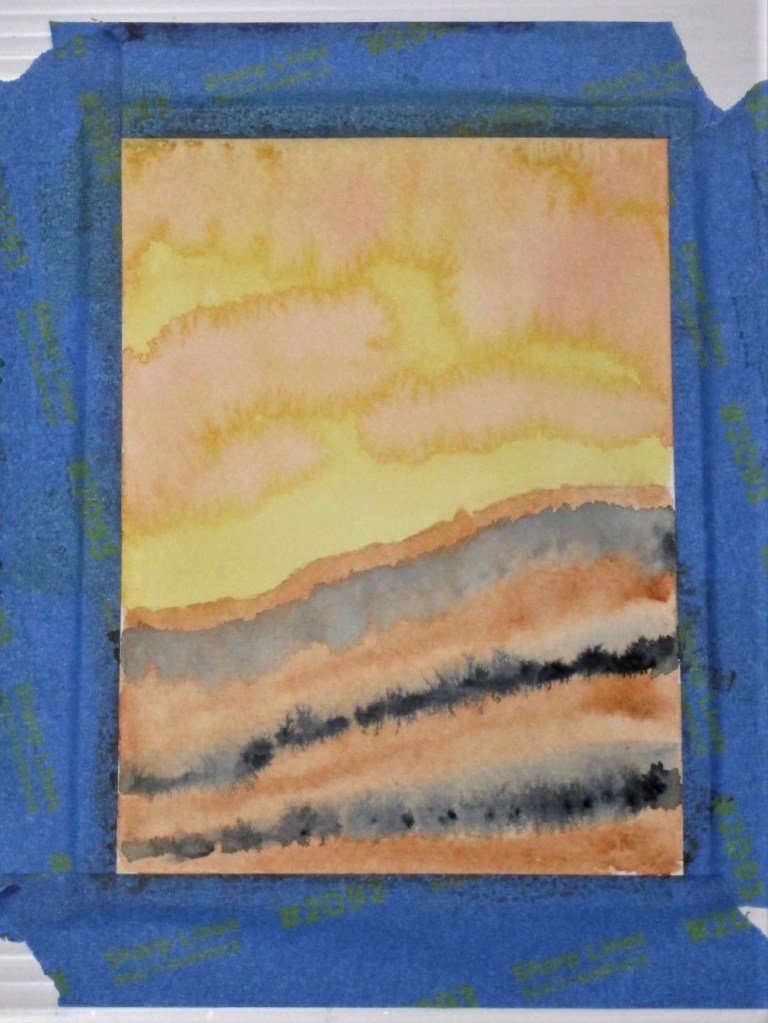
For my exercise, I wanted to experiment with a quinacridone gold wash. Since it is a staining pigment, I decided to pair it with burnt sienna, a granulating pigment. With the idea of a sunset, I added some splashes of alizarin crimson. Streaks of payne’s gray served to ground the image.
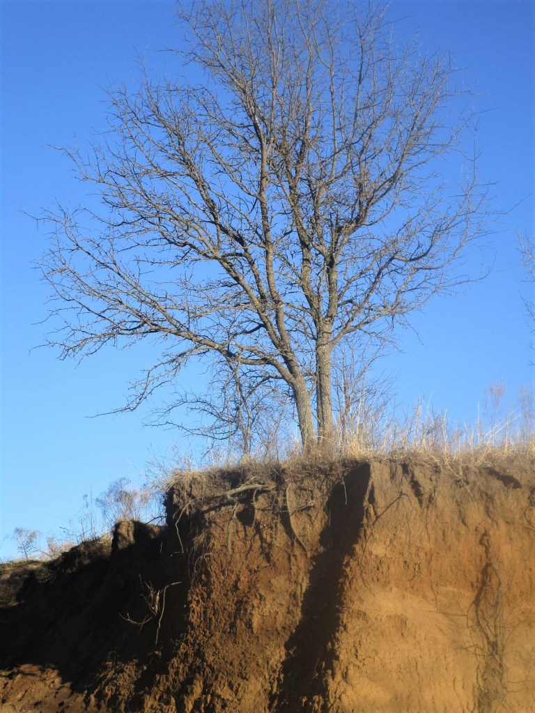
I love the mingling of the pigments so far. This image reminds me of a place at Tallgrass Prairie, where rushing water had torn away part of a ridge, exposing roots and strata of soil. I quickly painted in some details to complete the scene.
Later, I searched my photographs for a picture of the wash.
If I were to paint this scene again, I would include the deep shadows where the landform bends away from the viewer.
Painted wet-in-wet and wet-in-dry with a Sumi brush on 140 lb. cold press paper.
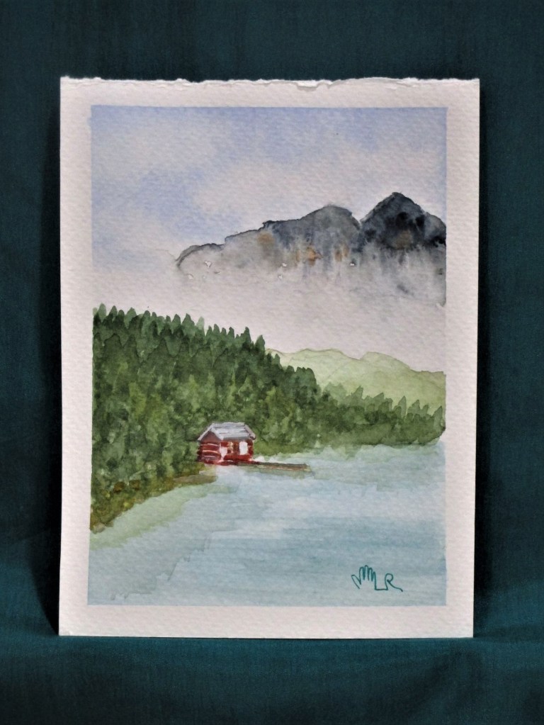
I laid down this wash yesterday so it had plenty of time to dry. This is a weak blend of French ultramarine blue and sap green. It took mere minutes to paint.
This morning I had a firm idea of what I wanted to do. First I washed some water over the lower portion and blotted up the excess. This brightened the foreground. Using a one inch flat I brushed the sky with a stronger ultramarine wash and picked out the clouds with a tissue. The rest of the paint went on with the same brush using vertical strokes for the trees and horizontal slashes for the snow shadows.
At the end, I used the Sumi brush to work a little burnt sienna into the trees. It was this last step that caused the wonderful blooms. I love the texture that resulted.
Total time to make this impression: 15 minutes.
Pigments: Ultramarine blue, sap green, payne’s grey and burnt sienna.
Last week my order from Jerry’s Arterama arrived just in time. I had run out of watercolor paper. Here is my choice:
I was convinced to try this particular paper by a video demonstration from manufacturer. While the cotton content is only 25%, it was described as the next best thing to 100% cotton at less than half the price. If I use 1/2 a page per exercise, my daily cost for paper will be .25 cents.
So how did my first try go?
This is a gradient wash using Thalo blue. I didn’t get it as gradual as I would have liked, but I found it acceptable for my purpose. For the next one, I used a Sumi brush to manipulate the wash more while spreading it over the wet paper.
I really like this effect. The flares, or blooms, of pigment near the top of the paper suggest flowers to me. So I chose to paint poppies.
I probably spent about 45 minutes on this – 2 times longer than my allotted 15 minutes. What I like about this painting: By using a lot of water and working with the shapes left on the background wash, I achieved an impressionistic look. I was also able to make some nice shadows and highlights. What I don’t like: My brushstrokes are hesitant and a bit fussy. And the darks could be darker.
To evaluate this paper, I will need to paint on it a lot more. My initial impression is satisfaction. It didn’t buckle and it stayed wet an acceptable period of time.
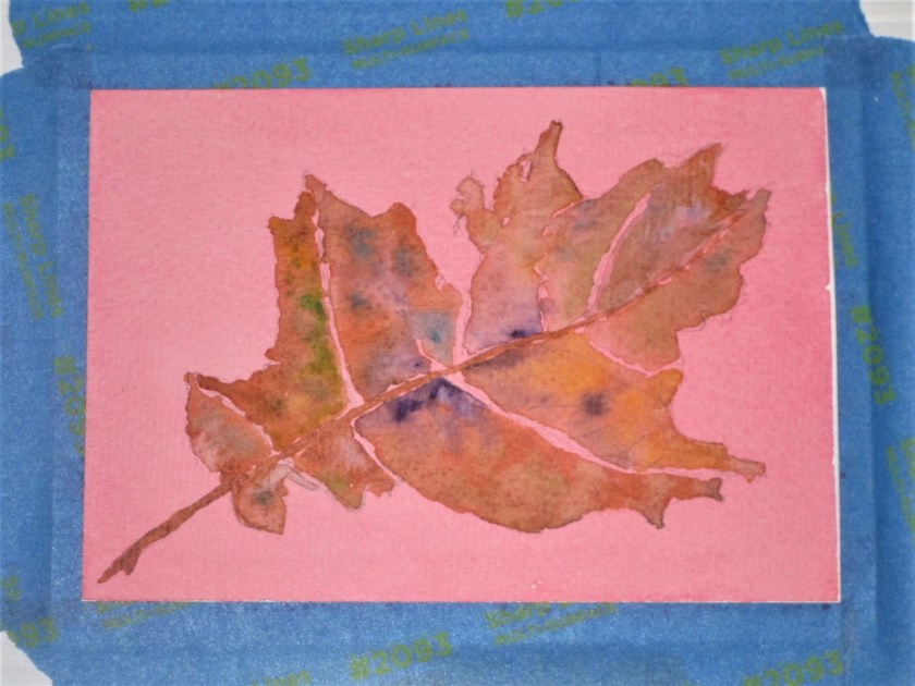
Still working with the quinacridone red wash, I decided to paint a dried-up oak leaf over the washed paper. Here is my pencil sketch, drawn from a leaf I brought home with me a few weeks ago.
My experiment today is with a wet-on-wet technique. First I used plain water stroked over sections of the leaf individually. Then I dropped in burnt sienna. After watching the brown spread out, I added drops of different colors.
Adding details, I painted in the stem, veins and a shadow. Next came a little white gouache stroked over the pale veins. And finally some brown pen outlined the edges.