Posted in collage, painting

A New-to-me Design Tool

When it comes to my painting practice, I have been in a months-long drought. While knitting like a demon, I have not been inspired to paint, either on watercolor paper or fabric, since the completion of the Oregon Native quilt in early August.

That ended after reading a post by Just Sketching, in which he describes a compositional tool that blows the “rule of thirds” completely out of the water. It is called the Harmonic Armature. This tool takes the rule of thirds to the next level. In the rule of thirds, the designer/artist divides the picture plane into three more-or-less equal parts, both horizontally and vertically. The goal is to organize the major elements to intersect one or more spots where the lines cross.

I have no trouble understanding and using this rule, but I always am left with questions about how best to lay out the rest of my composition.

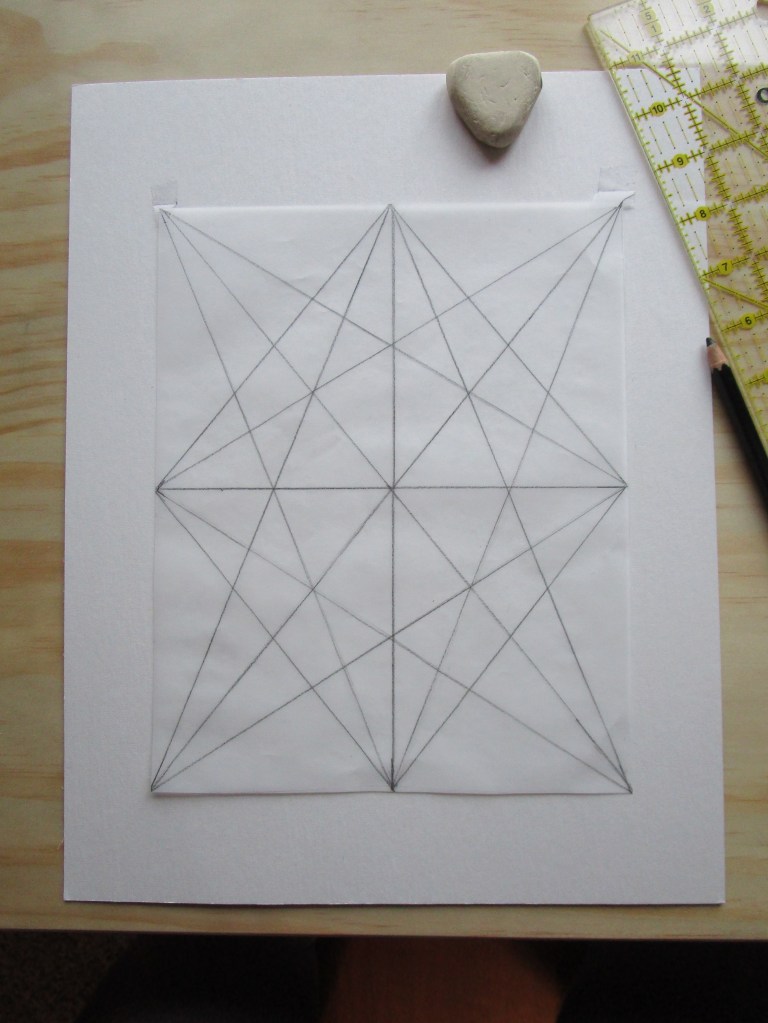
Now look at the Harmonic Armature
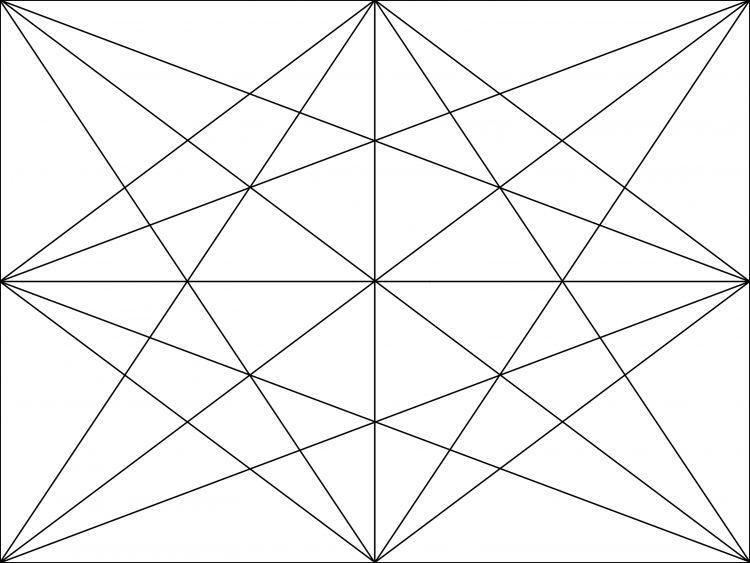
The four dots are clearly visible, but there is so much more. To get an idea of how this tool is used, have a quick listen to this video by Diante Jenkins.

I had to try this right away, so I started searching through some of my old paintings. I found one based on an excellent photograph that I did five years ago, in my early days working with watercolor paint.
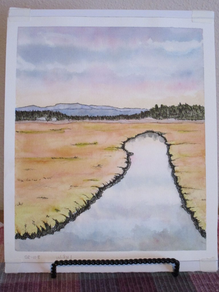
I like how it turned out, but it always struck me as too empty. This past summer, I took it to a workshop I attended on making transfer prints with a laser jet printer. I transferred a photocopy of the painting to a cradled plywood board. Then I didn’t know what to do with it . I decided to add collage to it. What it needed was something alive – like birds. But where to put them?

First, I drew the HA on an 8×10 piece of tracing paper.
Next, I thumbed through some magazines and cut out various shapes of birds in dark colors. I also found some silhouetted figures in the magazine, which could work in my new design, so I cut these out.

After taping the armature over the print, I carefully slipped my cut-out shapes into place, taking advantage of the converging lines and focal points visible on the tool.
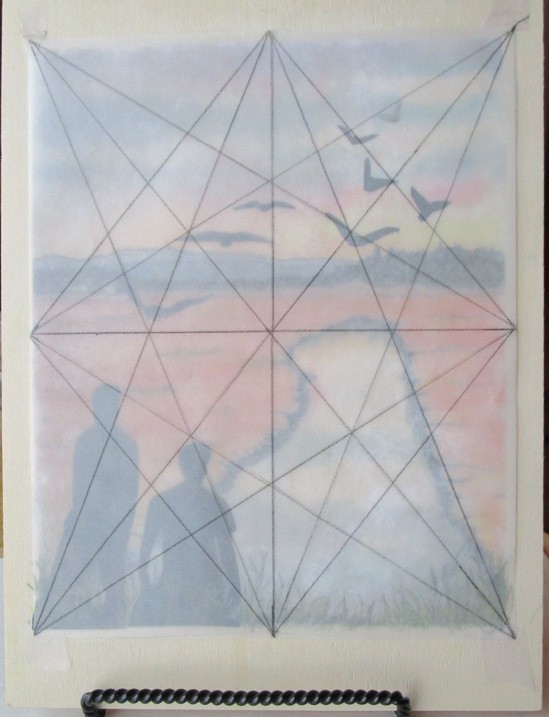
Once the glue dried, I added a few colored pencil marks to blend the silhouettes with the foreground.
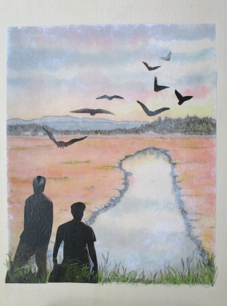
It was a delightfully spent afternoon.

Now I am keen to get out my unfinished watercolors and see how I can move them to the finish line inspired by my new tool.

Posted in knitting, painting

Friday Finishes (Yes, two!)

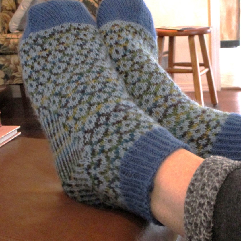
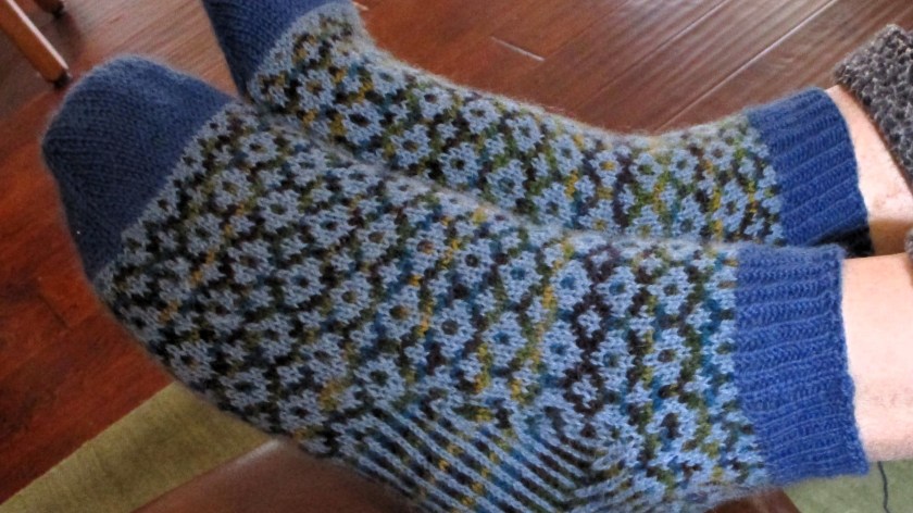
It’s been a pleasant and productive week for me. You see in the image that I have finished the second sock of the Mary Delany pattern.

This is the first time I have stranded two yarns across the heel. For the past few years I have been seeking construction techniques that reinforce the areas of the sock foot which always get holes. Logic tells me that two strands are stronger than one.

I used one blended yarn and one all-wool yarn. Fiber content includes acrylic, alpaca and sheep’s wool. Time will be the measure of success in this test of tensile strength!

The pattern is by Kate Davies, and I will again insert the link to it. I must confess to substituting another Fair Isle pattern for the pattern’s. Your results will vary.

https://www.ravelry.com/patterns/library/mary-delany

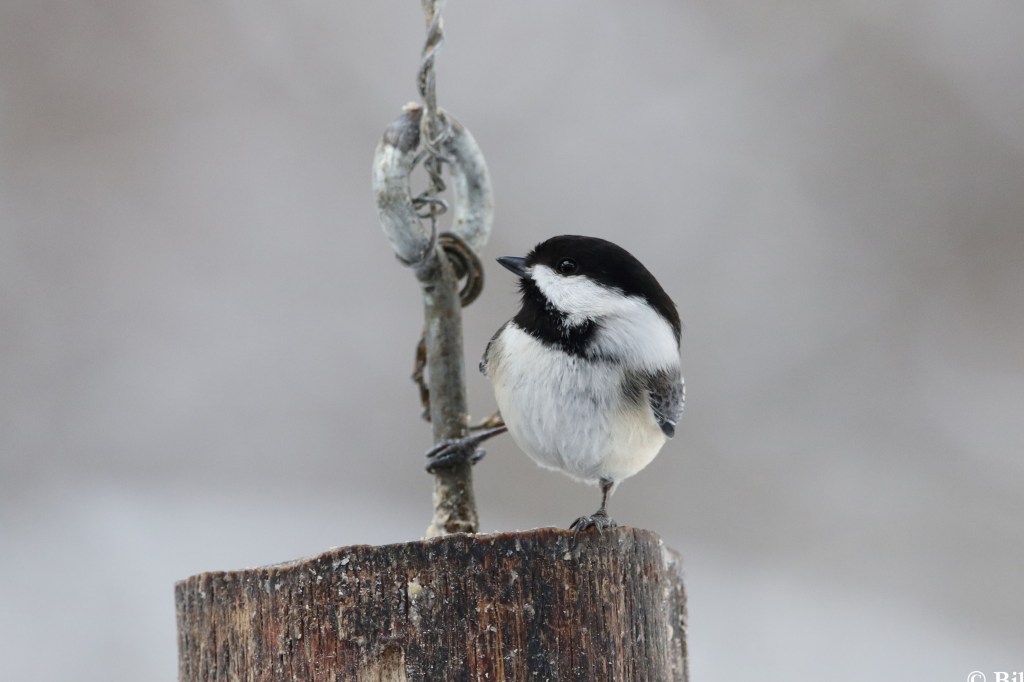
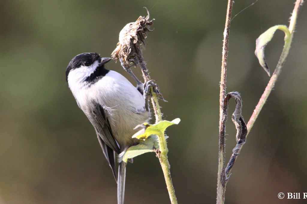
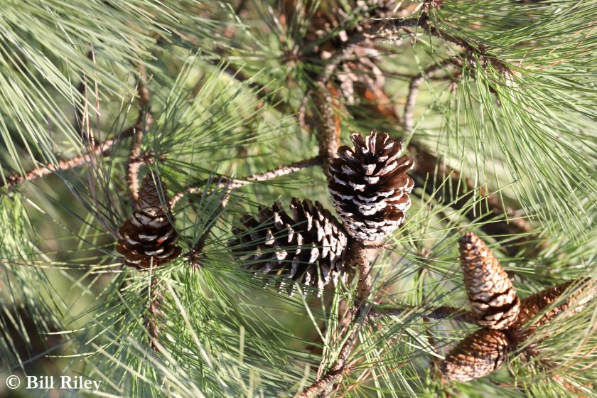
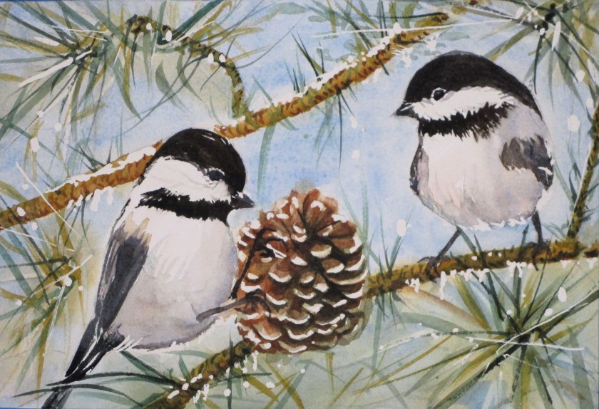
My second finish of the week is the Winter Birds watercolor painting based on Bill’s photographs. My composition is compiled from three of his photographs.

The two chickadees are cozied up to a pinecone, with the pine’s branches and needles as background. Working out the best layout was a wonderful challenge. My goal for the painting was to suggest bird camaraderie during the depths of winter.

WINTER CHICKS

This painting is about done. I still need to clean up some edges, tone some of the masked areas and add a highlight or two. All fun stuff. And it’s finished in time to slip it into a frame and hang it on the wall before Winter officially begins.

After laying in masking fluid, I used hansa yellow deep, transparent orange, pyrrol scarlet, burnt sienna, Winsor green blue shade, Cerulean blue and ultramarine blue. My new favorite black mix is ultramarine blue and transparent orange.

Posted in Uncategorized

Inspired by Photographs: A Collaboration

My imagination was captured by the 100 Day Project Challenge. The idea is simple: choose a creative project, do it every single day for 100 days, and share your process on your social accounts using the hashtag #The100DayProject.

https://www.the100dayproject.org/

After thinking about aspects of my work that I want to improve, I hit upon the idea of collaborating with my husband, Bill. He is a dedicated photographer who carries his Canon with telephoto lens everywhere he goes. Consequently, he has an immense library of images. So here is what I suggested to him:

Process: From his library of photographs, he will curate several dozen into collections with prompts generated by me. From that point, I will create artwork based on the images, working daily for 100 days.

Guidelines: There are almost none. Back and forth consultations between photographer and artist are encouraged. I agreed to publish his photographs only if they are stamped with his mark.

Here are the prompts I provided to Bill:

  • Atmosphere
  • Best of the Birds
  • Creatures Great and Small
  • Faces
  • Gardens
  • Kids’ Stuff
  • Light Effects
  • Mineral
  • Photographer’s Choice
  • Rural America
  • Seasons
  • Transportation
  • Urban Architecture
  • Vacation Favorites
  • Waterscape

My plan is to work daily, but post on this site only once a week. I have no idea how many paintings, drawings, sketches, quilt blocks or knitted swatches will be made, so it seems easier just to group them.

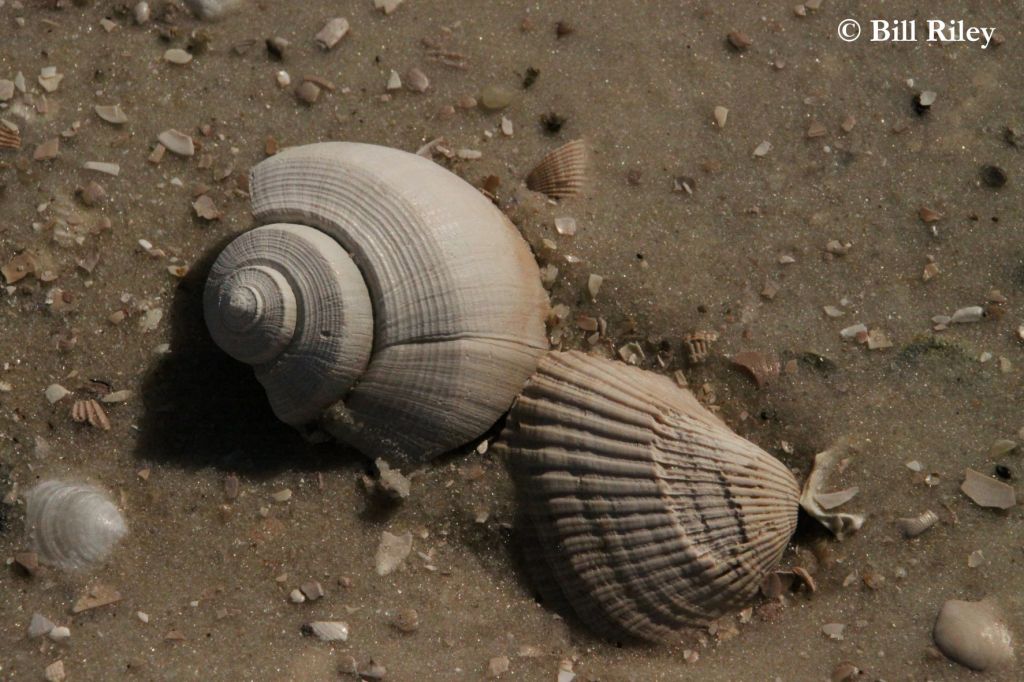
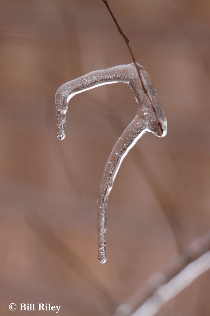
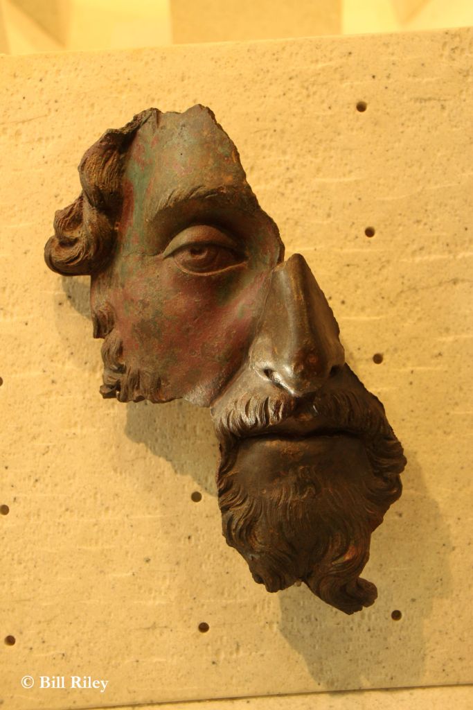
And here are the images I have chosen for study the first week of the challenge.

Photographs by Bill Riley, reuse by permission only.

Posted in painting

American Ruin in Watecolor

Hi friends! I have been absent for a few weeks while traveling around the country. A large chunk of our travel was in wintery Wisconsin. Despite the cold, snowy and windy weather, I found some inspiration in what we saw. I love the rolling countryside of the Driftless region. And the sand hill cranes. (More on the cranes coming soon.)

For today I will start with a rural landscape. My re-entry into art started with Wednesday’s Open Studio at the local art association. Every month on the first Wednesday, watercolor artist Cheryl Bryan provides a lesson. This week’s subject was buildings. I chose to paint a barn, in honor of all the lovely barns I saw in WI.

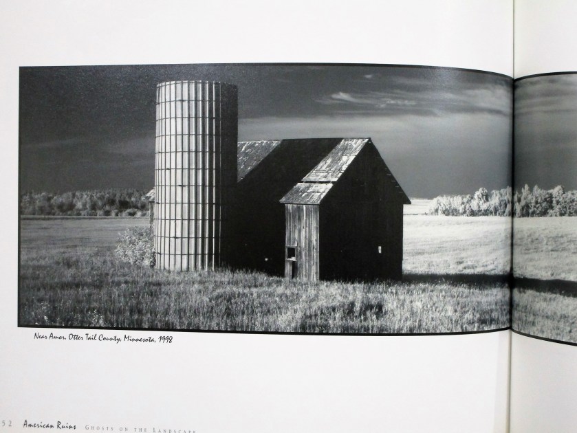
For my reference photo, I turned to American Ruins: Ghosts on the Landscape by Maxwell MacKenzie. A few years back I was blown away by MacKenzie’s formidable photographs of falling down farm buildings on the great plains. My first attempt at rendering one of these images was a few years back when I was learning to draw with pen and ink.

Today I picked this image to paint in watercolor.

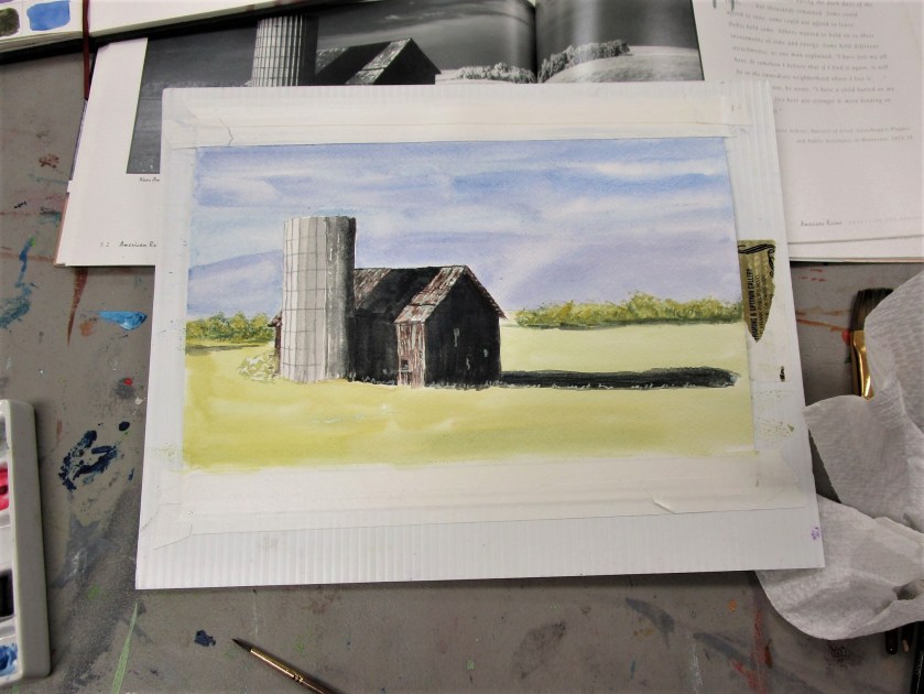
The sketch took me almost no time. I didn’t need to re-scale it to fit my paper, so I did a tracing of the essential lines. I then transferred the tracing to my paper. Next I added masking fluid to retain some of the white spaces (especially those small holes in the old barn.

For more drama, I added a few more holes.

To keep things simple, I chose a limited palette: burnt sienna, cerulean blue, cobalt blue, carbazole voilet and Winsor yellow. Oh, and a little black.

Cheryl’s lesson focused on painting values. She asked us to decide where to use high, medium and low values, assigning one value to background, foreground and subject.

Using a black and white photo made this part easy. I wanted to retain the photographer’s focal point, which was the deep shadows thrown by the silo and barn. My background would be a medium tone and my foreground light. After painting the sky and adding a preliminary wash to the foreground, I painted my subject.

At this point I was stumped on how to proceed. So I showed my work to Cheryl, who gently scolded me for using black paint. Watercolor students are discouraged from using black paint. We are told that it deadens the painting.

I went home and proceeded to wash out as much of the black paint as I could.

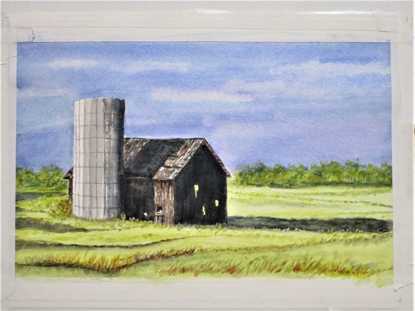
Today I returned to the painting. First, I decided that the sky was too light. Masking the top of the silo and barn, I added a glaze of cobalt blue to the sky. Then I painted glazes over the three areas of black paint using blue, brown and yellow.

At this point I removed all the masking fluid and turned to the foreground. Now, I live on a prairie. I spend many, many hours traveling on roads that cross the prairie. You would imagine that it would be easy for me to fill my painting with prairie grasses. But that expansive area of yellow paint just sat there and mocked me.

To get over my artist’s block, I reviewed this tutorial on composition by Joseph Zbukvic

Forgetting everything I know about prairie grasses, I proceeded to fill my foreground and middle ground with Zzzzzzs…… okay, gently curving zzzs.

The only areas still bothering me were the trees and the little shrub behind the silo. I added more paint and some trunks on the tree line and repainted the shrub as a bare-twigged remnant in burnt sienna. This seemed to work.

I’m finally ready to call it done.

To learn more about Maxwell MacKenzie, you may visit his website.

http://maxwellmackenzie.com/americanruins.php