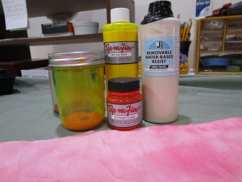
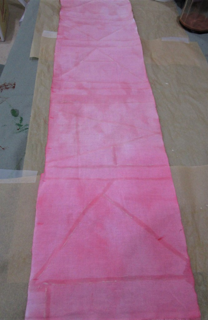
Today I will be enhancing the fabrics I color washed yesterday with more color. I’m excited to try water-based resist, a product new to me. I will be using it on the pale pink strip of fabric, also pictured, above.
The product came with a little applicator. I quickly discovered that it was impossible to get the gloppy resist paste into the tiny opening on the applicator. So I moved on to using a narrow paintbrush. But first, I wanted to try some crayons, just to see if the crayon marks would resist the paint. Here is my swatch all crayoned and resisted, before I flowed in the paint.

I mixed yellow, orange and ecru Dye-Na-Flow paint to get a bright gold color.
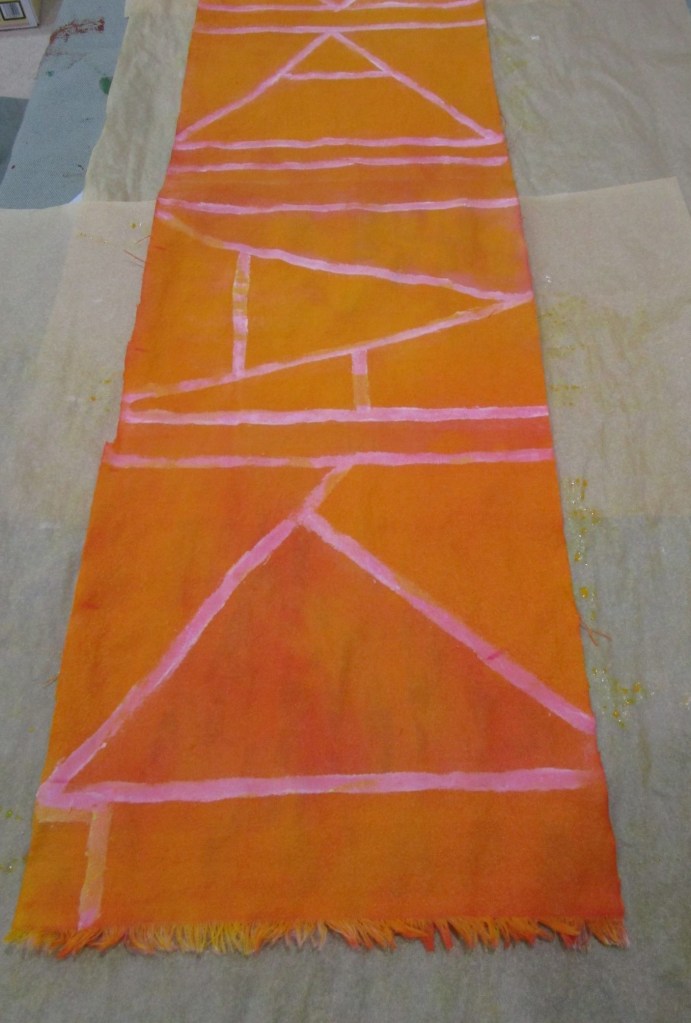

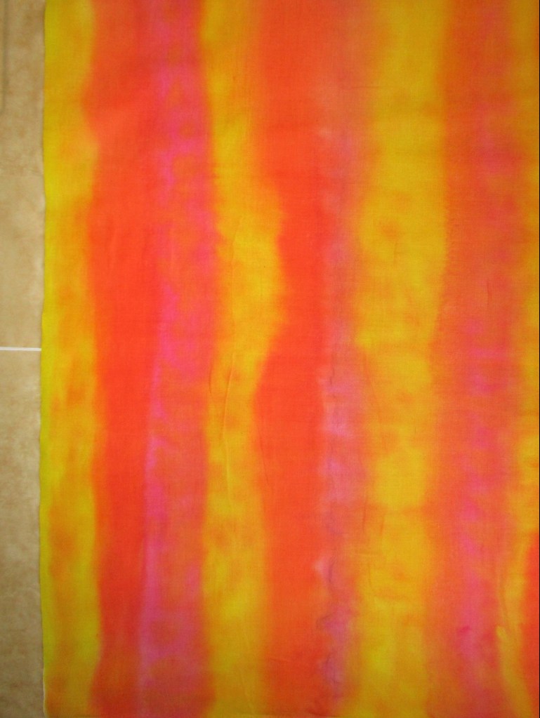
Tomorrow we will see whether the resist worked. Next I moved on to the striped piece of fabric. I wanted to print it with the following item:
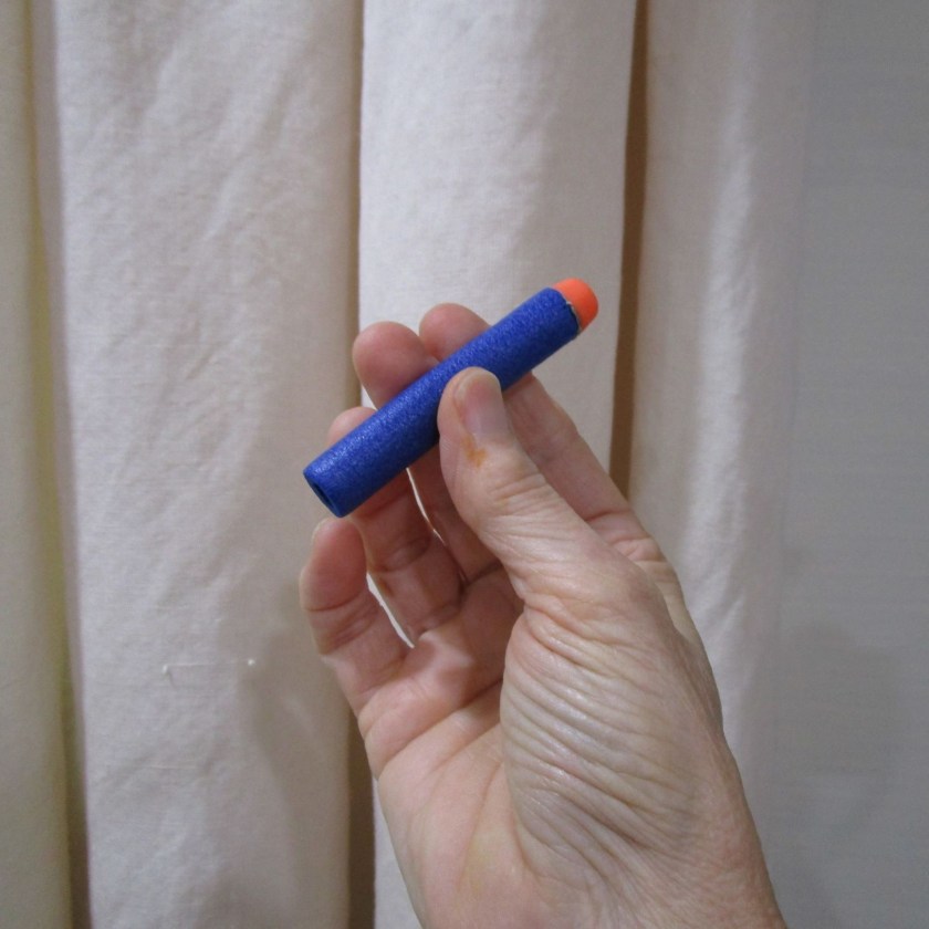
Any one who is related to a son or a grandson will recognize a foam nerf bullet. I will be printing with the back end of the bullet, which makes a very nice circle. Here is the fabric before and after printing with orange Jacquard Textile paint.
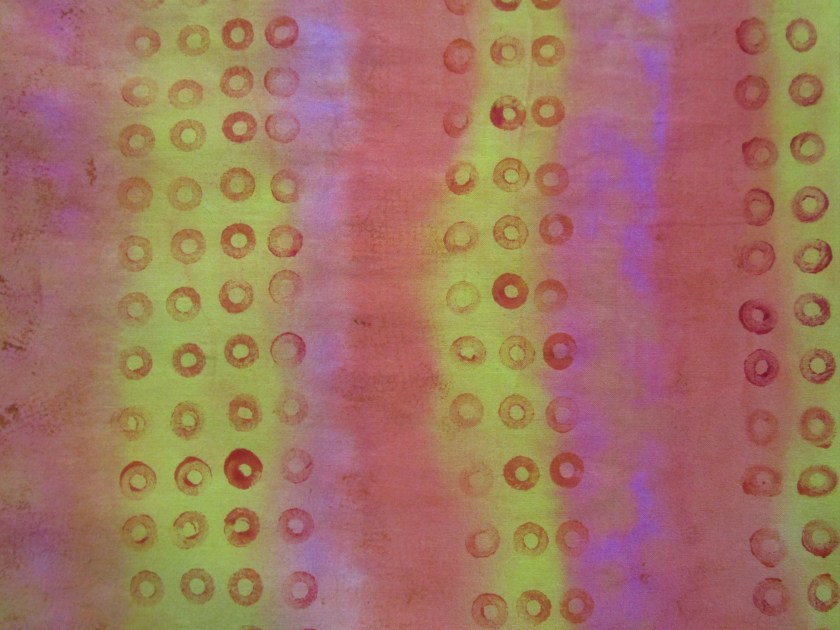
I would say that this fabric is unique.
Addendum to this post: I thought you might be interested in seeing these fabric swatches after they were washed, dried and pressed.
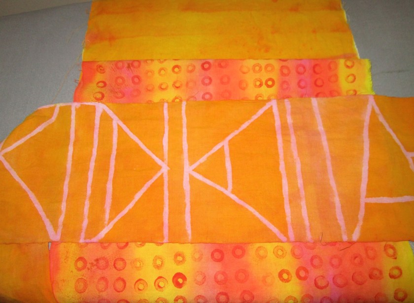
I’m pleased with these swatches, but especially so the water resist piece. Even though the lines did not resist all the way through the fabric, the front of the piece shows the pink lines clearly. The only negative is that the resist hasn’t completely washed out of the fabric. I will probably need to give the fabric an additional soak.


