Posted in painting

Using Paint to Create Depth

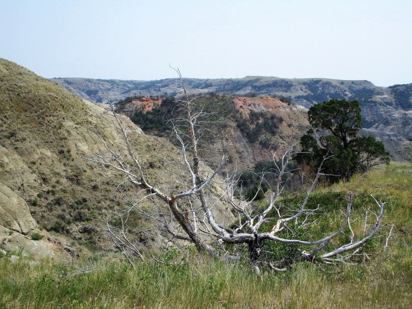
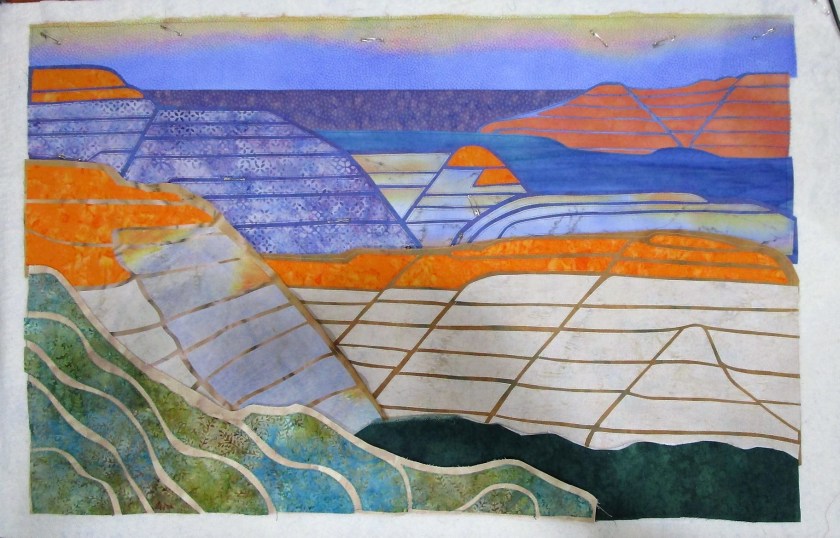
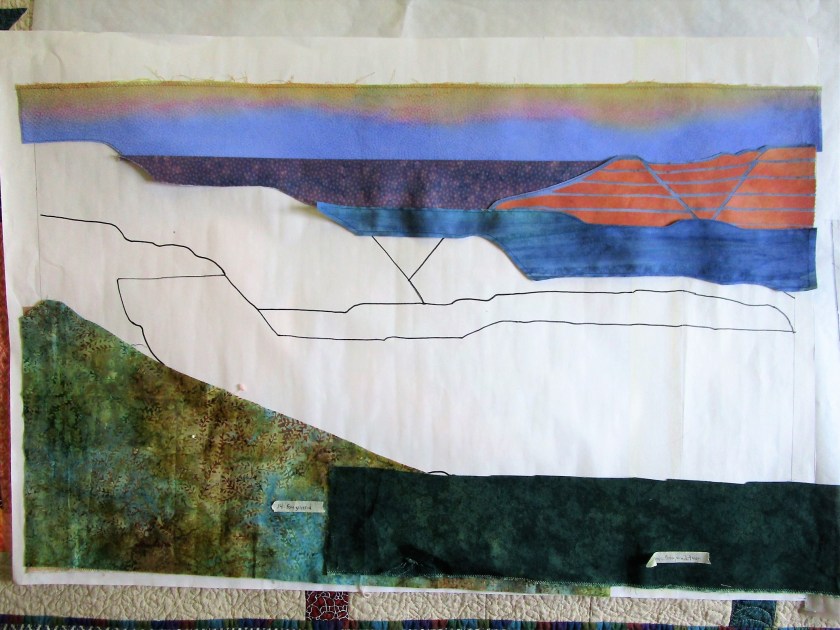
This past week, I completed the sewing phase of Badlands art quilt. All segments are sewn in, and all but one is quilted.

Quilt lines are not visible in this photo.

The next step in my workplan has me using textile paint to add shading and lines. I learned the technique from a tutorial by Annette Kennedy through Craftsy. Annette is known for her realistic landscape quilts. She is an award-winning fiber artist.

https://www.craftsy.com/class/painted-pictorial-quilts/

So, I have a lot of trepidation about slathering a perfectly nice quilt with paint.

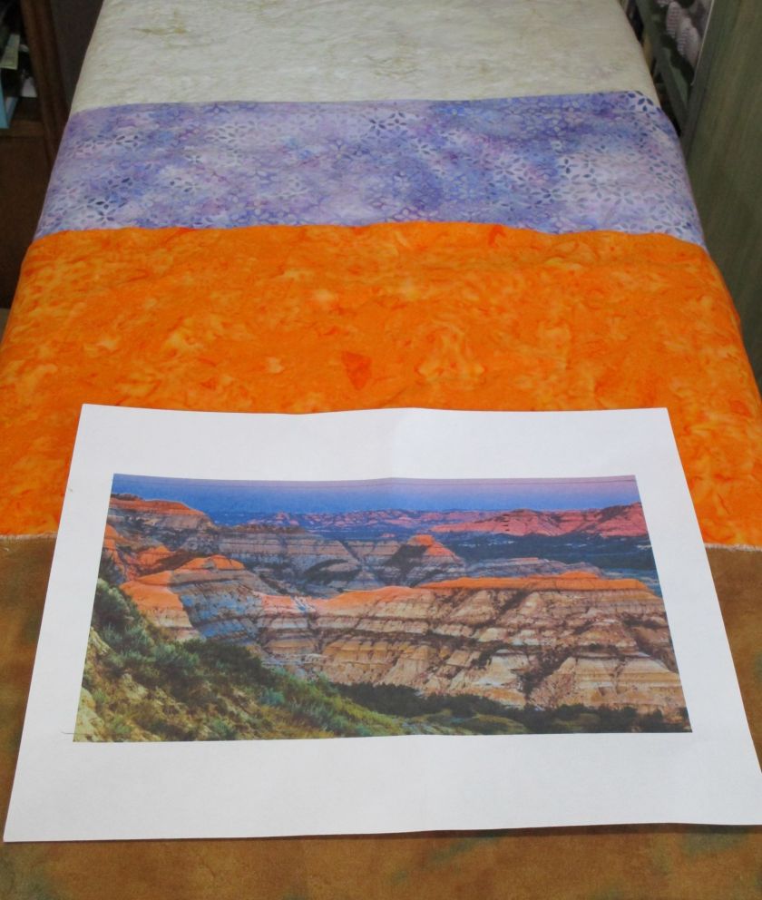
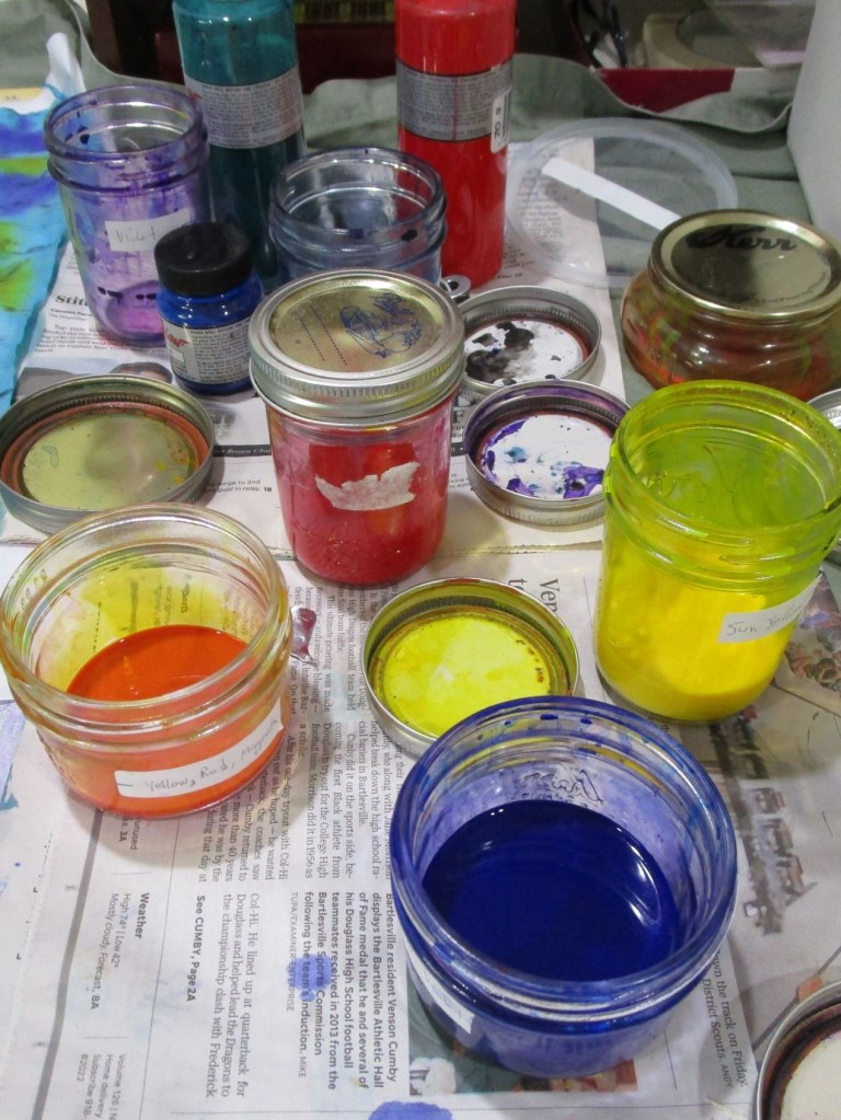
The paints I use are Jacquard Textile Color. I will mix them with a floating medium recommended by Annette. It dilutes the paint, making it lighter and keeping it from drying too fast.
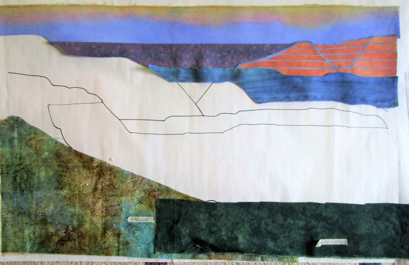
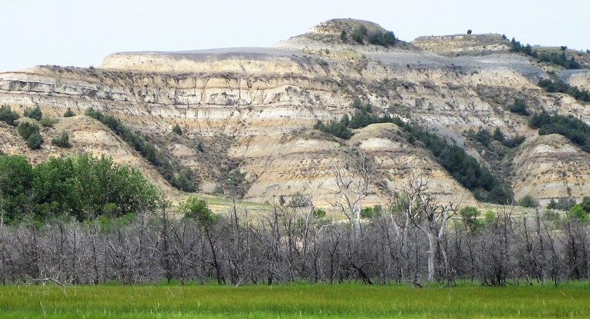
Before painting:

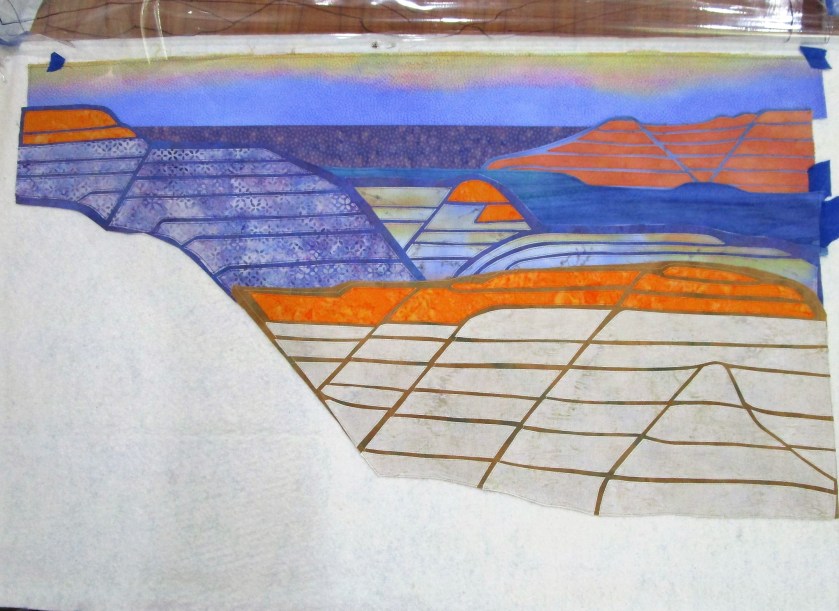
In this photo, I have started shading the large mountains in the foreground. You will also see the applique I have made for my focal point, painted and ready for fusing.

I’m still nervous, but I am trusting that everything will come together in the end.

Posted in quilting

Work in Progress: Badlands

When I last wrote about this art quilt project, I was waiting on a delivery of fabric.

Here is what my quilt looked like at that point.

I had selected some fabrics from my stash. The sky and horizon segments had been painted and positioned. My first module of background ridges was cut-out, fused and stitched together. I liked it a lot. But it was clear to me that I needed more orange and purple fabrics to really represent the scene as I designed it.

This photo shows my reference image and the three batik fabrics that arrived from Fabric.com last month. I was pretty impressed that the fabric colors looked just like they did on my computer screen.

So, full steam ahead with the work!!

Half-way assembled:

In this photo all the segments are finished and in place but one – the lower right. You see the segment’s base fabric that I plan to use.

At this stage I am very encouraged, and kind of excited. The lines and colors of the work represent my inspiration very well.

After I finish sewing down and quilting the background and middle ground, I will turn my attention to the focal point and foreground. Then comes a bit more painting of details before the final assembly.

Posted in colorwork, painting

Painting the Quilt Backing

On Wednesday I got started with the backing fabric for the Badlands art quilt. It turned out even better than I had expected.

I started with a black-on-white cotton print, which imitates Carrera marble.

I was drawn to this fabric because it represents a stone product. The veining suggested to me the many cracks throughout the Badlands formations.

The first step was to achieve a consistent ground color by dipping the fabric into diluted blue-green paint. Squeezing out the excess, I smoothed the piece out onto a large piece of butcher paper. Then using the other paint I had mixed for the quilt front, I applied horizontals bands of color – orange first, then blue-purple. I let the piece sit and slightly dry before sprinkling on rock salt, also in horizontal bands.

AFTER APPLICATION OF PAINT, BEFORE DRYING.

I allowed the paint to dry almost completely before brushing off the salt.

The next morning, I hung it outside to get this photo:

It looks so dramatic, I’m wondering if it will be a waste to use it as a backing.

Earlier today I learned that the batiks I ordered for this project will arrive this afternoon. I can’t wait to see them.

Posted in knitting, painting, quilting

A Couple of WIPs

Yesterday I officially lost at yarn chicken.

AHWWWWWWW!

I have about 16 rounds plus the toe left to knit. Grr. So I wandered through my stash to see if I could find a good substitute and come up with a gameplan.

This morning, entering my studio, I suddenly spied The Swatch. Then I remembered that I had knit two swatches for this project! Both of them included the cream yarn.

SAVED!!!!!!

In other news, I have been painting fabric for the Badlands quilt. Here is a group of color samples in my chosen palette.

I also spent a lot of time simplifying my sketch and making a pattern on freezer paper. This pattern will become the cutting guide for the quilt’s segments. I don’t call them blocks, because they are all different shapes, following the major lines of the subject.

I actually got underway with cutting and sewing some of these segments, starting from the background.

Progress photo.

I’m pretty happy with the work so far. But now I am waiting on fabric to be delivered. In acknowledgement of my rather crude fabric painting skills, I broke down and bought some batik fabrics with colors for the middle ground of the design.

In the meantime, I plan to paint the backing fabric and make the quilt sandwich this week. Then I will be ready to move forward as soon as the package arrives.

Posted in drawing

Sunday Sketching: Value Study

For over a year, I have been ruminating over an idea I have for an art quilt. It is inspired by our trip last year to Teddy Roosevelt National Park in North Dakota.

For those not familiar with the park, it is known for what’s called the Badlands. These are sedimentary rock formations that have been eroded away, displaying the different layers almost like a layer cake.

Here is an example of what I’m talking about.

The timing and circumstances of the trip were counter-productive to getting any good photographs. It was high noon in mid-July. I had no idea how hot it could be in North Dakota during the summer. To compound things, the whole western edge of the United States was on fire last year. We were about a thousand miles away from the smoke and yet haze covered the entire sky and dampened the light. Nearly all the color was washed out of the scenery. No shadows. No highlights.

Here is my best photograph in the park that day.

To get a suitable reference photo of the overlook, I resorted to the Internet. This photo was taken by Mike Hanson. It is 2017 and it must be a sunset view.

Bill added the segmenting lines so that I could scale it up to size I wanted. Using the grid method, I transferred the major shapes to paper and sketched a value study.

Very well pleased with the result, I moved on to the fun stuff: selecting a color scheme and swatching it out in watercolor. I chose a split complementary scheme focused on orange, with blue-violet and blue-green as the complements.

Now my creative juices are flowing. I’m excited to pick out some fabrics and start painting them!