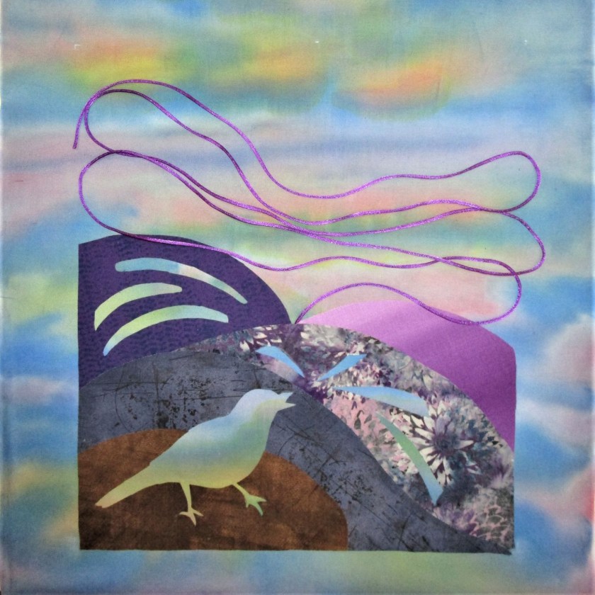
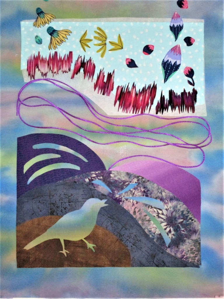
Yesterday I spent some time working through the design and material choices still facing me with regard to “Catbird Sings.” I settled on the arrangement for the lower half of the work, tacking it into place. The violet satin cord will serve as a transition device linking the lower to the upper half of the piece.
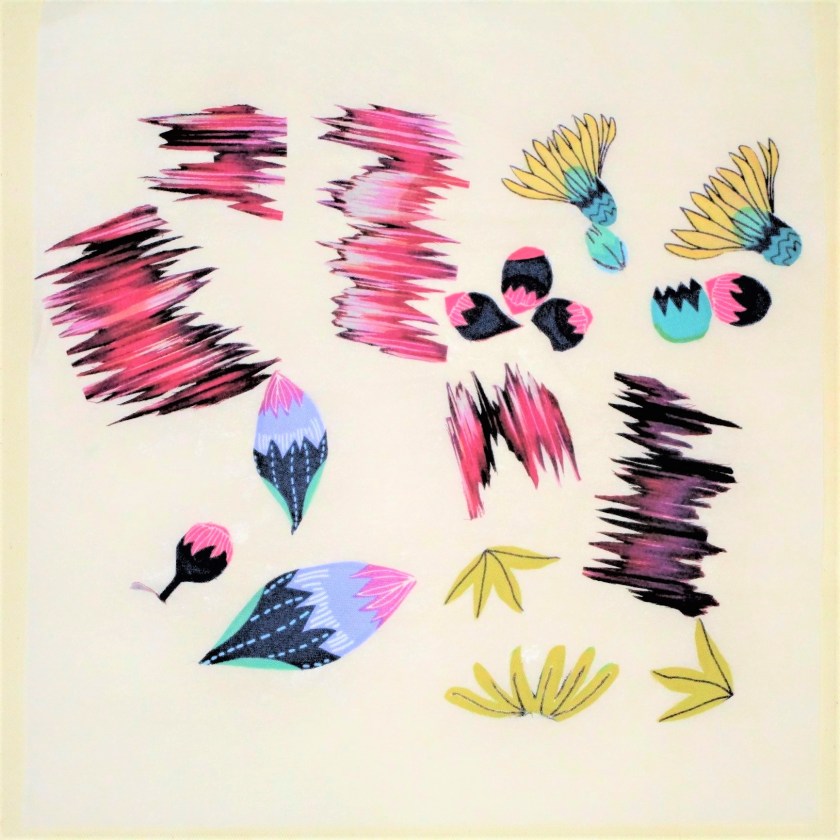
It will be couched into place when I start sewing. Next I chose and cut out various bits and bobs from two printed fabrics to represent his varied “cat calls”.
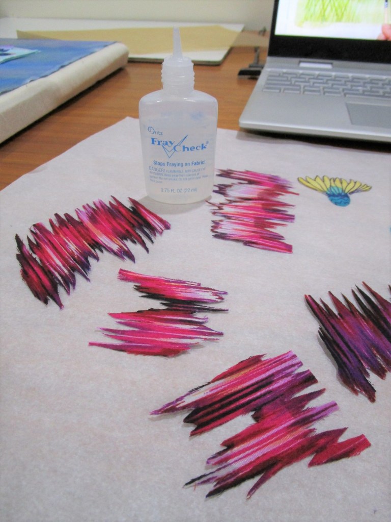
The colors all link well to the palette chosen. The wavy lines will represent the loud squawks. Before proceeding to the next steps, I treated all the edges with Fraycheck.
Those wavy pieces in particular will shred massively if not treated.
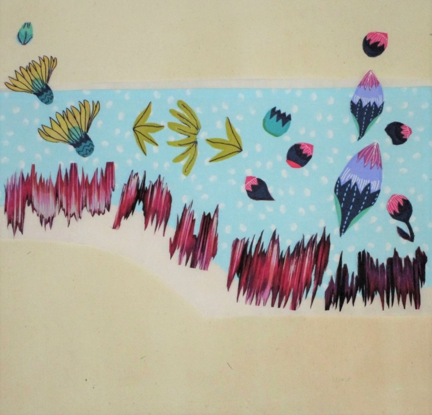
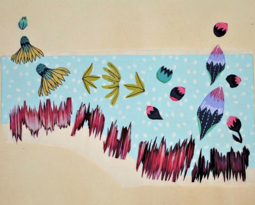
I was ready to test some layouts for the upper half:
I like this grouping. But do I use the daisies with petal sides up……..
….or petal-side down. Hmmmmmmm….. I like the line created by the upside daisies.
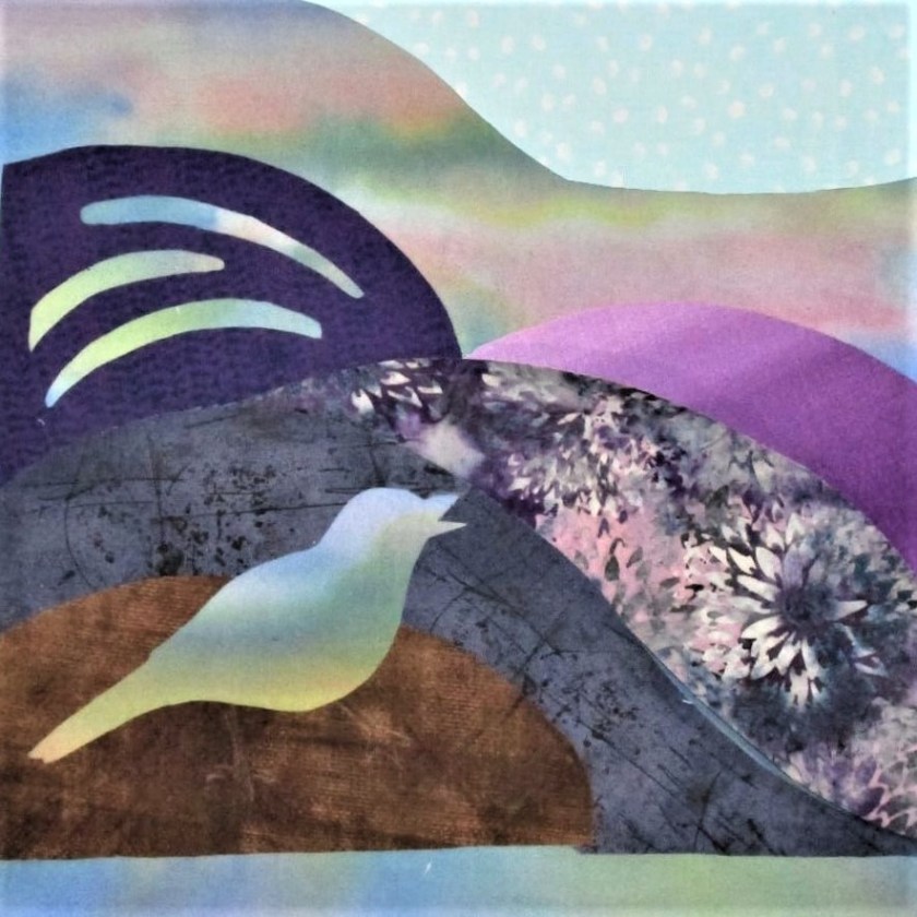
TENTATIVE FINAL ARRANGEMENT
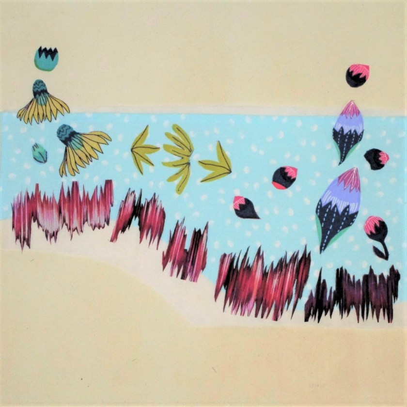
And here is how I left the work. Before I finalize, I will need to decide on how I will quilt all of the different sections. It won’t do to fall in love with a layout and then struggle to quilt around it.
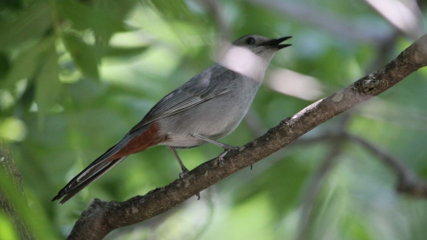
The idea for this fiber object came to me one morning while porch-sitting with a book. It was a gorgeous day, but I was poring intently, with all my focus, on the book in hand. Surprisingly, I no longer remember what I was reading. The probable cause of this memory lapse was the very thing that intruded upon my thoughts. A catbird had begun an insistent and virtuosic song. The sound tore my mind from my book and into the present moment. Looking about, I failed to spot him. So instead of continuing to search with my eyes, I closed them and sat back in my chair.
Pretending that I possessed synesthesia, I imagined what that birdsong might look like, if it were visible. There were deep chortles and murmurs, but also squeaks, shrieks and ascending melodies. It went on and on. And on. Eventually the catbird flew off.
Here’s what I wrote in my journal: “Sky-inspired painted background. Reverse applique to suggest an unseen bird. Throaty -chortling purples, warm tones high pitch trills – bright white squeaks. dashed gestural lines to suggest direction of pitch. Parallel wavy lines for a musical staff.”
All very poetic. But I want to make a piece of visual art, and as such it must have form.
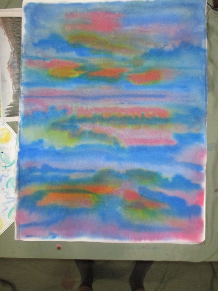
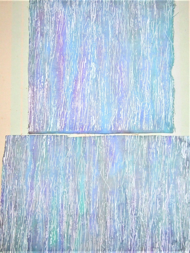
This week I got underway. Since my fabric paints were out, I started with the background. On a piece of white quilting cotton I stroked colors that I thought would make a good sky at daybreak – pale blue, violet, peach and gold. I achieved this rather startling canvas:
Paint is still wet here
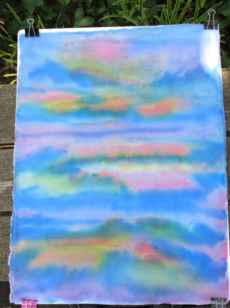
What sort of a sky has leaf and dark green in it? None I’d ever seen. I was prepared to set it aside and start again. But on second thought, I chose to continue with this background. The unconventional sky colors can represent the effect of birdsong on the air. Here is my bright background after it dried.
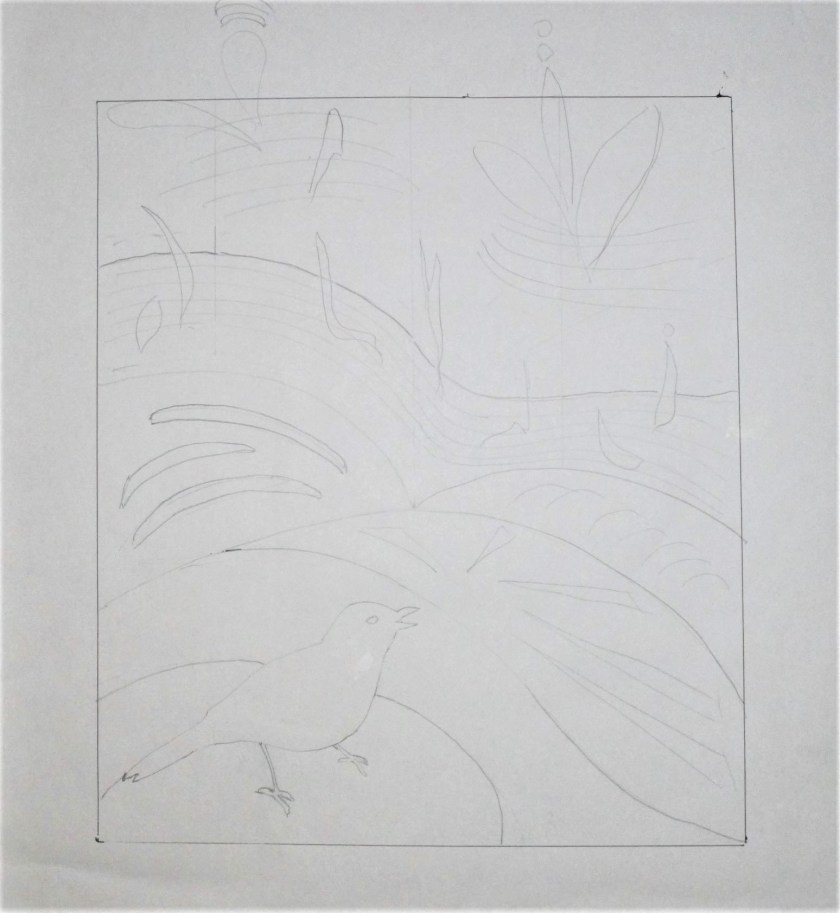
Next comes the sketch. I put the catbird’s silhouette in the lower left.
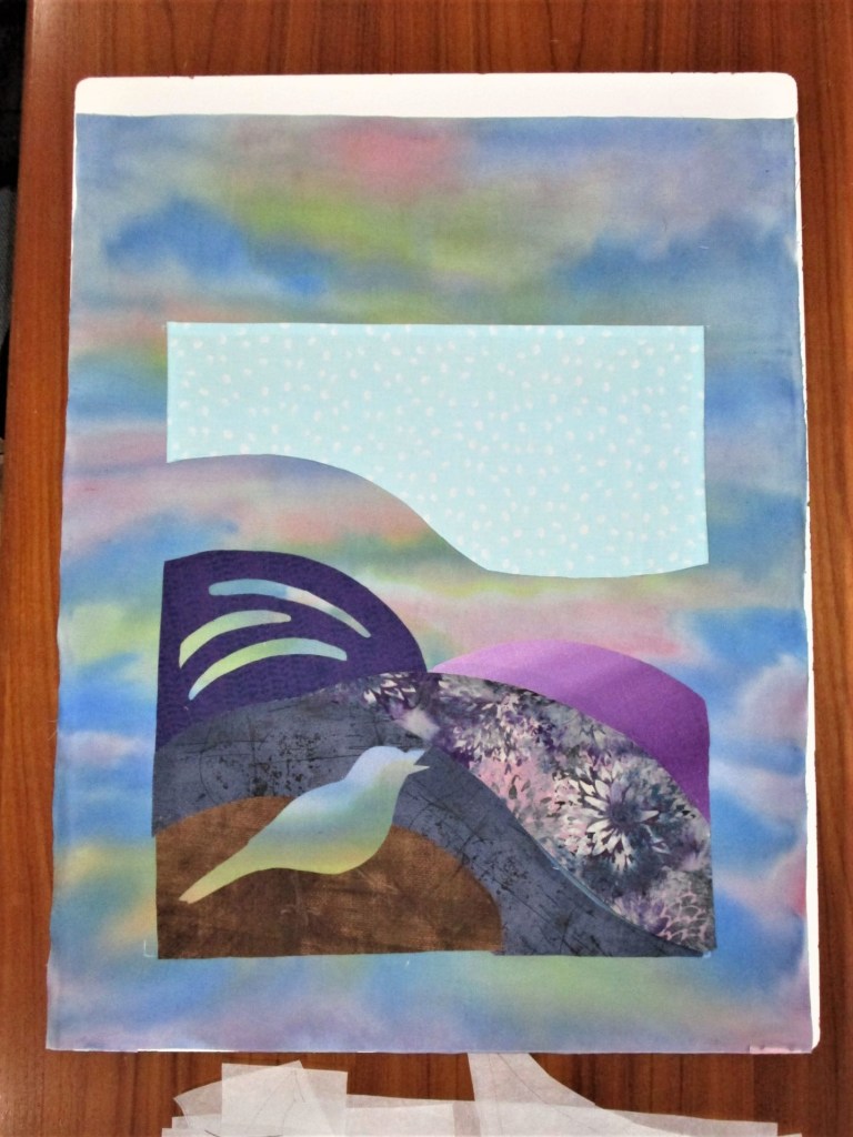
Now the hard part. Searching my fabrics for the colors mentioned in the journal, I found some purples and some brassy bright scraps. Also a few interesting prints. Most of yesterday was occupied with choosing, cutting and attaching fusible to the back of my chosen fabrics. Here is what this applique quilt looked like at the end of the day.
“Catbird Sings” stage oneClose up
While I am keen to get on with this work, I need some supplies. So I will have to pause pending a visit to the craft store.
On Monday I learned that the next prompt for the stay at home quiltalong was Plus Sign. As in the past round, several challenge participants had their additions up and posted on the first day. I was not so quick to get to work. First of all, I wasn’t sure where I should place a plus sign on my project. Secondly, I wasn’t sure what technique I wanted to use I considered all of these options in turns:
Nine patch blocks made with contrasting strips
Painted on, either freehand, stamped or stencilled
Applique
Reverse applique
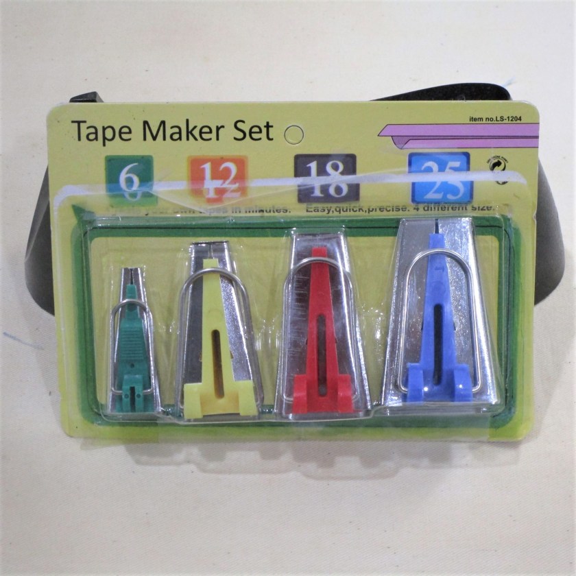
As I awoke this morning, I had the answer – really, it came to me just as I got out bed! I remembered this little tool stuffed away in my sewing cabinet:
I would make plus sign appliques, but I would do it with fabric strips run through the bias tape maker. This tool folds under the raw edges making a very even tape, very quickly.
It turned out to be the only part of the project that was quick.
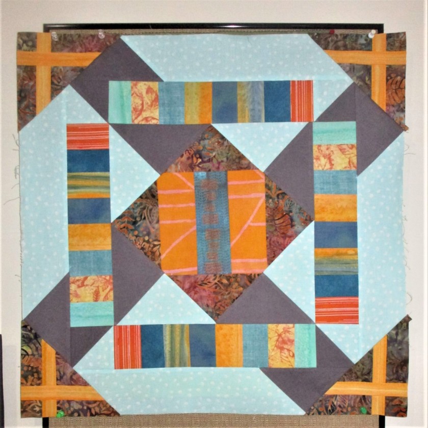
My first goal was to bring the gray X motif, which had a prominent place on this work, to a graceful close. To do this, I cut and pieced a border using the light blue and dark grey fabrics, with the grey piece matching the angle of the X already in progress.
Here are three of these borders, sewn and ready to be pressed.
When sewn in place, the grey X get its rectangular legs finished up.
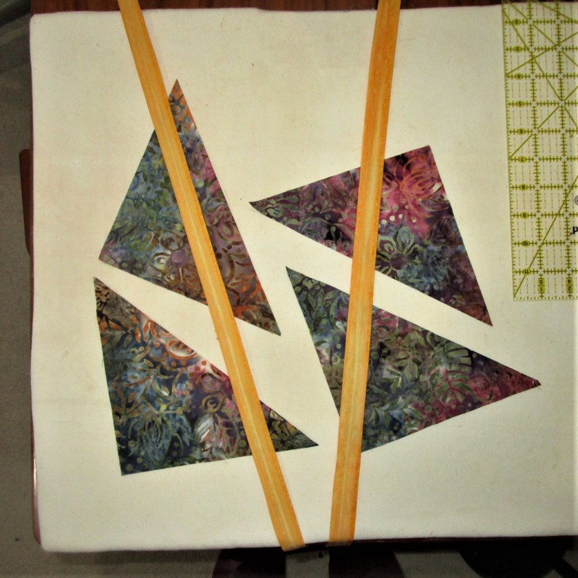
Now I am ready to add the plus signs. It’s time for the floral batik fabric to make another appearance. I cut it into four triangles to finish the corners. It is here that the plus signs will appear.
Corner triangles and tape, ready to be fused together
One of the problems I had with using the plus sign motif is that it looked like a stubby, ungraceful pair of sticks to me. To solve this issue, I decided to elongate two sides of it. The long legs will come from the edges of the triangles, with the cross happening at a right angle in the corner.
All of this sounded very simple to me, in terms of the construction steps. This is where my lack of experience kicked in. After prepping the pieces, I started sewing them in place. Nothing would line up correctly! I measured each triangle, but didn’t find anything wrong with their angles. After spending an hour or so, sewing on and removing a few triangles, I finally realized that I had failed to true up the border edges. What a rookie mistake!
Eventually I sorted out the 90 and 45 degree edges and sewed everything together.
To see some of the other quilters’ work, you can visit their posts.
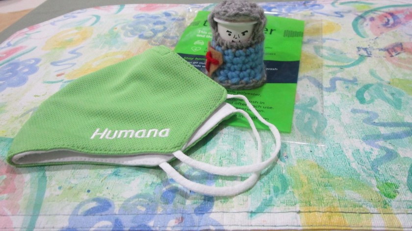
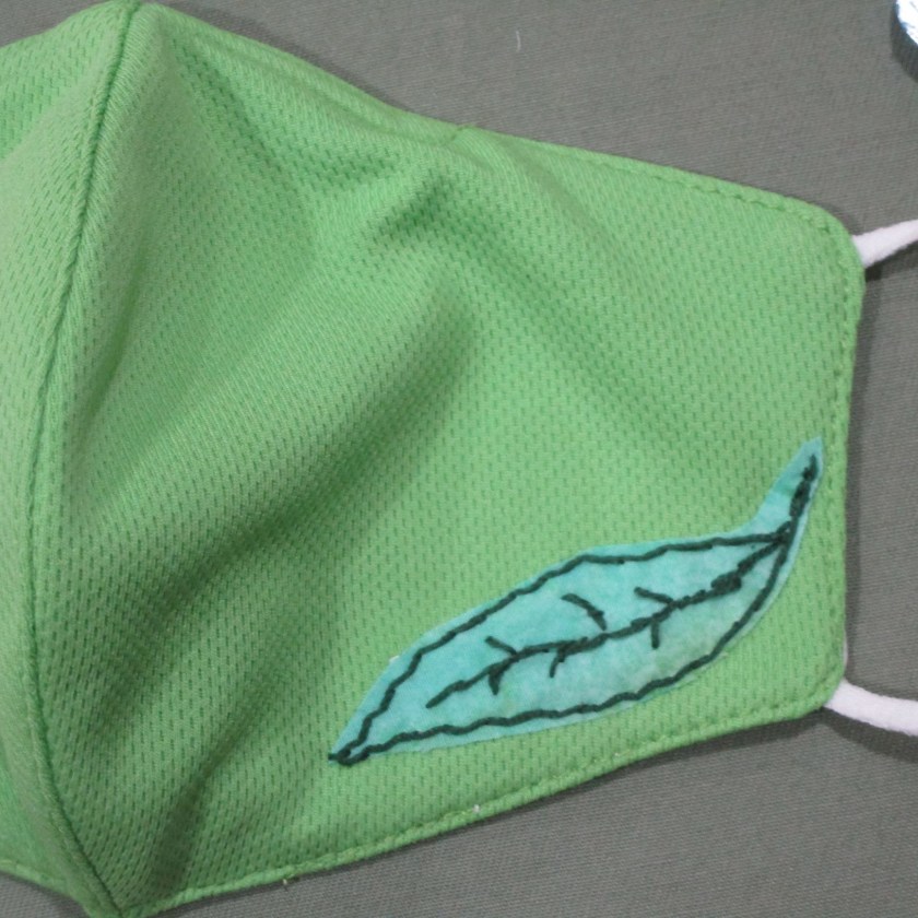
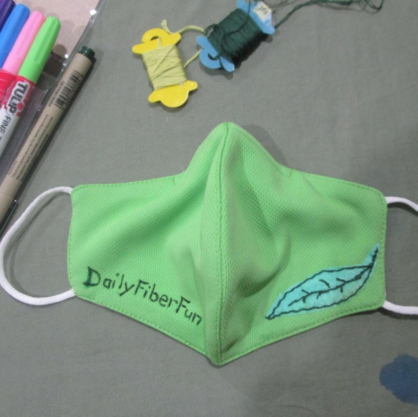
I’ve been struggling along with a pathetic homemade mask that I whipped up quickly. This is a very nice one, but I draw the line at being a walking billboard for some company. I decided to make a few modifications.
Applique fused on and embroidered with cotton floss.
That little motif covered the logo nicely. Then I thought, what can I put on the other side of the mask? It came in a flash – why not advertise myself?
First of all, everyone said “Keep the fence.” Many of you liked the wine-purple color, but some agreed with me that an adjustment of some kind was needed.
I did try options 1 and 2.
Option 1: Start over with another fabric. Here are the samples I painted on the white fabric. I decided that it was a fun exercise, but just didn’t look too fence-like.
Option 2: I applied a wash of a cool blue color to tone down the strident red violet.
It just plain didn’t work as intended. To my eye, this is worse than before.
In the end, I chose to start again with the original fabric, for the same reason that I picked this fabric in the first place. The print had an earthy, woody texture to it. This time I mixed my violet paint with enough azure blue to create a sort of periwinkle or lavender tone. I also modified my foam brush by cutting notches into it.
The Winner!
Thanks to all who participated in the game. Your encouragement and positive remarks let me feel the community around me. I wish I could give you each a hug.
Now I can move on to sewing. I’ll start with a little hand embroidery on the flowers.