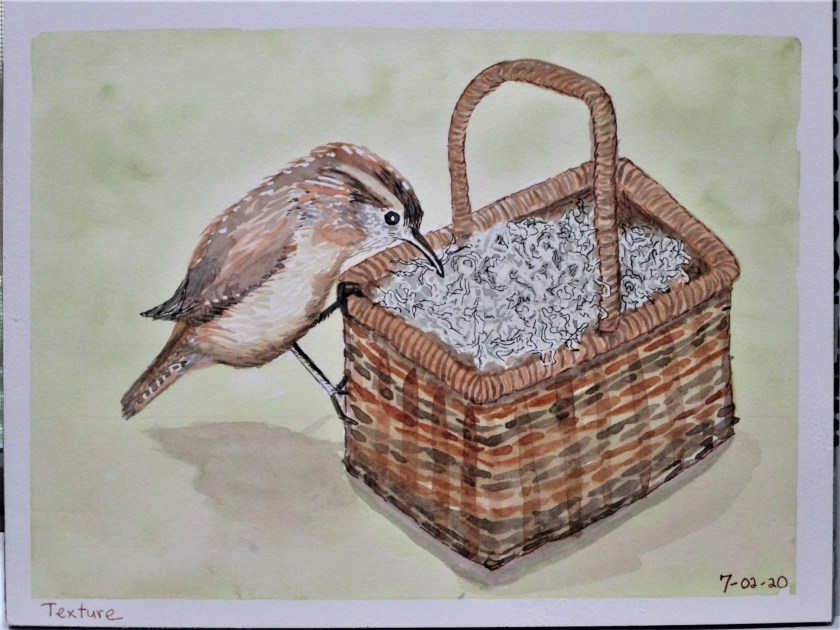
I was happy with today’s topic. It’s time for me to practice painting textures. I especially wanted to paint a basket. This basket was stashed away in a bathroom cabinet. It is filled with Spanish moss – I’m not sure where I got the moss. So, two textures – plaited reeds and Spanish moss. To add a third texture, I posed a little wren, who seems keen to grab some of that moss for her nest.
Yellow ochre, New Gamboge, Burnt Sienna, French Ultramarine Blue and a little Payne’s grey. I added two ink colors using Micron pens – Black and tan. Paper is Paul Rubans watercolor block.
For the first day of #WorldWatercolorMonth, I chose the image of jumping for joy. Having my joyful figure on the beach at sunset gave me a ideal opportunity to practice blending colors in a wash. I used micron pen on the shore line and figure only.
She sure has a lot of hair.
Paynes grey, New gamboge, Quin red on Strathmore watercolor travel journal.
It’s been almost two weeks since I posted last. My days have been full, if not busy, but nothing to write home about. At least I can catch you up on projects in progress.
Improvisational Quilt.
As you see in the photo, the quilt is under the needle. I have been whacking away at the quilting for days and days. This is the biggest piece of cloth that I have attempted to quilt with my lil’ old Bernina.
I’m doing a parallel- straight line pattern, mostly because this type of quilting doesn’t require much manipulation of the quilt. I start at a long section and keep sewing parallel lines until I get tired or run out of bobbin thread. My goal is simply to finish. Pretty lines and straight lines are both out of the question at this point. Optimistically, I’m going for quirky charm. My daughter loves that aesthetic.
Watercolor Painting
My water color painting results have been less than satisfying. When I crashed and burned at applying the background wash to the bird of paradise painting, it got tossed. I then resolved to start back at the beginning. To this end, I checked out a “teach yourself” watercolor instruction book from the library and began working through the techniques one each day. Today’s lesson was line and wash. I chose to paint from a photograph I took of a pond on our local walking trail.
Willow trees hanging over the water
Here is my painting.
I enjoyed working on this one and am happy with it. The only thing I want to add is darker paint on the the group of leaves at the right edge, giving the painting more contrast of values.
The garden has been getting much of my attention. But starting today, heat is intensifying. So I will likely shift my attention back to indoor activities.
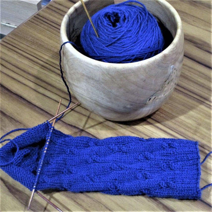
This time of year I frequently find myself diving into my yarn stash. The goal is to USE it, and to use it in projects that are comfortable for the knitter to make on hot summer days and nights. Today I have three items that fit in this category.
First up is this quirky little hat.
Earlier this year my daughter gave me the small, beat-up hat you see on the right side of this photo. She had inherited it from another mom. Our baby really liked wearing it, but now it was too small and full of holes. I dove into my stash and found plenty of yarns that almost matched, color-for-color, the hues of the original hat. De-coding the pattern was quite simple, since it was a classic shape and used only stockinette with a few purl rounds. The only challenge was working the decreases at the top, to reproduce the “stem.”
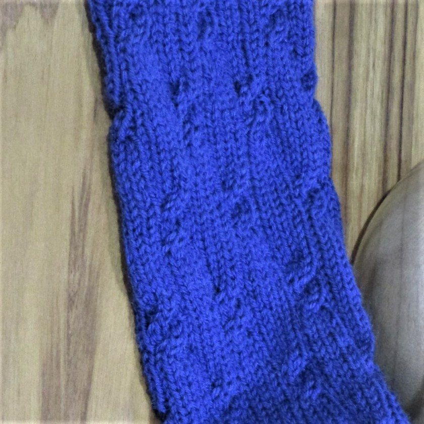
During my stash dive I discovered several sock yarn skeins, some of which have enough yardage for a pair of socks. This deep blue yarn was left over from a sweater I made for myself a few years ago.
Love this Color.
The sock pattern comes from a book by one of my favorite knitting writers, Clara Parkes. The Knitter’s Book of Socks is quite good. It includes twenty sock patterns, each by a different designer. She also writes about the characteristics of different yarn fibers, and how these might match up with the qualities required by socks: elasticity, strength and absorption. I highly recommend this book for knitters who like making socks.
This pattern is Firefly, by Jennifer Hagan. The two by two cables are all right-leaning. She has them spaced out along the leg of the sock in such a way that they are easy to make.
My last stash buster started out as a pass-along yarn. Knitting friend Kathy gave me several skeins of Peruvian sock weight yarn in a so-so shade of blue. The blend includes alpaca and wool, but also 50% acrylic. In my stash I found a pale blue tweedy sock yarn bought on sale that had not inspired me. But by knitting them held together, these two yarns worked harmoniously. There was just enough for the skirt of a toddler dress.
When the pale blue ran out, I continued on up the bodice with the alpaca blend held double. The yoke includes a small pattern using strands of Cascade 220.
The dress design is mine, but the stranded design comes from a traditional Faroese Kettunøsin pattern. They are little dog heads.
While I sit here indoors, out my window it is raining heavily. This downpour is quite welcome, since it is the first rain since May. Gardening is out for the day, but knitting, quilting, writing and painting will keep me busy until dark.
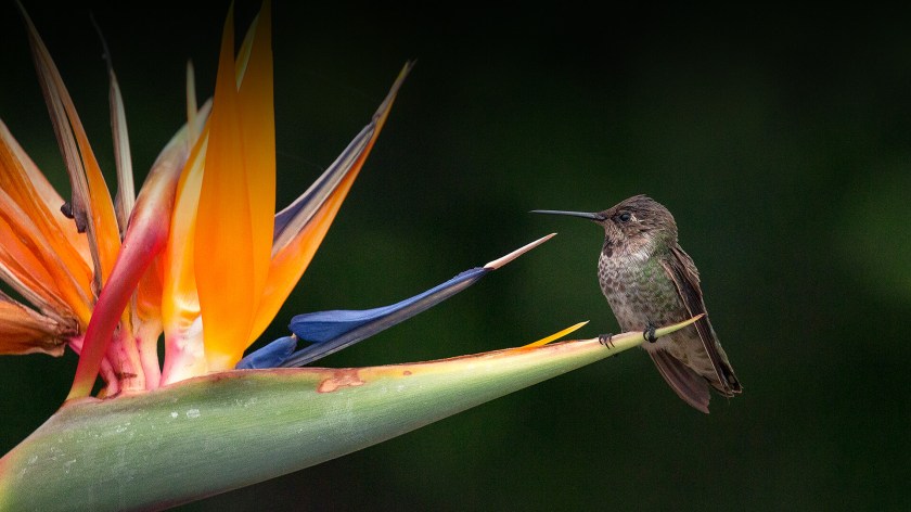
I have been collecting images of the tropical flower called Bird of Paradise for a few months now. Initially I wanted to make quilt blocks with this flower as a motif. But lately, I have been charmed by this photograph offered by the San Diego Zoo, of a flower with hummingbird.
I decided it would be a perfect reference for a water color painting. There are three techniques that I could practice from this one photograph: color mixing, background washing and masking.
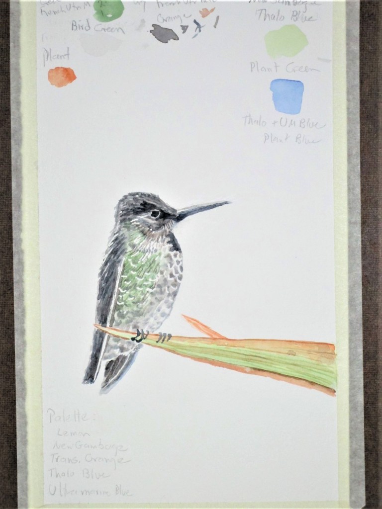
It occurred to me that I would be more successful if I practiced each of these techniques separately, before combining them into a finished painting. My first study was the hummingbird.
The masking fluid allowed me to reserve the white margins on the breast feathers and the wings. I think he came out quite nicely. While I was at it, I used the same paper to determine the color mixes for the rest of the painting. You can see my little notes penciled in above the bird.
As an aside – Did you know that hummingbirds are the primary pollinators for Bird–of-Paradise flowers?
Yesterday I painted a small study of the whole image. The scariest part was the very dark background wash. I used a mix of ultramarine blue and burnt sienna, with a small amount of lemon yellow to neutralize the blue.
This study is on 5″ by 8″ Strathmore travel journal
I feel I was successful in laying down the wash correctly, but it isn’t quite dark enough. There is also insufficient contrast between the bird and the background. And what can I do to make the petals more luminous?