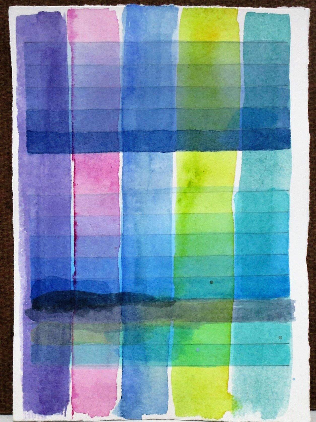
While tidying up my studio the other day, I came across several of my watercolor test swatches. I have three samples, each no bigger than 4 x 6 inches, that were made as I prepared to paint the geometric abstract of the Belize lagoon.
Looking at them with fresh eyes I got the idea of framing the paintings as a group. But first, I would want to work on them some more.
In the language of watercolor, a wash that is painted over existing washes is called a glaze. The term emphasizes the sheer characteristic of this medium. Today I got busy adding some glazes. When the paint had dried, I added a little line work.
Here is what I have so far.
I like the fresh and bright colors and the variety of shapes. But I am wondering if these tiny paintings are finished now. I’m toying with the idea of sewing on them with embroidery thread.
Rather than ending up Dazed and Confused, I believe that I will put this project aside and see how I feel about it tomorrow.
We’ve been enjoying lots of birds in our backyard. Because it has been such a dry and cold spring, the birds seem to be spending lots of time perched on the birdbath.
Male cardinal, photo taken last year
All the interest in the little blue birdbath reminded me that I had started a series of watercolor paintings of various creatures that stop here to drink or bath. In particular, I want to make a large-scale painting of an imaginary scene.
In my imagination, a bird and a squirrel are having an argument over which of them gets to drink first. I had done some small sketches and paintings of squirrels. Today I am sketching a blue jay perched here, right about where the cardinal is sitting.
To get started, I turned to David Sibley’s book, What it’s like to be a bird.
One of the things I love about this guide is the watercolor paintings, done to scale, of each bird featured. I knew Sibley was a great naturalist and now I know him as a fine illustrator. Turning to his image of blue jays, I traced the life-size head of the blue jay.
Eventually, I ended up scaling it down to about 90% of life size. I then transferred the tracing to my sketchbook. Then I looked at several photographs of the blue jay, some from the internet and some from Bill’s archives. Since I couldn’t find exactly the posture I want to represent, I just took bits and pieces of different images. This could have turned into a disastrous Frankenstein of a drawing, but it didn’t.
Love this guy’s attitude!
This took about an hour and a half, the but the time was well worth it. I learned a lot by studying each part of the bird as I worked on it.
In the future, I will do a few watercolor studies of the jay and also draw a squirrel to this same scale, before combining all the pieces together in one painting.
Last week I was recruited to teach a class at my local art association. I said yes, but I was at a loss on what to present. The introductory knitting classes which I taught last year were very lightly attended. I had to do some recruiting just to get a minimum number of students.
Thinking about possible roadblocks to knitting, I came face to face with certain inalienable facts about the craft:
The learning curve is steep.
Projects take a long time to finish.
What if I narrowed the number of skills required to a minimum, and what if I used these few techniques to make quick-to-complete projects? ……………..
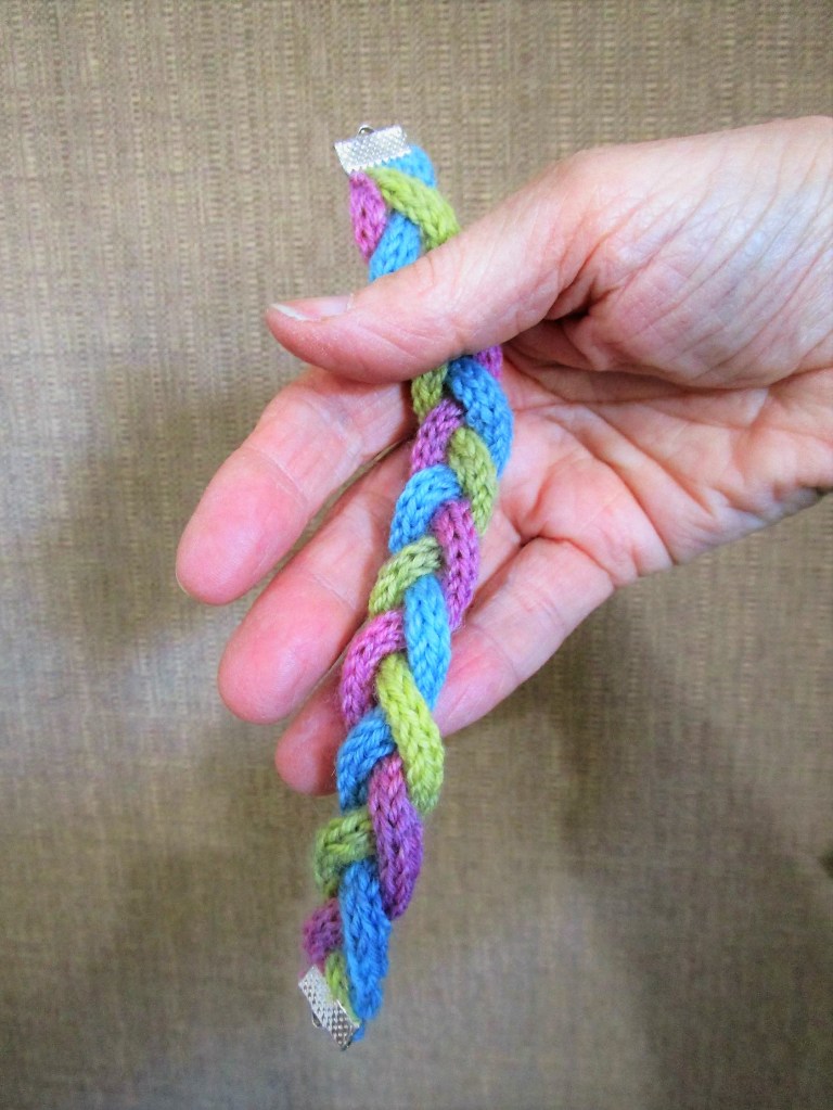
The answer is I-Cord! This little add-on is used for strings for tying knitted hats and other decorative frou-frou. All it takes is a few yards, a cast-on, and repeated knit stitches over a very short row.
So today I am researching and stitching up all kinds of I-cord accessories. These projects will include jewelry so I will need a selection of beads.
The two strings in the left of the photo were purchased today. All the others I had acquired in the past 3 or 4 four years.
I also perused my stash for left-over fingering weight yarn. (No shortage here.)
To kick things off I worked up this 18-necklace using tonally dyed merino wool and some porcelain beads.
My version is made with just one strand because I had only 24 beads. I love how each bead dangles below the cord. I am wearing it over a shirt, but this necklace would also be soft against bare skin.
I sewed one end of the three strands together, braided them and then sewed the other end. The crimping finial is designed for holding ribbons so that they don’t fray.
For my third item, I switched to worsted weight yarn and move up to a size 5 needle. I was so happy to use up the left-overs of this lovely variegated Malibrigo merino.
This necklace doesn’t use a pattern. It will be made to my own specifications.
And here are my three I cord samples as of dinner time.
This should be enough material to work up a class proposal. I will also try making a headband and a multi-strand necklace.
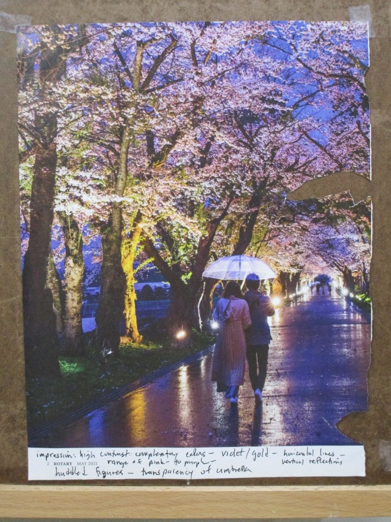
This month I have been participating in an art forum called Sketchbook Revival. For this page of my sketchbook I am following Faith Evans-Sill and her workshop that has us experiment with color and pattern prompted by an image.
I chose to be inspired by a photograph I found in my Rotary Magazine.
For the technique, we are asked to sweep stripes of color across the page, then intersperse shapes and patterns between and among the stripes. I decided to be somewhat more literal in my experiments. I wanted to reproduce the colors and elements that I saw in the photo, especially the trees.
In addition to regular watercolor paint, I worked in some metallic paints to capture some of the shine that’s visible in image. Once everything dried, I made marks with a black micron pen and a few colored pencils.
There were two benefits to the exercise. 1. Splashing the paint around was relaxing and stimulating to my brain. 2. I discovered colors and mixes that were new to me.
If you are interested in Faith Evans-Sill and her class offerings, here is her webpage.
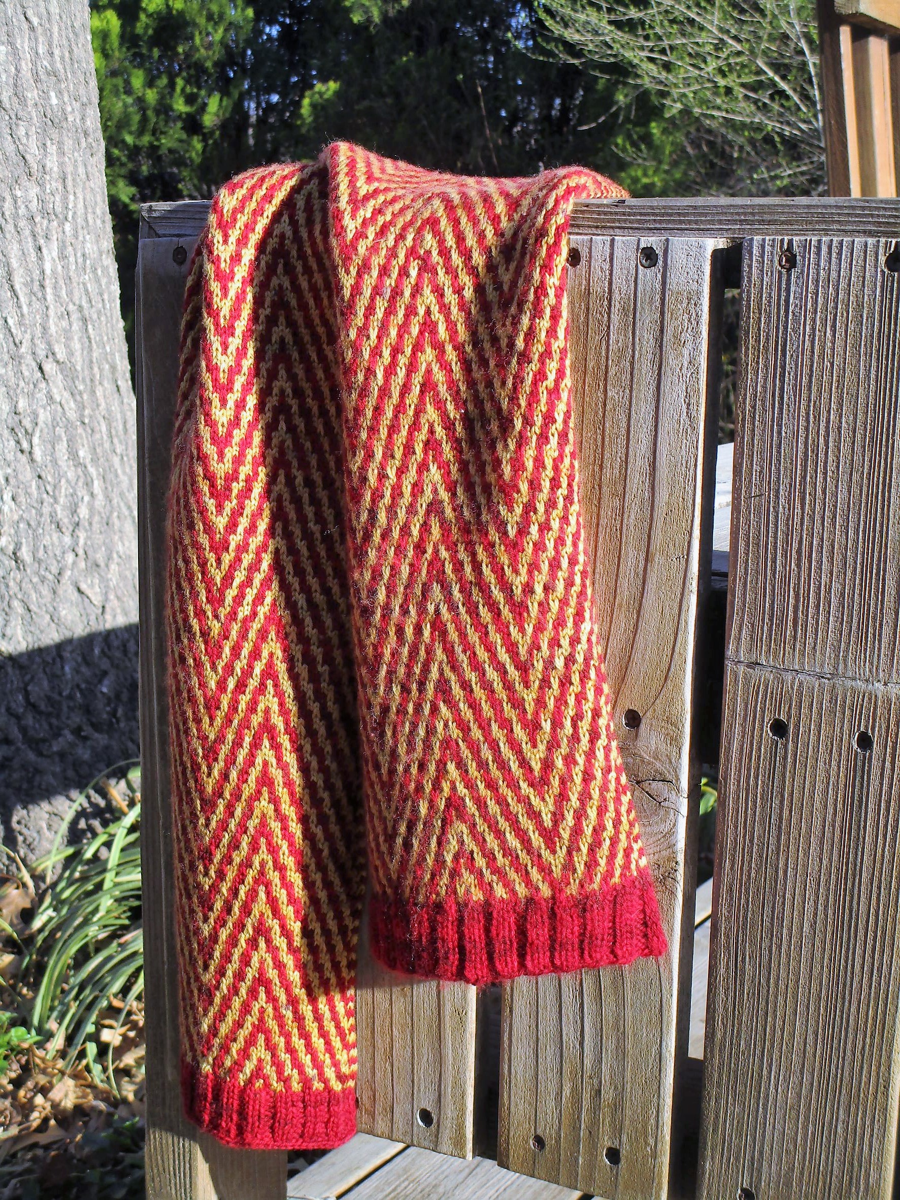
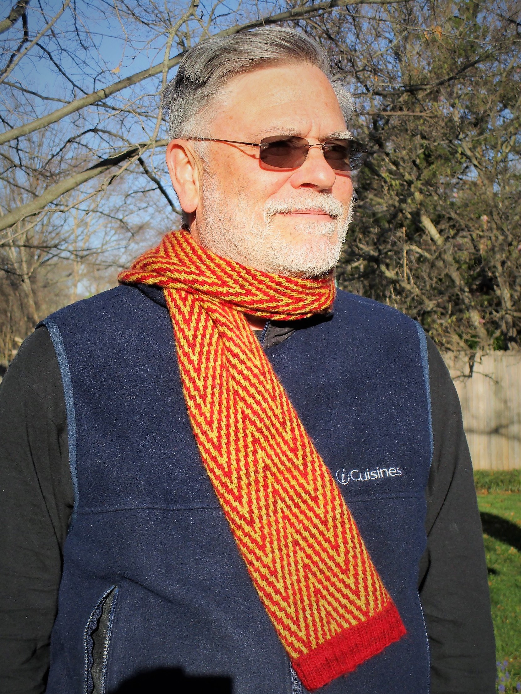
A day late and a dollar short, here is my finish for yesterday. I made this for a friend’s birthday which, sadly, came and went before I had finished knitting.
The chevron stitch pattern is one I had been wanting to try for a while. This version is created using a slipped-stitch, not a stranded technique – which contributed to the lateness of my completion. Because slip-stitch, also known as mosaic technique, tends to pull the rows up tight against each other, it took 48 rows to create 4 inches of scarf.
The yarn came from Hobby-Lobby, from its new line of hand-dyed fingering weight yarns. Fiber is 100% superwash merino wool.
Bill has kindly consented to serving as my model today.
If you would like to give this stitch a try, I have attached a pdf of the twelve-row pattern that I used.
It was fairly easy to memorize, with only three right-side rows that varied. In this technique all back-side rows are the same: purl the knits and slip the slips. The pattern also features an I-cord edging.
I’m pleased with the result, but mostly relieved that I finished.