For the past two weeks I have been laboring slowly but surely over this quilt. The first week was spent sewing blocks together and sandwiching the quilt. Because I plan to do the quilting in sections, I assembled the quilt in three pieces.
I dithered about for what seemed like forever to come up with a quilting plan. Many hours were spent viewing various classes on Craftsy. Christa Watson’ class “The Quilters Path” is one that gave me some guidance.
https://www.craftsy.com/product/the-quilters-path-plan-it-stitch-it-quilt-it-dvd-streaming/
By Monday, I had come up with a plan.
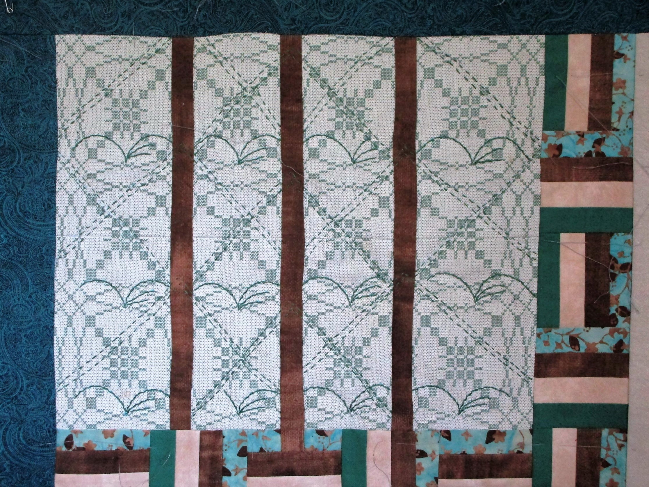
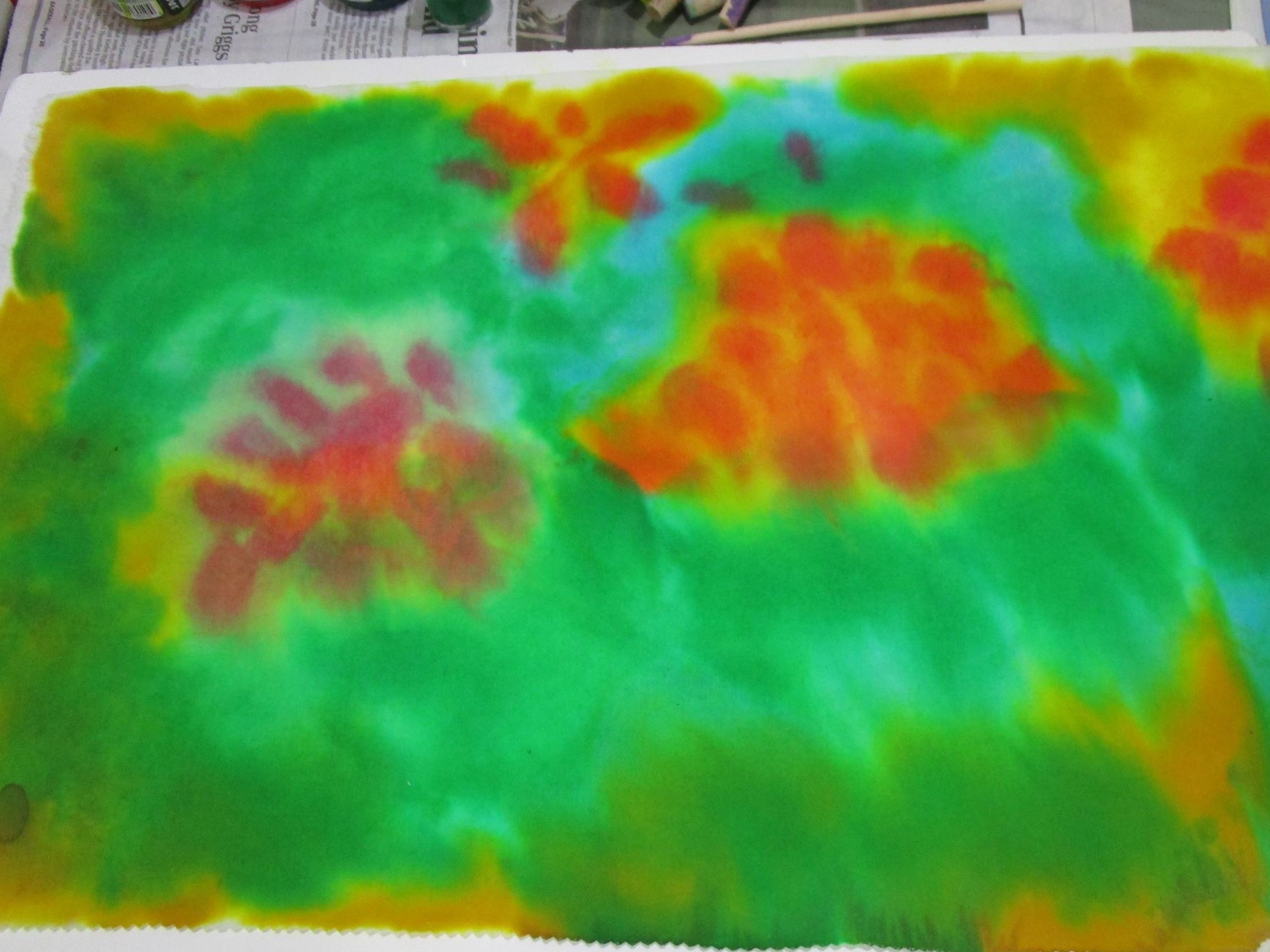
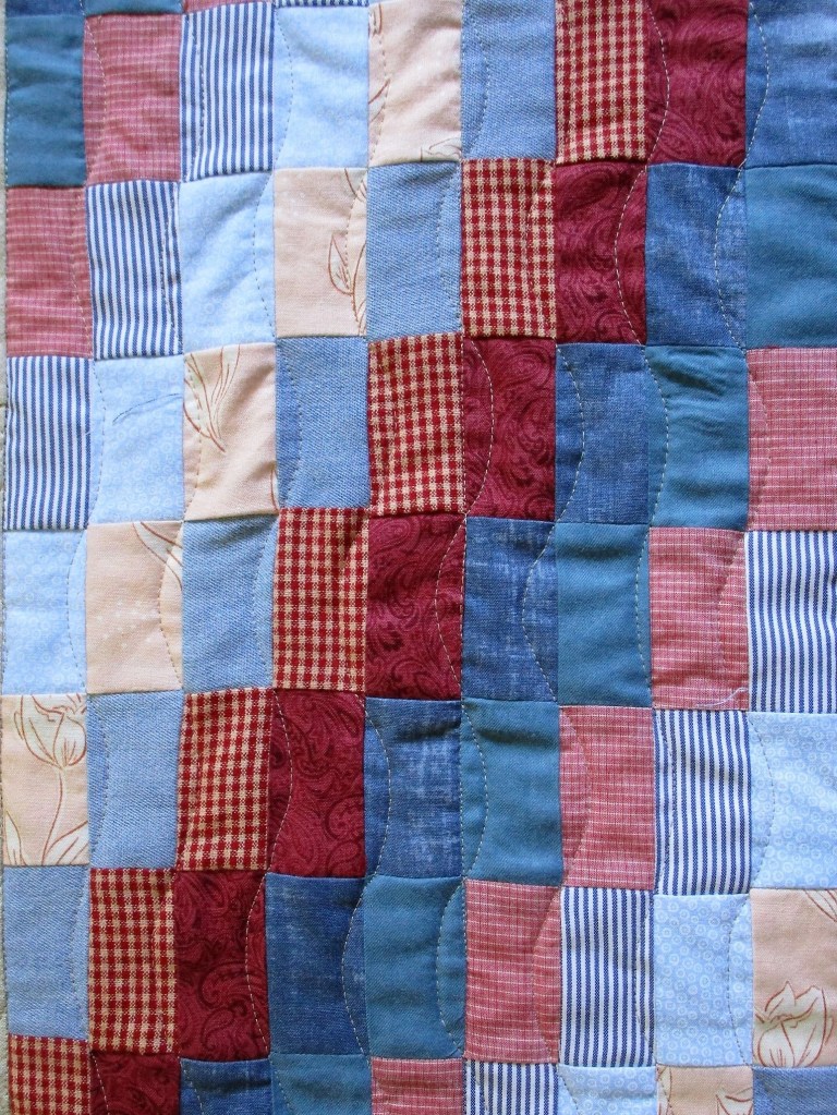
I started with the Around the world block. First I worked stitch-in-the-ditch every three inches to stabilize the section. Next came the free motion pattern. All of those straight lines needed to be softened and quilted down.
I worked gentle curves across the straight lines.
What remained to be quilted in this block were two large sections of background fabric, including the part with the whirligig. Christa’s all-over motif of loops with random flowers and leaves came to the rescue.

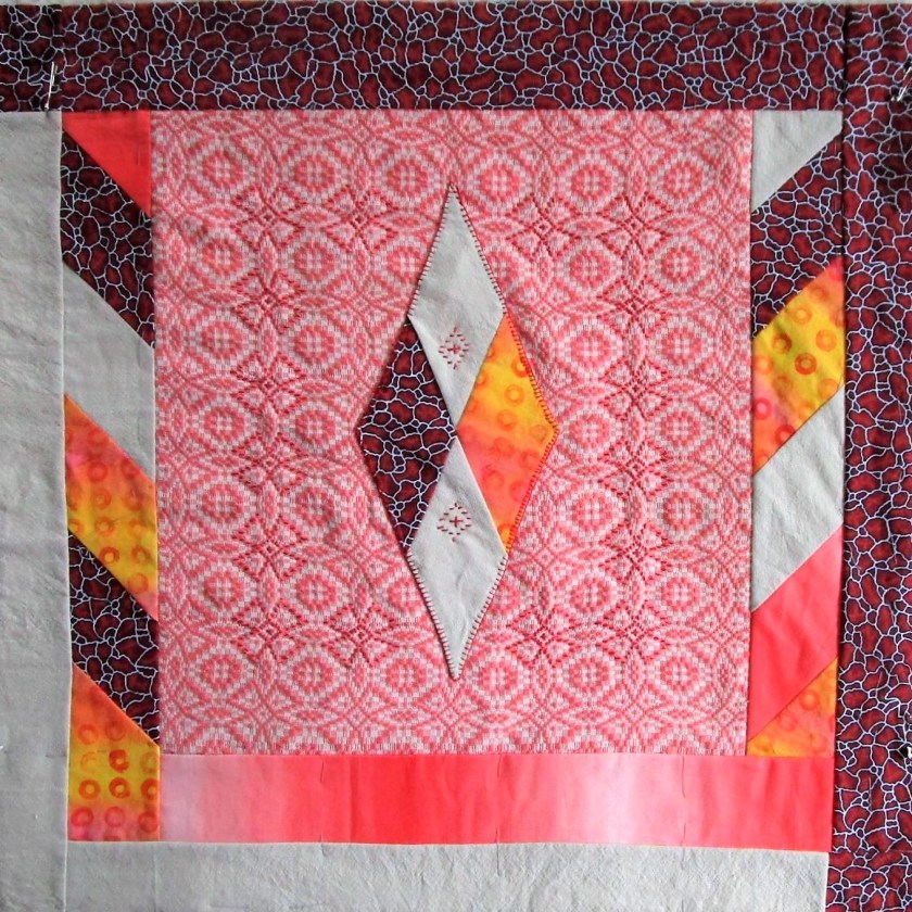
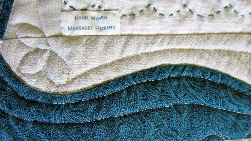
Here is a photograph of the completed sections of an adjoining block.
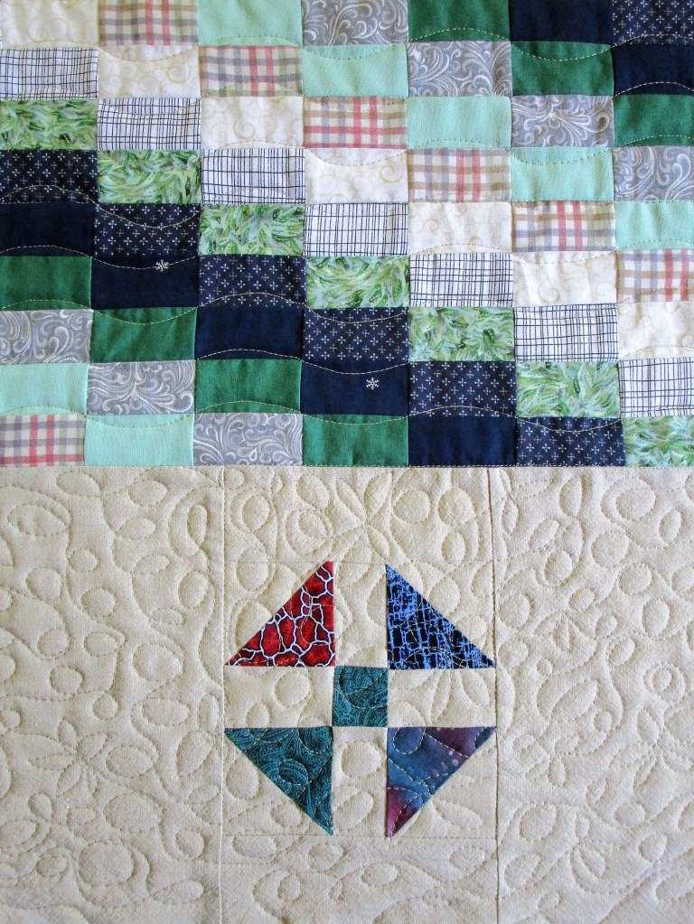
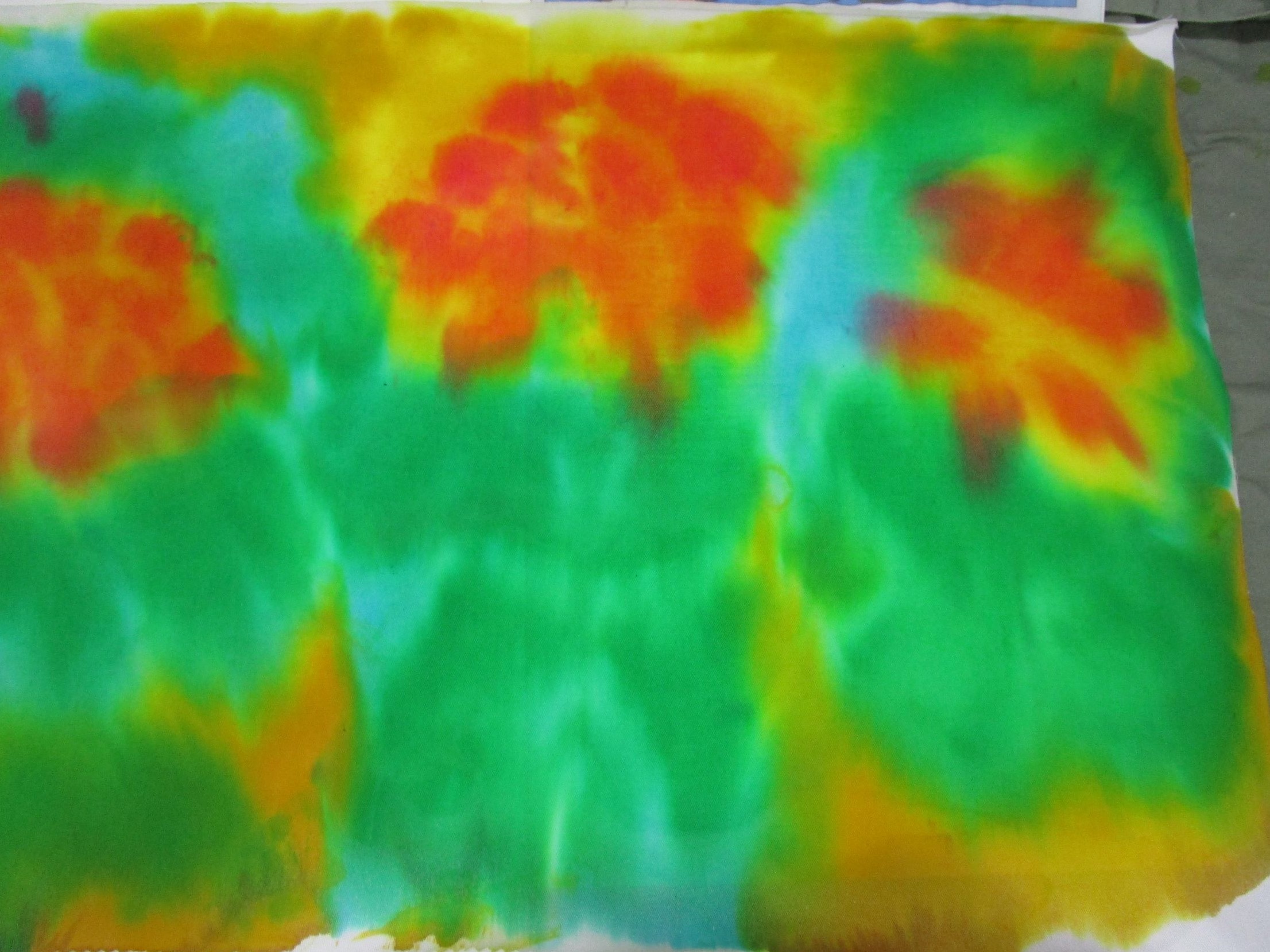
This is very pleasing to my eye. Having now completely quilted one of the three pieces, I feel that I will likely finish the other two by week end. Then I can move on to final assembly, binding and the Big Reveal!