Posted in painting

Color wash – The Dark Side

Okay, no Star Wars reference intended – I am talking about painting on a dark solid fabric. This is what I chose to do today. My goal is to make swatches that will represent the night sky in a future fiber object. Here are my chosen fabrics:

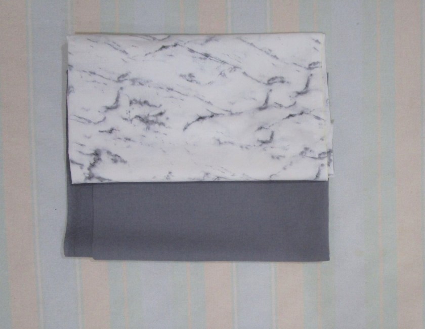
The gray solid will be used for most of the work. I chose the white marbled fabric because the black lines are vaguely cloud-like. Here we go:

With the gray fabric pieces cut roughly 13 by 21 inches, I painted one with blue and black and the other with violet, blue and black. I used foam brushes and loose, wavy strokes. Then I blended all the blotches together and lay the fabrics flat to dry. Here they are after drying.

Blue-Black
Violet, Blue and Black

The original gray is still visible, but it just shades the colors into a deeper range. I like the brooding, atmospheric effect. Next is the white marbled fabric.

I stuck with the blue paint, but darkened it by mixing in black for a monochromatic color scheme. At the last minute, I decided to scrunch the wet fabric.

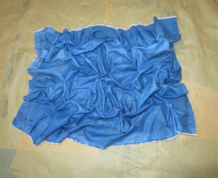
And here is the swatch after it has dried.

Whoa!

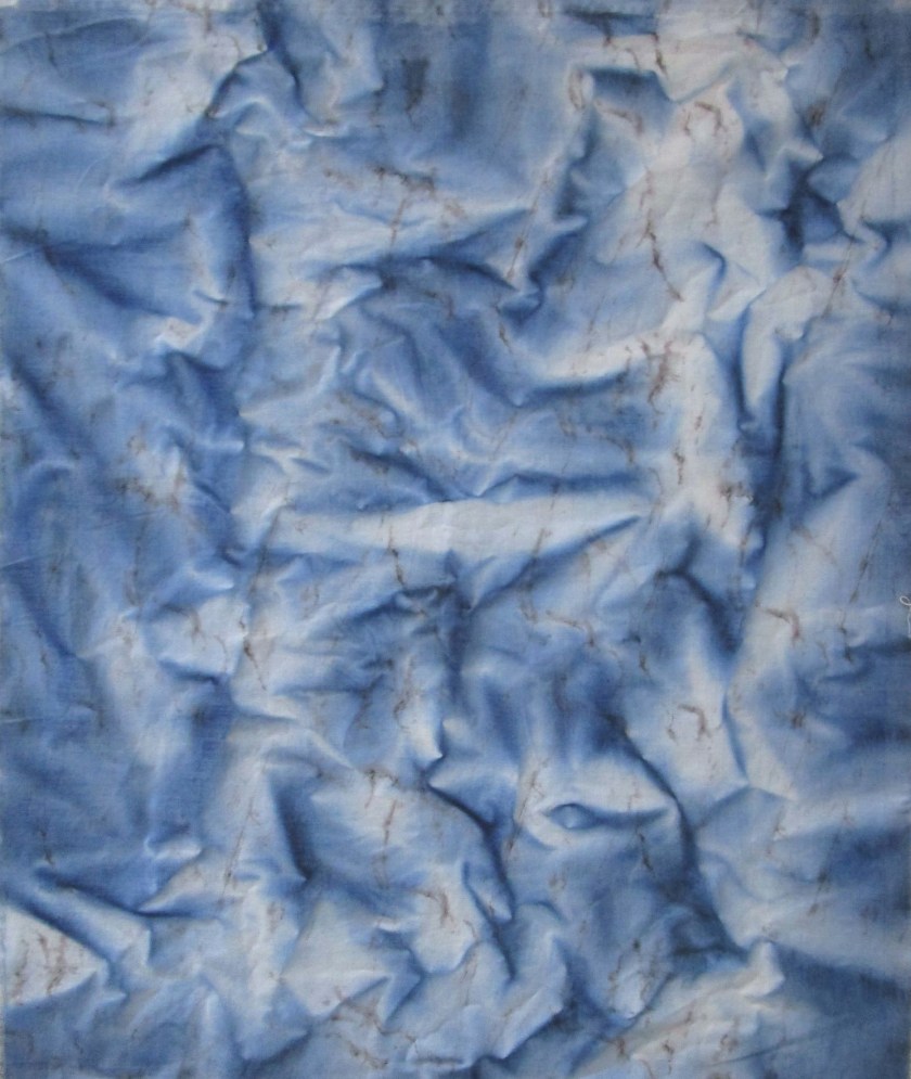
This looks nothing like a night sky to me. It more resembles fast-moving water rippling over rocks. This piece could inspire a new fiber object for a later day.

Posted in colorwork, painting

DIY Fabric Color – Pattern

Today I will be enhancing the fabrics I color washed yesterday with more color. I’m excited to try water-based resist, a product new to me. I will be using it on the pale pink strip of fabric, also pictured, above.

The product came with a little applicator. I quickly discovered that it was impossible to get the gloppy resist paste into the tiny opening on the applicator. So I moved on to using a narrow paintbrush. But first, I wanted to try some crayons, just to see if the crayon marks would resist the paint. Here is my swatch all crayoned and resisted, before I flowed in the paint.

I mixed yellow, orange and ecru Dye-Na-Flow paint to get a bright gold color.

Tomorrow we will see whether the resist worked. Next I moved on to the striped piece of fabric. I wanted to print it with the following item:

Any one who is related to a son or a grandson will recognize a foam nerf bullet. I will be printing with the back end of the bullet, which makes a very nice circle. Here is the fabric before and after printing with orange Jacquard Textile paint.

Before. (In this image the paint is still wet.)
After

I would say that this fabric is unique.

Addendum to this post: I thought you might be interested in seeing these fabric swatches after they were washed, dried and pressed.

I’m pleased with these swatches, but especially so the water resist piece. Even though the lines did not resist all the way through the fabric, the front of the piece shows the pink lines clearly. The only negative is that the resist hasn’t completely washed out of the fabric. I will probably need to give the fabric an additional soak.

Posted in painting

DIY Fabric Colors

Recently I ordered a LOT of Dye-na-Flow fabric paint from Dharma Trading Co. https://www.dharmatrading.com/ Now that I have the quilting bug, I want to create my own fabrics. I know, there are thousands of beautiful quilt fabrics out there in retail world. But most of them are just not for me. And the ones I do like are kinda pricey. So here I go, making my own.

I had purchased several yards of white and light gray solid fabric specifically for coloring. I have an idea for designing a sunset scene. So today I am coloring the white fabric with warm colors such as yellow, orange, gold, and pink. Here is my swatch fabric where I tested a few combinations.

There’s also a little bit of ecru in the mix.

I plan to use 4 inch strips in my project, so I cut the fabric into 13″ wide pieces. This will yield three strips per piece, and incidentally, be a workable size for painting. Here are the results of today’s work:

Stripes of sunset colors. The orangey stripe should fall into the center of the 4 inch strip.
This gold turned out very well. I added some orange stripes and splatters. The stripe will go across the strips.
This was the tail end piece. It may be enough for one strip. It looks a bit blue in this photo, but I assure you that it dried pale pink.

It was a relaxing and productive afternoon. I look forward to working on the gray fabric. It will be interesting to see how it reacts to the sheer fabric paint.

Posted in drawing, hand embroidery, painting, sewing

Welcome to Summer, Farewell to Gloria

It’s my desire to note each season as it arrives with a fiber project that celebrates the specialness of the season. When I learned of the passing of Gloria Vanderbilt, I decided to include a small tribute to her in today’s celebration of summer.

I remember Gloria Vanderbilt best from her television adverts, promoting her line of jeans. She promised to make jeans designed to fit women’s curves. That promise was fulfilled – those jeans did fit us! She branded her product by signing her name on the hip pocket. Soon, all the designers were catering to women’s shape and placing their logos on the pockets.

So, thank you, Gloria. You made us feel good about our bodies, at a time in our lives when we needed a boost to our self image.

Today’s fiber object shows a woman contemplating the sun while lying on a beach. In tribute to Ms. Vanderbilt, my lady is dressed in a pair of cut-off jeans. Here is the sketch I made with the design’s basic elements.

I toyed with the idea of inserting the Gloria Vanderbilt logo somewhere in the design, but ultimately decided not to. Here is the finished object.

Hello Summer, Goodbye Gloria

I’m happy with all the elements of this piece. First of all, my ability to draw is getting better. It only took me two tries to sketch this slightly stylized female body. I am also getting better control of the fabric paint while using the wash technique. And finally, both my hand and machine embroidery are improved.

Posted in colorwork, painting

Colorwashed Landscape

Fireweed

We are busy day today, getting ready for hosting company. So instead of working up a new fiber object, I thought I would share this colorwashed piece of fabric which I made a few months ago. How it came to be is somewhat interesting, at least to me.

I started with a square of white cotton poplin. Using slightly wavy strokes and starting at the top, I applied blue, purple, red and green. Before the fabric dried, I used the “scrunch” technique – crumpling the fabric in various places. This causes the paint to run and dry unevenly, resulting in the dark creases you see above. Immediately, I thought it looked like a view of the Rocky Mountains. Dark brown and black appeared in the creases where the red paint met the purple and green. This reminded me of the mountains in recovery from a forest fire. To enhance the effect, I printed on the fabric in brown and green with blocks cut in jagged shapes, to represent the tree trunks, both living and dead. I painted snow on the mountains. Then I used fabric markers to delineate the sky and a field of pink blooming fireweed.

This landscape feels to me as if it appeared by magic.