Also known as the Frugal Crafter, Lindsay is very generous with her knowledge of water color painting and teaches her art through videos on her WordPress blog as well as her Teachable site. I chose the Texture Toolbox: Feather and Fur lessons. This is an intermediate course, but I feel ready for it. Here is my result from lesson 1
And here is lesson two: A little sparrow fluffing up her feathers after a bath.
I’m pretty happy with both of these pieces.
Today the weather is still stunningly beautiful. My husband has gone fishing. I will likely spend the day gardening. There are seeds to plant and flowers to pick.
I hope you enjoy your day. You know it will never come again.
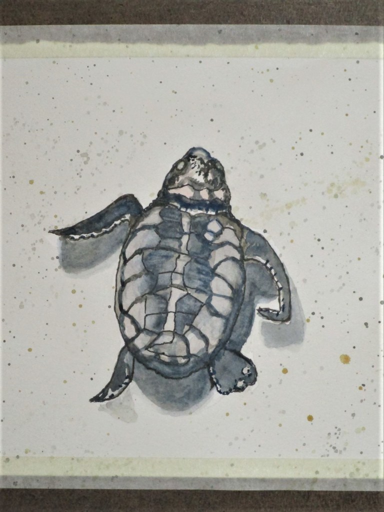
Today I am offering two watercolor sketches of baby sea turtles. Everyone loves babies. And what better symbol of the earth’s prolific life than these little guys?
Their moms swim up to 1,500 miles to return to that one special beach. Thousands will converge on the spot where they were born some years before, each female toiling up the beach until she finds that sweet spot to lay her eggs. And lay she does – dozens are dropped into the nest, which she slowly buries and then toils back to the water, never to lay eyes on her own progeny.
The hatchlings dig out and sprint towards the light of the sea. Those that survive predators on the beach face a most uncertain future.
So let’s all cheer on the baby turtles, for their own success, and as a symbol of our own future selves on this precarious planet, third one from the sun.
I am having issues with realism. It’s not what you’re thinking. This isn’t about reality. I have a firm grip on my personal reality, and also on the wider reality of life in the dysfunctional 21st century. No, it’s about trying to portray realistic images in my artwork. My dissatisfaction began to grow as I learned to paint with watercolor. All the instruction I have received so far focuses on rendering what I see in the real world. Specifically, I’m taught, how to paint in a manner that emulates three dimensions of shapes in the real world. It’s not going well. And now my dissatisfaction with painting has spilled over into my work with fiber, leading to a muted feeling about all my work.
When I began to experiment with fiber, I was inspired by the work of Gustav Klimt. Klimt began his training in applied arts. This influence shows in his paintings,which are filled with decorative surfaces. It’s the opposite direction of realism. He takes the human form and renders it as a surface, with delicate textural coloration. The rest of his canvas is bursting with a riot of color and pattern.
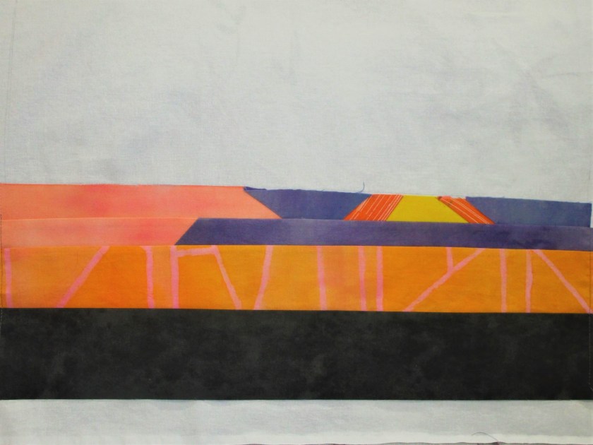
It is time for me to return to my first impulse about fiber art and make an abstract work. I’ve chosen a sunset as my subject. This photograph is one I took about a year ago during one of our trips to Wisconsin. My intention is to boil the sunset down to its essential lines and colors, sew strips to a backing fabric and then apply decorative stitches. I’ll use hand-painted scraps of cloth leftover from other projects.
I started out by making a rendering in crayon, placing an emphasis on the angular lines.
After working out the number of strips I will need, I scaled up the image to size, which will be 18 by 12. Next I assembled the fabrics.
I realized that I will need to paint a few more pieces to have enough grayish purple for all the clouds in the scene. So I found a few white and gray scraps that will be painted.
I also made a pattern in full size on butcher paper. I don’t have a photo of it for you, and it has already been cut up. As I made the pattern, I winnowed down the detail even further to get to the essential lines of the sunset. I am using muslin as a backing fabric. Work will proceed from the most complex strip (the sun) outward, first down and then up. After a few hours, I had the lower half assembled.
After getting to this stage, I felt a palpable sense of relief.
Tomorrow I will finish painting the fabric and assemble the rest of the piece.
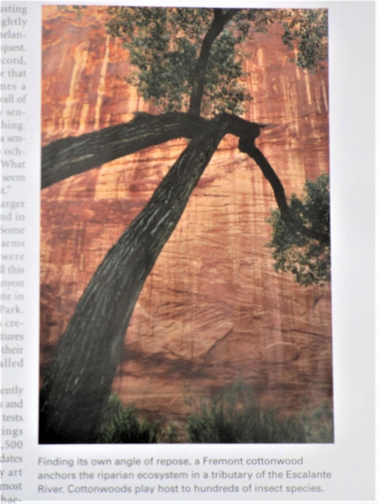
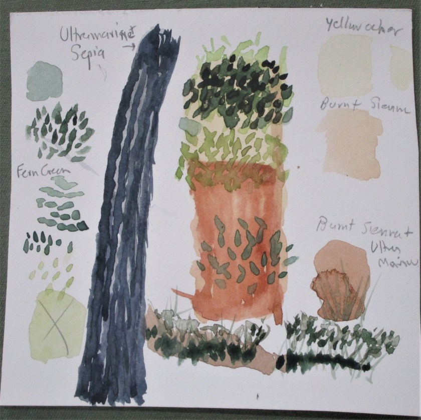
While organizing the reading material in my studio, I came across a National Geographic magazine from 2007 that I had saved for some reason. There were no bookmarks or post-it notes attached. So I asked myself: why did this issue end up here? The only thing to do is thumb through it and sees what jumps out. I stopped at page 147.
The photographer captured a tortured cottonwood on the Colorado Plateau, which is an area that sprawls across four states and contains a vast expanse of sedimentary rock. The plateau is carved by the Colorado and other rivers. This particular cottonwood is on the banks of the Escalante River in Utah. The dramatic sandstone cliff behind the tree forms a warm backdrop to the massive black branches. It’s as if the tree is embracing the cliff. I knew right away that I wanted to paint it.
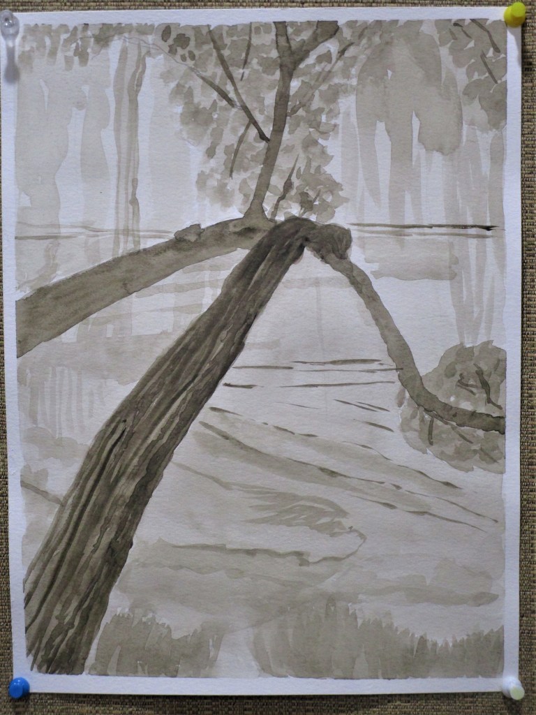
Instead of just jumping in and fooling around with paint and brushes, I studied the subject a little. Following the classic approach to painting, I first made a value study. This involves working out the light-to-dark areas of the image in a monotone. I had no gray paint, so I chose to paint the value study in sepia hues.
That seemed to go well. I was satisfied with this study. Next I worked out my palette. I had a little fun, making my paint swatches into parts and pieces of the image.
The palette will be yellow ocher, burnt sienna, sepia brown, ultramarine blue and fern green. My gestural study, using the selected palette, was next. I don’t have a photograph of this step. What I learned from that step was that the stone cliff is composed entirely of warm hues. So I chose to paint the tree in cool hues. As I worked through my studies, it became clear that this subject is all about the focal point. Having realized this, I knew it would be my task to eliminate any parts of the background that distracted.
After sketching in the outline of the tree branches, I applied an overall wash, and then laid down some burnt sienna on the cliff face.
The cottonwood looks ghostly. Focal point is where the branches intersect.
A landscape watercolor can take several steps to paint. I ended up painting four different layers, each of which needed drying time before I could proceed. Here is the painting after the second and third layers were complete.
I let it dry overnight. The next day I worked in the final details, adding another layer of darker leaves, some shading and shadows on the tree trunk, and some fine lines in burnt sienna on the cliff face. I tried to emphasize the detail lines that directed the eye to the focal point. After these parts dried, I glazed the whole background with a thin layer of yellow ocher and finally worked some textural lines onto the trunk.
Finished Painting. Cottonwood on the Escalante River
The finished painting is definitely better than I had expected it to be. The only fly in my ointment is that I didn’t use artists’ quality paper. So there is some buckling to deal with. Does anyone have recommendations on how to flatten the paper out?
Over the week-end, I played with paint – both fabric and watercolor types. It was a relaxing way to spend the days. Let me tell you about the fabric experiments.
I have an idea to create a small quilt with an underwater theme. There will be schools of little fish moving about in multiple directions. I already have some lovely orange striped and some batik fabrics for the fishes bodies. What I need is an interesting blue background that looks like ocean. So I got out the Jacquard Dye-Na-Flow paint.
I started with plain white fabric and painted a series of bands in shades of blue and blue-green. Not content to stop there, I grabbed the rock salt and applied it liberally.
This was a little bit of overkill. It’s very pretty, but now the fabric looks like blue seltzer water. Since this look is too busy for my original purpose, I will set it aside for another use. Next I overpainted a couple of printed fabrics that had white backgrounds. The first piece was pretty straightforward – a marble veining on white.
This could be a background
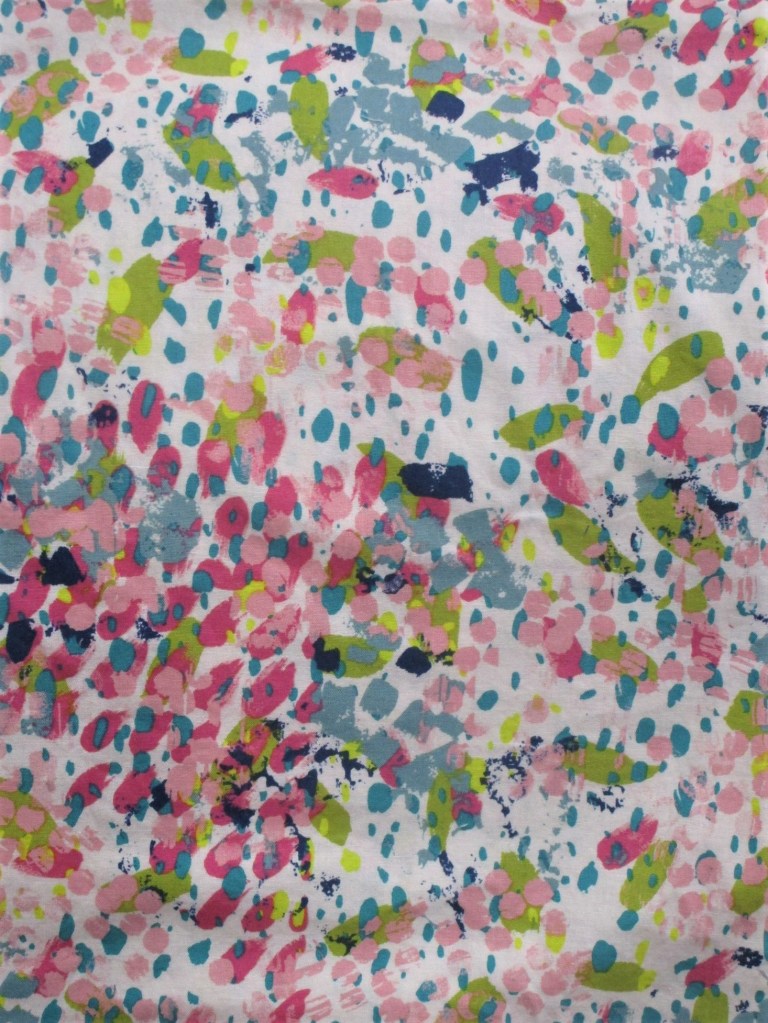
And finally I selected a print that had a white background. It looked like this:
After painting with azure blue it now it looks like this!:
I love it. Notice how the chartreuse green blobs jump into prominence. They resemble tiny fish. And the dark pink blobs remind me of coral clumps. All the paler colors have faded into the background. This is something I’m excited to work with.