Posted in painting

#WorldWatercolorMonth Two More Days

It’s been a quiet week-end here at the studio. I have definitely been absorbed by painting.

Today I have two images to share. The prompt for July 3rd was Playful. I chose to paint some dolphins in a pool with their toys.

This is technically a mixed-media painting. I started out by scribbling on the white paper with white crayon to create a wax resist. I also used a little white gel pen, to see if it would resist the paint. And finally, I brushed on the traditional drawing gum resist. The frothy effect is the crayon. The white ring in the lower right corner is the gel pen, and the white marks on the dolphins’ heads is the gum. After applying the paint, I came back with black micron pen to add detail to the dolphins.

This was a fun and fairly quick painting. I like that it looks like a storybook illustration.

The prompt for July 4th was the word Quiet. Immediately I thought about a sleeping baby. If the baby is sleeping, momma tells everyone to Be Quiet! But then, I thought about sleeping owls. They also nap during daylight hours.

I found a good photograph of two sleepy owls, and made this sketch of it:

I really liked the sketch and was excited to render the image in water color. This was to be a traditional painting, with nothing but watercolor paints on top of a few pencil marks.

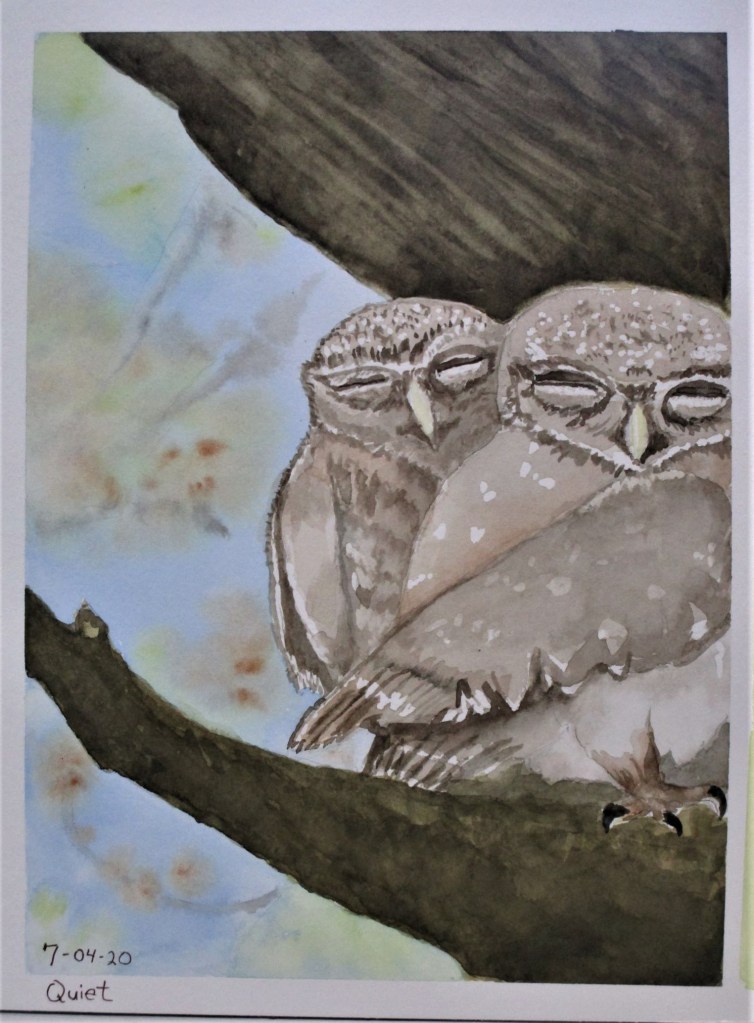
It took me all afternoon, because I had to wait for each wash to dry thoroughly before continuing. I reserved the white of the owls’ feathers with drawing gum resist. Completing the painting was satisfying, although some areas are not quite as I had intended them to be.

While the pose I rendered is exactly like the photograph, there is a some mystery about the image. Can you see the wing of the little owl on the left? It is tucked by its side. And yet, something that seems to be a wing is lying on top of the tucked-in wing. After thinking about this, there’s only one logical conclusion: The larger owl has its right wing wrapped around the smaller owl.

What do you think? Do owls give hugs? Or did the internet photographer doctor up the photo?

Posted in painting

#WorldWatercolorMonth Texture

I was happy with today’s topic. It’s time for me to practice painting textures. I especially wanted to paint a basket. This basket was stashed away in a bathroom cabinet. It is filled with Spanish moss – I’m not sure where I got the moss. So, two textures – plaited reeds and Spanish moss. To add a third texture, I posed a little wren, who seems keen to grab some of that moss for her nest.

Yellow ochre, New Gamboge, Burnt Sienna, French Ultramarine Blue and a little Payne’s grey. I added two ink colors using Micron pens – Black and tan. Paper is Paul Rubans watercolor block.

Posted in painting

#WorldWatercolorMonth Day 1

For the first day of #WorldWatercolorMonth, I chose the image of jumping for joy. Having my joyful figure on the beach at sunset gave me a ideal opportunity to practice blending colors in a wash. I used micron pen on the shore line and figure only.

She sure has a lot of hair.

Paynes grey, New gamboge, Quin red on Strathmore watercolor travel journal.

Posted in painting, quilting

A little of this, a little of that

It’s been almost two weeks since I posted last. My days have been full, if not busy, but nothing to write home about. At least I can catch you up on projects in progress.

Improvisational Quilt.

As you see in the photo, the quilt is under the needle. I have been whacking away at the quilting for days and days. This is the biggest piece of cloth that I have attempted to quilt with my lil’ old Bernina.

I’m doing a parallel- straight line pattern, mostly because this type of quilting doesn’t require much manipulation of the quilt. I start at a long section and keep sewing parallel lines until I get tired or run out of bobbin thread. My goal is simply to finish. Pretty lines and straight lines are both out of the question at this point. Optimistically, I’m going for quirky charm. My daughter loves that aesthetic.

Watercolor Painting

My water color painting results have been less than satisfying. When I crashed and burned at applying the background wash to the bird of paradise painting, it got tossed. I then resolved to start back at the beginning. To this end, I checked out a “teach yourself” watercolor instruction book from the library and began working through the techniques one each day. Today’s lesson was line and wash. I chose to paint from a photograph I took of a pond on our local walking trail.

Willow trees hanging over the water

Here is my painting.

I enjoyed working on this one and am happy with it. The only thing I want to add is darker paint on the the group of leaves at the right edge, giving the painting more contrast of values.

The garden has been getting much of my attention. But starting today, heat is intensifying. So I will likely shift my attention back to indoor activities.

Posted in painting

Bird of Paradise Work in Progress

I have been collecting images of the tropical flower called Bird of Paradise for a few months now. Initially I wanted to make quilt blocks with this flower as a motif. But lately, I have been charmed by this photograph offered by the San Diego Zoo, of a flower with hummingbird.

I decided it would be a perfect reference for a water color painting. There are three techniques that I could practice from this one photograph: color mixing, background washing and masking.

It occurred to me that I would be more successful if I practiced each of these techniques separately, before combining them into a finished painting. My first study was the hummingbird.

The masking fluid allowed me to reserve the white margins on the breast feathers and the wings. I think he came out quite nicely. While I was at it, I used the same paper to determine the color mixes for the rest of the painting. You can see my little notes penciled in above the bird.

As an aside – Did you know that hummingbirds are the primary pollinators for Bird–of-Paradise flowers?

Yesterday I painted a small study of the whole image. The scariest part was the very dark background wash. I used a mix of ultramarine blue and burnt sienna, with a small amount of lemon yellow to neutralize the blue.

This study is on 5″ by 8″ Strathmore travel journal

I feel I was successful in laying down the wash correctly, but it isn’t quite dark enough. There is also insufficient contrast between the bird and the background. And what can I do to make the petals more luminous?

Palette: Lemon Yellow, New Gamboge, Winsor Transparent Orange, Thalo Blue, Ultramarine Blue, Burnt Sienna, Quinacridone Red.