Posted in colorwork, painting, quilting

Follow up on Fence Questionaire

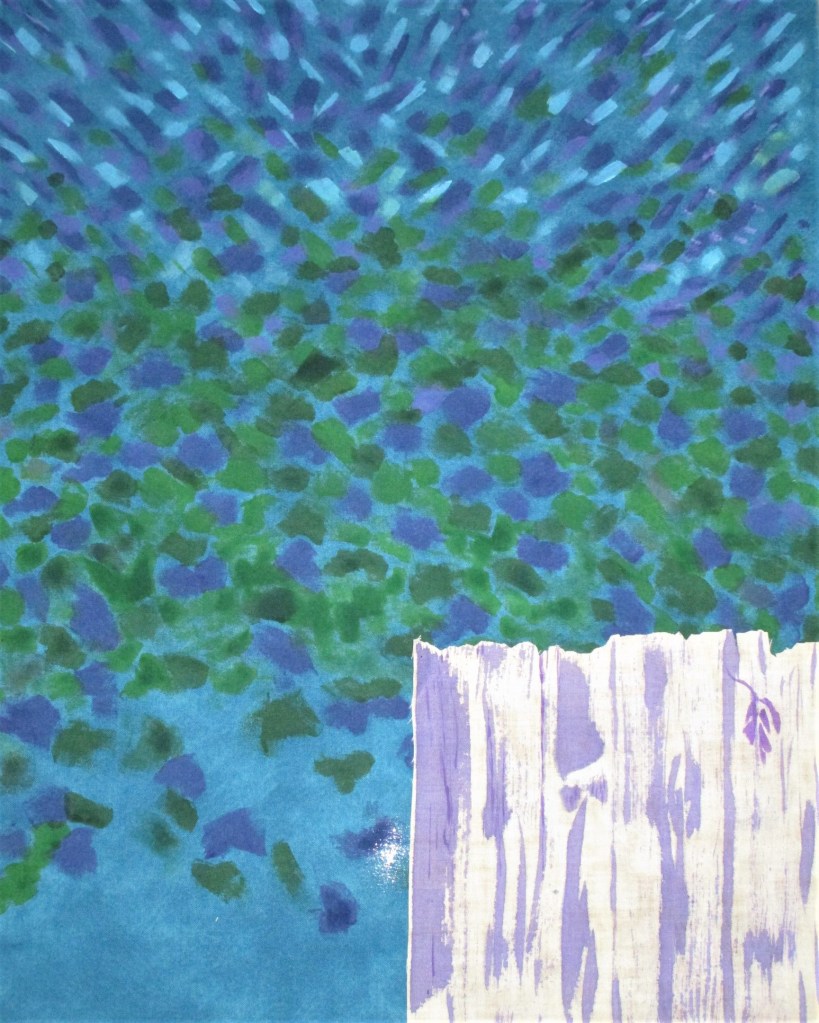
First of all, everyone said “Keep the fence.” Many of you liked the wine-purple color, but some agreed with me that an adjustment of some kind was needed.

I did try options 1 and 2.

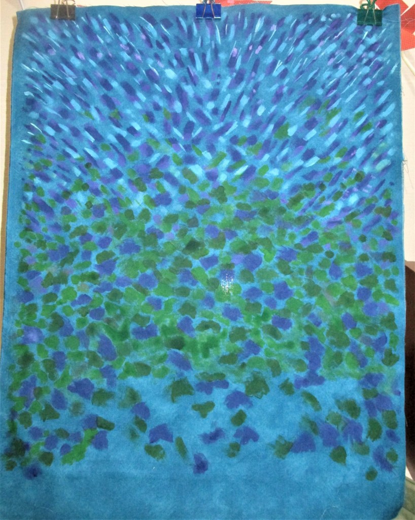
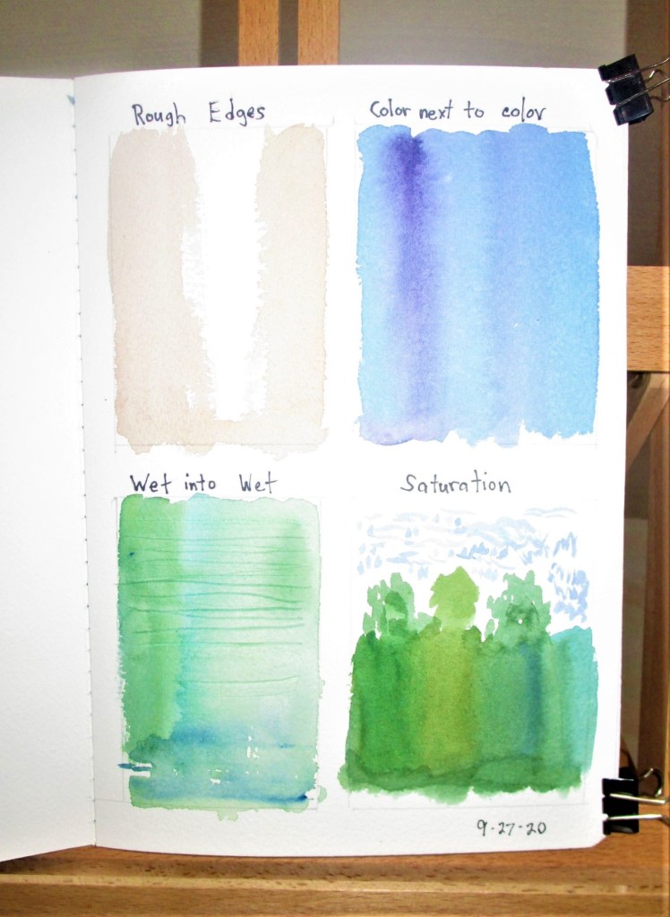
Option 1: Start over with another fabric. Here are the samples I painted on the white fabric. I decided that it was a fun exercise, but just didn’t look too fence-like.

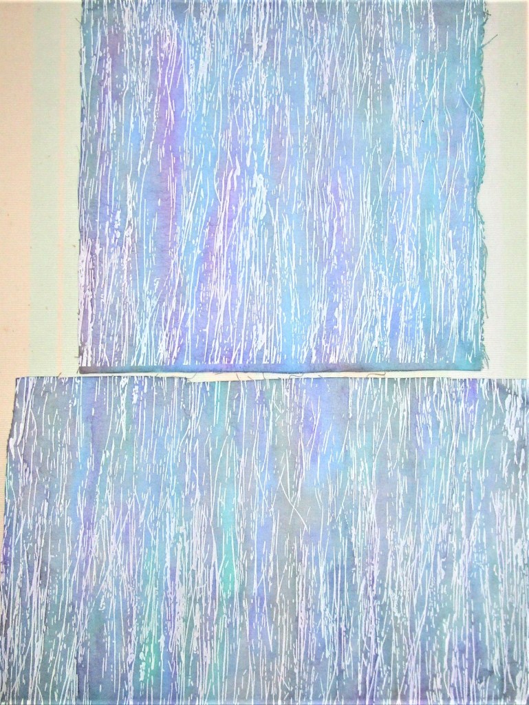
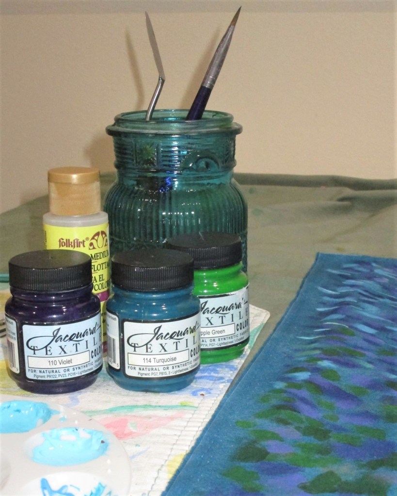
Option 2: I applied a wash of a cool blue color to tone down the strident red violet.

It just plain didn’t work as intended. To my eye, this is worse than before.

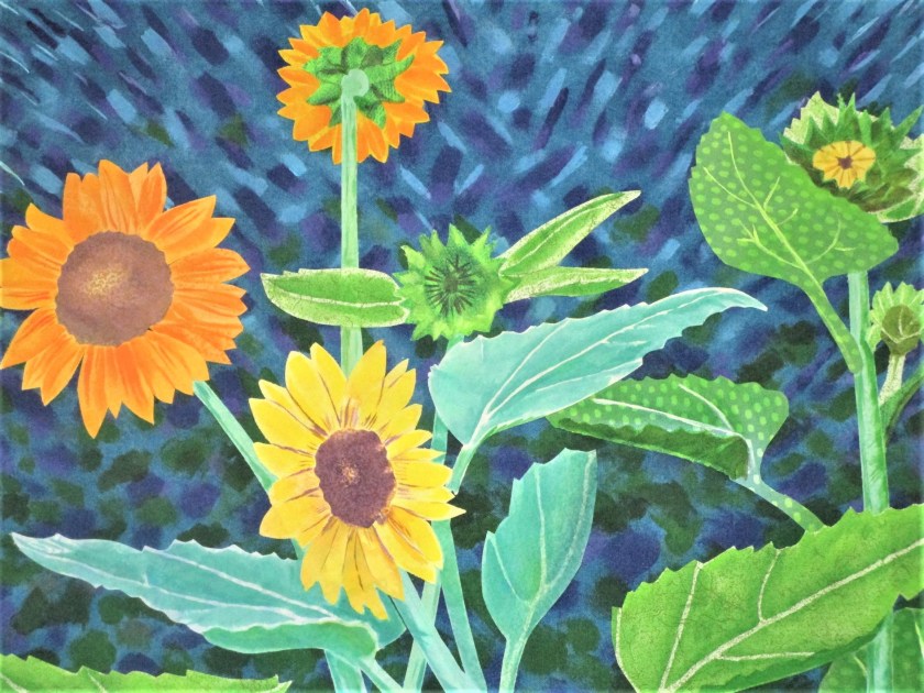
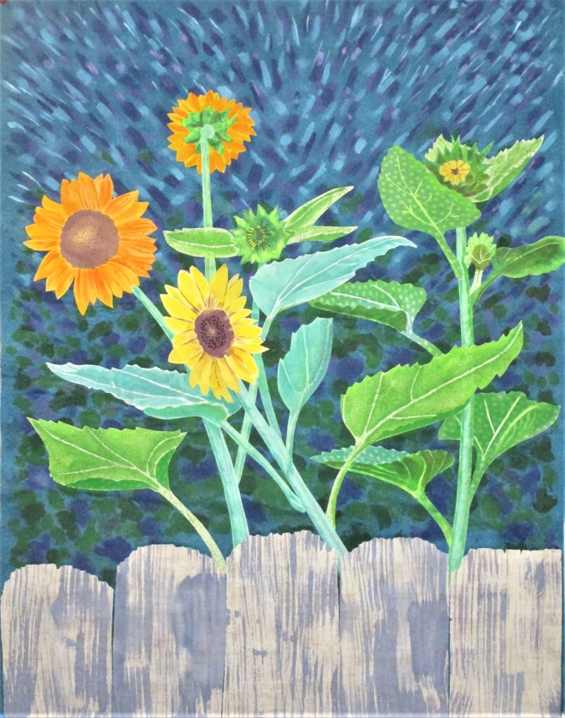
In the end, I chose to start again with the original fabric, for the same reason that I picked this fabric in the first place. The print had an earthy, woody texture to it. This time I mixed my violet paint with enough azure blue to create a sort of periwinkle or lavender tone. I also modified my foam brush by cutting notches into it.

The Winner!

Thanks to all who participated in the game. Your encouragement and positive remarks let me feel the community around me. I wish I could give you each a hug.

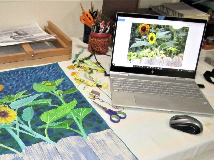
Now I can move on to sewing. I’ll start with a little hand embroidery on the flowers.

Happy making to all and to all a good day.

Posted in painting

Sitting on the Fence

……..about the fence.

Today I finished painting the Van Gogh-ish sunflower scene.

Close of up the flowers.

I’m very happy with my work. I also applied a wash of paint on the fabric that will become the fence. But I’m just perplexed about whether the fence works with the rest of the piece. Here it is:

I like the texture – it’s quite true to the real thing. I even like the violet color. It’s the tone of the violet that I’m not sure of. And I don’t think the light tan base color works well with the rest of the palette.

There are a few options:

  1. Start over with new fabric. I have white and a white on white print that might work.
  2. Apply another light wash over this fabric. Since the paints are transparent, a cool shade of blue would blend with the background and make the violet areas look blue-purple.
  3. Stick with what I have and modify the fence color by painting highlights in an opaque paint and stitching texture with thread in colors that fit the palette.
  4. Omit the fence and let the sunflowers float on the background.

What do you think?

Posted in painting

Channeling Vincent Van Gogh

If you read my post dated October 1, you will remember that I have a desire to make a fiber object featuring sunflowers. As a reminder, here is the photograph I took this summer that will form the basis of my design.

I got pulled off my work when I decided to make a “confetti” sample on October 1st. It was great fun, but it won’t really give me the effect I want for this background.

So today, I am back on the trail of Van Gogh. I’ve studied some of his still life paintings, enough to get a handle on how he painted those dotted backdrops. I am trying it on the background fabric I have selected. It is a mottled pattern in a Prussian blue color. Certainly, it looks painterly in its own way, but it lacks the dynamic quality I seek.

I get out my Jacquard textile paints and, with new brush in hand, start at the top of the fabric. Directional lines and dashes are what I’m going for.

Sky complete, starting on foliage background.

As I work my way down the fabric, I move from thinner lines to fatter, more blocky shapes. These represent what I see when looking at the background of my photo: mottled light and shadow of leaves, branches, etc.

Middle section painted.

I leave the bottom of the fabric blank, because the foreground is the fence. I have another piece of fabric for this element. It will be painted with a dry brush technique to portray the weathered state of the boards.

Background with my test swatch of fence fabric. I make the marks in violet paint.

I found this process quite meditative. As the fabric gets filled with splotches, one pauses, studies the work, and asks oneself: Where do I put the next mark? What is it calling for? How will I know when it’s finished?

Mr. Van Gogh might have known, but I am only guessing.

Posted in painting

Learning to Paint Water

I’ve moved on to the next tutorial by Shari Blaukopf. This one is exciting to me because it’s all about techniques for painting water. Still water, moving water, rapids, reflections, waterfalls – these are all subjects that interest me greatly.

First off was brush techniques frequently used to paint water.

Sketchbook – first attempts

Hm, I think the wet into wet needs a little more practice.

A little better.

There’s no substitute for learning by doing, so I moved on to the first subject: Still water. Here you see my sketch and the first washes.

While I might have made the blues darker, I was well enough satisfied to move on to the next steps.

In my enthusiasm to paint, I failed to get photographs of each stage. Let’s just say that there were two more layers of wash (mostly on the trees) and then final details. Once everything had dried, I applied some white gouache lines to the still water.

Completed painting:

While I feel that I succeeded in getting the reflections right, I’m not terribly satisfied with the overall painting. I’ll probably try it again.

To see Shari’s work, you can visit her blog here.

Friday, Oct 2nd. Today I painted the still water scene again. This rendition is much more pleasing to me.

The colors are cleaner and more transparent. The sky and water are vibrant instead of washed out. And the vegetation in the background is clearly defined.

Posted in painting

Final Lesson – Painting Shadows

Yesterday my husband and I returned from a week in Wisconsin. It was the baby’s 2nd birthday and we were there to celebrate. I loved my time there. My granddaughter had just broken the code on language, and words were tumbling out of her mouth in great abundance.

I had intended to post this blog last Sunday, but family life took priority.

The reference image for the lesson was a slightly decayed old service station in South Carolina. I will admit that I wasn’t terribly inspired to paint it. Bu I knew there were lessons to be learned from the effort.

First the sketch. Only a small number of pencil lines were used. I didn’t ink them.

There is a wide curving drive way across the foreground. The sun is coming from the right side of the image. It is high in the sky, but not directly overhead. First wash:

Next came the trees and shrubs in the background.

I was okay with this work, except for the dark tree on the right. The green doesn’t seem to fit with the other shades of green paint. Here is the final painting.