Posted in painting

Monochromatic Study

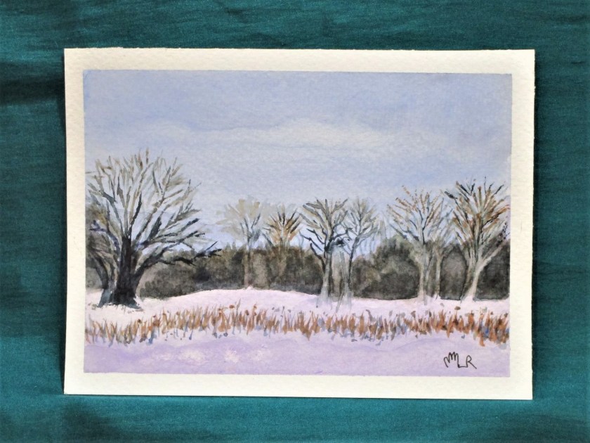
You may recall that I was back to experimenting in water color paint earlier this week. Working with carbazole violet, I laid down a wash and then lifted the paint back in vertical lines. Because these looked like tree outlines to me, I added some pencil lines to accentuate the effect.

Yesterday I returned to this sketch. Deciding that I would continue with one color, I started to layer up violet washes between the white lines. This went pretty well, except for the fact that some of the white trunks and branches got covered up. In my mind the painting was ruined. Instead of giving up on it, I let the paint dry and then, following the lines of the trunks, lifted up the paint to find some branches. I stroked some paint horizontally in the foreground to suggest tracks in the snow. Finally I dabbed water and dots of paint in upper area of the paper, splashed on more water and let it dry again. Now I was willing to sign this one.

GHOSTLY TREES

It’s interesting how much I am learning by doing with these little pieces. I guess it’s the idea that there is no price to pay for failure.

Only a small scrap of paper and a bit of my time.

Posted in painting

Update on my Watercolor Journey

It’s been over a month since I worked in watercolor paint. I’m disappointed in myself for dropping out of a self-imposed daily practice. Even though I am busy with two quilts, the desire to improve my painting skills is ever present. It’s time to pick up my brush again.

To that end, I signed up for a 10 week program of in-person art classes. The instructor is Ross Meyers, who is offering the classes at our local art association. After my first lesson (drawing), I got all ambitious again, remembering that I wanted to paint some snow scenes this winter.

Winter Woods

You may recall that I am working on 4 by 6 inch pieces of Fabriano Studio cold press paper. In this little painting I am practicing with carbazole violet. I like the way that shadows on the snow pick up cool hues of blue and violet. The reference photo I am looking at is by Catherine Arcolio, who posts under the name Leaf and Twig. In her posts she combines beautiful photography with a brief poem.

The Two Of Us – leaf and twig (wordpress.com)

The second painting is another experiment with violet. I laid down a graduated wash and let it soak in briefly. Then with a rigger brush, I lifted the paint vertically.

The resulting image reminds me of snow blown onto tree trunks. I added some pencil marks to accentuate this impression.

For the next layer, I will come back with full strength violet and a rigger brush to make grasses in the foreground. I will use a dry brush technique and maybe some black paint to further refine the tree trunks.

After my next art lesson, I’ll write about what I am learning, and whether I think it is worthwhile.

Posted in painting

Foggy Mountain Retreat

Lately I’ve been viewing a lot of images of mountains in the fog. It was time for me to paint my own.

The trick is to paint the mountains on dry or slightly damp paper, then flood the area just under them. The water pushes the pigment away.

French ultramarine blue, cobalt blue, Payne’s grey, burnt sienna, quinacridone gold and scarlet lake. Cold press Fabriano Studio paper.

Posted in painting

Windowsill Geranium

I’m still playing around with quinacridone gold as a background wash. This time, I dropped in five splotches of violet, hoping to get some interesting browns.

I failed to take a photograph of the initial wash. But the results reminded me of the geranium cutting I started a few months ago.

The most striking thing about this photograph is that it is backlit. The leaves furthest from the viewer are the lightest. I really wanted to capture this impression in watercolor, and today is the day to try, using my quin gold washed paper.

I painted leaves on top of four violet blotches, and the pot over the bottom one. To make green, I added a small amount of cobalt blue to the gold. When that didn’t give me a bright enough color, I tried lemon yellow with the cobalt.

As I worked, I felt strongly that the painting was falling well short of my vision for it. But instead of giving up, I kept adding more layers, working the shadowed areas with violet and lifting paint from the highlit ones. Continuing to work, I dropped in white gouache mixed with a little lemon yellow into the background and also into some of the leaf veins. To finish, I layered a bit more gold into corners of the background.

I wouldn’t call this my best work. But something good is beginning to happen. There is a sense of shape – the lower right leaf is the best example. The varying layers of color are bringing a depth of color that is suggestive of the natural world.

I will be painting geraniums again, and soon.

Quinacridone gold, Winsor yellow, cobalt blue and carbazole violet on Fabriano Studio cold press paper.

Posted in painting

Sunset at the Wash

For my exercise, I wanted to experiment with a quinacridone gold wash. Since it is a staining pigment, I decided to pair it with burnt sienna, a granulating pigment. With the idea of a sunset, I added some splashes of alizarin crimson. Streaks of payne’s gray served to ground the image.

I love the mingling of the pigments so far. This image reminds me of a place at Tallgrass Prairie, where rushing water had torn away part of a ridge, exposing roots and strata of soil. I quickly painted in some details to complete the scene.

Later, I searched my photographs for a picture of the wash.

If I were to paint this scene again, I would include the deep shadows where the landform bends away from the viewer.

Painted wet-in-wet and wet-in-dry with a Sumi brush on 140 lb. cold press paper.