
To all men who devote precious time to their families, this day honors your efforts. Thank you for raising the next generation.
To all men who devote precious time to their families, this day honors your efforts. Thank you for raising the next generation.

Ever since I wove a small tapestry on a hand-made loom, I’ve mused about weaving threads over a water color painting. So today I am playing around with the idea.
I started with this 4 by 6 painting I did last December.

It’s an exercise from Kateri Ewing’s book Watercolor is for Everyone. After drawing two columns of randomly sized rectangles, the artist applies selected colors, reversing the order of application in the second column.
I thought this painting would be a good background for my proposed thread embellishment because of its rectilinear structure. To start, I poked holes at regular intervals along the outside vertical edges. Next I stitched a zigzag pattern across the painting with no. 3 cotton twist thread in a gold color.

Now what, I asked myself. How about creating points along the thread intersections by tying knots? Okay. For this step I chose a dark cool green shade.

To further reinforce the intersections, I painted shapes with a metallic paint.

Not a bad way to spend a quiet afternoon. It was soothing and meditative. It reminded me of those picture stitch cards that I worked as a girl when learning how to sew.
Now I have a brand new perspective on what is possible with paint and thread.
You can learn about Kateri Ewing’s work here:

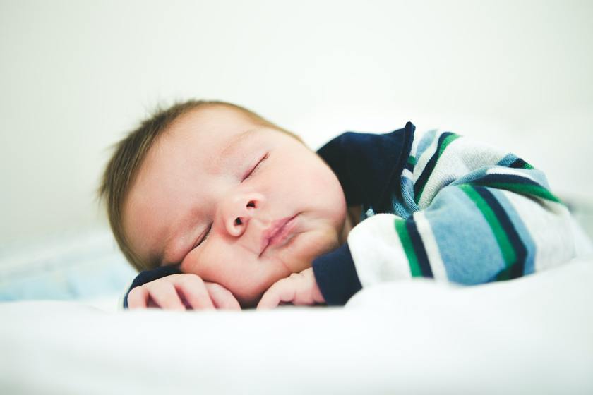
Yesterday I made a watercolor version of the sleeping baby posted earlier this week.
Here is the original photograph:
And my take on this portrait using watercolor.

Somehow in the process of painting, the little mite’s coloration was translated from dark hair to straw-colored red hair, and the facial tones got very rosy, especially the lips. I guess I am channeling Lu.
Anyway, this sketch pleases me. With practice I am learning how to manipulate multiple layers of wash, getting the colors to blend better.
Pigments used were raw sienna, yellow ochre, quinacridone red, burnt sienna, ultramarine blue, carbazole violet, and tiny bit of permanent alizarin crimson. This was worked in my brand new 5 x 8 inch Hahnemuhle watercolor sketchbook. The paper was very forgiving.

During my lessons with Ross Meyers, I wanted to learn how to paint a portrait. He had given a good lesson on drawing faces. Now I was ready to paint one. I found this photograph on Unsplash to use as a reference. (Unsplash.com is a site where photographers give permission to download and use their images. without attribution.)

I liked that it was a very clean close-up of a young man. I saved the photo in black and white format in order to simplify the values. Then I did a contour sketch at home on water color paper and brought it to class.
The first question I had was about pigments suitable for portraiture. Ross suggested yellow ochre, burnt sienna, alizarin crimson and burnt umber. I didn’t have the umber, so I got out payne’s gray. He demonstrated the first wash – over the face and hair. While it was drying, I moved on to another painting. I never made it back to this painting until yesterday.
Starting with the same palette, I painted the neck and the lips, brows and eyes. Next I increased the shadows and added more details to the face.
I decided that the background should be a dark color. I chose violet, but mixed it with indigo so I could get some texture and granulation.
Today I added more shadow and beard stubble, painted in the eyelashes and put a pale grey wash on the T-shirt. Here is my young man now.
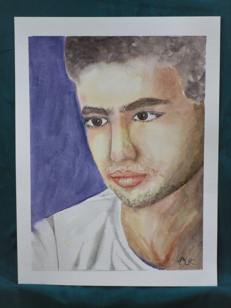
While my version is not an exact rendering of the original photograph, I am very happy with this finish. He looks a bit exotic – I think it’s the long Roman nose. His face is slightly tough but with softness around his eyes.
After this effort, I am feeling more optimistic about painting people’s faces. Maybe I will try painting a family member now.

I had an inspiration recently to try painting some converging curved lines that I saw in a photograph. While perusing my supplies, I came across some 8 by 10 boards with paper stretched on top, promoted as suitable for watercolor paints. So I thought I would test them with my current inspiration.

I plan to use staining pigments, starting with quinacridone rose and Thalo blue in the first two blocks. Why pink and blue? I think my brain was lingering on the yarns from my latest knitting project. Cast-on Monday – Summer Style
It took a little work to get the paper wet enough to lay on the wash. But eventually the paper was evenly wet and I laid down the paint using my biggest round brush.

So far so good. At this point, I was happy that the paper/board seemed to be performing well. After allowing the paint to dry overnight, I added two additional colors – gold and violet. This time, I let the colors bleed into the pink and blue, as a way to merge the two together. The work began to remind me of gender roles and society. Why? Again, the pink and blue, and the way the curves leveled out while flowing in a parallel fashion across the paper.
Here is the board immediately after laying down the two additional washes.

And 30 minutes later……

And here after completely dry.

Analysis: I’m not terribly sure what I am trying to say about gender and society. Something about shifting lines, blurring edges and the pressure to conform.
But the experiment on the watercolor board was successful enough to persuade me to try it again.

