Posted in painting

Special Delivery Sunday

The doorbell just rang and I knew that my package from Amazon was here.

I have enrolled in a class on printmaking. While I have made a few stamps to use in my painted fabric projects, I have never been very satisfied with my efforts. Part of my difficulty was due to inexperience, but mostly it was due to poor tools and materials. So when my art association offered a class I was keen to enroll.

The instructor suggested that students purchased this Lino-cut kit.

It seems to have every tool needed to cut and stamp a mono-print, except the paper, of which I have plenty.

And while I was looking for something else to buy (you know, so I could get free shipping,) I found this porcelain palette at a very affordable price.

I don’t need 18 wells, but I do need a large area for color mixing. In the past I’ve tried larger plastic palettes, but was disappointed by their tendency to get stained. This porcelain palette will not stain. And Bonus! When I turned the palette over,

…the reverse side had 12 mixing areas. That’s a useful option.

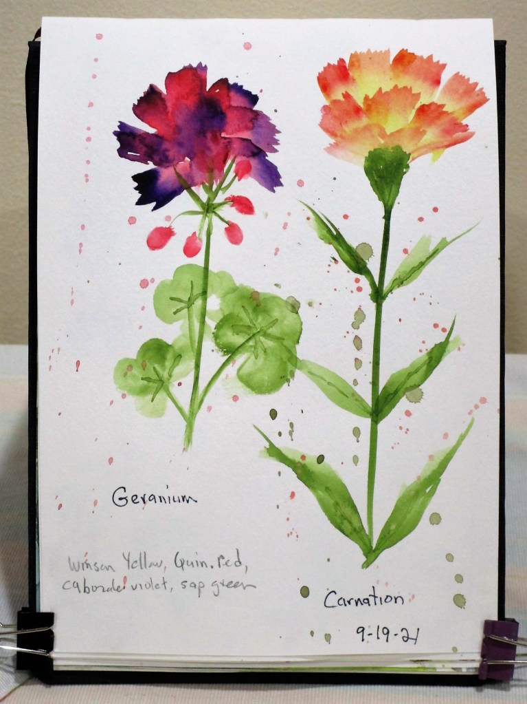
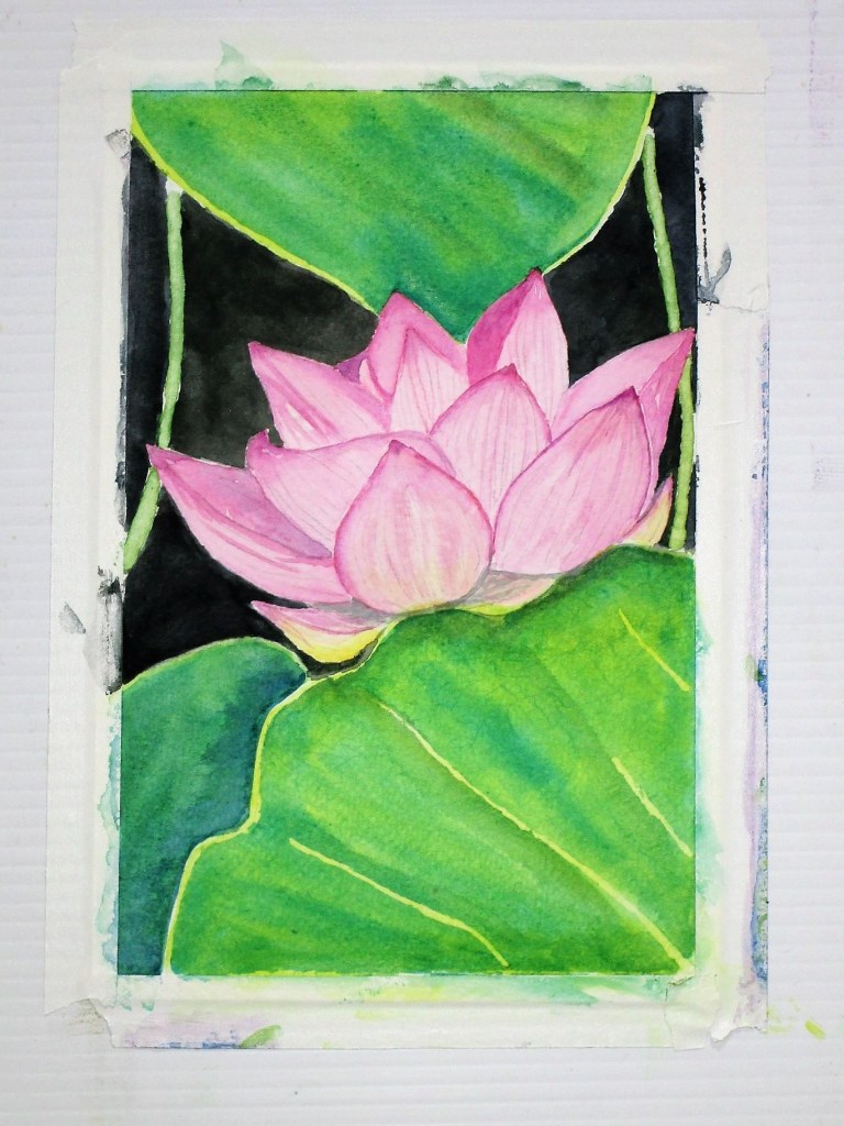
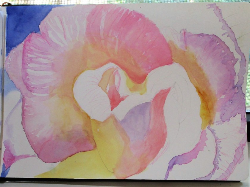
Now, of course, I’m itching to get out my watercolors. ‘Bye!

Posted in painting

Sunday Sketching – Flowers

This month I signed up to take a class taught by the frugal crafter, Lindsay Weirich.

https://lindsayweirich.teachable.com/p/loose-juicy-watercolor-florals

Since today is Sketching Sunday, I am sharing a few of the quick and loose flowers that I have painted while following her instruction.

None of these took longer than fifteen minutes to do. They certainly help me fill up the blank pages in my watercolor sketchbook.

How are you spending your week-end? I hope you are making time for fun stuff.

Posted in painting

Watercolor Wednesday

I have been saving this image from Unsplash for the time when my skills were sufficient to paint it. I think I’m ready now.

There are several challenges:

  1. Painting the pink flower with shading and without losing its delicate transparency.
  2. Making the background black enough while keeping the crisp edges of the foreground.
  3. Rendering the texture of the leaf in the foreground

It took me a few days and several stages.

Pencil outline of the flower and underpainting of the leaves. I added some colored pencil on the foreground, but these lines completely disappeared under subsequent glazes.

Before I proceeded to the next layers, I reserved the edges by coating them with masking fluid.

First layer of paint on flower and background, second glaze on leaves.
Second layer of paint on flower and background. Once it dried, I rubbed off the masking fluid.

Final painting. To render the curves of the foreground leaf, I decided to add a dark color band which doesn’t exist in the original photograph. I used a blue Prismacolor pencil to draw in the delicate veins which are visible between the large ribs.

I like the glowing look of the flower. The crimson petal tips really come forward visually. I’m happy with the foreground leaf. I’m wondering if I need to darken the leaf in the background.

Maybe I will wait a day and see how I feel about it.

Painted on Fabriano Studio cold press paper with Winsor yellow, quinacridone magenta, alizarin crimson, prussian blue, viridian, gold green and sap green.

Posted in painting

My First Rose

Flowers are a popular subject for beginning watercolor students. So far, I have not been attracted to this subject. If given a choice, I would prefer to paint an animal instead of a flower. But today I decided to go for a rose.

And not just any rose. I picked a multi-hued rose, very close up. Obviously, I was ready for a challenge.

This photograph was chosen from a free-usage website, most likely Unsplash. Unfortunately, I saved it to my folder so long ago that I can’t remember where it came from. I was attracted by the assortment of warm colors. I especially like the magenta hues, because I recently purchased a tube of quinacridone magenta.

Day One.
All the initial washes are in place
Deeper values and a little bit of detail

I used my Prismacolor pencils to emphasize the veining in the petals.

I’m reasonably happy with my first effort. But in retrospect, it would have been wiser to pick a rose of one hue – a red, red rose – for my initiation into painting flowers.

Posted in painting

Sunday Sky

This painting started life as a practice sky. I stroked ultramarine blue over the top 2/3rd of the paper, let it sit, and then lifted off the cloud shapes with a wet paper towel. Today I added the sea and sand with inspiration from a photo by Cristian Cabral on Unsplash.

I chose this image because of the foamy waves and dark-colored sand with footprints In addition to the Ultramarine blue I used raw sienna, burnt sienna, paynes gray and a tiny bit of new gambose to make the trees a bit green. Paper is Fabriano Studio cold press cut to 6×9 inches.

You can view more images by this photographer here:

https://unsplash.com/@hangaromo